
wix/react-native-ui-lib
wix/react-native-ui-lib has 7,157 GitHub stars and 749 forks. Star changes are not measured yet. Last checked 2026-11-07 23:06 UTC. Last push 2026-11-03.
UI Components Library for React Native
Measured star growth
- in 24h
- Update delayed
- in 7 days
- Update delayed
- in 15 days
- Update delayed
- in 1 month
- Update delayed
Net star changes over overlapping periods, not daily totals. Missing measurements are left blank. Stars measure attention, not software quality.
README.md
Original

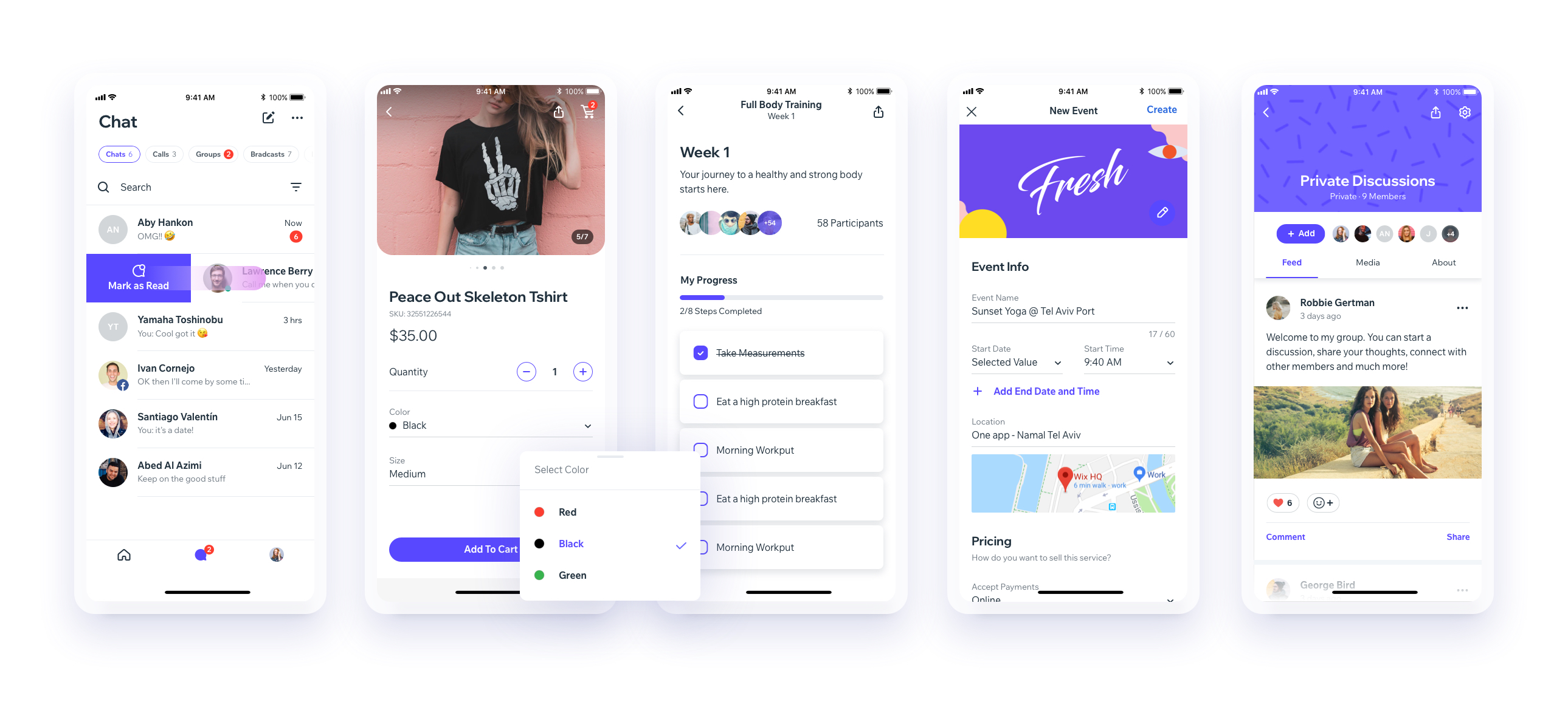
UI Toolset & Components Library for React Native


Notes
React Native New Arc
We are working on upgrading our UI Library to support the new React Native Architecture. Currently, we support React Native 0.73, and we plan to support React Native 0.77 next. While we don’t have a timeline yet, this is part of our roadmap.
Releases
Repository administrators: see the release runbook for manual releases, npm trusted publishing setup, and recovery.
Links
Download our Expo demo app
(You will need the Expo App)
or open link in your devices
[expo ] exp://exp.host/@vn.chemgio/rnuilib?release-channel=default
Installing
See setup instructions here.
New Major Version 6.0
See breaking changes
For React Native >= 0.60.0
please use react-native-ui-lib
For React Native < 0.60.0
please use react-native-ui-lib@^3.0.0
Create your own Design System in 3 easy steps
Step 1
Load your foundations and presets (colors, typography, spacings, etc...)
// FoundationConfig.js

import {Colors, Typography, Spacings} from 'react-native-ui-lib';

Colors.loadColors({
  primaryColor: '#2364AA',
  secondaryColor: '#81C3D7',
  textColor: '##221D23',
  errorColor: '#E63B2E',
  successColor: '#ADC76F',
  warnColor: '##FF963C'
});

Typography.loadTypographies({
  heading: {fontSize: 36, fontWeight: '600'},
  subheading: {fontSize: 28, fontWeight: '500'},
  body: {fontSize: 18, fontWeight: '400'}
});

Spacings.loadSpacings({
  page: 20,
  card: 12,
  gridGutter: 16
});
Step 2
Set default configurations to your components
// ComponentsConfig.js

import {ThemeManager} from 'react-native-ui-lib';

// with plain object
ThemeManager.setComponentTheme('Card', {
  borderRadius: 8
});

// with a dynamic function
ThemeManager.setComponentTheme('Button', (props, context) => {
  // 'square' is not an original Button prop, but a custom prop that can
  // be used to create different variations of buttons in your app
  if (props.square) {
    return {
      borderRadius: 0
    };
  }
});
Step 3
Use it all together. Your configurations will be applied on uilib components so you can use them easily with modifiers.
// MyScreen.js

import React, {Component} from 'react';
import {View, Text, Card, Button} from 'react-native-ui-lib';

class MyScreen extends Component {
  render() {
    return (
      <View flex padding-page>
        <Text heading marginB-s4>
          My Screen
        </Text>
        <Card height={100} center padding-card marginB-s4>
          <Text body>This is an example card </Text>
        </Card>

        <Button label="Button" body bg-primaryColor square></Button>
      </View>
    );
  }
}
Contributing
Explore related projects
freeCodeCamp/freeCodeCamp
freeCodeCamp.org's open-source codebase and curriculum. Learn math, programming, and computer science for free.
458,741 starsdonnemartin/system-design-primer
Learn how to design large-scale systems. Prep for the system design interview. Includes Anki flashcards.
377,308 starsreact/react
The library for web and native user interfaces.
252,404 starsvuejs/vue
This is the repo for Vue 2. For Vue 3, go to https://github.com/vuejs/core
212,629 stars