
stevdza-san/Swipeable-KMP
stevdza-san/Swipeable-KMP has 74 GitHub stars and 6 forks. GitHot measured 0 stars in 24 hours. Last checked 2026-11-16 03:40 UTC. Last push 2026-11-01.
Measured star growth
- in 24h
- 0
- in 7 days
- Update delayed
- in 15 days
- Update delayed
- in 1 month
- Update delayed
Net star changes over overlapping periods, not daily totals. Missing measurements are left blank. Stars measure attention, not software quality.
About
A highly customizable swipeable component that supports both dismiss and reveal behaviors.
Web & AppsREADME.md
OriginalSwipeable KMP







A highly customizable, modern swipeable component for Compose Multiplatform
Supporting Android, iOS, Desktop, and Web (WASM) with beautiful animations and intuitive gestures
🎥 Demo
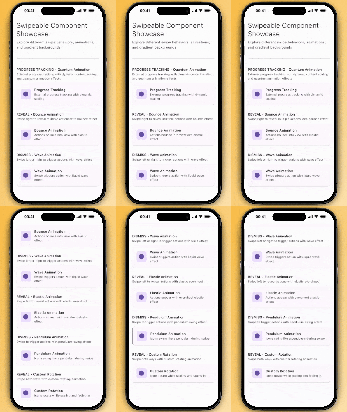
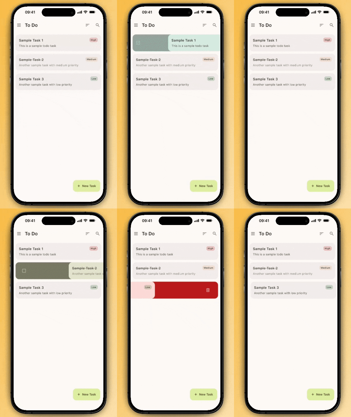
Experience the full range of swipe behaviors and animations
✨ Features
🎯 Dual Behavior Modes
- REVEAL: Persistent action buttons that stay open for multiple interactions
- DISMISS: Quick swipe-to-action that automatically snaps back
🌍 True Multiplatform
- Android - Native touch gestures
- iOS - Smooth iOS-style interactions
- Desktop - Mouse and keyboard support
- Web (WASM) - Pure Kotlin, no JavaScript
🎨 Rich Customization
- 15+ Built-in Animations - From subtle fades to quantum effects
- Gradient Backgrounds - Solid colors, linear gradients, and radial gradients
- Platform-Native Haptic Feedback - Three modes, three intensities, directional control
- Flexible Theming - Colors, shapes, spacing, and more
- Intuitive Thresholds - Single value controls both drag distance and trigger point
- Real-time Progress - Custom animation callbacks
- Directional Control - Left, right, or bidirectional swipes
Quick Start
Installation
Option 1: Direct Dependency
Add to your commonMain dependencies:
implementation("com.stevdza-san:swipeable-kmp:1.0.8")
Option 2: Version Catalog (Recommended)
Add to your libs.versions.toml:
[versions]
swipeableKmp = "1.0.8"

[libraries]
swipeable-kmp = { module = "com.stevdza-san:swipeable-kmp", version.ref = "swipeableKmp" }
Then in your commonMain dependencies:
implementation(libs.swipeable.kmp)
Note: For haptic feedback on Android, the library automatically adds the
VIBRATEpermission via manifest merger. No additional setup required!
Basic Usage
Swipeable(
    behavior = SwipeBehavior.REVEAL,
    rightRevealActions = listOf(
        SwipeAction(
            customization = ActionCustomization(
                icon = Icons.Default.Delete,
                iconColor = Color.White,
                containerColor = Color.Red
            ),
            onAction = { /* Delete item */ }
        )
    ),
    // Add gradient background
    rightBackground = SwipeBackground.linearGradient(
        colors = listOf(Color.Red, Color.Pink)
    ),
    // Add haptic feedback
    hapticFeedbackConfig = HapticFeedbackConfig.Default
) {
    // Your content here
    Card {
        Text("Swipe me!")
    }
}
📖 Documentation
Behavior Modes
REVEAL Mode
Perfect for multiple actions - swipe to reveal persistent action buttons.
Swipeable(
    behavior = SwipeBehavior.REVEAL,
    rightRevealActions = listOf(
        SwipeAction(/* Edit action */),
        SwipeAction(/* Share action */),
        SwipeAction(/* Delete action */)
    )
) { /* content */ }
DISMISS Mode
Great for quick actions - swipe to trigger and automatically return.
Swipeable(
    behavior = SwipeBehavior.DISMISS,
    rightDismissAction = SwipeAction(
        customization = ActionCustomization(
            icon = Icons.Default.Archive,
            containerColor = Color.Blue
        ),
        onAction = { /* Archive item */ }
    )
) { /* content */ }
Advanced Customization
Understanding Threshold
The threshold parameter controls both the maximum drag distance and when actions trigger:
Swipeable(
    threshold = 0.3f  // 30% of screen width
) { /* content */ }
How it works:
- Max Drag Distance:
screenWidth × threshold0.3= content can drag up to 30% of screen width0.5= content can drag up to 50% of screen width
- Trigger Point: Action triggers when you reach 100% of the max drag distance
- Lower thresholds (e.g.,
0.2) = shorter drags, easier to trigger - Higher thresholds (e.g.,
0.5) = longer drags, more effort required
- Lower thresholds (e.g.,
Examples:
threshold = 0.2→ Max drag: 20% of screen, triggers at full 20%threshold = 0.3→ Max drag: 30% of screen, triggers at full 30%threshold = 0.4→ Max drag: 40% of screen, triggers at full 40%
Custom Animations
Swipeable(
    // Choose from 15+ built-in animations
    actionAnimation = ActionAnimationConfig.Quantum,

    // Or create custom animations
    animationSpec = spring(
        dampingRatio = Spring.DampingRatioMediumBouncy,
        stiffness = Spring.StiffnessMedium
    )
) { /* content */ }
Real-time Progress Tracking
var swipeProgress by remember { mutableStateOf(0f) }

Swipeable(
    onSwipeProgress = { progress, direction ->
        swipeProgress = progress
        // Create custom animations based on swipe progress
    }
) {
    Box(
        modifier = Modifier
            .scale(1f - swipeProgress * 0.1f) // Shrink as user swipes
            .background(
                lerp(Color.Blue, Color.Red, swipeProgress)
            )
    ) {
        Text("Progress: ${(swipeProgress * 100).toInt()}%")
    }
}
Gradient Backgrounds
Create stunning visual effects with solid colors or gradients:
Swipeable(
    // Solid color backgrounds
    leftBackground = SwipeBackground.solid(Color.Blue),
    rightBackground = SwipeBackground.solid(Color.Red),

    // Linear gradient backgrounds
    leftBackground = SwipeBackground.linearGradient(
        colors = listOf(Color.Blue, Color.Cyan, Color.Green)
    ),

    // Radial gradient backgrounds
    rightBackground = SwipeBackground.radialGradient(
        colors = listOf(Color.Red, Color.Orange, Color.Yellow)
    )
) { /* content */ }
Haptic Feedback
Add tactile feedback to enhance the swipe experience with platform-native haptic effects.
Platform Support:
- ✅ Android - Uses
VibrationEffectAPI with fallback to legacyVibrator(requiresVIBRATEpermission - auto-added by library) - ✅ iOS - Uses
UIImpactFeedbackGeneratorwith prepared generators for optimal performance - ⚪ Desktop/Web - No-op (these platforms don't support haptic feedback)
Basic Haptic Feedback
Swipeable(
    hapticFeedbackConfig = HapticFeedbackConfig.Default,  // Medium haptic at threshold
    rightDismissAction = SwipeAction(/* ... */)
) { /* content */ }
Haptic Feedback Modes
Three distinct modes control when haptic feedback triggers:
// 1. THRESHOLD_ONCE - Single feedback at threshold (default)
// Perfect for clear "action ready" indication
Swipeable(
    hapticFeedbackConfig = HapticFeedbackConfig(
        mode = HapticFeedbackMode.THRESHOLD_ONCE,
        intensity = HapticFeedbackIntensity.MEDIUM
    )
) { /* content */ }

// 2. CONTINUOUS - Feedback while swiping
// Creates immersive tactile experience (throttled to ~5% progress intervals)
Swipeable(
    hapticFeedbackConfig = HapticFeedbackConfig(
        mode = HapticFeedbackMode.CONTINUOUS,
        intensity = HapticFeedbackIntensity.LIGHT
    )
) { /* content */ }

// 3. PROGRESS_STEPS - Feedback at 25%, 50%, 75%, 100%
// Provides incremental progress indicators
Swipeable(
    hapticFeedbackConfig = HapticFeedbackConfig(
        mode = HapticFeedbackMode.PROGRESS_STEPS,
        intensity = HapticFeedbackIntensity.HEAVY
    )
) { /* content */ }
Haptic Intensity Levels
Three intensity levels for different use cases:
| Intensity | Android | iOS | Best For |
|---|---|---|---|
LIGHT |
TEXT_HANDLE_MOVE |
UIImpactFeedbackStyleLight |
Subtle, frequent feedback |
MEDIUM |
CLOCK_TICK |
UIImpactFeedbackStyleMedium |
Balanced, general use |
HEAVY |
CONTEXT_CLICK |
UIImpactFeedbackStyleHeavy |
Destructive actions, warnings |
Directional Haptic Feedback
Customize haptic feedback separately for left and right swipes - perfect for differentiating between destructive and non-destructive actions:
Swipeable(
    // Light continuous feedback for archive (non-destructive)
    leftHapticFeedbackConfig = HapticFeedbackConfig(
        mode = HapticFeedbackMode.CONTINUOUS,
        intensity = HapticFeedbackIntensity.LIGHT
    ),
    // Heavy milestone feedback for delete (destructive)
    rightHapticFeedbackConfig = HapticFeedbackConfig(
        mode = HapticFeedbackMode.PROGRESS_STEPS,
        intensity = HapticFeedbackIntensity.HEAVY
    ),
    leftDismissAction = SwipeAction(label = "Archive", /* ... */),
    rightDismissAction = SwipeAction(label = "Delete", /* ... */)
) { /* content */ }
Note: leftHapticFeedbackConfig applies when swiping RIGHT (revealing left actions), and rightHapticFeedbackConfig applies when swiping LEFT (revealing right actions).
Convenient Presets
// Predefined configurations for common use cases
HapticFeedbackConfig.Default         // Threshold once, medium intensity
HapticFeedbackConfig.Disabled        // No haptic feedback
HapticFeedbackConfig.Continuous      // Continuous, medium intensity
HapticFeedbackConfig.ProgressSteps   // Progress steps, medium intensity
Real-World Examples
// Email app - Different feedback for archive vs delete
Swipeable(
    leftHapticFeedbackConfig = HapticFeedbackConfig(
        mode = HapticFeedbackMode.THRESHOLD_ONCE,
        intensity = HapticFeedbackIntensity.LIGHT
    ),
    rightHapticFeedbackConfig = HapticFeedbackConfig(
        mode = HapticFeedbackMode.THRESHOLD_ONCE,
        intensity = HapticFeedbackIntensity.HEAVY
    ),
    leftDismissAction = SwipeAction(label = "Archive", /* ... */),
    rightDismissAction = SwipeAction(label = "Delete", /* ... */)
) { EmailCard() }

// Social media - Continuous feedback for interactive swipe
Swipeable(
    hapticFeedbackConfig = HapticFeedbackConfig.Continuous,
    leftRevealActions = listOf(
        SwipeAction(label = "Like", /* ... */),
        SwipeAction(label = "Share", /* ... */)
    )
) { PostCard() }

// Settings - No haptic for subtle interactions
Swipeable(
    hapticFeedbackConfig = HapticFeedbackConfig.Disabled,
    rightRevealActions = listOf(
        SwipeAction(label = "Edit", /* ... */)
    )
) { SettingsRow() }
Fine-tuned Control
Swipeable(
    direction = SwipeDirection.RIGHT,      // Only allow right swipes
    threshold = 0.3f,                      // 30% of screen width for both drag distance & trigger
    shape = RoundedCornerShape(16.dp),     // Custom shape
    leftBackground = SwipeBackground.solid(Color.Green),   // Background styling
    rightBackground = SwipeBackground.linearGradient(
        colors = listOf(Color.Red, Color.Pink)
    )
) { /* content */ }
Animation Showcase
Built-in Animation Styles
| Animation | Description | Best For |
|---|---|---|
Default |
Scale & fade in | General UI |
SlideUp |
Slide from bottom | Lists, sheets |
SlideDown |
Slide from top | Toolbars |
SlideLeft |
Slide to the left | Navigation |
SlideRight |
Slide to the right | Navigation |
Rotate |
Rotate with scale | Attention grab |
Bounce |
Elastic pop-in | Feedback |
Flip |
3D card flip | Cards |
Elastic |
Overshoot scaling | Playful UI |
Spring |
Springy entrance | Dynamic motion |
Pendulum |
Swinging motion | Playful actions |
Wave |
Fluid distortion | Organic UI |
Magnetic |
Pull & snap | Attraction effects |
Origami |
Folding reveal | Creative UI |
Materialize |
Particle assembly | Magical effects |
Quantum |
Glitch teleport | Futuristic UI |
Morph |
Shape morphing | Creative UI |
Custom |
User-defined | Advanced use |
// Try different animations with gradient backgrounds
Swipeable(
    actionAnimation = ActionAnimationConfig.Quantum,
    rightBackground = SwipeBackground.linearGradient(
        colors = listOf(Color.Magenta, Color.Blue)
    )
) { /* content */ }

Swipeable(
    actionAnimation = ActionAnimationConfig.Pendulum,
    leftBackground = SwipeBackground.radialGradient(
        colors = listOf(Color.Green, Color.Yellow)
    )
) { /* content */ }

Swipeable(
    actionAnimation = ActionAnimationConfig.Wave,
    rightBackground = SwipeBackground.solid(Color.Red)
) { /* content */ }
Custom Animation Creation
val customAnimation = ActionAnimationConfig.custom(
    enableScale = true,
    enableFade = true,
    animationModifier = { progress ->
        Modifier
            .rotate(progress * 360f)
            .offset(y = (50.dp * (1f - progress)))
    }
)
API Reference
Core Components
Swipeable
The main composable component.
| Parameter | Type | Default | Description |
|---|---|---|---|
behavior |
SwipeBehavior |
DISMISS |
Interaction mode (DISMISS/REVEAL) |
direction |
SwipeDirection |
BOTH |
Allowed swipe directions |
threshold |
Float |
0.3f |
Controls both max drag distance and trigger point (0.0-1.0). Max drag = screenWidth × threshold. Action triggers at 100% of max drag. |
leftBackground |
SwipeBackground |
solid(Color.Gray) |
Left side background (solid/gradient) |
rightBackground |
SwipeBackground |
solid(Color.Red) |
Right side background (solid/gradient) |
actionAnimation |
ActionAnimationConfig |
Default |
Action button animations |
animationSpec |
AnimationSpec<Float> |
tween(300) |
Swipe transition animations |
hapticFeedbackConfig |
HapticFeedbackConfig |
Default |
Default haptic feedback for both directions |
leftHapticFeedbackConfig |
HapticFeedbackConfig? |
null |
Haptic config for left swipe (overrides default) |
rightHapticFeedbackConfig |
HapticFeedbackConfig? |
null |
Haptic config for right swipe (overrides default) |
onSwipeProgress |
((Float, SwipeDirection?) -> Unit)? |
null |
Real-time progress callback |
SwipeAction
Defines an individual action button.
SwipeAction(
    customization = ActionCustomization(
        icon = Res.drawable.delete,        // Action icon
        iconSize = 24.dp,                  // Icon size
        iconColor = Color.White,           // Icon tint
        containerColor = Color.Red,        // Button background
        shape = CircleShape,               // Button shape
        padding = 48.dp                    // Button size
    ),
    onAction = { /* Handle action */ },    // Action callback
    label = "Delete",                      // Accessibility label
    autoClose = true                       // Auto-close reveal panel after action click (REVEAL mode only)
)
autoClose(default:true) — Whentrue, the swipe panel automatically animates back to the closed position after the action is tapped. Set tofalseto keep the panel open afteronActionfires (e.g. for a toggle action where the UI updates in place).
#### `SwipeBackground`
Configures background styling with solid colors or gradients.

```kotlin
// Solid color background
SwipeBackground.solid(Color.Red)

// Linear gradient background
SwipeBackground.linearGradient(
    colors = listOf(Color.Blue, Color.Purple, Color.Pink),
    startX = 0.0f,                          // Start position X
    startY = 0.0f,                          // Start position Y
    endX = Float.POSITIVE_INFINITY,         // End position X
    endY = 0.0f                            // End position Y
)

// Radial gradient background
SwipeBackground.radialGradient(
    colors = listOf(Color.Yellow, Color.Orange, Color.Red),
    centerX = Float.POSITIVE_INFINITY,      // Center position X
    centerY = Float.POSITIVE_INFINITY,      // Center position Y
    radius = Float.POSITIVE_INFINITY        // Gradient radius
)
HapticFeedbackConfig
Configures haptic feedback behavior and intensity.
HapticFeedbackConfig(
    enabled = true,                              // Enable/disable haptic feedback
    mode = HapticFeedbackMode.THRESHOLD_ONCE,    // When to trigger (THRESHOLD_ONCE, CONTINUOUS, PROGRESS_STEPS)
    intensity = HapticFeedbackIntensity.MEDIUM   // How strong (LIGHT, MEDIUM, HEAVY)
)

// Convenient presets
HapticFeedbackConfig.Default        // enabled, THRESHOLD_ONCE, MEDIUM
HapticFeedbackConfig.Disabled       // disabled
HapticFeedbackConfig.Continuous     // enabled, CONTINUOUS, MEDIUM
HapticFeedbackConfig.ProgressSteps  // enabled, PROGRESS_STEPS, MEDIUM
HapticFeedbackMode Options:
THRESHOLD_ONCE- Single feedback when threshold is reachedCONTINUOUS- Feedback throughout swipe (throttled every ~5% progress)PROGRESS_STEPS- Feedback at 25%, 50%, 75%, 100% milestones
HapticFeedbackIntensity Options:
LIGHT- Subtle, frequent interactionsMEDIUM- Balanced, general purposeHEAVY- Destructive actions, important events
Platform Requirements:
- Android:
VIBRATEpermission (automatically added by library manifest) - iOS: No additional setup required
- Desktop/Web: No-op implementations (platforms don't support haptics)
Theming & Styling
Material Design Integration
Swipeable(
    rightRevealActions = listOf(
        SwipeAction(
            customization = ActionCustomization(
                icon = Icons.Default.Delete,
                iconColor = MaterialTheme.colorScheme.onError,
                containerColor = MaterialTheme.colorScheme.error,
                shape = MaterialTheme.shapes.medium
            )
        )
    ),
    shape = MaterialTheme.shapes.large,
    rightBackground = SwipeBackground.linearGradient(
        colors = listOf(
            MaterialTheme.colorScheme.errorContainer,
            MaterialTheme.colorScheme.error.copy(alpha = 0.7f)
        )
    )
) { /* content */ }
Custom Design Systems
// Define your design tokens
object SwipeTheme {
    val dangerAction = ActionCustomization(
        containerColor = Color(0xFFFF3B30),
        iconColor = Color.White,
        shape = RoundedCornerShape(12.dp)
    )

    val primaryAction = ActionCustomization(
        containerColor = Color(0xFF007AFF),
        iconColor = Color.White,
        shape = CircleShape
    )

    // Gradient backgrounds
    val dangerBackground = SwipeBackground.linearGradient(
        colors = listOf(Color(0xFFFF3B30), Color(0xFFFF6B6B))
    )

    val successBackground = SwipeBackground.radialGradient(
        colors = listOf(Color(0xFF34C759), Color(0xFF30D158), Color(0xFF32D74B))
    )
}
🌟 Star this repo if you find it useful!
Made with ❤️ by Stevdza-San