
sbycrosz/react-native-credit-card-input
sbycrosz/react-native-credit-card-input has 1,508 GitHub stars and 708 forks. GitHot measured -1 stars in 24 hours and 0 in 7 days. Last checked 2026-11-11 19:06 UTC. Last push 2025-11-10.
Easy, cross-platform credit-card input for your React Native Project! Start accepting payment 💰 in your app today!
What you can do
- Skeuomorphic credit-card 💳
- Lite version for smaller screens / compact layout
- Credit-card input validations & formatting while you're typing
- Form is fully navigatable using keypad
Measured star growth
- in 24h
- -1
- in 7 days
- 0
- in 15 days
- Collecting history
- in 1 month
- Collecting history
Net star changes over overlapping periods, not daily totals. Missing measurements are left blank. Stars measure attention, not software quality.
README.md
OriginalReact Native Credit Card Input - Finally updated in 2024!
Example on Expo Snack - Easy (and good looking) credit-card input for your React Native Project 💳 💳
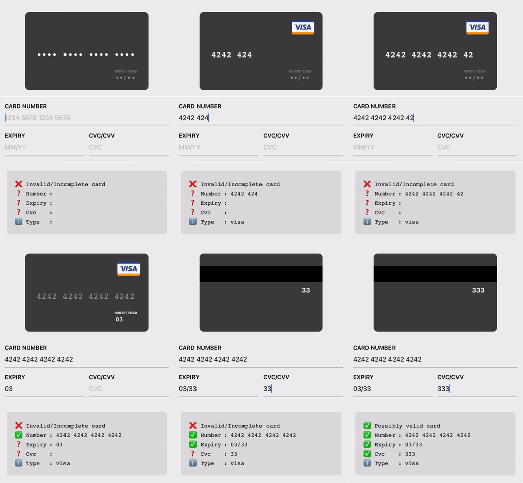
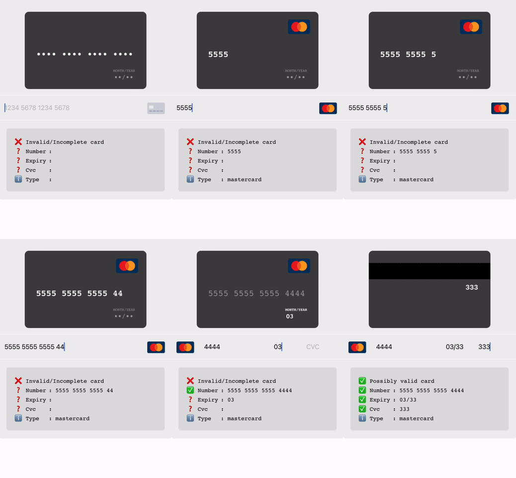
Code:
<CreditCardInput />
// or
<LiteCreditCardInput />
Features
- Skeuomorphic credit-card 💳
- Lite version for smaller screens / compact layout
- Credit-card input validations & formatting while you're typing
- Form is fully navigatable using keypad
- Works on both Android, iOS and Web!
Usage
yarn add react-native-credit-card-input
then add these lines in your react-native codebase
import { CreditCardInput, LiteCreditCardInput } from "react-native-credit-card-input";

<CreditCardInput onChange={_onChange} />
// or
<LiteCreditCardInput onChange={_onChange} />

// Note: You'll need to enable LayoutAnimation on android to see LiteCreditCardInput's animations
// UIManager.setLayoutAnimationEnabledExperimental(true);
And then on your onChange handler:
_onChange => form => console.log(form);

// will print:
{
  valid: true, // will be true once all fields are "valid" (time to enable the submit button)
  values: { // will be in the sanitized and formatted form
  	number: "4242 4242",
  	expiry: "06/19",
  	cvc: "300",
  	type: "visa", // will be one of [null, "visa", "master-card", "american-express", "diners-club", "discover", "jcb", "unionpay", "maestro"]
  },
  status: {  // will be one of ["incomplete", "invalid", and "valid"]
	number: "incomplete",
	expiry: "incomplete",
	cvc: "incomplete",
  },
};
Example
Or run it locally
yarn install

yarn example ios
# or
yarn example android
# or
yarn example web
Should I used this in my project?
- Yes, if you need a quick credit card input component for your project or proof of concept.
- Yes, if the current UI/component fit your use case
- Otherwise, you're probably better off using your favorite form library and implementing the validation with the card-validator package!
Components
LiteCreditCardInput
| Prop | Type | Description |
|---|---|---|
autoFocus |
boolean |
Optional. Specifies if the input should auto-focus. |
style |
ViewStyle |
Optional. Custom style for the component's container. |
inputStyle |
TextStyle |
Optional. Custom style for the input fields. |
placeholderColor |
string |
Optional. Color for the placeholder text. |
placeholders |
{ number: string; expiry: string; cvc: string; } |
Optional. Custom placeholders for the input fields. |
onChange |
(formData: CreditCardFormData) => void |
Required. Callback function called when form data changes. |
onFocusField |
(field: CreditCardFormField) => void |
Optional. Callback function called when a field gains focus. |
CreditCardInput
| Prop | Type | Description |
|---|---|---|
autoFocus |
boolean |
Optional. Specifies if the input should auto-focus. |
style |
ViewStyle |
Optional. Custom style for the component's container. |
labelStyle |
TextStyle |
Optional. Custom style for the labels. |
inputStyle |
TextStyle |
Optional. Custom style for the input fields. |
placeholderColor |
string |
Optional. Color for the placeholder text. |
labels |
{ number: string; expiry: string; cvc: string; } |
Optional. Custom labels for the input fields. |
placeholders |
{ number: string; expiry: string; cvc: string; } |
Optional. Custom placeholders for the input fields. |
onChange |
(formData: CreditCardFormData) => void |
Required. Callback function called when form data changes. |
onFocusField |
(field: CreditCardFormField) => void |
Optional. Callback function called when a field gains focus. |
CardView
| Prop | Type | Description |
|---|---|---|
focusedField |
'name' | 'number' | 'expiry' | 'cvc' |
Optional. Specifies which field is currently focused. |
type |
CreditCardIssuer |
Optional. Specifies the type of the credit card issuer. |
name |
string |
Optional. The name on the credit card. |
number |
string |
Optional. The credit card number. |
expiry |
string |
Optional. The expiry date of the credit card. |
cvc |
string |
Optional. The CVC code of the credit card. |
placeholders |
{ number: string; expiry: string; cvc: string; name: string; } |
Optional. Custom placeholders for the input fields. |
style |
ViewStyle |
Optional. Custom style for the component's container. |
fontFamily |
string |
Optional. Custom font family for the text. |
imageFront |
ImageSourcePropType |
Optional. Image source for the front of the credit card. |
imageBack |
ImageSourcePropType |
Optional. Image source for the back of the credit card. |
Explore related projects
freeCodeCamp/freeCodeCamp
freeCodeCamp.org's open-source codebase and curriculum. Learn math, programming, and computer science for free.
459,006 starsdonnemartin/system-design-primer
Learn how to design large-scale systems. Prep for the system design interview. Includes Anki flashcards.
377,619 starsreact/react
The library for web and native user interfaces.
252,530 starsvuejs/vue
This is the repo for Vue 2. For Vue 3, go to https://github.com/vuejs/core
212,532 stars