
prabhuignoto/react-chrono
prabhuignoto/react-chrono has 4,206 GitHub stars and 230 forks. GitHot measured 0 stars in 24 hours. Last checked 2026-11-07 16:28 UTC. Last push 2025-12-29.
Modern Timeline Component for React
Measured star growth
- in 24h
- 0
- in 7 days
- Update delayed
- in 15 days
- Update delayed
- in 1 month
- Update delayed
Net star changes over overlapping periods, not daily totals. Missing measurements are left blank. Stars measure attention, not software quality.
README.md
Original
The Ultimate Timeline Component for React Applications
Build stunning, interactive timelines with rich media support, accessibility-first design, and comprehensive customization options





Timeline Modes & Layouts4 Flexible Modes • Nested Timelines • Responsive |
Rich Media & ContentImages • Videos • YouTube • Custom Components |
Theming & CustomizationDark Mode • 36 Properties • Google Fonts |
Developer ExperienceTypeScript • Zero Dependencies • Vanilla Extract |
User ExperienceSlideshow • Search • Keyboard Navigation |
Accessibility & i18nWCAG AA • 60+ i18n Elements • Mobile First |
Table of Contents
Quick Start
Timeline Modes
Features
API & Documentation
Quick Start
⚡ Get started in 30 seconds
Installation
# Using npm
npm install react-chrono

# Using yarn
yarn add react-chrono

# Using bun (recommended)
bun add react-chrono
Requirements: React 18.2+ or 19+ | Node.js 22+ | TypeScript 4.0+ (optional) | Modern browsers
Basic Usage
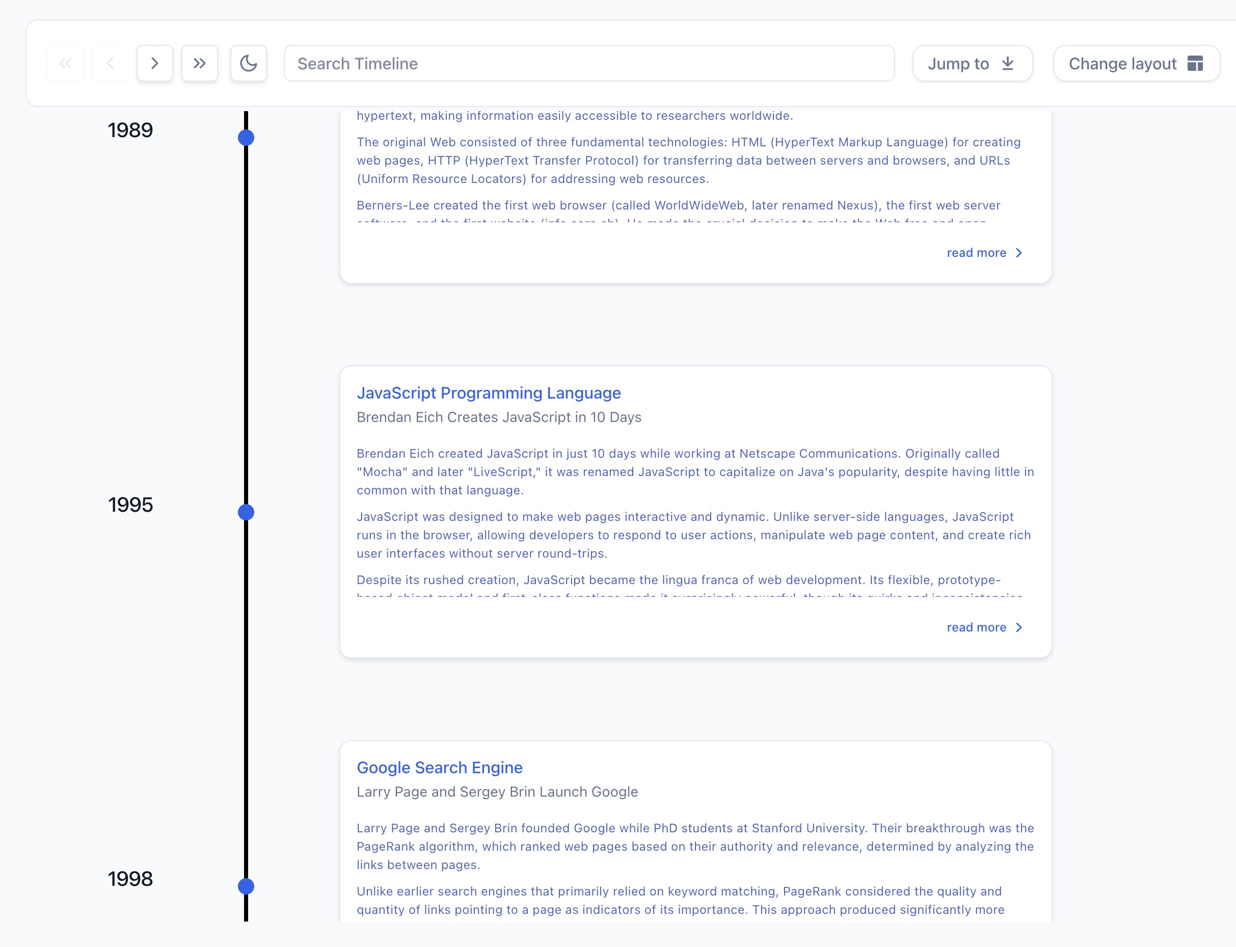
Minimal Setup - Your First Timeline
import { Chrono } from 'react-chrono';

const items = [
  { title: 'May 1940', cardTitle: 'Dunkirk', cardDetailedText: 'Allied evacuation from France' },
  { title: 'June 1944', cardTitle: 'D-Day', cardDetailedText: 'Normandy invasion begins' }
];

<Chrono items={items} />
Result Preview:
Common Configurations
Horizontal Timeline with Custom Theme
<Chrono
  items={items}
  mode="horizontal"
  theme={{ primary: '#0079e6', cardBgColor: '#f5f5f5' }}
/>
Vertical Timeline with Media
const items = [
  {
    title: 'January 2024',
    cardTitle: 'Product Launch',
    cardDetailedText: 'Released version 3.0 with new features',
    media: {
      type: 'IMAGE',
      source: { url: 'https://example.com/launch.jpg' },
      name: 'Product launch event'
    }
  }
];

<Chrono items={items} mode="vertical" />
Alternating Timeline with Slideshow
<Chrono
  items={items}
  mode="alternating"
  animation={{
    slideshow: {
      enabled: true,
      duration: 3000,
      type: 'fade'
    }
  }}
/>
Advanced Configuration with Grouped API ✨
The new grouped API organizes configuration into logical sections:
<Chrono
  items={items}
  mode="alternating"

  layout={{
    cardWidth: 450,
    cardHeight: 'auto',  // Automatic sizing based on content
    responsive: { enabled: true, breakpoint: 768 }
  }}

  content={{
    alignment: {
      horizontal: 'center',
      vertical: 'center'
    }
  }}

  interaction={{
    keyboardNavigation: true,
    pointClick: true,
    autoScroll: true
  }}

  display={{
    borderless: false,
    toolbar: { enabled: true, sticky: true }
  }}

  animation={{
    slideshow: { enabled: true, duration: 4000, type: 'fade' }
  }}

  theme={{
    primary: '#0079e6',
    cardBgColor: '#ffffff',
    cardTitleColor: '#1f2937'
  }}
/>
💡 Try it live: Browse interactive examples in Storybook
Visual Examples
See React Chrono in action
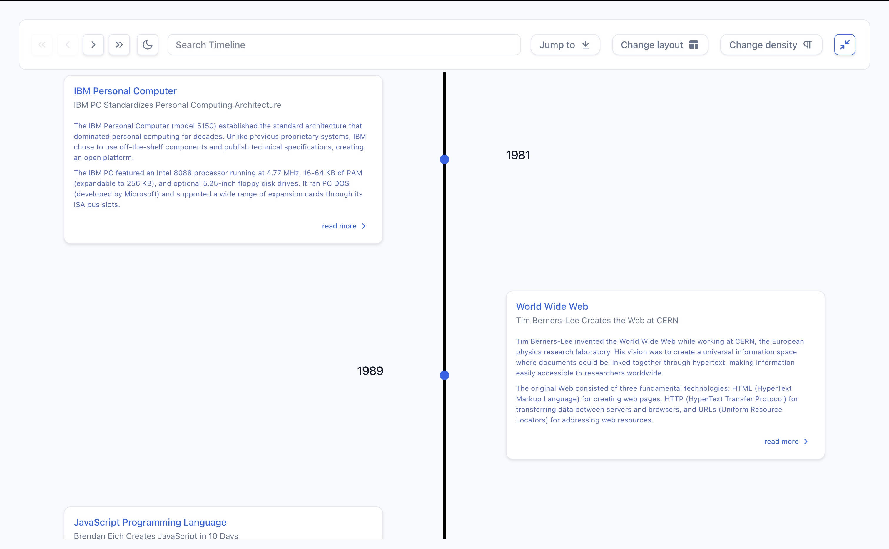
Vertical Mode Scroll-friendly chronological flow
|
Alternating Mode Cards alternate left and right
|
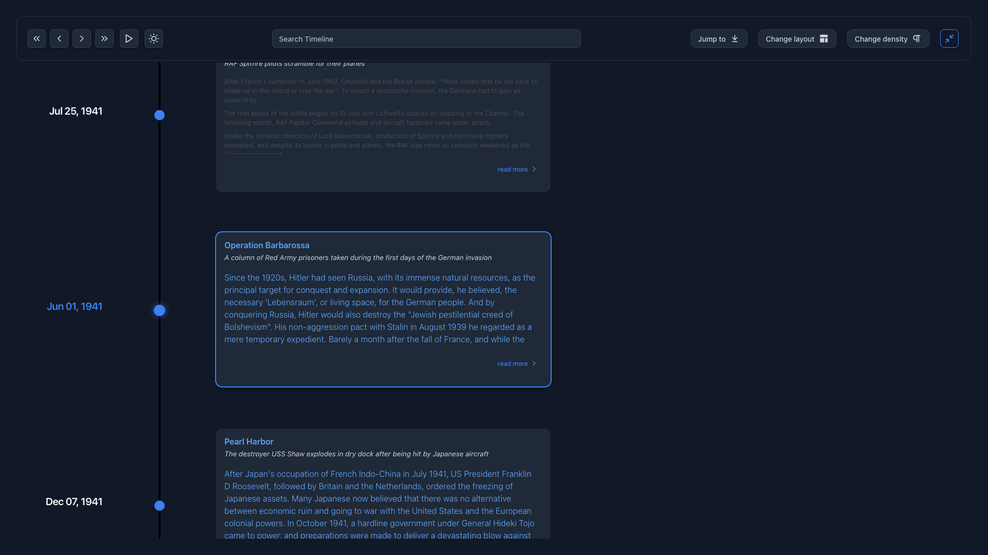
Dark Mode Complete theme control
|
Horizontal All Dashboard view showing complete timeline
|
Timeline with Media Embed YouTube videos and images
|
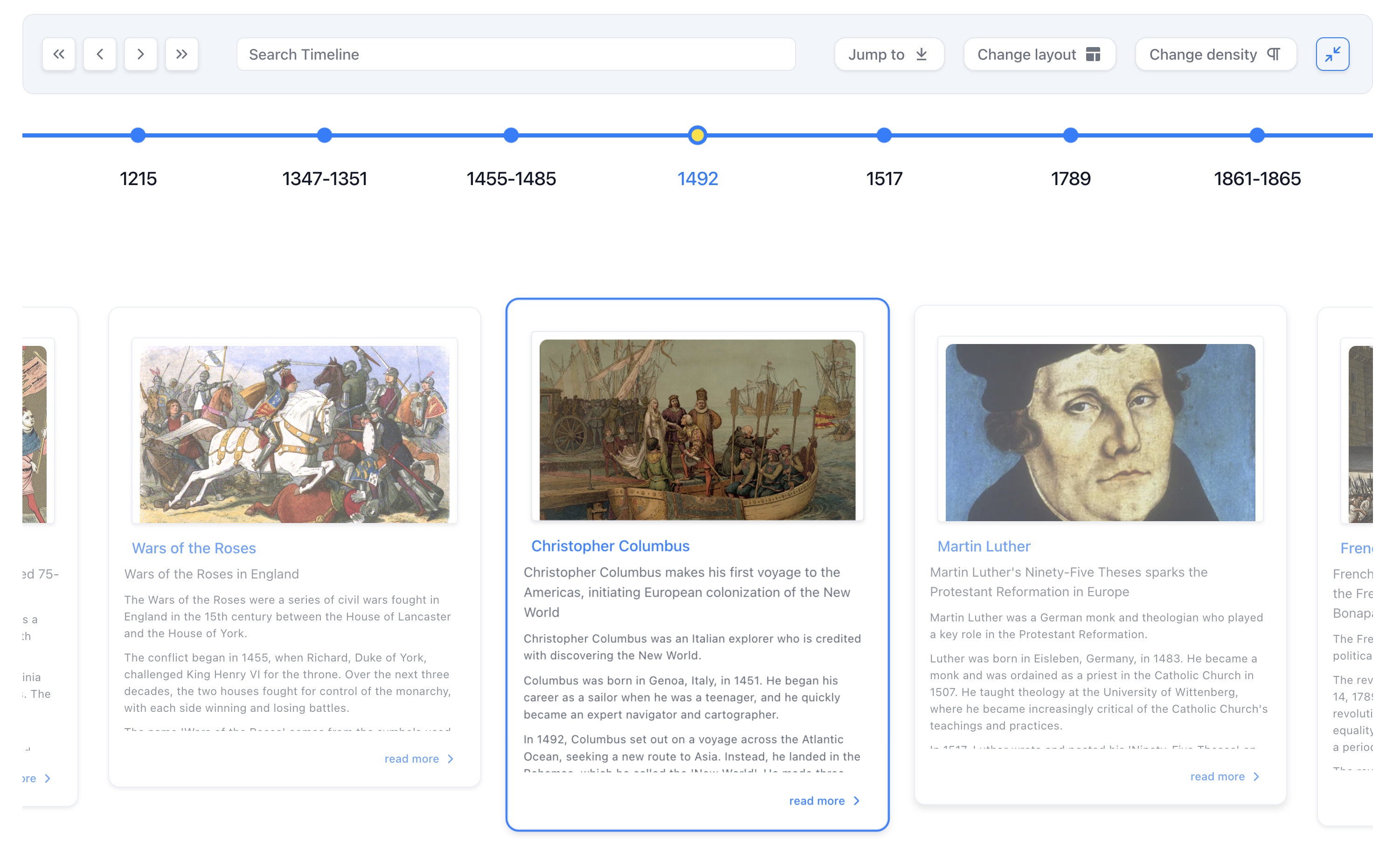
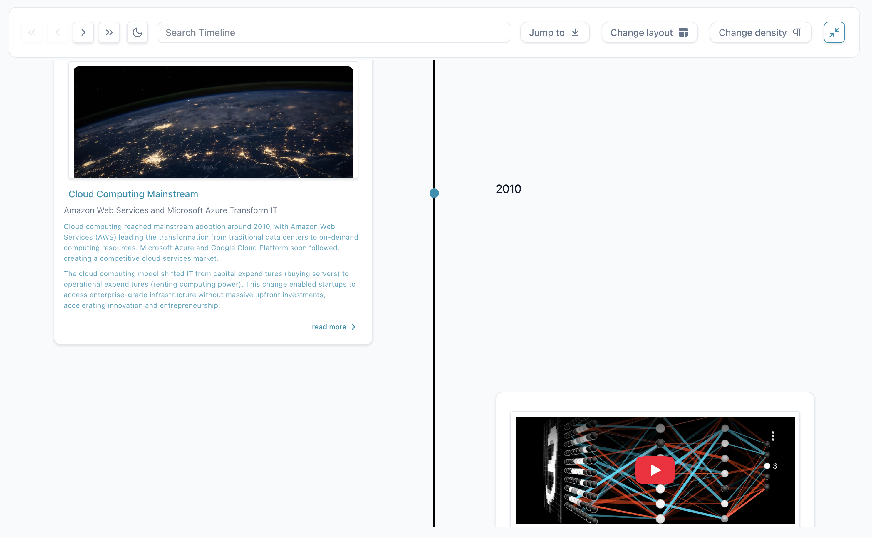
Timeline Modes
React Chrono offers four layout modes, each optimized for specific use cases:
| Mode | Best For | Visual Style |
|---|---|---|
| Vertical | Feeds, news timelines, mobile experiences | Top-to-bottom scroll-friendly layout |
| Horizontal | Historical narratives, project phases | Left-to-right chronological flow |
| Alternating | Portfolios, company milestones | Cards alternate left and right of central axis |
| Horizontal All | Dashboards, comparisons | Shows all timeline items at once |
Use Case Guide
📱 Mobile-First Content → Use Vertical Mode
Perfect for feeds, news timelines, and mobile experiences where scrolling is natural.
<Chrono items={items} mode="vertical" />
📊 Historical Narratives → Use Horizontal Mode
Ideal for historical narratives and project phases where the journey matters.
<Chrono items={items} mode="horizontal" />
💼 Portfolios & Milestones → Use Alternating Mode
Great for portfolios and company milestones with balanced visual rhythm.
<Chrono items={items} mode="alternating" />
📈 Dashboards & Comparisons → Use Horizontal All
Perfect for dashboards, comparisons, and seeing the complete picture at once.
<Chrono items={items} mode="horizontal-all" />
Key Features
Rich Media Integration
Smart Loading & Performance
|
|
Interactive Features
Slideshow Mode Auto-playing presentations with customizable durations, transition effects, and progress indicators. Keyboard Navigation Full accessibility with arrow keys, Home/End for quick jumps, Escape for modals. Real-time Search Instantly highlights matching content across titles, descriptions, and metadata. |
|
Theming & Customization
Complete Theme Control
|
|
Internationalization
Global Ready
|
|
Advanced Features
Nested Timelines Create multi-level narratives where major events contain detailed sub-timelines. Custom Components Embed fully interactive React components within timeline cards. Responsive Design Fundamentally adapts to each device with smart font sizing and spacing. |
|
Essential Props
React Chrono requires minimal configuration to get started:
| Property | Type | Description |
|---|---|---|
items |
TimelineItem[] |
Array of timeline data |
mode |
string |
Layout mode: 'horizontal' | 'vertical' | 'alternating' | 'horizontal-all' |
theme |
Theme |
Customize colors and appearance |
📚 Need complete prop documentation? See our comprehensive Props Reference
Migration from v2 to v3
React Chrono v3.0 maintains full backward compatibility - your existing v2.x code will work without changes. However, we recommend migrating to the new grouped API for better maintainability and IDE support.
Quick Migration
v2.x (still works):
<Chrono
  items={items}
  cardWidth={400}
  disableNavOnKey={false}
  borderLessCards={true}
  slideShow={true}
  slideItemDuration={3000}
  mediaHeight={400}
/>
v3.0 (recommended):
<Chrono
  items={items}
  layout={{ cardWidth: 400 }}
  interaction={{ keyboardNavigation: true }}
  display={{ borderless: true }}
  animation={{
    slideshow: {
      enabled: true,
      duration: 3000
    }
  }}
  media={{ height: 400 }}
/>
Common Prop Mappings
| v2.x Prop | v3.0 Prop |
|---|---|
borderLessCards |
display.borderless |
disableNavOnKey |
interaction.keyboardNavigation (inverted) |
timelinePointDimension |
layout.pointSize |
slideShow |
animation.slideshow.enabled |
slideItemDuration |
animation.slideshow.duration |
mediaHeight |
media.height |
parseDetailsAsHTML |
content.allowHTML |
disableToolbar |
display.toolbar.enabled (inverted) |
What's New in v3.0
- 🎨 Grouped API - Props organized into logical groups (
layout,interaction,content,display,media,animation) - ⚡ Zero-runtime CSS - Migrated to Vanilla Extract for better performance
- 🌐 i18n Support - 60+ configurable text elements
- 🎭 Google Fonts - Per-element font control
- 🖼️ Fullscreen Mode - Cross-browser fullscreen support
- 📌 Sticky Toolbar - Always-accessible controls
🔗 Complete migration guide: Props Reference
What's New in v3.0
🎉 Major updates and improvements
Key Highlights
🏗️ Grouped API
Props organized into logical groups ( |
⚡ Performance Complete migration to Vanilla Extract for zero-runtime CSS and improved performance |
🎨 New Features Auto card height, content alignment, Google Fonts, i18n support, fullscreen mode, and more |
📋 Full changelog: See CHANGELOG.md for complete details
🔄 Backward Compatible: All v2.x props remain fully supported with automatic mapping to the new grouped API
Development Setup
Prerequisites
- Node.js 22+
- bun (recommended) or npm
Initial Setup
# Clone the repository
git clone https://github.com/prabhuignoto/react-chrono.git
cd react-chrono

# Install dependencies
bun install
Development Commands
# Start development server with hot reload
bun run dev

# Build for production
bun run build

# Run unit tests
bun test

# Lint and format code
bun run clean
Testing Framework
React Chrono uses a comprehensive testing approach:
- Unit Tests: Vitest with @testing-library/react
Contributing
We welcome contributions! Please see our Contributing Guide for details.
Quick Contribution Checklist
- Fork the repo and create a feature branch
- Write tests for new features
- Ensure all tests pass:
bun run find-bugs - Follow our code style:
bun run clean - Update documentation if needed
- Submit a pull request
Built With Modern Technologies
Core Technologies
|
Development Tools |
Support the Project
Love React Chrono? Help us grow!
⭐ Star on GitHub | 🐦 Follow on Twitter | 🐛 Report Issues
Made with ❤️ by Prabhu Murthy and contributors
Explore related projects
freeCodeCamp/freeCodeCamp
freeCodeCamp.org's open-source codebase and curriculum. Learn math, programming, and computer science for free.
458,740 starsdonnemartin/system-design-primer
Learn how to design large-scale systems. Prep for the system design interview. Includes Anki flashcards.
377,308 starsreact/react
The library for web and native user interfaces.
252,404 starsvuejs/vue
This is the repo for Vue 2. For Vue 3, go to https://github.com/vuejs/core
212,629 stars