
onlymoein/liquidglass
onlymoein/liquidglass has 53 GitHub stars and 1 forks. GitHot measured 0 stars in 24 hours. Last checked 2026-11-15 08:28 UTC. Last push 2026-11-13.
Measured star growth
- in 24h
- 0
- in 7 days
- Collecting history
- in 15 days
- Collecting history
- in 1 month
- Collecting history
Net star changes over overlapping periods, not daily totals. Missing measurements are left blank. Stars measure attention, not software quality.
About
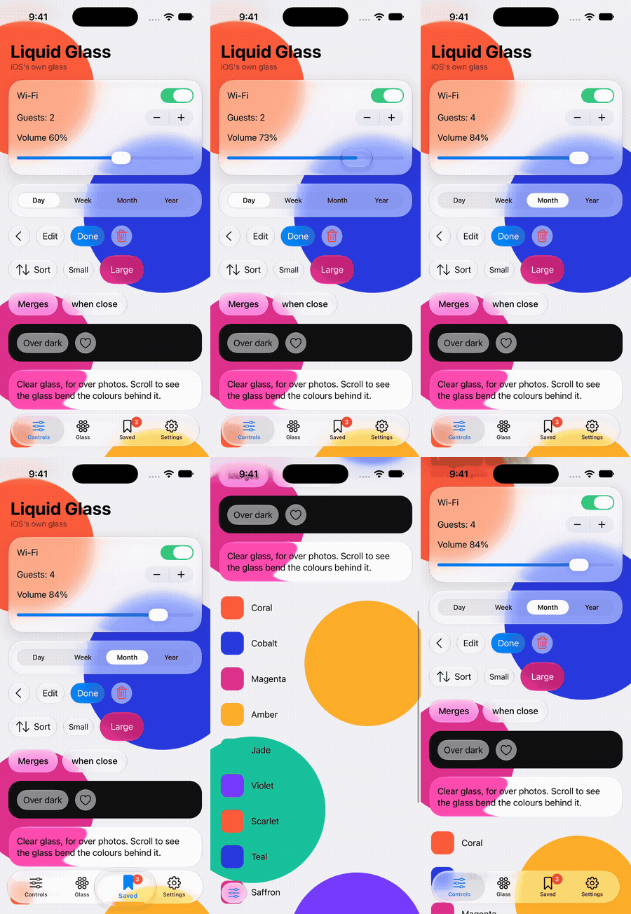
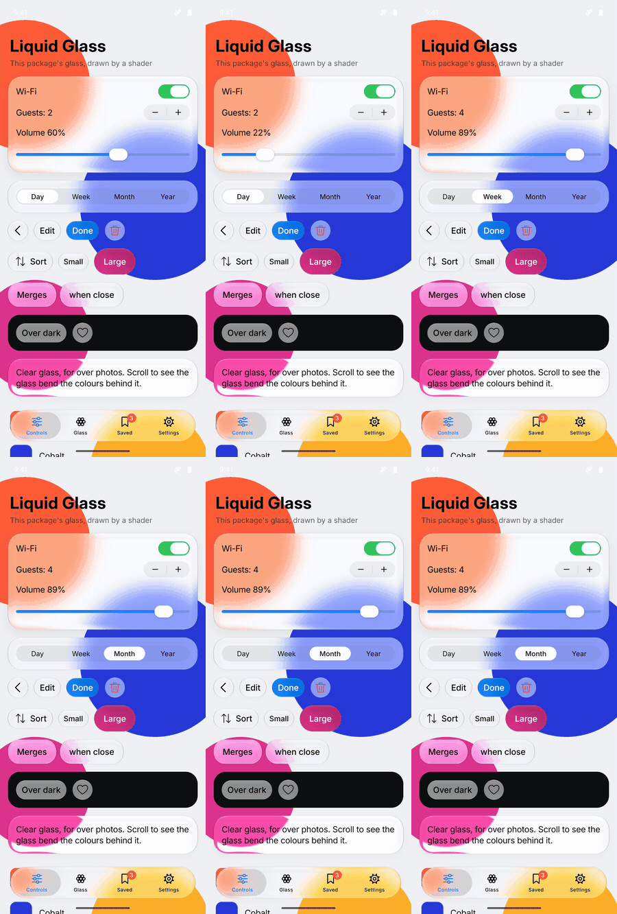
iOS 27-style Liquid Glass for React and React Native: glass that bends the light behind it, and controls that move like iOS's. Not affiliated with Apple.
Web & AppsREADME.md
Originalliquidglass
Apple's iOS 27 Liquid Glass for React and React Native
Glass that bends the light behind it, and the iOS controls built from it,
measured against the real thing on the iOS simulator.





Live demo · Web quick start · React Native quick start · Prompt for your AI agent · Performance · FAQ
 |
 |
 |
| Web real iOS 27 left, liquidglass right |
React Native, iOS Apple's own glass |
React Native, Android drawn to iOS's measurements |
Use it with an AI agent
Copy this prompt into Claude Code, Cursor, Codex or any coding agent, and replace the last step with what you want built. It has the agent pick the right package for your project and read the liquidglass skill before it writes any code.
Add Apple's iOS 27 Liquid Glass to this app using liquidglass.

1. Before writing any code, install the liquidglass agent skill and read it:
     npx skills add onlymoein/liquidglass
   If you can't run that, read the skill straight from GitHub:
     https://github.com/onlymoein/liquidglass/blob/main/skills/liquidglass/SKILL.md
   Follow it for everything below.

2. Look at this project and pick the matching package:
   - A website or web app (React, Next.js, Vite, Remix):
       npm install @onlymoein/liquidglass
   - A mobile app (React Native or Expo):
       npx expo install @onlymoein/liquidglass-native expo-glass-effect
     It has native code, so rebuild with `npx expo run:ios` or `npx expo run:android`;
     it doesn't run in Expo Go. Read node_modules/@onlymoein/liquidglass-native/README.md,
     and on Android wrap what the glass should show in a <Backdrop>.
   If the project has both, use each package in its own app.

3. Use the library's components (Glass, Button, Switch, Slider, Stepper, SegmentedControl,
   Menu, TabBar, and on the web Toolbar, NavigationBar, Sheet, Alert, Input) instead of
   hand-made blur or "glassmorphism" CSS. Keep to the skill's rules: put glass over
   something colourful, don't nest glass inside glass, don't wrap it in opacity or filter,
   and give icon-only controls an aria-label (accessibilityLabel in React Native).

4. Build this: <describe what you want, for example "replace the bottom navigation with
   a TabBar and the settings toggles with Switch">

5. When you're done, run the app, look at the screens you changed, and tell me what you
   changed and anything that didn't work.
The skill teaches the agent both packages: the components and their props, theming, browser differences, and what to check when glass looks wrong. To install it yourself:
npx skills add onlymoein/liquidglass
It also ships in the web package, at node_modules/@onlymoein/liquidglass/skills/liquidglass/SKILL.md.
Performance
Glass is expensive to draw, so liquidglass does the heavy work where it can't slow your page down. These numbers are from the demo and the bundle, checked on every pull request:
| Measured | Result |
|---|---|
| Lighthouse (mobile) | 99 performance score |
| Page held up while scrolling | 0 ms, with no dropped frames |
One Button |
about 12 kB, minified and compressed |
| Every component | about 31 kB; bundlers drop what you don't use |
| Dragging the window narrower | memory stays flat; unused lenses are freed |
- The lens maps and rims are drawn in a Web Worker, off the page's thread. Glass is frosted at once and picks up its lens a moment later.
- Each piece of glass holds only the maps it's drawn with, and they're freed once nothing uses them.
- Each component brings only its own CSS, the first time it renders.
- Safari uses its native blur, and Firefox's bent copy of a backdrop updates in small slices while the page is idle, so neither holds the page up.
- Content Security Policy: allow
worker-src blob:andimg-src blob: data:.
The checks are npm run size, npm run perf:lighthouse and npm run perf:frames. The last one scrolls the demo, grows and restyles Firefox's copied backdrop, and drags the window narrower, failing if the page is held up or lenses pile up.
Why liquidglass
- One API for web and mobile.
Button,Switch,Slider,Menu,TabBarand the rest have the same names and props in React and React Native. - Measured, not eyeballed. The repo runs real iOS controls and this library side by side on the simulator and measures the difference. In Chrome, glass colour is within 2 levels out of 255 of iOS.
- The real thing on iPhone. In React Native on iOS, the components are Apple's own UIKit glass and controls. On Android, the package draws the glass itself, to the same measurements.
- Moves like iOS. Presses, menus, sheets and the tab bar's lens are on springs fitted to recordings of iOS 27.
- Fast. 99 on Lighthouse mobile, nothing holding up the page, about 12 kB per
Button. See Performance. - Accessible. Keyboard and screen-reader support throughout. Glass turns fully tinted when the system is set to reduce transparency or increase contrast.
- Ready for AI coding agents. A ready-made prompt and an agent skill teach Claude Code, Cursor or Codex the whole library.
Quick start
| You're building | Package | Runs on |
|---|---|---|
| A website or web app (React, Next.js, Vite, Remix) | @onlymoein/liquidglass |
Chrome, Edge, Safari, Firefox |
| A mobile app (React Native, Expo) | @onlymoein/liquidglass-native |
iOS and Android |
React for the web
npm install @onlymoein/liquidglass
import { Button, Glass, Switch } from "@onlymoein/liquidglass";

export function Settings() {
  return (
    <Glass style={{ borderRadius: 28, padding: 20 }}>
      <Switch aria-label="Wi-Fi" defaultChecked />
      <Button variant="filled">Continue</Button>
    </Glass>
  );
}
There's no other setup: each component brings its own CSS the first time it renders. It needs React 18 or later. Put glass over a photo, a gradient or content that scrolls, since glass shows what's behind it.
React Native and Expo
npx expo install @onlymoein/liquidglass-native expo-glass-effect
npx expo run:ios   # or run:android
import { Button, Glass, Slider, Switch } from "@onlymoein/liquidglass-native";

export function Player() {
  return (
    <Glass style={{ padding: 16, borderRadius: 28, gap: 12 }}>
      <Switch defaultChecked />
      <Slider defaultValue={0.5} />
      <Button label="Done" variant="filled" onPress={() => {}} />
    </Glass>
  );
}
It needs Expo SDK 54 or later and a development build; it doesn't run in Expo Go. On Android, wrap what the glass should show in a Backdrop. The full guide is in the React Native README.
Components
| Component | What it is | Web | React Native |
|---|---|---|---|
Glass |
A plain piece of glass to put anything on | ✓ | ✓ |
GlassGroup |
Glass that flows together when pieces come close | ✓ | ✓ |
Button |
A glass or filled button in the iOS sizes, with an optional icon or tint | ✓ | ✓ |
Switch |
An on/off switch with a glass thumb | ✓ | ✓ |
Slider |
A slider with a glass thumb | ✓ | ✓ |
Stepper |
Two buttons that step a number down and up | ✓ | ✓ |
SegmentedControl |
A row of choices with a thumb that lifts into a lens under a finger | ✓ | ✓ |
Menu |
A menu that grows out of its button | ✓ | ✓ |
TabBar |
Tabs with a lens that follows the finger | ✓ | ✓ |
Toolbar, ToolbarGroup |
A bar of actions that frosts as content scrolls under it | ✓ | |
NavigationBar |
A screen's top bar: back button, actions, a large title that slides into the bar | ✓ | |
Input, SearchField |
Text fields set in glass | ✓ | |
ContextMenu |
A menu that opens when you hold something down or right-click it | ✓ | |
Sheet |
A sheet that rises from the bottom and drags between heights | ✓ | |
Alert |
A modal question with pill buttons | ✓ | |
PageControl |
Page dots on a capsule of glass | ✓ | |
Progress, Spinner |
A progress bar and the activity indicator | ✓ | |
Backdrop, Text, ScrollView |
What glass shows on Android, an iOS-like typeface, and iOS's bounce | ✓ |
Every control can be controlled (value / checked / open with onValueChange / onCheckedChange / onOpenChange) or uncontrolled (defaultValue / defaultChecked / defaultOpen).
Web components in detail: Toolbar, NavigationBar, Menu, Sheet, Alert, TabBar, GlassGroup
Toolbar
import { Button, Toolbar, ToolbarGroup } from "@onlymoein/liquidglass";

<Toolbar aria-label="Notes">
  <ToolbarGroup aria-label="Navigation">
    <Button>Back</Button>
  </ToolbarGroup>
  <ToolbarGroup aria-label="Actions">
    <Button>Share</Button>
    <Button>Edit</Button>
  </ToolbarGroup>
</Toolbar>
Put it first inside whatever scrolls; it sticks to the top. Buttons in one group share a piece of glass. When content scrolls under the bar, a frosted band fades in, as on iOS 27. Use edge="soft" for iOS 26's lighter blur, or edge="none" for neither. The arrow keys move between actions.
NavigationBar
import { Button, NavigationBar, ToolbarGroup } from "@onlymoein/liquidglass";

<NavigationBar
  title="Inbox"
  onBack={goBack}
  trailing={
    <ToolbarGroup aria-label="Actions">
      <Button aria-label="Compose" icon={<ComposeIcon />} />
    </ToolbarGroup>
  }
/>
A Toolbar with a title. The title starts large and scrolls away with the content, and a smaller one fades into the bar once it's gone. large={false} keeps the small title from the start. onBack adds the round back button, and leading and trailing hold other actions.
Menu
import { Menu } from "@onlymoein/liquidglass";

<Menu
  aria-label="Account"
  label="Account"
  items={[
    { heading: "Appearance" },
    { label: "Light", checked: theme === "light", keepOpen: true, onSelect: () => setTheme("light") },
    { label: "Dark", checked: theme === "dark", keepOpen: true, onSelect: () => setTheme("dark") },
    "separator",
    { label: "Sign out", destructive: true, onSelect: signOut },
  ]}
/>
- With a
labelthe trigger is a pill, like iOS's pull-down button. Without one it's a round button with an ellipsis or youricon. alignlines the menu up with the trigger'sstart,centerorend.triggerpasses props to the trigger button, such as{ variant: "filled" }.- An item with
hrefis a link:onSelectruns instead if it's given, for your router, and ⌘, Ctrl, Shift or the middle button opens a new tab. checkedshows a checkmark, andkeepOpenleaves the menu open so the change can be seen.- It opens in the top layer, so nothing around the trigger can clip it.
Sheet and Alert
import { Alert, Sheet } from "@onlymoein/liquidglass";

<Sheet aria-label="Details" open={open} onOpenChange={setOpen}>
  {details}
</Sheet>

<Alert
  open={asking}
  onOpenChange={setAsking}
  title="Delete shipment?"
  message="This can't be undone."
  actions={[{ label: "Cancel", role: "cancel" }, { label: "Delete", role: "destructive", onSelect: remove }]}
/>
A sheet rests at half height as floating glass, and at full height as an opaque panel. detents chooses which heights it has. Drag it from anywhere, not just the handle. Scrolling content inside it hands drags back and forth as on iOS. Drags that start on a slider, a text field or anything marked data-lg-no-sheet-drag stay with that element.
TabBar
Give items an icon for the 62-point iOS tab bar. minimized shrinks it to the current tab's icon, as iOS does when a page scrolls down, and onExpand tells you when that icon is tapped. Items with an href render through link, such as Next.js's Link.
GlassGroup
import { Button, GlassGroup } from "@onlymoein/liquidglass";

<GlassGroup spacing={20} style={{ gap: 6 }}>
  <Button aria-label="Add" icon={<PlusIcon />} />
  <Button aria-label="Edit" icon={<PencilIcon />} />
</GlassGroup>
Glass closer together than spacing becomes one shape, and parts again as it moves away.
Popups from other libraries
Add the class lg-grow to a popup from Radix, Base UI or similar. It then grows out of its transform-origin on data-open and shrinks away on data-closed, with the menu's spring.
Theming: light and dark, transparency, colours
Light and dark follow the system. To pin one, set data-theme="light" or data-theme="dark" on any element.
Transparency works like the iOS 27 setting. --lg-transparency runs from 0 (fully tinted) through 0.5 (regular, the default) to 1 (clear). Set it anywhere and the glass inside follows. If someone's system is set to reduce transparency or increase contrast, glass is fully tinted, as on iOS.
:root {
  --lg-transparency: 0.8;
}
Colours are CSS variables you can override:
| Variable | What it sets |
|---|---|
--lg-fill |
The accent colour of filled buttons and sliders |
--lg-on |
A switch that's on |
--lg-glass-tinted |
The tint when --lg-transparency is below 0.5 |
--lg-shine |
How strong the rim's lines are; 1 matches iOS 27 |
--lg-contrast, --lg-brightness, --lg-saturate |
What glass does to what's behind it (add -small for glass 60 points tall or less) |
Browser support
| Browser | Colour, blur and rim | Edge bends like iOS |
|---|---|---|
| Chrome, Edge and other Chromium browsers | ✓ | ✓ |
| Safari (Mac, iPhone, iPad) | ✓ | |
| Firefox | ✓ | Over content you mark |
Only Chromium lets a page bend what's behind an element. Everywhere else the glass looks the same, but its edge doesn't bend. In Firefox, add data-liquidglass-backdrop to a wallpaper or hero image behind the glass, and the glass bends a copy of it. Keep it to a small area, since everything inside it is copied for every piece of glass over it.
<img data-liquidglass-backdrop src="/wallpaper.jpg" alt="" />
FAQ
Does it work in Next.js? Yes. The components are client components, so you can import them from server component files. Their styles are added on the client.
Why doesn't the edge bend in Safari? Safari doesn't let a web page filter what's behind an element. The glass has the same colour, blur and rim there; only the bend is missing.
My glass is invisible or plain grey.
Glass needs something colourful behind it. Also check its ancestors: one with opacity below 1, filter, mask or backdrop-filter limits the glass to what's inside that ancestor. Glass nested in other glass has the same problem.
Does the React Native package work in Expo Go?
No. It has native code, so it needs a development build (npx expo run:ios) or EAS Build.
What about Android? Android has no Liquid Glass, so the package draws its own to iOS's measurements. It bends from Android 13, and is blurred and toned without the bend before that. See Android.
I used glisse.
liquidglass started as a fork of glisse by Kelvin Zhang, and the components and props are the same. Change your imports, and rename data-glisse-backdrop to data-liquidglass-backdrop. If you set --lg-glass, set --lg-glass-tinted and --lg-transparency instead.
License
MIT. Copyright Kelvin Zhang and Moein Saharkhiz.
liquidglass is an independent project. It isn't affiliated with or endorsed by Apple. Apple, iOS and Liquid Glass are trademarks of Apple Inc.