Projects View on GitHub
nicedouble/StreamlitAntdComponents
nicedouble/StreamlitAntdComponents has 559 GitHub stars and 37 forks. GitHot measured 0 stars in 24 hours. Last checked 2026-11-17 03:49 UTC. Last push 2024-08-05.
Measured star growth
- in 24h
- 0
- in 7 days
- Collecting history
- in 15 days
- Collecting history
- in 1 month
- Collecting history
Net star changes over overlapping periods, not daily totals. Missing measurements are left blank. Stars measure attention, not software quality.
About
A Streamlit component to display Antd-Design
Developer ToolsREADME.md
OriginalStreamlit-Antd-Components

A Streamlit custom component to implement Antd-Design and Mantine widgets.
Check out the Demo App for more example.
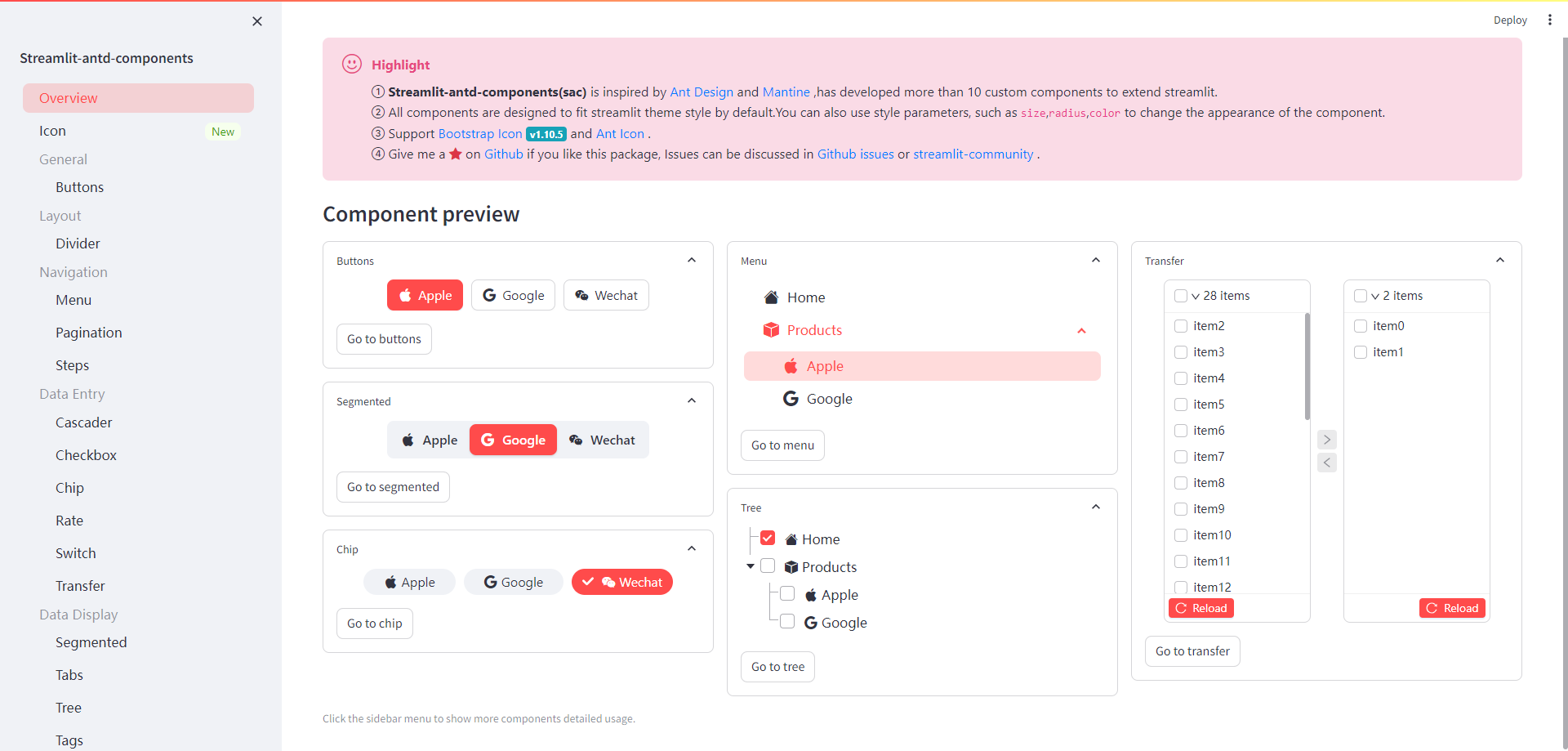
This library now provides component blow:
buttonsA group of buttons component.dividerA divider line separates different contentmenuA versatile menu for navigationstepsA navigation bar that guides users through the steps of a taskcascaderChooses cascade items in one float layer for better user experience.checkboxA group of checkbox.rateRate componentswitchSwitching between two states or on-off statetransferDouble column transfer choice boxsegmentedSegmented Controls.tabsA tabs component.treeA hierarchical list structure component.alertAlert component for feedbackresultUsed to feed back the results of a series of operational taskstagTag for categorizing or markuppaginationA long list can be divided into several pages
Install
pip install streamlit-antd-components
Quickstart
Create a group of buttons,use more style params.
import streamlit as st
import streamlit_antd_components as sac

btn = sac.buttons(
    items=['button1', 'button2', 'button3'],
    index=0,
    format_func='title',
    align='center',
    direction='horizontal',
    radius='lg',
    return_index=False,
)
st.write(f'The selected button label is: {btn}')

Todo
- pop-up component
- Interaction between components
- Add component callback function
- multiple sac components