
n00bcodr/Jellyfish
n00bcodr/Jellyfish has 326 GitHub stars and 22 forks. GitHot measured +2 stars in 24 hours, +2 in 7 days, and +6 in 15 days. Last checked 2026-11-18 01:30 UTC. Last push 2026-11-15.
What you can do
- Jellyfin 10.11 and 12 - the Modern (React) layout, plus the legacy desktop, mobile and TV layouts, from small phones to 4K TVs.
- 16 palettes (including the frosted Liquid Glass) with readable text on every one, and an easy way to make your own.
- Fast - heavy blur effects are kept off the large panels, so scrolling stays smooth on modest hardware; lite.css goes further for TVs and old tablets.
- Theme Builder - pick a palette (or make your own), switch the optional modules and the slideshow on and off with a live preview, and copy the exact lines to paste into Jellyfin.
Measured star growth
- in 24h
- +2
- in 7 days
- +2
- in 15 days
- +6
- in 1 month
- Collecting history
Net star changes over overlapping periods, not daily totals. Missing measurements are left blank. Stars measure attention, not software quality.
About
Jellyfin Theme inspired by Flow, Zesty and Ultrachromic
Web & AppsREADME.md
Original



Jellyfish Theme | 
This theme is heavily inspired by Flow, Zesty and Ultrachromic I've made a few tweaks and modifications of my own.
Login page backgrounds from @ksushlapush
[!IMPORTANT]
theme.cssis now the only stylesheet - it targets Jellyfin 10.11+ natively, and includes the React/MUI top bar & nav drawer rules needed for Jellyfin 12's "modern" layout (formerly a separate12_fixes.cssimport). Just importtheme.css, no extra file needed for normal pages.The admin dashboard is a special case: Jellyfin removed the ability to theme it via Custom CSS Code, so
theme.css's dashboard-only section only takes effect through the JS-injection workaround (see Dashboard Theming) - most users don't need to set that up at all, it's only for admins who want the dashboard itself themed.If you're still on Jellyfin 10.10.x or older, the theme should mostly still work (there's a legacy fallback for the old detail-page markup), but it's no longer the primary target and minor misalignments are possible.
✨ Highlights
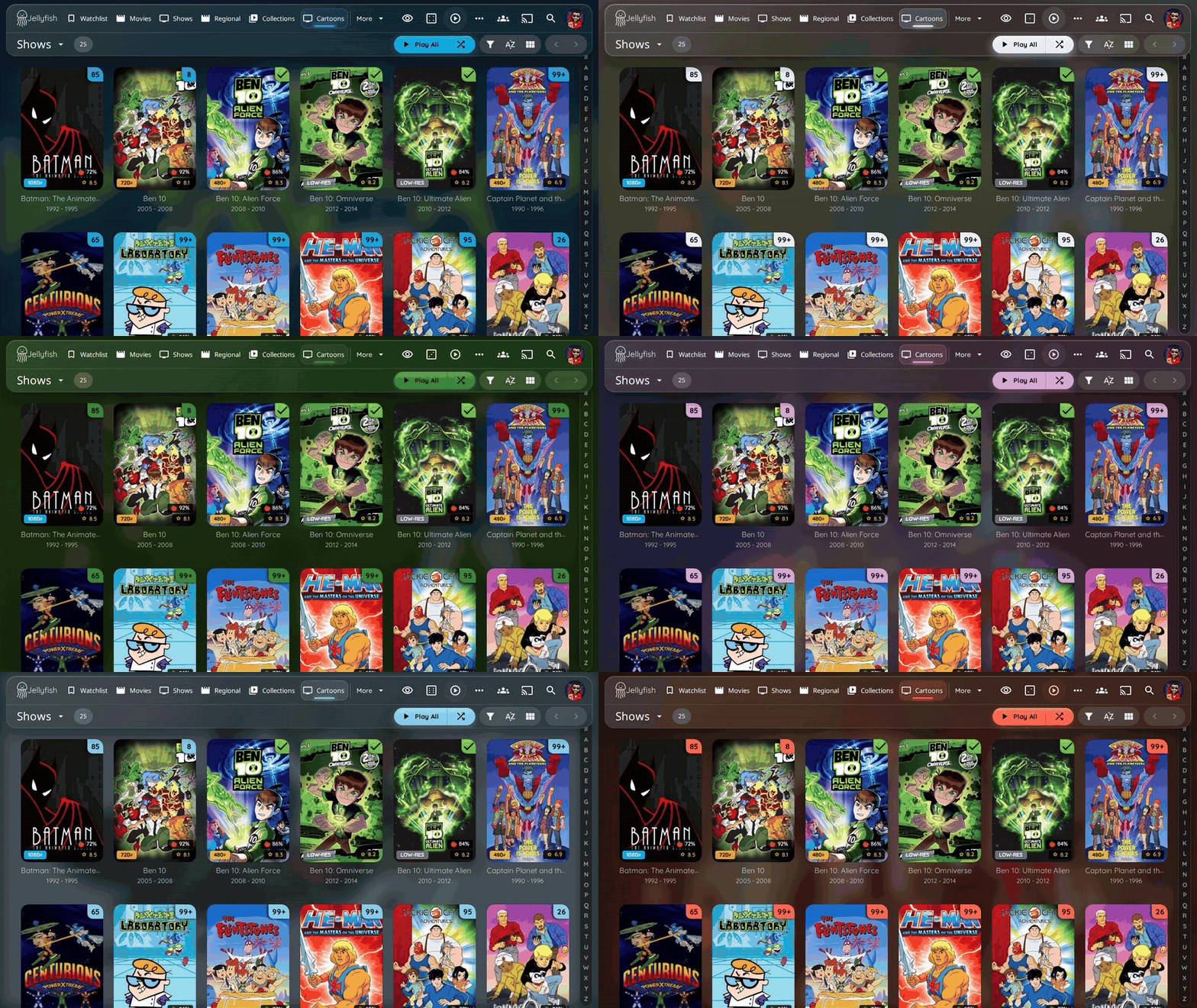
- Jellyfin 10.11 and 12 - the Modern (React) layout, plus the legacy desktop, mobile and TV layouts, from small phones to 4K TVs.
- 16 palettes (including the frosted Liquid Glass) with readable text on every one, and an easy way to make your own.
- Fast - heavy blur effects are kept off the large panels, so scrolling stays smooth on modest hardware;
lite.cssgoes further for TVs and old tablets. - Theme Builder - pick a palette (or make your own), switch the optional modules and the slideshow on and off with a live preview, and copy the exact lines to paste into Jellyfin.
- Works with Jellyfin Enhanced, KefinTweaks and the Media Bar plugin, with an optional add-on stylesheet for the plugin's own panels.
🖼️ Gallery
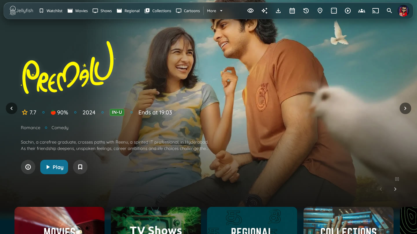 Home, with the Media Bar plugin |
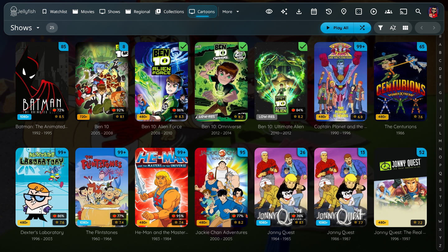 Library with the A-Z picker and badges |
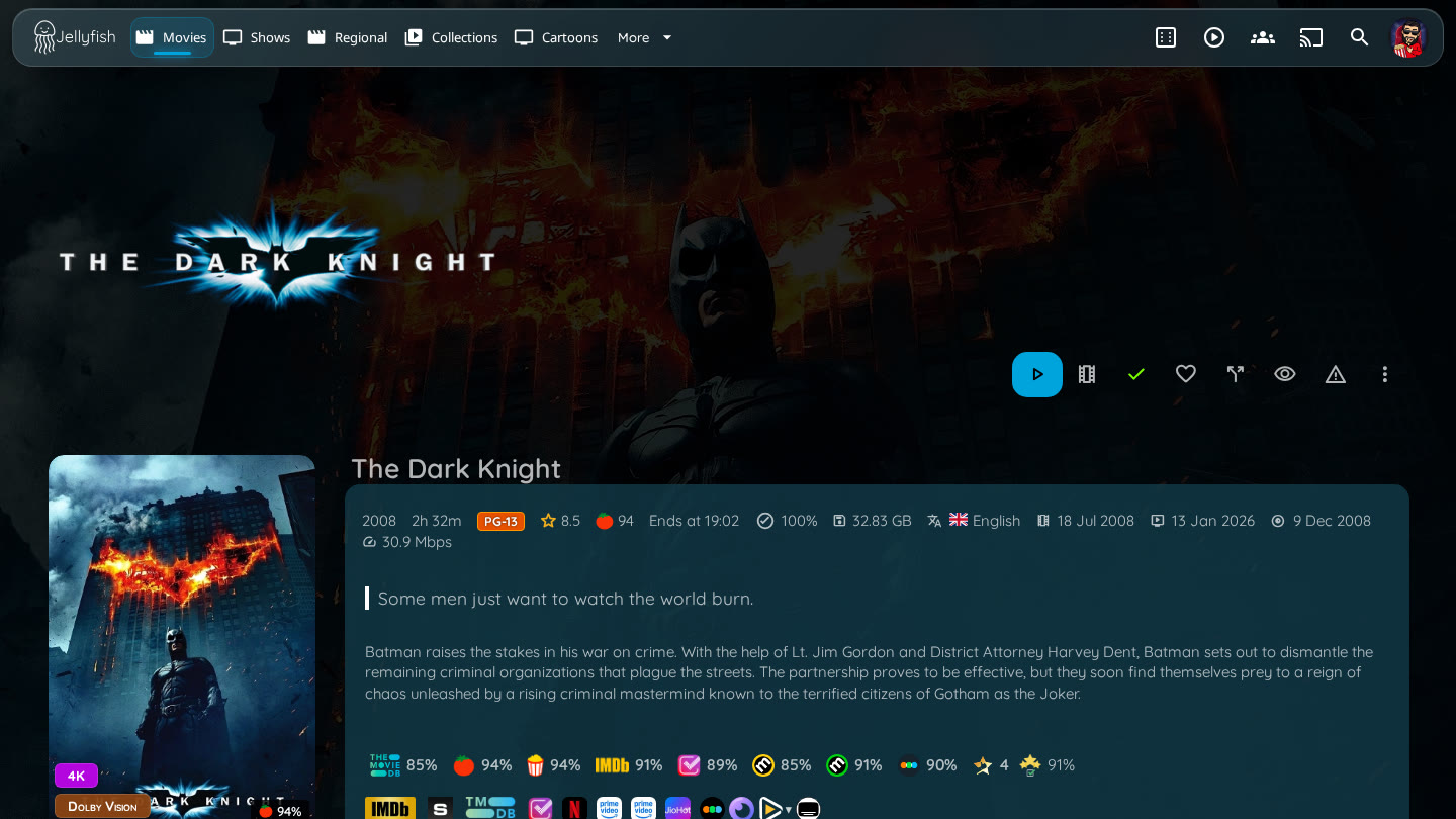 Movie |
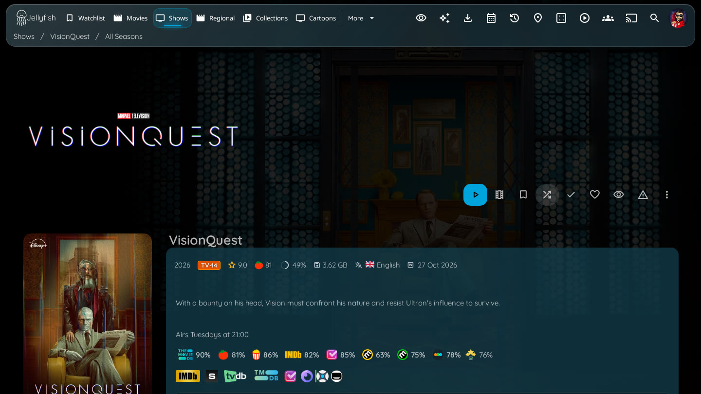 Series |
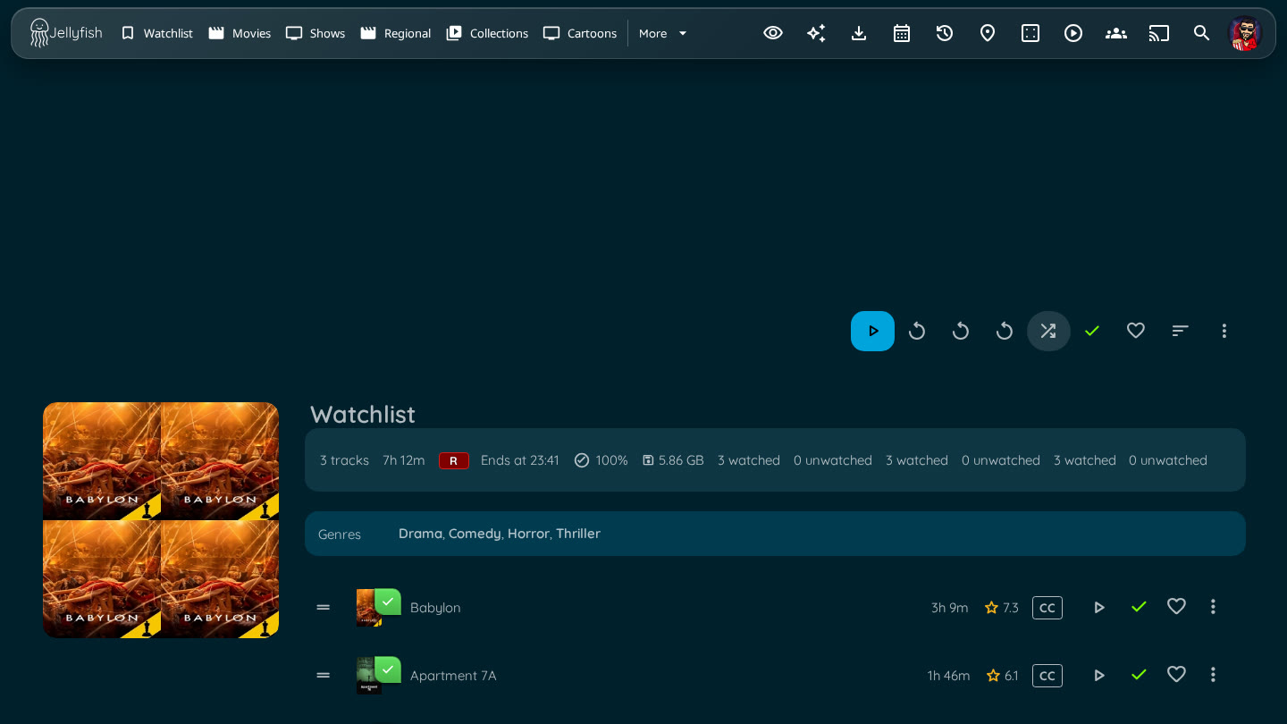 Playlist |
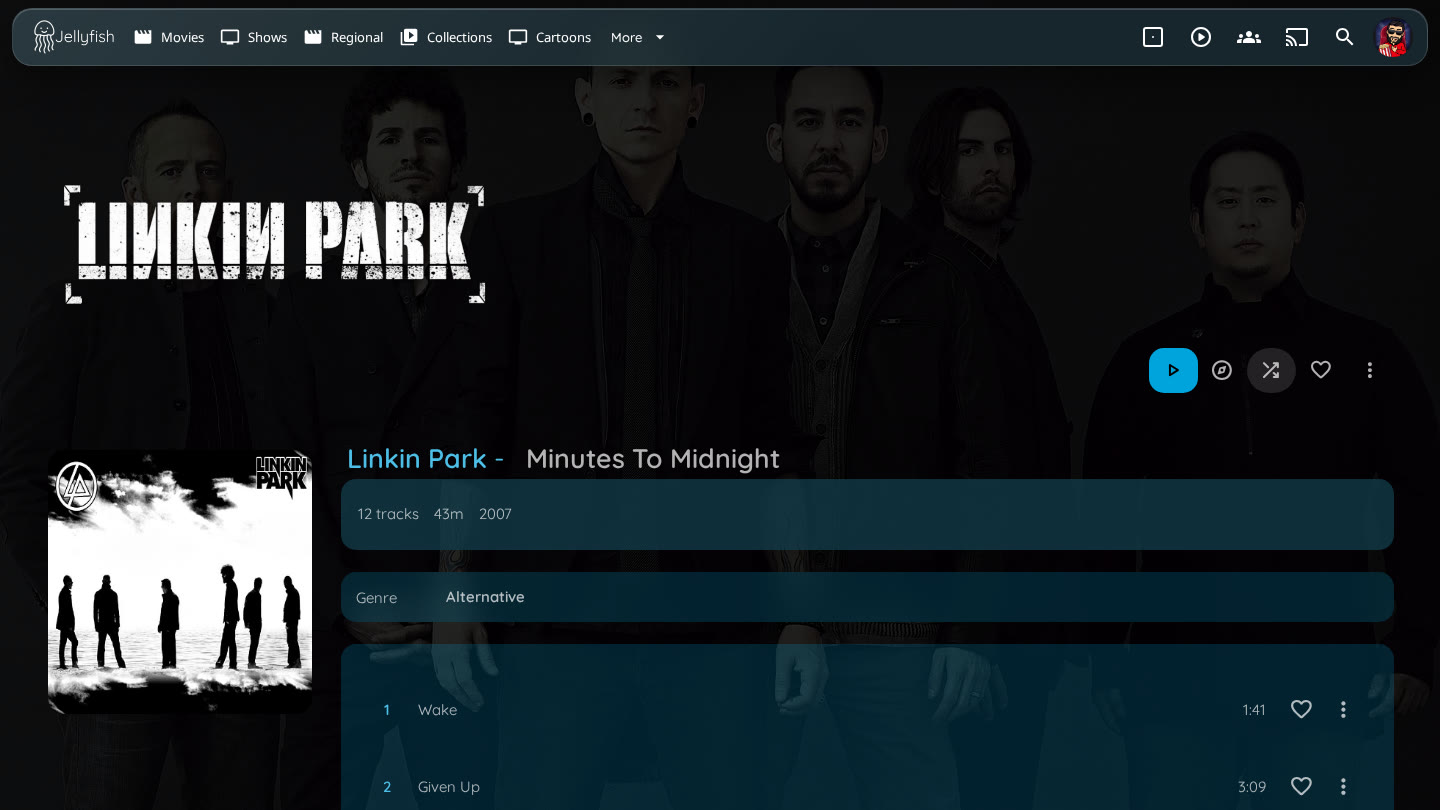 Album |
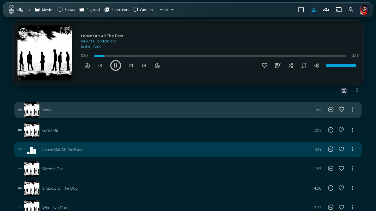 Now playing / queue |
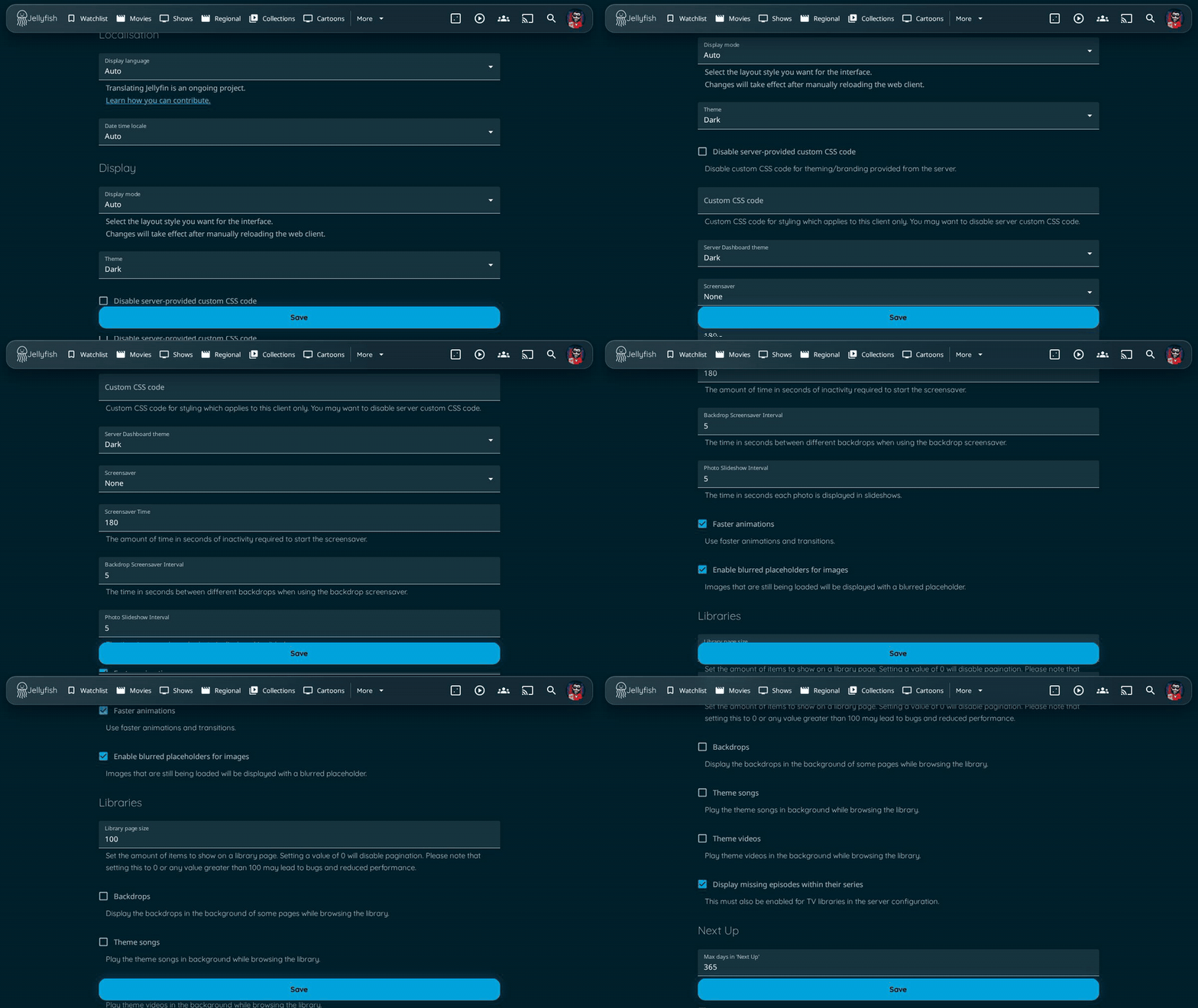 Settings with the floating Save button |
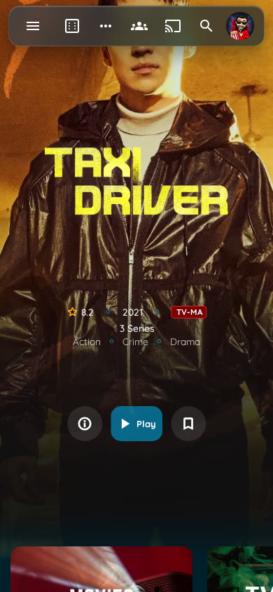
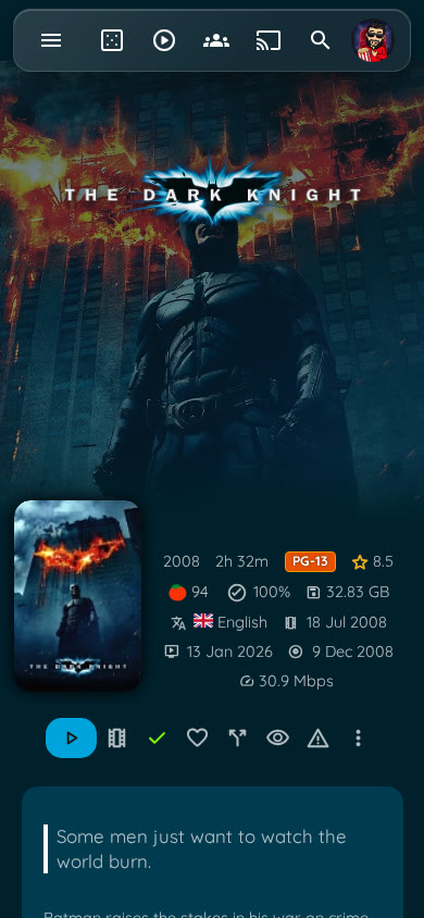
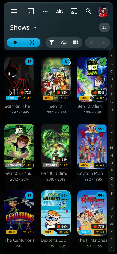
On a phone
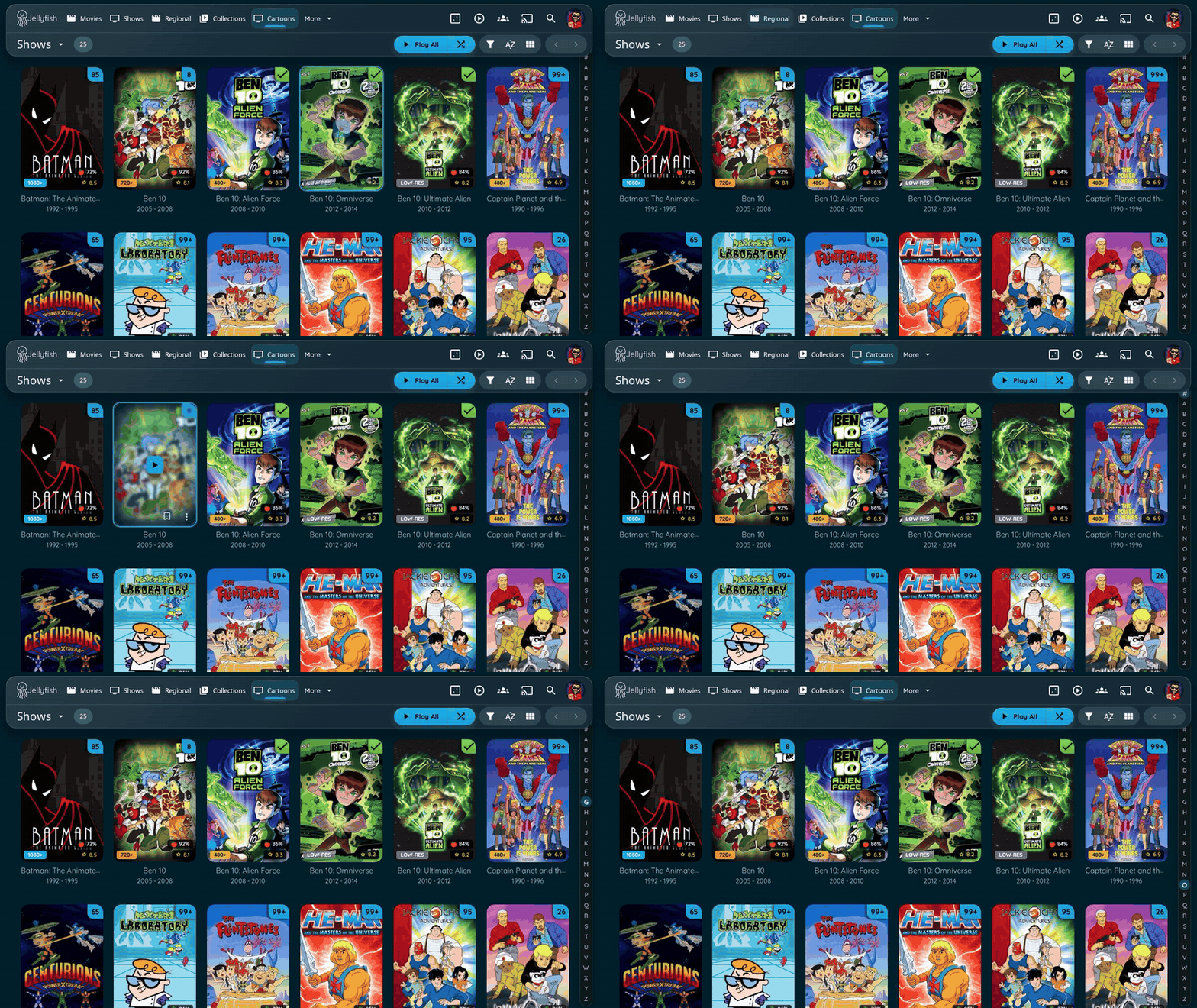
Hover states: navigation, cards and the A-Z picker
📑 Table of Contents
Installation
[!TIP] Don't want to write the imports by hand? The Theme Builder lets you pick a palette and modules, shows them live, and gives you the lines to copy.
Globally for all users
To apply a theme globally to all users via the Dashboard:
- Navigate to Dashboard Settings
- Log in as an administrator
- Go to Dashboard → General → Custom CSS Code
- Add Import Statement
- In the Custom CSS field, add all the desired
@importstatements:
- In the Custom CSS field, add all the desired
   @import url("https://cdn.jsdelivr.net/gh/n00bcodr/jellyfish@main/theme.css");
   @import url("https://cdn.jsdelivr.net/gh/n00bcodr/jellyfish@main/indicators.css");
   @import url("https://cdn.jsdelivr.net/gh/n00bcodr/jellyfish@main/progress_bar.css");
   /* Any other imports or custom CSS will go here */
- Save Changes
- Click Save at the bottom of the page
- Refresh your browser to see the changes
User/Device-Specific Theme (Display Settings)
Individual users can apply the theme to their own account without affecting others:
- Navigate to User Settings
- Click on your profile icon
- Go to Settings → Display → Custom CSS Code
- Add Import Statement
- In the Custom CSS field, add your
@importstatement:
- In the Custom CSS field, add your
@import url("https://cdn.jsdelivr.net/gh/n00bcodr/Jellyfish/colors/peach.css");
- Save and Refresh
- Click Save
- Refresh the page to apply the theme
[!Note] If you only want to change the color you can simply add import statement for the color you want.
If you want to replace the entire CSS for that device, you can choose 'Disable server-provided custom CSS code' and add the CSS statements in user display settings page as you prefer.
Theme
Main Theme with JellyBlue as default
@import url("https://cdn.jsdelivr.net/gh/n00bcodr/Jellyfish/theme.css");
| Home** | Item Details |
|---|---|
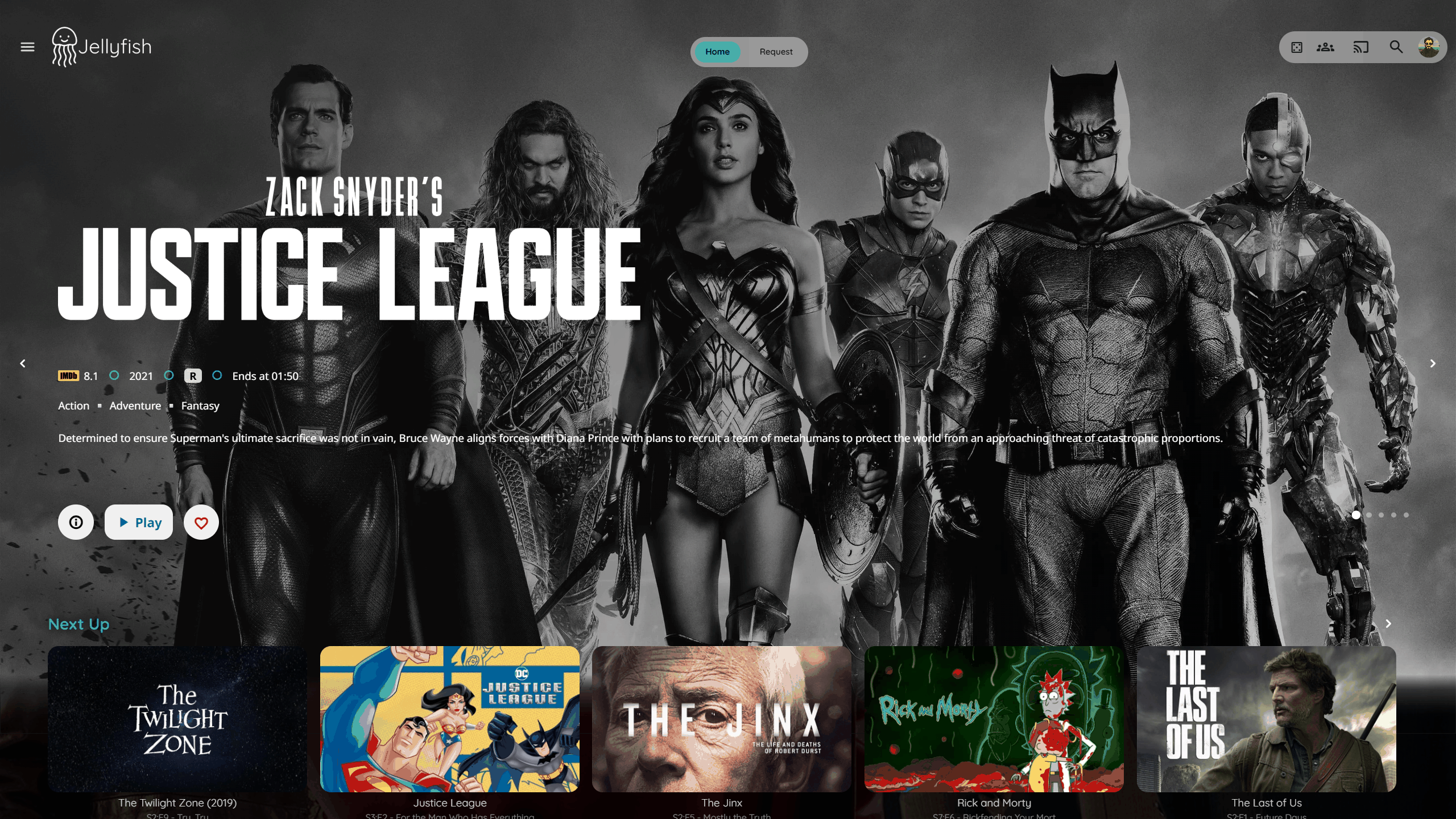 |
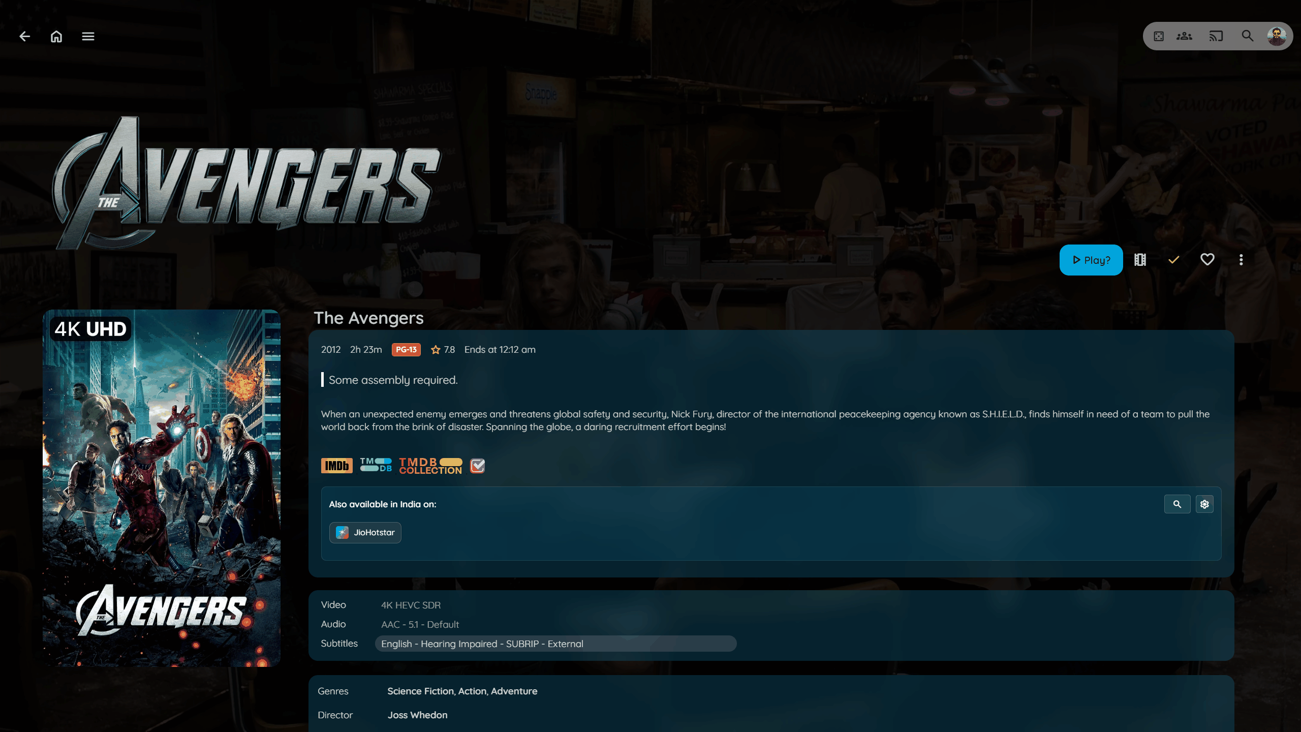 |
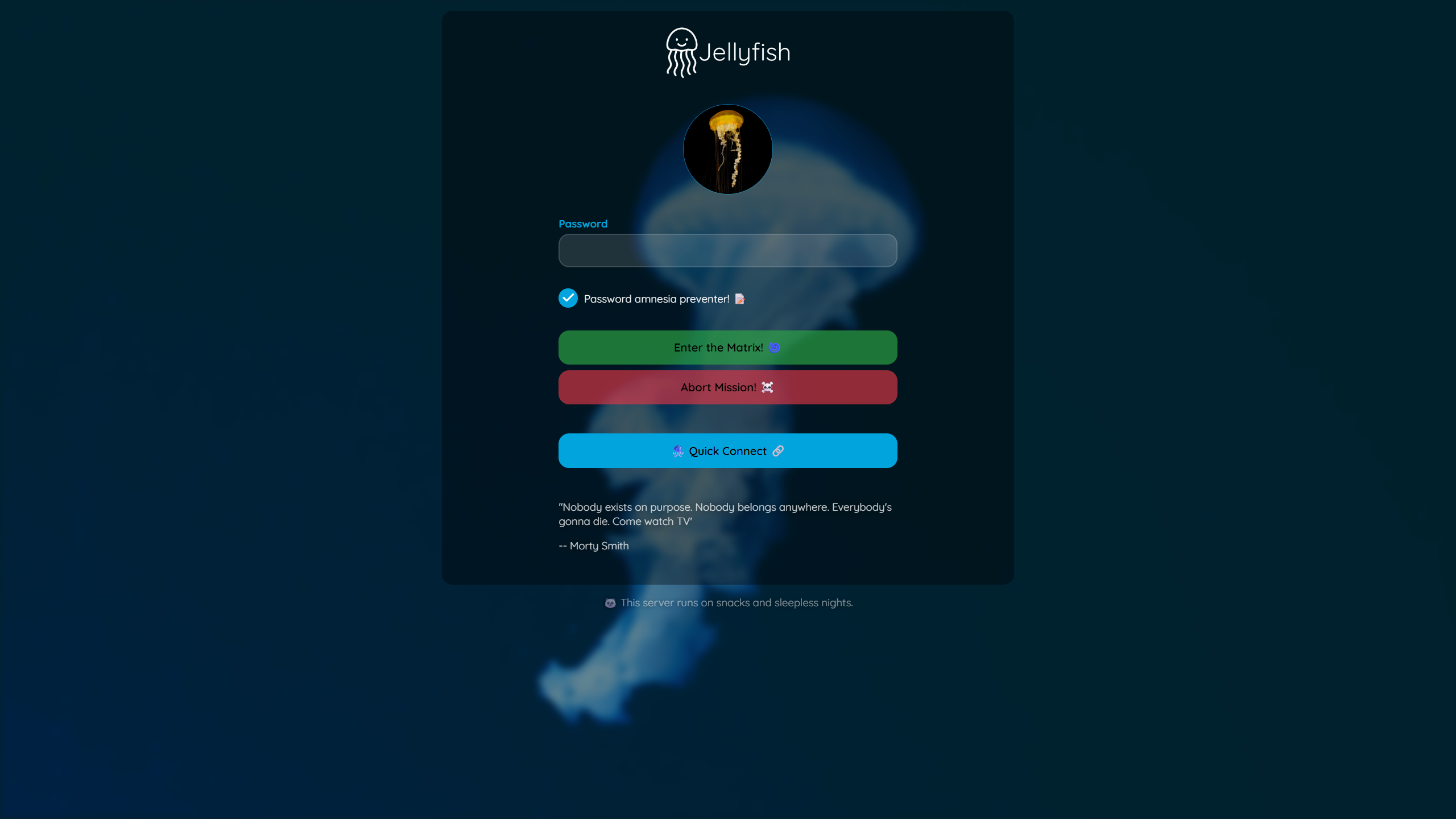
| Login I | Login II |
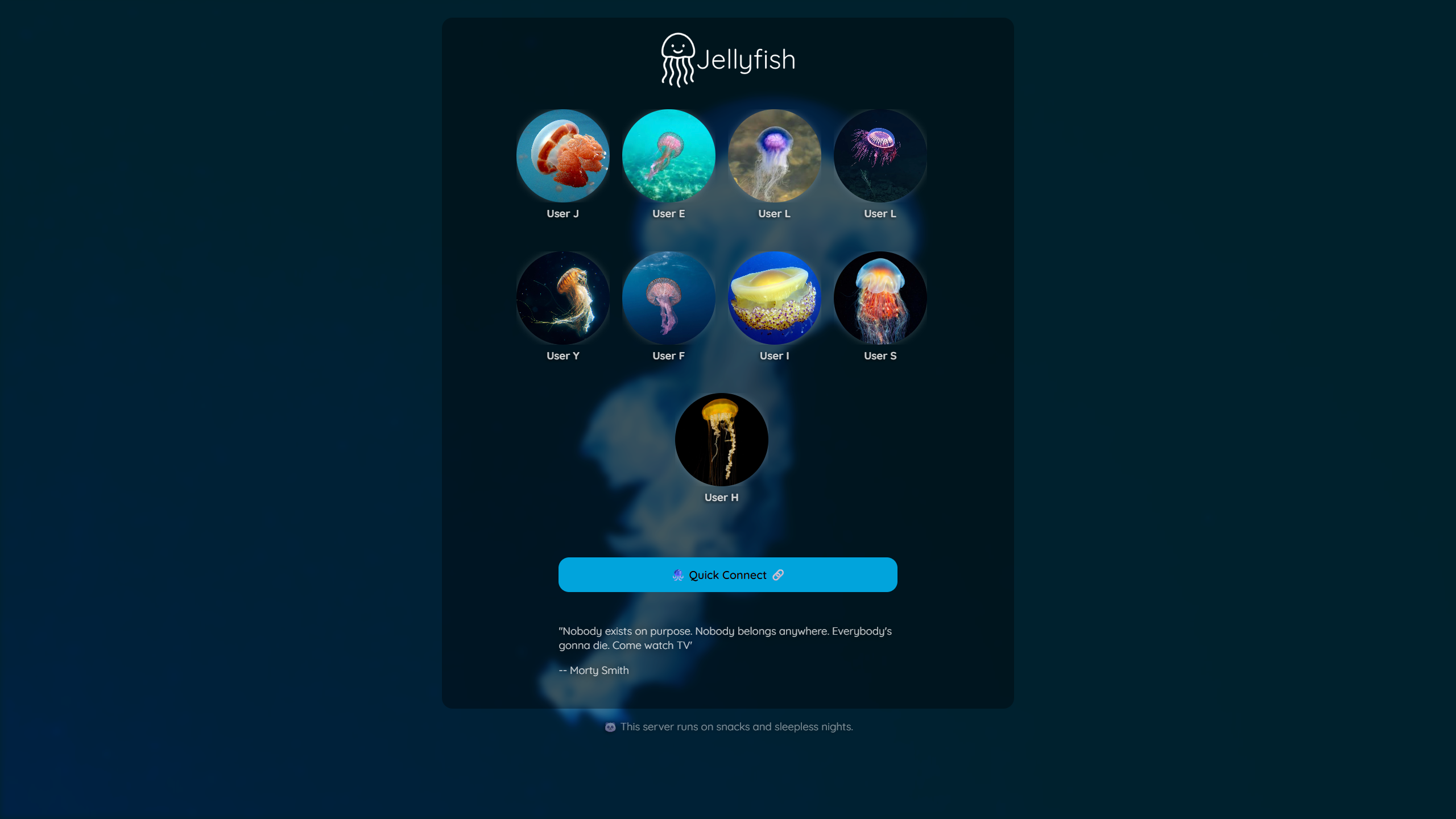 |
 |
----
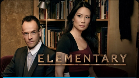
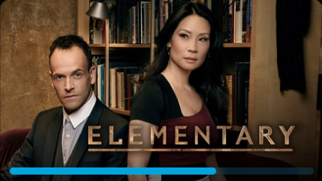
Floating Progress Bar
@import url("https://cdn.jsdelivr.net/gh/n00bcodr/Jellyfish/progress_bar.css");
| Without | With |
|---|---|
 |
 |
----
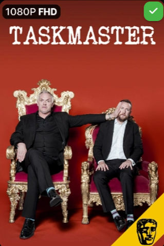
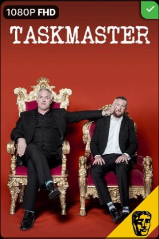
Indicators attached in the corner
Flush to the card corner on tablets and larger screens. On phones the theme's inset, rounded badges are used instead (corner-hugging badges are clipped by the card's rounded corner and are hard to read on narrow cards).
@import url("https://cdn.jsdelivr.net/gh/n00bcodr/Jellyfish/indicators.css");
| Without | With |
|---|---|
 |
 |
----
Media Bar slideshow
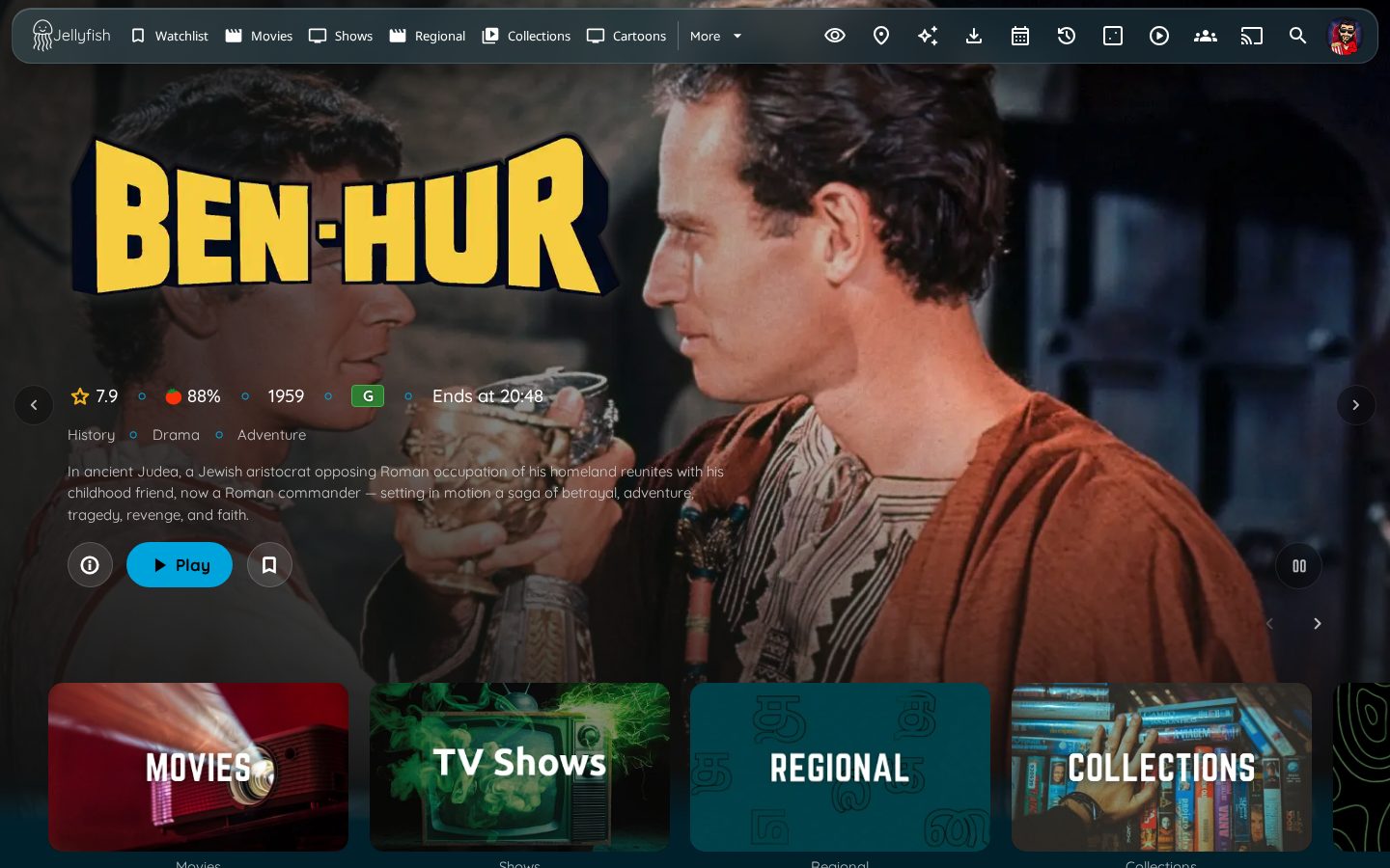
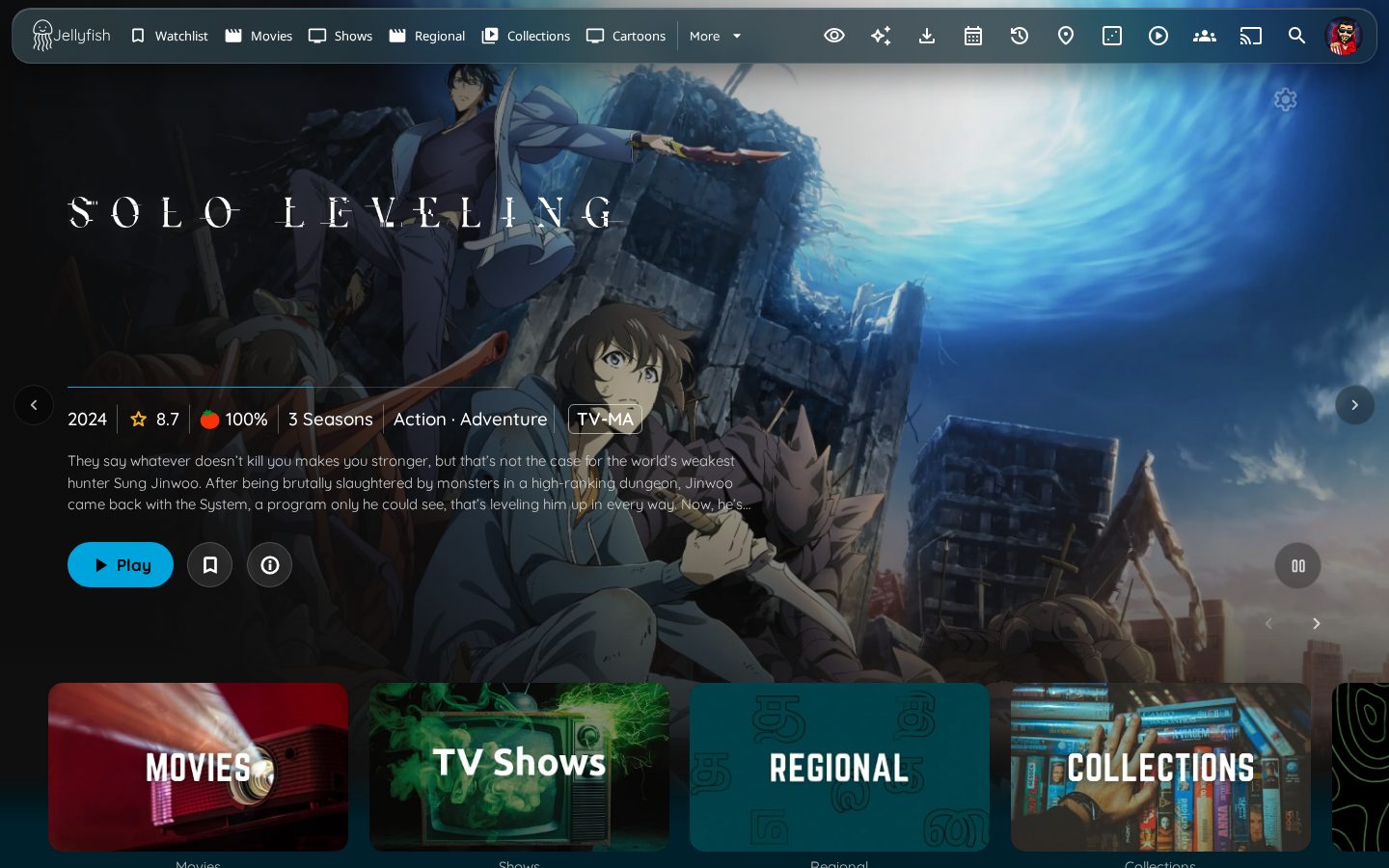
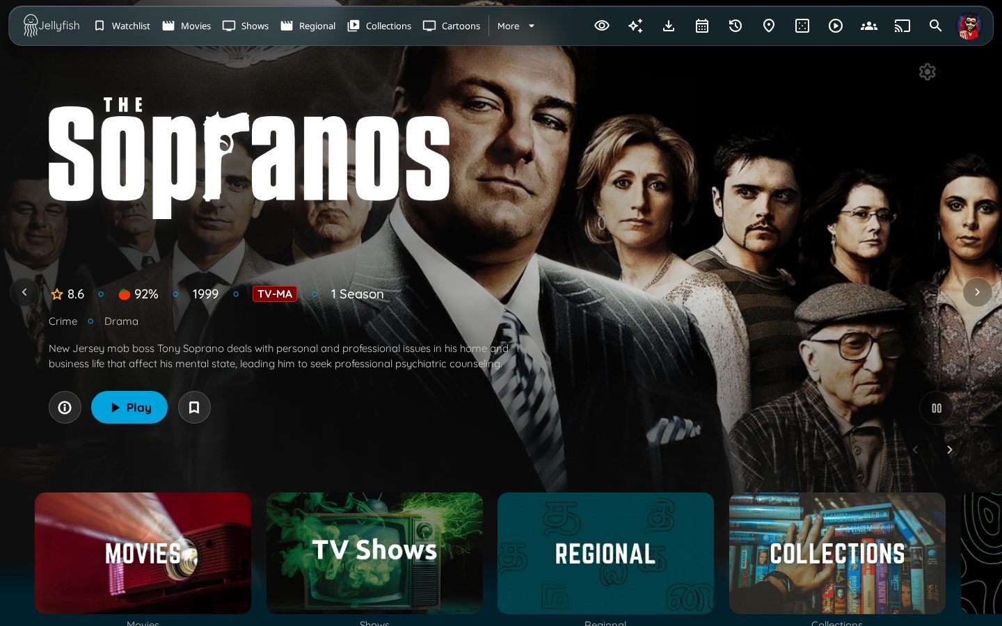
Styles the home-page slideshow of the Media Bar and Media Bar Enhanced plugins with one design. It was built against Media Bar 6.1.0 (all three layouts: marquee, classic, plate) and Media Bar Enhanced 3.10.0, on Jellyfin 12.2. Install only one of the two plugins. Nothing needs changing in either plugin.
Pick one of these. Each file loads the ones it needs, so do not import more than one:
| You want | Import |
|---|---|
| The full-height bar on every screen | slideshow.css |
| A compact card on every screen | slideshow-compact.css |
| Full bar on desktop and tablet, compact card on phones | slideshow-compact-mobile.css |
@import url("https://cdn.jsdelivr.net/gh/n00bcodr/Jellyfish/slideshow.css");
/* or */
@import url("https://cdn.jsdelivr.net/gh/n00bcodr/Jellyfish/slideshow-compact.css");
/* or */
@import url("https://cdn.jsdelivr.net/gh/n00bcodr/Jellyfish/slideshow-compact-mobile.css");
Full bar (slideshow.css)
| Media Bar Enhanced | Media Bar, marquee layout |
|---|---|
 |
 |
| Media Bar, classic layout | Media Bar, plate layout |
 |
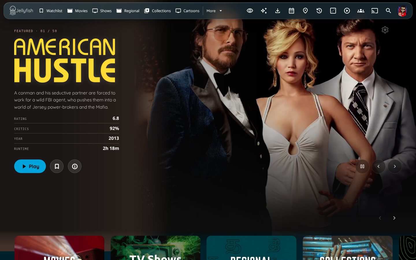 |
The two plugins draw the same pieces (backdrop, logo, ratings, genres, synopsis, buttons, arrows) with different markup, so the stylesheet lines them up into one stack:
- One stack. Left-aligned with the first row of cards and anchored just above the home rows, in the same order in both plugins: logo, ratings, genres, synopsis, buttons. The logo takes the free space above the info, so it sits high on tall screens.
- Buttons. Play is the accent pill used on the item pages, so it follows your palette. Info, watchlist and favorite are round frosted-glass buttons of one size. Watchlist replaces the favorite button when both exist.
- Controls. Previous and next sit on either side of the slide. Pause sits at the bottom right. Mute shows only while a trailer plays. The pagination dots and counter are hidden. (In the plate layout all three controls sit together at the bottom right.)
- Type and shading. Quicksand throughout, accent-colored separators, a shade from the left for the text and one from the bottom into the page. The marquee layout's timer rule uses the accent.
- Entrance. The pieces fade in one after another when a slide appears.
- Clicks. The buttons stay clickable where the home rows overlap the bottom of the bar.
- Plate layout. The plugin draws its own tinted panel and spec table, which are kept. Only the font, the Play button and the controls follow the theme.
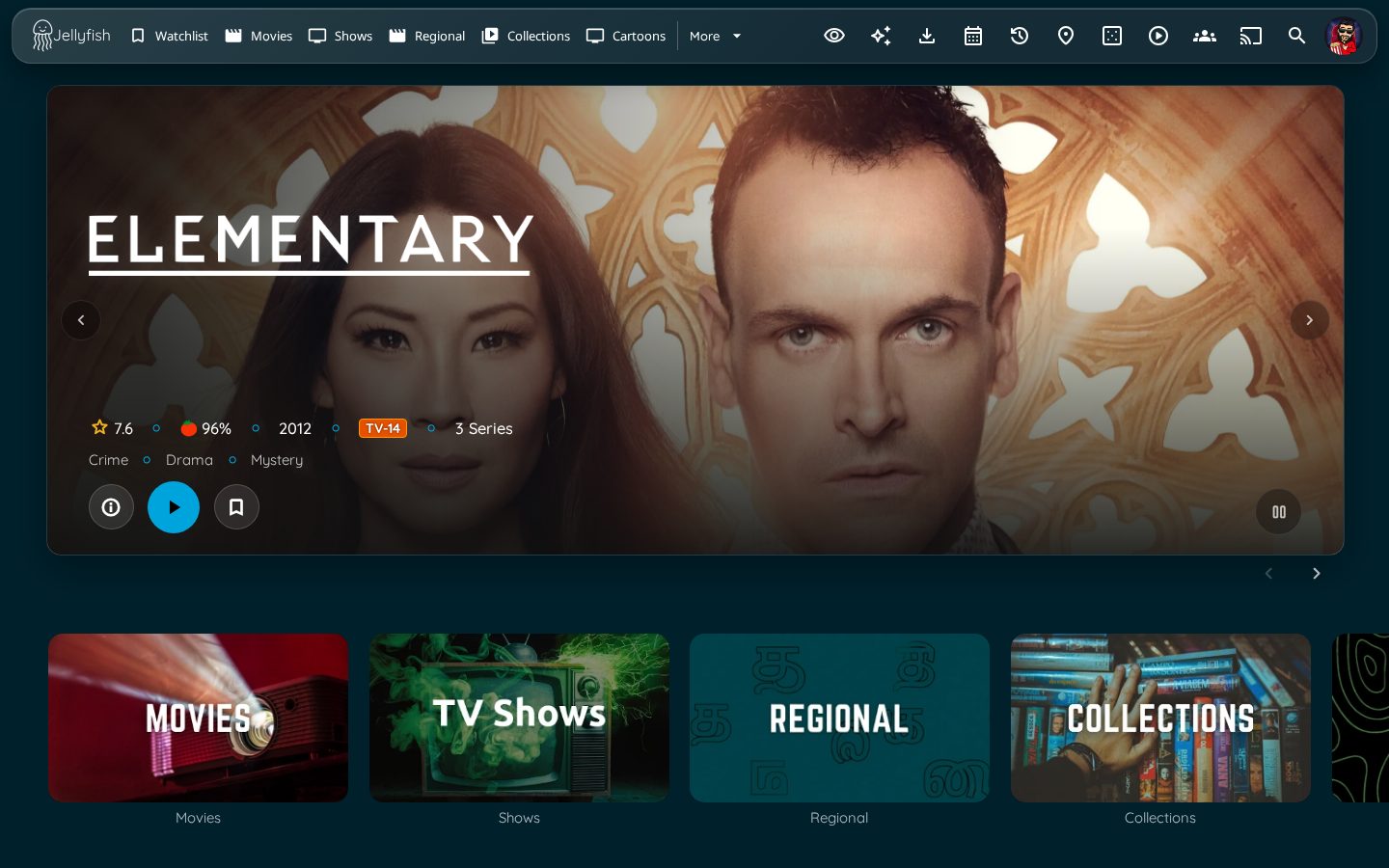
Compact card (slideshow-compact.css)
| Media Bar Enhanced | Media Bar, marquee layout |
|---|---|
 |
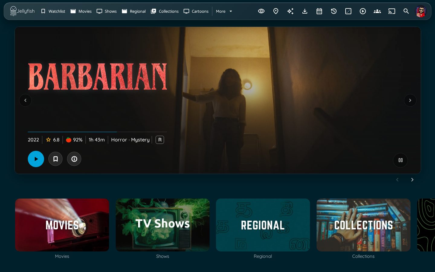 |
A smaller slideshow, in the spirit of ElegantFin's media bar support: a rounded, bordered card inset to the width of the home rows, below the floating top bar, with the rows starting right under it. The backdrop runs to the card's edges instead of fading into the page. The synopsis is left out, Play is a round icon button, and the logo, ratings, genres and buttons stay. It is about 54% of the screen height (21 to 34rem). The plate layout and the TV layout keep the full bar.
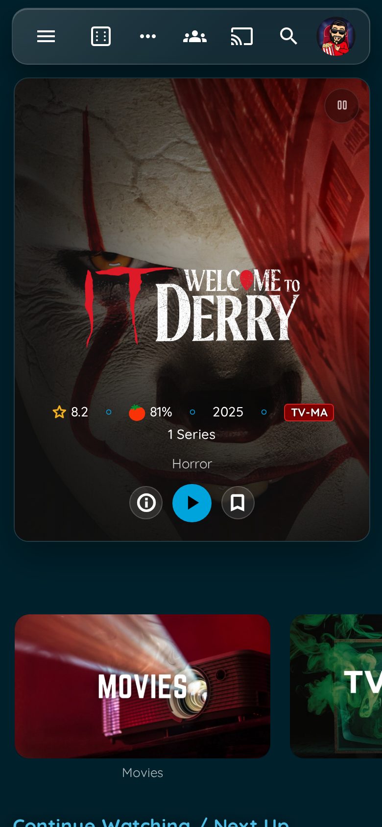
Full on desktop, compact on phones (slideshow-compact-mobile.css)
| Phone, Media Bar Enhanced | Phone, Media Bar marquee |
|---|---|
 |
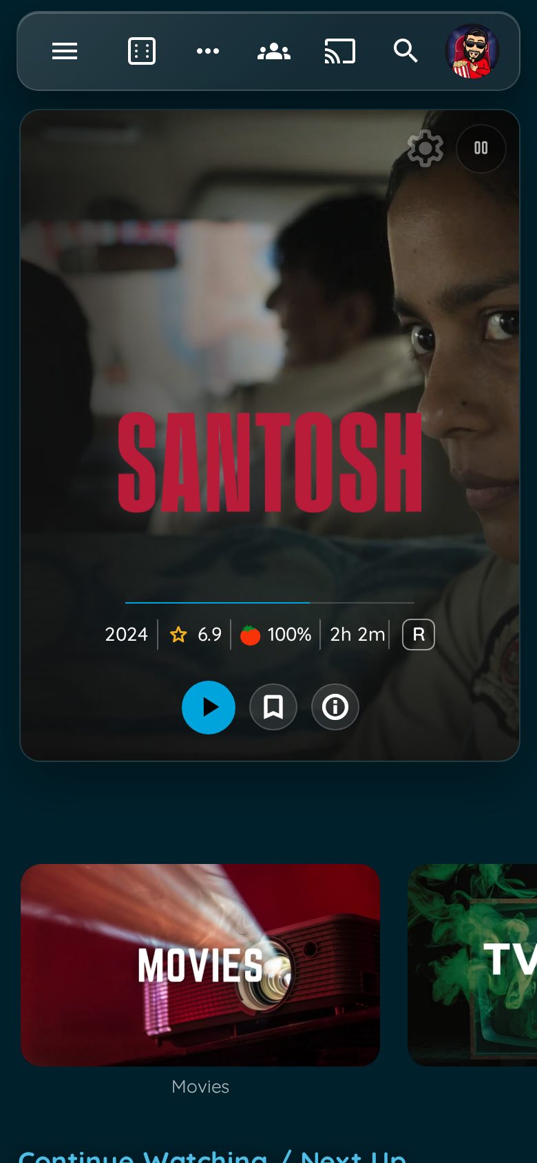 |
Desktops, laptops, tablets and phones on their side get the full bar above. A phone held upright (max-width: 767px and portrait, the width the plugin itself treats as a phone) gets the compact card, with the pause button in the card's corner. To change what counts as a phone, copy the two @import lines from the file into your Custom CSS and edit the media query on the second one.
Tuning. Override these after the import with html:root { ... }:
| Variable | Default | Meaning |
|---|---|---|
--slideshow-height |
100vh |
Height of the full bar |
--slideshow-content-top |
62vh |
How far the home rows are pushed down |
--slideshow-gutter |
calc(3.3% + 1.5rem) |
Left and right inset of the text, so it lines up with the first row of cards at any width |
--sl-stack-width |
min(54%, 48rem) |
Width of the text stack |
--sl-control |
clamp(2.6rem, 2.1rem + 1.1vw, 3.25rem) |
Size of the round buttons |
--sl-card-h |
clamp(21rem, 54vh, 34rem) |
Height of the compact card |
Known limits. Autoplaying trailer backdrops, Media Bar Enhanced's own media-bar-mobile-* modes and the TV layout's focus handling were not tested, and Safari was not available for testing, so check iPad and iPhone. A black logo stays hard to read on a dark backdrop; the plugins supply the image. On a phone, the marquee layout leaves out genres, because a long list does not fit its one-line spec row.
----
Show Scrollbars
theme.css hides scrollbars by default. Import this to bring them back.
@import url("https://cdn.jsdelivr.net/gh/n00bcodr/Jellyfish/scrollbar.css");
----
Watched / Favorite Buttons on Card Hover
theme.css hides the watched and favorite buttons shown when hovering a card. Import this to show them again.
@import url("https://cdn.jsdelivr.net/gh/n00bcodr/Jellyfish/card_buttons.css");
----
Lite mode (optional, for TVs, old tablets and Raspberry-Pi-class clients)
Turns off the costly effects: smaller blur radius, no backdrop blur on large panels, small fixed-size badges, no entrance animations or hover lifts and no smooth scrolling. Import it after theme.css and your palette.
@import url("https://cdn.jsdelivr.net/gh/n00bcodr/Jellyfish/lite.css");
----
Jellyfin Enhanced add-on (optional, if you use the Jellyfin Enhanced plugin)
Styles the plugin's header "More" menu, the active-streams panel, form-control fonts and the plugin's own CSS variables - none of which go through its Themer - and fixes the icon tray collapsing into "..." when KefinTweaks breadcrumbs are on. Import it after theme.css (and your palette).
@import url("https://cdn.jsdelivr.net/gh/n00bcodr/Jellyfish/jellyfin-enhanced.css");
----
Text Instead of Icons
In the item details page (desktop layout), show text for Trailer, Mark as watched, Add to Watchlist and more. Play keeps its icon. Buttons added by Jellyfin Enhanced and KefinTweaks (Hide, Report issue, Spoiler blur, Watchlist) are labelled the same way.
@import url("https://cdn.jsdelivr.net/gh/n00bcodr/Jellyfish/icontext.css");
| Without | With |
|---|---|
 |
 |
----
Coloured Parental Ratings
[!TIP] Jellyfin Enhanced now colour-codes age ratings by rating board on its own, so you no longer need this module or its script if you use that plugin.
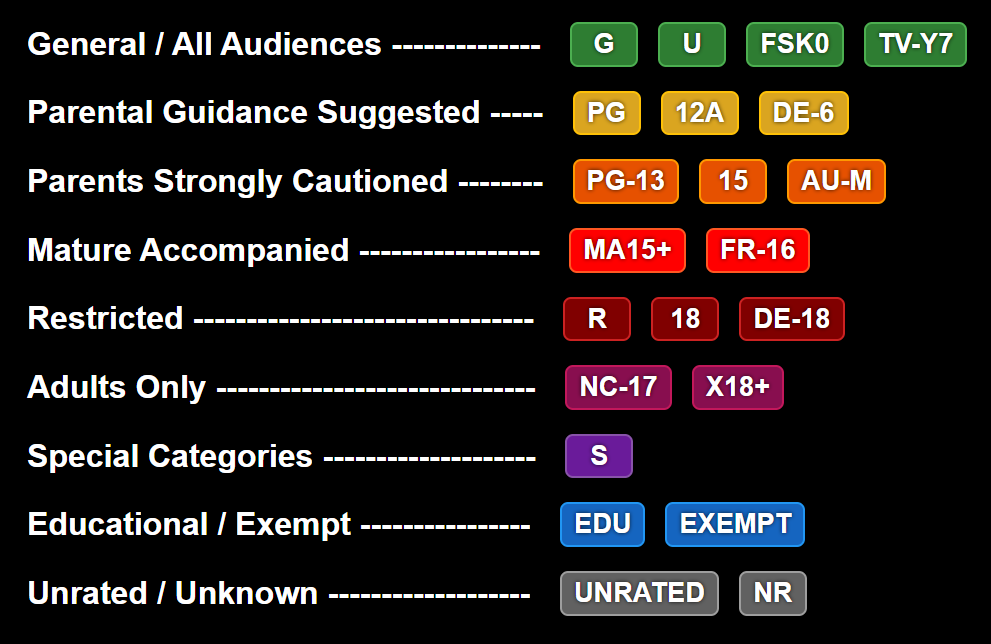
[!NOTE] Only works with a custom javascript
@import url("https://cdn.jsdelivr.net/gh/n00bcodr/Jellyfish/ratings.css");
----
 Logo
Streamberry Logo (inspired by Black Mirror) instead of Jellyfish Logo. Included by default with jellyflix.css
@import url("https://cdn.jsdelivr.net/gh/n00bcodr/Jellyfish/streamberry_logo.css");
----
📝 Companion Scripts
🎨 Colors
Pick a palette and import it after theme.css. Jelly Blue is built into theme.css, so it needs no extra import.
@import url("https://cdn.jsdelivr.net/gh/n00bcodr/Jellyfish/colors/<name>.css");
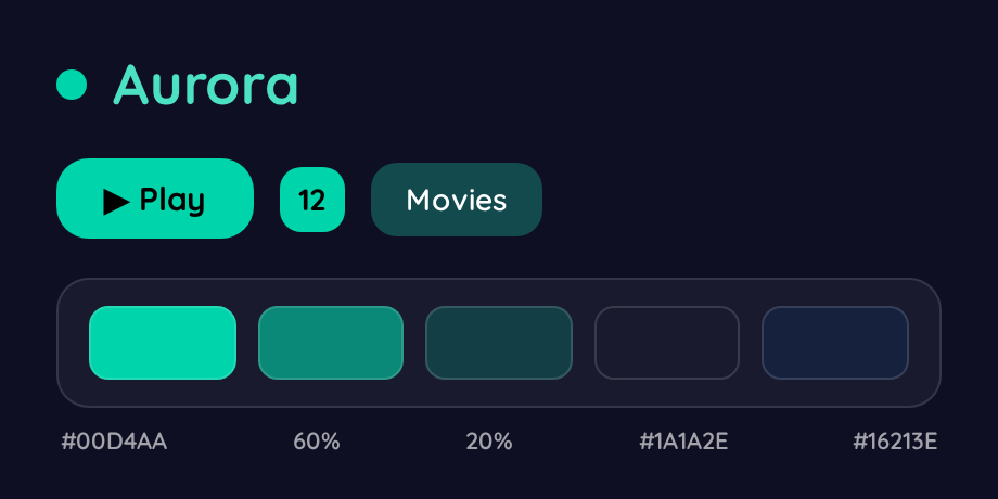 aurora.css |
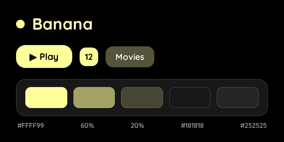 banana.css |
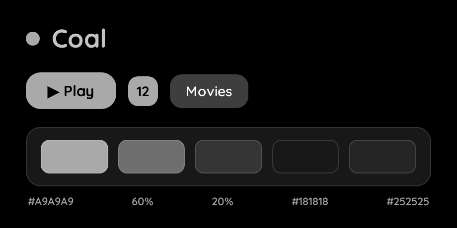 coal.css |
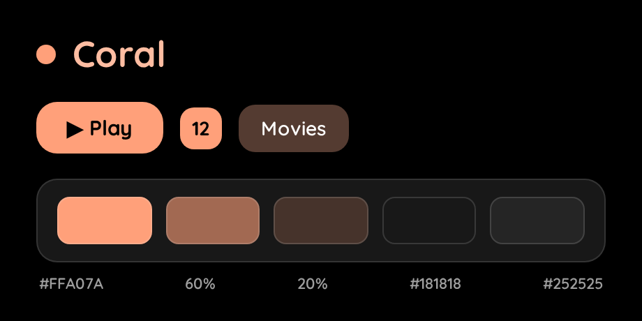 coral.css |
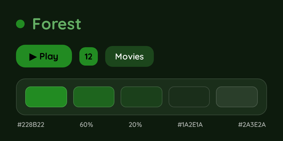 forest.css |
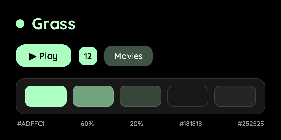 grass.css |
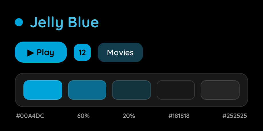 jellyblue.css |
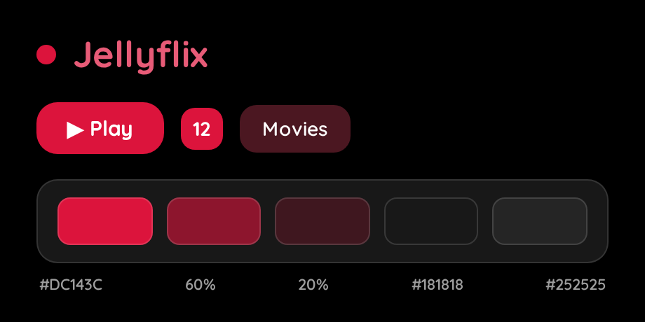 jellyflix.css |
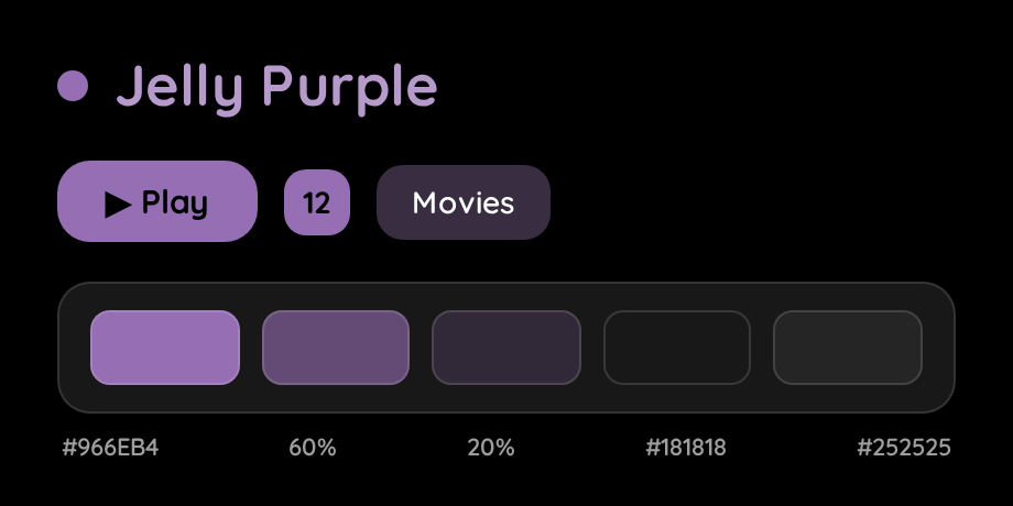 jellypurple.css |
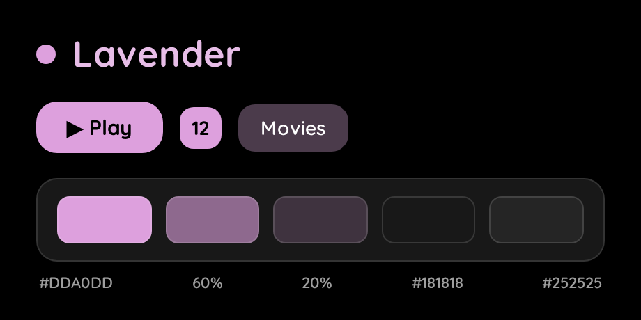 lavender.css |
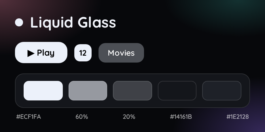 liquidglass.css |
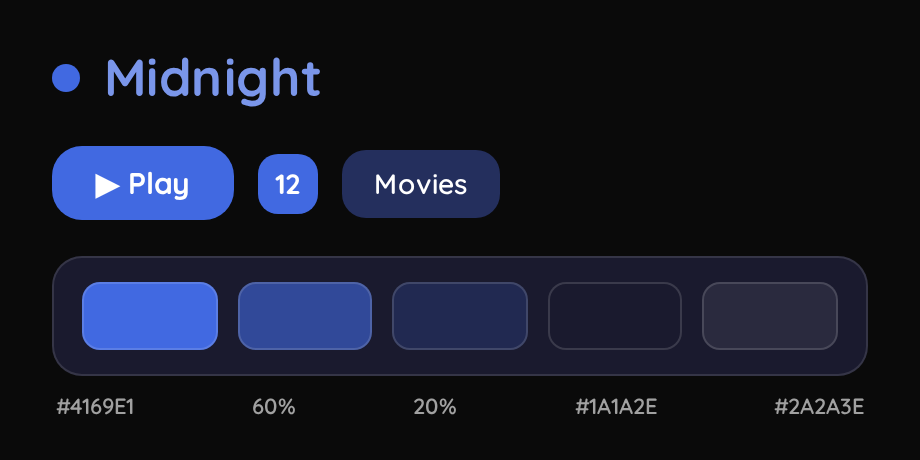 midnight.css |
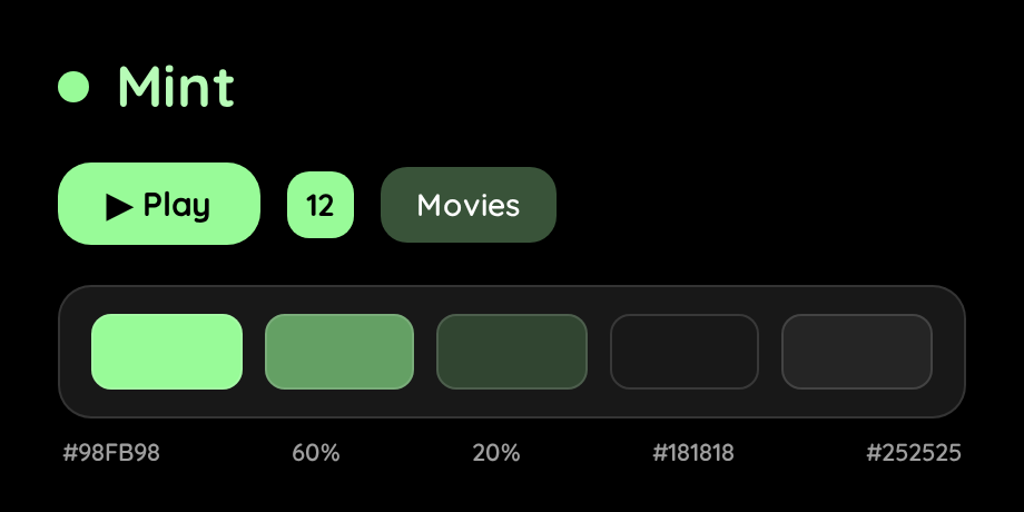 mint.css |
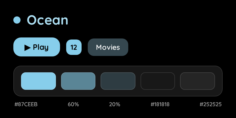 ocean.css |
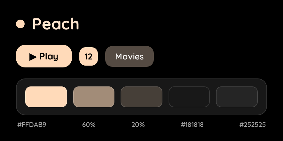 peach.css |
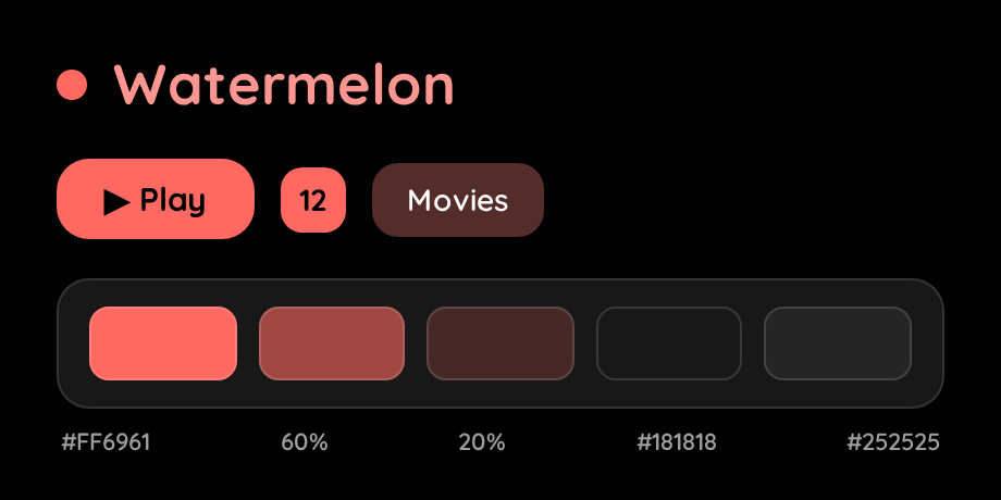 watermelon.css |
Liquid Glass is an Apple-"Liquid Glass"-inspired palette: neutral graphite, a pearl-white accent and a soft iridescent glow, so the color comes from your artwork rather than a blue tint (change --primary-r/g/b in the file for a tinted variant). Besides the usual colors it makes the header, drawer, menus, dialogs, A-Z picker and buttons frosted, translucent glass with a bright edge highlight. It needs a browser with backdrop-filter (every current Chrome, Edge, Safari and Firefox); older engines fall back to solid panels.
Making your own palette
A palette is just a handful of CSS variables - copy any file in colors/ and change these:
| Variable | What it is |
|---|---|
--primary-r/g/b |
The accent color as three numbers (0..255) |
--primary-background-color / --secondary-background-color |
Page background / drawer, cards, dialogs (keep both dark) |
--text-color |
Text drawn on top of the solid accent (Play button, active tab, unwatched count). Use #000000 for light accents and #ffffff for dark ones - aim for ≥ 4.5:1 contrast |
--header-background-color |
The frosted pill behind the header tabs (legacy/TV layouts) |
Everything else (readable accent-colored text, tinted selected rows and dialogs, the whole Jellyfin 12 palette) is derived automatically from those values by theme.css, so a new palette stays readable without further work.
Quick tweaks
Add these after the theme import in Custom CSS to adjust the look without editing any file:
:root {
  --rounded-cards: 10px;   /* corner radius of cards, panels and buttons (default 15px) */
  --blur: 8px;             /* strength of the frosted-glass blur; lower = faster on weak devices */
  --indicator-size: 28px;  /* size of the watched / unwatched-count badges on cards */
}
Recommended Plugins
To completely replicate the look in the screenshots you'd need the below plugins installed and configured
🧪 Compatibility
- Works for Movies and TV Shows, should work fine mostly for Music and Books, although I don't use Jellyfin for either of them
- Works on both mobile app and web browser, known to have issues / not work on Jellyfin Media Player
- Jellyfin 12 layouts (Settings → Display → Display mode): checked on 12.2 in the Modern/Desktop/Mobile layouts (the React app) and in the legacy Desktop (legacy), Mobile (legacy) and TV layouts. The TV layout is a legacy-app layout in Jellyfin 12, so it uses the same stylesheet rules as the legacy desktop/mobile layouts, with larger A-Z letters and no blur effects (TV GPUs are weak).
- Screen sizes: from ~360px phones through tablets and narrow/tiled desktop windows to 4K TVs at 200-250% scale. The A-Z picker always fits the viewport height, card badges scale with the screen.
[!NOTE] Jellyfin for good reason removed the ability to add custom CSS in the dashboard in version 10.11.
So direct theming for the admin dashboard does not work, and that is expected.
Look at 10.11 Dashboard Theming for a work around. Try at your own risk!
[!NOTE] This theme like many others themes works best only when you have Backdrops and Details Banner enabled in display settings
Get the Plugin JellyfinTweaks for a way to force enable the above two and more on all your devices.
Made with 💜 for Jellyfin and the community
Enjoying Jellyfish?
Checkout my other repos!
Jellyfin-Enhanced (javascript) • Jellyfin-Elsewhere (javascript) • Jellyfin-Tweaks (plugin) • Jellyfin-JavaScript-Injector (plugin) • Jellyfish (theme)