
mikelikesdesign/dialkit-ios
mikelikesdesign/dialkit-ios has 138 GitHub stars and 11 forks. GitHot measured 0 stars in 24 hours. Last checked 2026-11-18 07:49 UTC. Last push 2026-11-14.
What you can do
- Config-driven controls keyed by writable key paths into your model
- Shared global store for multiple panels
- Optional draggable FAB with persisted position per storageID
- Mobile drawer presentation plus inline presentation
Measured star growth
- in 24h
- 0
- in 7 days
- Collecting history
- in 15 days
- Collecting history
- in 1 month
- Collecting history
Net star changes over overlapping periods, not daily totals. Missing measurements are left blank. Stars measure attention, not software quality.
About
DialKit is a SwiftUI package for editing and previewing interface updates live
Developer ToolsREADME.md
OriginalDialKit
DialKit is a SwiftUI package for editing and previewing interface updates live.
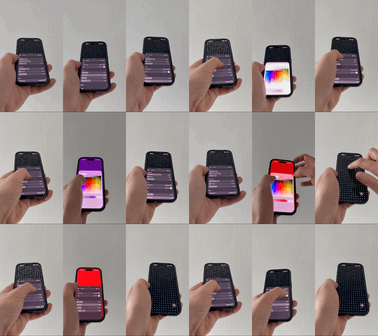
Credit
This Swift package is based on the original DialKit repository by Josh Puckett.
Requirements
- iOS 17 and later
- macOS 14 and later for local package builds and
swift test - SwiftUI
- A model type that conforms to
CodableandEquatable
Installation
Add this repository as a Swift Package dependency in Xcode, then import DialKit in your app.
import DialKit
Using DialKit from UIKit
DialKit's UI is built with SwiftUI, but UIKit apps can still use it by embedding DialRoot in a small UIHostingController bridge.
A UIKit integration detail:
If you pin a full-screen UIHostingController over an interaction-heavy UIKit screen, the overlay can intercept touches even when the drawer is visually closed. For UIKit, there are two recommended patterns depending on the kind of screen you are building.
Option 1: Host-Controlled Drawer (Recommended for interaction-heavy screens)
Use the binding-driven initializer, disable the built-in FAB, and open the drawer from your own UIKit button or gesture. This is the safest option for drawing, scrubbing, camera gestures, games, or any custom touch surface.
import Combine
import DialKit
import SwiftUI
import UIKit

struct CardModel: Codable, Equatable {
    var title = "Card"
    var cornerRadius = 24.0
    var isEnabled = true
}

@MainActor
final class DialPresentationBridge: ObservableObject {
    @Published var isPresented = false
}

private struct DialDrawerOverlay: View {
    @ObservedObject var presentation: DialPresentationBridge

    var body: some View {
        DialRoot(
            position: .bottomRight,
            storageID: "card-preview",
            showsFAB: false,
            isPresented: $presentation.isPresented
        )
    }
}

final class CardViewController: UIViewController {
    private let presentationBridge = DialPresentationBridge()
    private var cancellables: Set<AnyCancellable> = []

    private let dial = DialPanelState(
        name: "Card",
        initial: CardModel(),
        controls: [
            .text("title", keyPath: \.title),
            .slider("cornerRadius", keyPath: \.cornerRadius, range: 0.0...48.0, step: 1.0),
            .toggle("isEnabled", keyPath: \.isEnabled)
        ]
    )

    private lazy var dialHost = UIHostingController(
        rootView: DialDrawerOverlay(presentation: presentationBridge)
    )

    override func viewDidLoad() {
        super.viewDidLoad()

        addChild(dialHost)
        dialHost.view.frame = view.bounds
        dialHost.view.backgroundColor = .clear
        dialHost.view.autoresizingMask = [.flexibleWidth, .flexibleHeight]
        view.addSubview(dialHost.view)
        dialHost.didMove(toParent: self)

        dial.$values
            .receive(on: DispatchQueue.main)
            .sink { [weak self] values in
                self?.apply(values)
            }
            .store(in: &cancellables)
    }

    @objc
    private func openDial() {
        presentationBridge.isPresented = true
    }

    private func apply(_ values: CardModel) {
        // Update your UIKit view hierarchy from dial.values.
    }
}
Option 2: Built-in FAB (Use a passthrough container)
If you want DialKit's built-in FAB in a UIKit app, keep DialRoot mounted but place the hosting view inside a passthrough container.
When the drawer is closed, the container should let non-interactive overlay space fall through to UIKit. When the drawer is open, the container should stop passing touches through so backdrop tap-to-dismiss and drag-to-dismiss still work.
import Combine
import DialKit
import SwiftUI
import UIKit

struct CardModel: Codable, Equatable {
    var title = "Card"
    var cornerRadius = 24.0
    var isEnabled = true
}

@MainActor
final class DialPresentationBridge: ObservableObject {
    @Published var isPresented = false
}

private struct DialFABOverlay: View {
    @ObservedObject var presentation: DialPresentationBridge

    var body: some View {
        DialRoot(
            position: .bottomRight,
            storageID: "card-preview",
            showsFAB: true,
            isPresented: $presentation.isPresented
        )
    }
}

final class PassthroughHostingContainerView: UIView {
    weak var hostedView: UIView?
    var allowsPassthrough = true

    override func hitTest(_ point: CGPoint, with event: UIEvent?) -> UIView? {
        guard allowsPassthrough else {
            return super.hitTest(point, with: event)
        }

        guard
            let hostedView,
            !isHidden,
            alpha > 0.01,
            isUserInteractionEnabled
        else {
            return nil
        }

        let hostedPoint = convert(point, to: hostedView)
        return interactiveHit(in: hostedView, at: hostedPoint, with: event)
    }

    private func interactiveHit(in view: UIView, at point: CGPoint, with event: UIEvent?) -> UIView? {
        guard
            !view.isHidden,
            view.alpha > 0.01,
            view.isUserInteractionEnabled,
            view.point(inside: point, with: event)
        else {
            return nil
        }

        for subview in view.subviews.reversed() {
            let subviewPoint = view.convert(point, to: subview)
            if let hitView = interactiveHit(in: subview, at: subviewPoint, with: event) {
                return hitView
            }
        }

        guard view !== hostedView else {
            return nil
        }

        if view is UIControl || view is UIScrollView {
            return view
        }

        return !(view.gestureRecognizers?.isEmpty ?? true) ? view : nil
    }
}

final class CardViewController: UIViewController {
    private let presentationBridge = DialPresentationBridge()
    private let dialContainerView = PassthroughHostingContainerView()
    private var cancellables: Set<AnyCancellable> = []

    private let dial = DialPanelState(
        name: "Card",
        initial: CardModel(),
        controls: [
            .text("title", keyPath: \.title),
            .slider("cornerRadius", keyPath: \.cornerRadius, range: 0.0...48.0, step: 1.0),
            .toggle("isEnabled", keyPath: \.isEnabled)
        ]
    )

    private lazy var dialHost = UIHostingController(
        rootView: DialFABOverlay(presentation: presentationBridge)
    )

    override func viewDidLoad() {
        super.viewDidLoad()

        presentationBridge.$isPresented
            .receive(on: DispatchQueue.main)
            .sink { [weak self] isPresented in
                self?.dialContainerView.allowsPassthrough = !isPresented
            }
            .store(in: &cancellables)

        dialContainerView.translatesAutoresizingMaskIntoConstraints = false
        dialContainerView.backgroundColor = .clear
        view.addSubview(dialContainerView)

        NSLayoutConstraint.activate([
            dialContainerView.leadingAnchor.constraint(equalTo: view.leadingAnchor),
            dialContainerView.trailingAnchor.constraint(equalTo: view.trailingAnchor),
            dialContainerView.topAnchor.constraint(equalTo: view.topAnchor),
            dialContainerView.bottomAnchor.constraint(equalTo: view.bottomAnchor)
        ])

        addChild(dialHost)
        dialHost.view.translatesAutoresizingMaskIntoConstraints = false
        dialHost.view.backgroundColor = .clear
        dialContainerView.hostedView = dialHost.view
        dialContainerView.addSubview(dialHost.view)

        NSLayoutConstraint.activate([
            dialHost.view.leadingAnchor.constraint(equalTo: dialContainerView.leadingAnchor),
            dialHost.view.trailingAnchor.constraint(equalTo: dialContainerView.trailingAnchor),
            dialHost.view.topAnchor.constraint(equalTo: dialContainerView.topAnchor),
            dialHost.view.bottomAnchor.constraint(equalTo: dialContainerView.bottomAnchor)
        ])

        dialHost.didMove(toParent: self)
    }
}
Important Notes
- Add the hosting controller high enough in your UIKit hierarchy for the drawer or FAB overlay to sit above your content.
dial.valuesremains the source of truth for your tuned values.- Keep
DialPanelStatealive for as long as you want the panel to exist. - If UIKit needs to drive
isPresented, prefer anObservableObjectbridge over a plain storedBool, so SwiftUI sees external state changes reliably. - If you mount and unmount the SwiftUI host from UIKit and observe stale drawer state across repeated open/close cycles, recreating the
UIHostingControllerper presentation is safer than reusing one that has already driven the drawer lifecycle.
Core Concepts
DialKit has three main pieces:
DialPanelState<Model>: owns the editable values for one panelDialControl<Model>: describes the controls that should be shown for that modelDialRoot: renders every registered panel from the shared global store
The typical flow is:
- Define a
Modelthat contains the values you want to tune. - Create a
DialPanelState<Model>with an initial value and a list of controls. - Bind your UI directly to
dial.values. - Add a single
DialRootnear the top of your screen hierarchy.
Quick Start
import DialKit
import SwiftUI

struct CardModel: Codable, Equatable {
    var title = "Card"
    var cornerRadius = 24.0
    var isEnabled = true
    var fill = "#F97316"
    var style = "glass"
    var spring: DialSpring = .default
    var transition: DialTransition = .default
}

struct CardPreview: View {
    @StateObject private var dial = DialPanelState(
        name: "Card",
        initial: CardModel(),
        controls: [
            .text("title", keyPath: \.title),
            .slider("cornerRadius", keyPath: \.cornerRadius, range: 0.0...48.0, step: 1.0),
            .toggle("isEnabled", keyPath: \.isEnabled),
            .color("fill", keyPath: \.fill),
            .select("style", keyPath: \.style, options: ["glass", "solid"]),
            .group(
                "motion",
                children: [
                    .spring("spring", keyPath: \.spring),
                    .transition("transition", keyPath: \.transition),
                    .action("shuffle")
                ]
            )
        ],
        onAction: { path in
            print("Dial action:", path)
        }
    )

    var body: some View {
        ZStack {
            RoundedRectangle(cornerRadius: dial.values.cornerRadius)
                .fill(dial.values.isEnabled ? .orange : .gray)
                .overlay {
                    Text(dial.values.title)
                        .foregroundStyle(.white)
                }
                .padding(40)

            DialRoot(
                position: .bottomRight,
                defaultOpen: false,
                mode: .drawer,
                storageID: "card-preview"
            )
        }
    }
}
A few important details:
- Keep
DialPanelStatealive for as long as you want the panel to exist. In SwiftUI that usually means@StateObject. dial.valuesis the source of truth for the tuned values.- You only need one
DialRootto render every active panel. - In drawer mode,
DialRootshows a draggable FAB by default and opens a mobile bottom drawer when tapped. - If you do not want the FAB on screen, use the binding-driven drawer initializer and open DialKit from your own control or gesture.
Public API Overview
DialRoot
Default FAB-driven drawer setup:
DialRoot(
    position: .bottomRight,
    defaultOpen: false,
    mode: .drawer,
    storageID: "default"
)
Host-controlled drawer setup:
@State private var isDialPresented = false

DialRoot(
    position: .bottomRight,
    storageID: "default",
    showsFAB: false,
    isPresented: $isDialPresented
)
Supported positions:
.topRight.topLeft.bottomRight.bottomLeft
In drawer mode, position is the initial FAB anchor, not a panel alignment.
Supported modes:
.drawer: draggable FAB + mobile bottom drawer.inline: always-expanded panel rendered in place
Drawer behavior:
defaultOpen: falsestarts closed with only the FAB visible when you use the legacy drawer initializerdefaultOpen: truestarts with the drawer open at the medium height- the mobile drawer can be dragged between medium and tall states, then dragged down to dismiss
- short control lists size the drawer to content; longer lists scroll once the drawer reaches its height cap
isPresentedmakes the host app the source of truth for drawer visibility- when
isPresentedchanges totrue, DialKit opens the drawer at the medium height - when
isPresentedchanges tofalse, DialKit dismisses the drawer - user-driven dismissals also write
falseback into the binding showsFABdefaults tofalseon the binding-driven initializer; set it totrueif you want both your own trigger and the built-in FABstorageIDnamespaces the persisted FAB position only when the FAB is enabled
The package declares macOS support so it can be built and tested from a Mac host, but drawer mode is currently iPhone-first. A dedicated iPad presentation is deferred for now.
Custom Triggers
You can open DialKit from your own app UI by toggling a Boolean binding. In the demo, the drawer opens with a triple tap gesture instead of the default FAB.
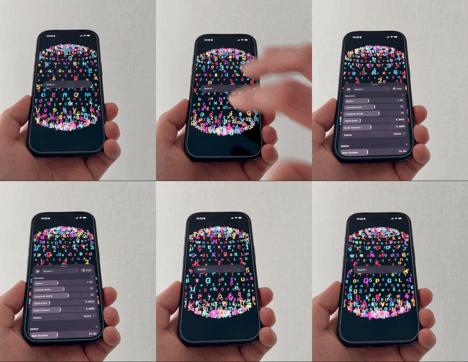
import DialKit
import SwiftUI

struct CardModel: Codable, Equatable {
    var title = "Card"
    var cornerRadius = 24.0
    var isEnabled = true
}

struct CardPreview: View {
    @StateObject private var dial = DialPanelState(
        name: "Card",
        initial: CardModel(),
        controls: [
            .text("title", keyPath: \.title),
            .slider("cornerRadius", keyPath: \.cornerRadius, range: 0.0...48.0, step: 1.0),
            .toggle("isEnabled", keyPath: \.isEnabled)
        ]
    )
    @State private var isDialPresented = false

    var body: some View {
        ZStack(alignment: .topTrailing) {
            RoundedRectangle(cornerRadius: dial.values.cornerRadius)
                .fill(dial.values.isEnabled ? .orange : .gray)
                .overlay {
                    Text(dial.values.title)
                        .foregroundStyle(.white)
                }
                .padding(40)

            Button("Tune Card") {
                isDialPresented = true
            }
            .buttonStyle(.borderedProminent)
            .padding()

            DialRoot(
                position: .bottomRight,
                storageID: "card-preview",
                showsFAB: false,
                isPresented: $isDialPresented
            )
        }
    }
}
Any SwiftUI interaction can drive the same binding. In the demo, a triple-tap gesture flips isDialPresented to true; you can also use a toolbar button, a custom overlay handle, a long-press gesture, or any other SwiftUI interaction that opens the drawer.
DialPanelState<Model>
DialPanelState(
    name: "Card",
    initial: CardModel(),
    controls: [...],
    onAction: { path in ... }
)
Public behavior:
values: the current tuned modelupdateValues(_:): commit programmatic edits, including changes inside reference modelspresets: saved presets for that panelactivePresetID: currently loaded preset, if anycontrols: the current control definitionsconfigure(name:initial:controls:): update the control config at runtimesavePreset(named:): returns whether a new version was savedversionSaveError: the last save failure, cleared after a successful saveloadPreset(id:)clearActivePreset()deletePreset(id:)renameVersion(id:name:)(passnilfor the base)copyInstructionText()
For programmatic edits to a class model, or a struct containing class instances, use
updateValues so DialKit publishes the change, invalidates the selected thumbnail,
and saves the selected version when persistence is enabled:
dial.updateValues { values in
    values.opacity = 0.3
}
Each call commits the model and invalidates its preview. Direct in-place mutations
such as dial.values.opacity = 0.3 on a class, or edits through another reference to
that object, cannot be observed automatically. Models containing only value types
can continue to use direct property edits on dial.values.
Saving a version copies the outgoing model so further edits belong to the new
version. Models containing only value types are copied directly. For reference
models, DialKit uses a Codable round-trip by default, including models encoded
as a single scalar value.
If a class or a nested reference has state excluded from Codable, supply
copyValues. For example, if your model implements an independent deepCopy():
let dial = DialPanelState(
    name: "Card",
    initial: CardModel(),
    controls: CardModel.controls,
    copyValues: { $0.deepCopy() }
)
The copier must preserve every version-relevant property and independently copy
every mutable reference, without modifying the original. It may throw if copying
is unavailable. Use value-based Equatable that compares all version-relevant
state. DialKit rejects copies that change those values or the configured control
values: savePreset returns false, sets versionSaveError, and leaves the
versions and selection intact. The built-in save button displays the error.
copyValues preserves in-memory state; persistence still saves only properties
included in Codable. Include a property in your encoding if it must survive
an app restart.
DialStore
DialStore.shared
DialPanelState instances automatically register with the shared global store, and DialRoot renders whatever is currently active from that store. Most apps do not need to talk to DialStore directly, but it is public.
DialPreset<Model>
presets is an array of public DialPreset<Model> values. Each preset contains:
idnamevalues
Defining Controls
DialKit uses writable key paths into your model. Each control gets a path string and a key path.
[
    .slider("opacity", keyPath: \.opacity, range: 0.0...1.0, step: 0.05),
    .slider("blur", keyPath: \.blur, range: 0.0...40.0, step: 1.0, unit: "pt"),
    .toggle("enabled", keyPath: \.enabled),
    .text("title", keyPath: \.title, placeholder: "Title"),
    .color("fill", keyPath: \.fill),
    .select(
        "style",
        keyPath: \.style,
        options: [
            DialOption("glass", label: "Glass"),
            DialOption("solid", label: "Solid")
        ]
    ),
    .spring("spring", keyPath: \.spring),
    .transition("transition", keyPath: \.transition),
    .group("motion", collapsed: false, children: [...]),
    .action("shuffle")
]
Supported controls:
slider: numeric values backed byDouble,Float,CGFloat, orInt, with optionalstepandunittoggle:Booltext:Stringcolor:Stringhex color valuesselect:Stringwith either[String]or[DialOption]spring:DialSpringtransition:DialTransitiongroup: nested folders of controlsaction: callback-only button routed throughonAction
Paths are also used to generate stable action identifiers. A nested action inside group("motion") with action("shuffle") is delivered as motion.shuffle.
DialOption
DialOption is a public helper type for labeled select options:
DialOption("glass", label: "Glass")
DialOption(value: "spring-physics", label: "Physics Spring")
Use [String] when the stored value and visible label should match. Use [DialOption] when you want a separate stored value and display label.
Working With Multiple Panels
Multiple panel states can exist at the same time. They automatically register with the shared DialStore.
struct MultiPreview: View {
    @StateObject private var cardDial = DialPanelState(
        name: "Card",
        initial: CardModel(),
        controls: CardModel.controls
    )

    @StateObject private var shadowDial = DialPanelState(
        name: "Shadow",
        initial: ShadowModel(),
        controls: ShadowModel.controls
    )

    var body: some View {
        ZStack {
            PreviewSurface(card: cardDial.values, shadow: shadowDial.values)
            DialRoot(storageID: "multi-preview")
        }
    }
}
Drawer mode uses one shared drawer. If multiple panels are active, DialKit shows a picker in the drawer header and renders the selected panel. Inline mode renders all active panels in place.
Iterations viewer
Tap Save version (the plus icon) to fork the current values and start editing the new version. As soon as the drawer has two versions, a horizontal row of thumbnails appears beneath the toolbar. Tap a thumbnail to switch and keep tuning. Swipe sideways to reach more versions.
With only the base version, the toolbar shows Save version and Copy. Once there are two or more versions, a separate grid button appears in both drawer and inline mode. Tap it to open the full gallery. The iPhone sheet opens partway so you can still see the running app. Drag up for more room, or tap a thumbnail to load it and return to the editor. Closing or swiping down leaves the selection alone.
V1 is the editable base. New saves default to V2, V3, and so on. Older saved names like Version 3 count toward the next number. Changes belong to the selected version. Use a card’s … menu or long-press to rename it or delete a saved version. The base can be renamed but cannot be deleted; deleting the selected version restores the base. Copy still copies the active values and the instruction to apply them as defaults.
On iOS, DialKit captures the exposed area of the app above or below the editor when you save, switch from the strip, or open Versions. The strip also refreshes the active thumbnail after edits settle. Previews come from the editor’s own window. If no preview is available, the version still works. To focus every thumbnail on a particular design, supply a sized SwiftUI view on DialRoot:
DialRoot()
    .dialVersionPreview(for: dial) { values in
        CardArtwork(values: values)
            .frame(width: 360, height: 240)
    }
Versions stay in memory by default. To restore values, names, the selected version, and available previews on the next launch, give the panel a stable persistKey. Use a different key for each panel and model schema.
let dial = DialPanelState(
    name: "Card",
    initial: CardModel(),
    controls: CardModel.controls,
    persistKey: "card-study"
)
Actions
Action controls are useful when you want the panel to trigger app logic that is not a direct key-path write.
let dial = DialPanelState(
    name: "Card",
    initial: CardModel(),
    controls: [
        .group(
            "actions",
            children: [
                .action("shuffle"),
                .action("resetLayout")
            ]
        )
    ],
    onAction: { path in
        switch path {
        case "actions.shuffle":
            print("shuffle")
        case "actions.resetLayout":
            print("reset")
        default:
            break
        }
    }
)
Springs and Transitions
DialKit includes two animation-oriented value types.
DialSpring
.time(duration: 0.35, bounce: 0.24)
.physics(stiffness: 200, damping: 25, mass: 1)
The spring control can switch between time-based and physics-based editing.
Useful public helpers:
let spring = DialSpring.default
let physics = spring.resolvedPhysics
let faster = spring.updatingTime(duration: 0.2)
let heavier = spring.updatingPhysics(mass: 1.5)
DialTransition
.easing(duration: 0.3, bezier: .standard)
.spring(.default)
The transition control supports:
- easing curves via
DialBezier - time-based spring mode
- physics spring mode
It also exposes a public mode-switching helper:
let easing = DialTransition.default.switching(to: .easing)
let physics = DialTransition.default.switching(to: .advanced)
Colors
Color controls are stored as strings for parity with the upstream DialKit model.
Supported formats:
#RGB#RRGGBB#RRGGBBAA
Example:
var fill = "#F97316"
DialKit converts these values to SwiftUI colors internally for the built-in control UI, and the built-in color control preserves alpha when you use #RRGGBBAA.
Runtime Reconfiguration
You can swap the control schema at runtime by calling configure(name:initial:controls:) on an existing panel state.
dial.configure(
    name: "Card",
    initial: CardModel(),
    controls: CardModel.advancedControls
)
When you reconfigure a panel:
- compatible current values are preserved
- invalid values are clamped or reset to fallback values
- existing presets are normalized to the new control schema
Tips
- Add
DialRootclose to the top of your screen hierarchy so the drawer and optional FAB can overlay your content. - Use a unique
storageIDper screen if you want each screen to remember its own FAB position. - Use
inlinemode for settings screens, inspectors, or debug panels that should always stay visible. - The built-in slider UI supports both tap-to-edit values and direct drag interaction with step haptics on iPhone.
- Keep your model small and focused. DialKit works best when each panel represents a coherent group of values.
- Prefer stable path names because they become labels, nested control identifiers, and action paths.
Features
- Config-driven controls keyed by writable key paths into your model
- Shared global store for multiple panels
- Optional draggable FAB with persisted position per
storageID - Mobile drawer presentation plus inline presentation
- Content-sized iPhone drawer with medium/tall drag states and shared multi-panel picker
- Iterations viewer with an editable base, preview gallery, and optional persistence
- Built-in copy action, color picker, tap-to-edit sliders, drag guide marks, and slider step haptics
- Nested groups, spring controls, transition controls, actions, text, toggle, color, select, and slider controls