
kesha-antonov/react-native-chat
kesha-antonov/react-native-chat has 88 GitHub stars and 12 forks. GitHot measured +1 stars in 24 hours and +6 in 7 days. Last checked 2026-11-16 21:57 UTC. Last push 2026-11-06.
What you can do
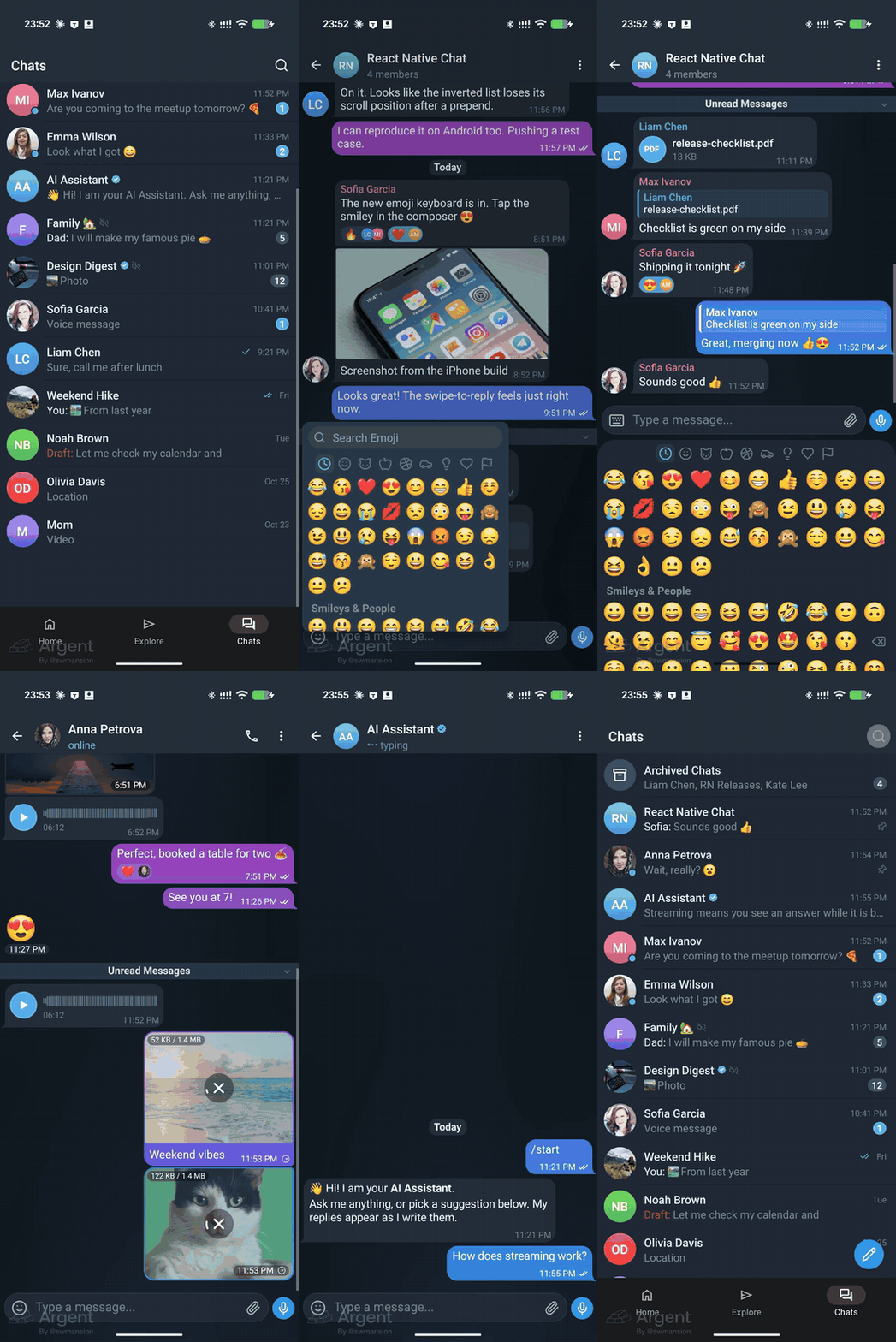
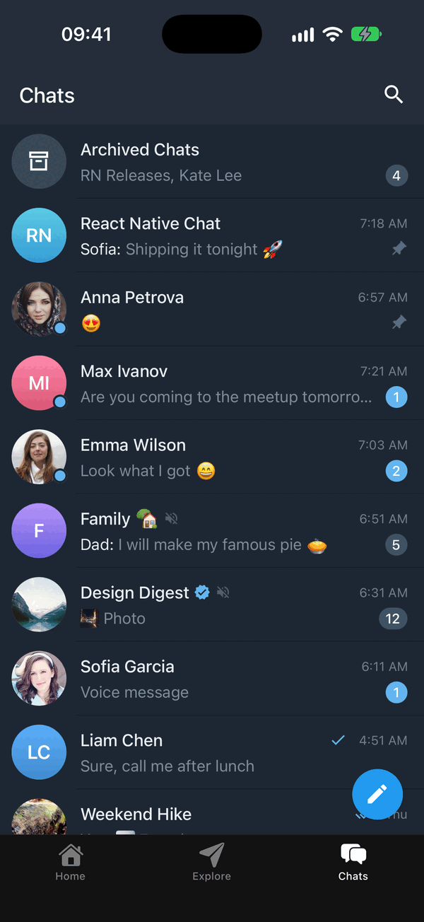
- 💬 Chat list - the list of chats with search, selection actions, archive, swipe to archive and draggable pinned chats; plug in your backend
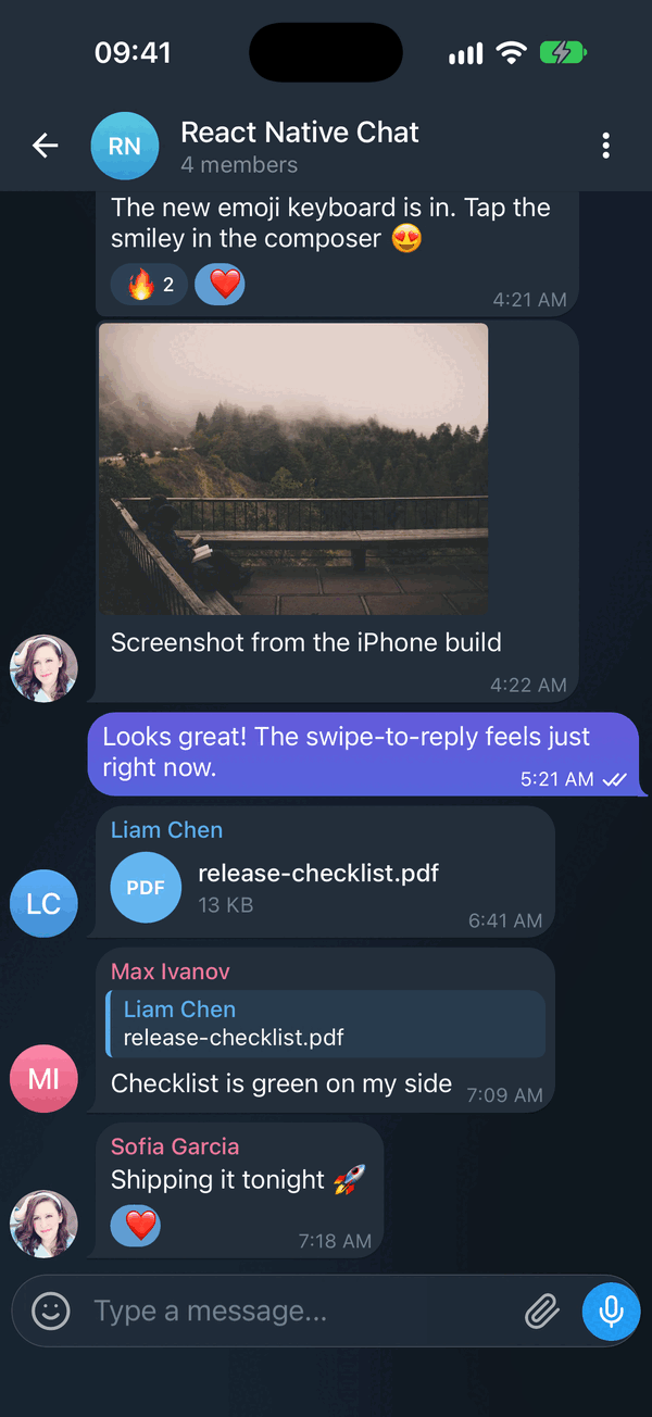
- 🌗 Dark mode & theming - full light/dark token system, switchable at runtime
- 🤖 Streaming AI messages - token-by-token replies with a typing caret and stop control
- 😀 Emoji reactions - long-press picker and reaction pills
Measured star growth
- in 24h
- +1
- in 7 days
- +6
- in 15 days
- Update delayed
- in 1 month
- Update delayed
Net star changes over overlapping periods, not daily totals. Missing measurements are left blank. Stars measure attention, not software quality.
About
The most complete chat UI for React Native & Web - streaming AI messages, emoji reactions, replies, quick replies, and full customization. TypeScript-first, Expo-ready.
Web & AppsREADME.md
Original





React Native Chat
The most complete chat UI for React Native & Web

Coming from react-native-gifted-chat? This is a drop-in replacement -
same IMessage, same props, a few renamed exports.
Migrate in one command with the codemod →
📖 Documentation · Installation · Usage · Props · Guides
Using it in production? A ⭐ helps other developers find the library.
Sponsors

Stream - React Native Chat SDK


Scan to install 
|
Support my workcryptoc - my crypto portfolio app. Your coins on the home screen, lock screen and watch face. iPhone, iPad, Mac, Apple Watch, Android, Android tablet and Wear OS.
Downloading it is what pays for the time that goes into these libraries. |
Quick start
npx expo install @kesha-antonov/react-native-chat react-native-reanimated react-native-gesture-handler react-native-safe-area-context react-native-keyboard-controller
import { useCallback, useState } from 'react'
import { Chat } from '@kesha-antonov/react-native-chat'

export function Example () {
  const [messages, setMessages] = useState([
    {
      _id: 1,
      text: 'Hello developer',
      createdAt: new Date(),
      user: { _id: 2, name: 'John Doe', avatar: 'https://placeimg.com/140/140/any' },
    },
  ])

  const onSend = useCallback((newMessages = []) => {
    setMessages(previous => Chat.append(previous, newMessages))
  }, [])

  return <Chat messages={messages} onSend={onSend} user={{ _id: 1 }} />
}
That is the whole setup - everything below is optional.
✨ Features
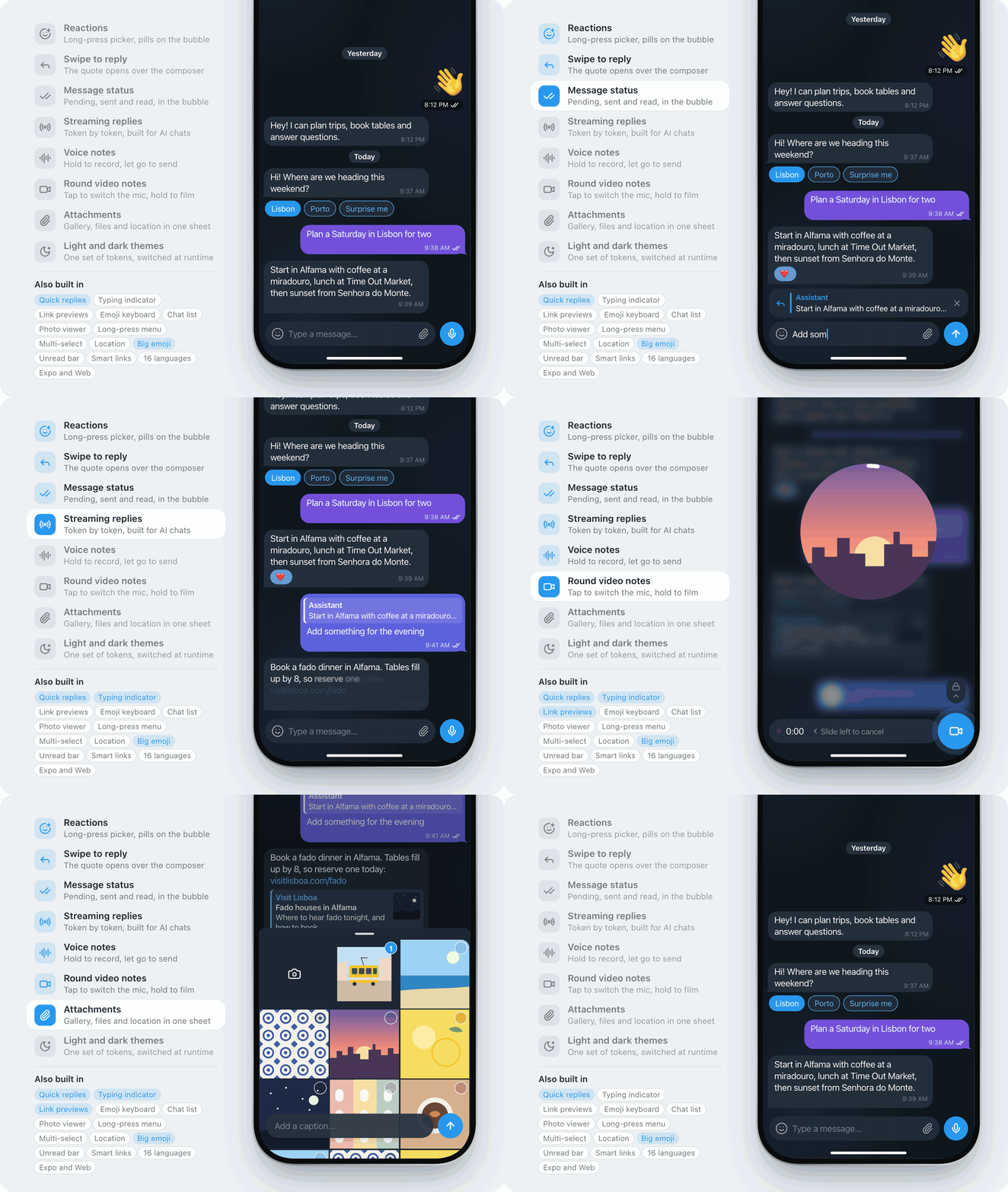
- 💬 Chat list - the list of chats with search, selection actions, archive, swipe to archive and draggable pinned chats; plug in your backend
- 🌗 Dark mode & theming - full light/dark token system, switchable at runtime
- 🤖 Streaming AI messages - token-by-token replies with a typing caret and stop control
- 😀 Emoji reactions - long-press picker and reaction pills
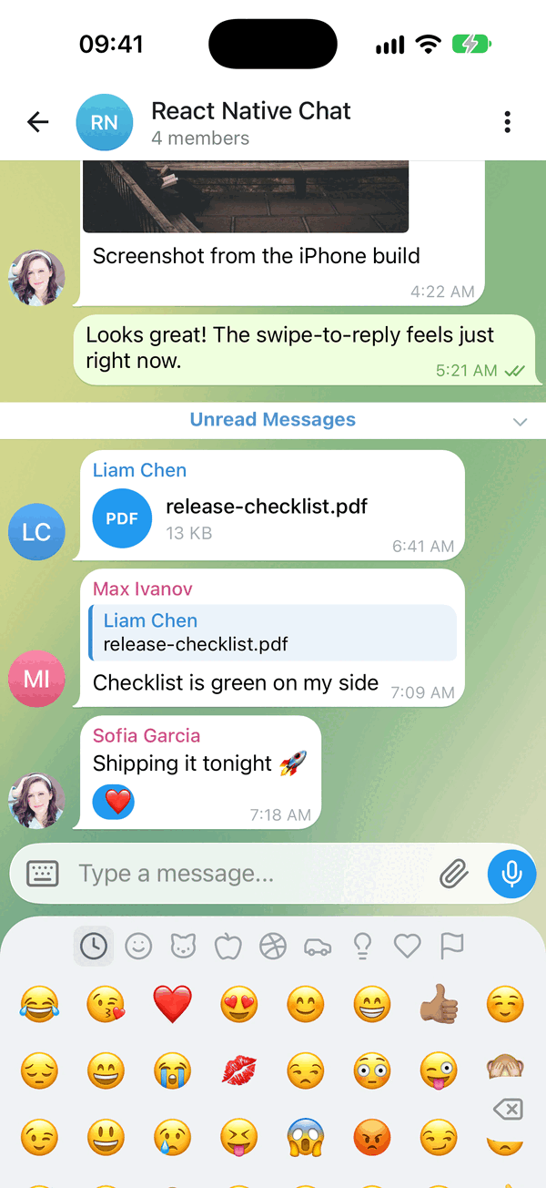
- ⌨️ Emoji keyboard - a full emoji panel in the keyboard's place, with search, recents and skin tones
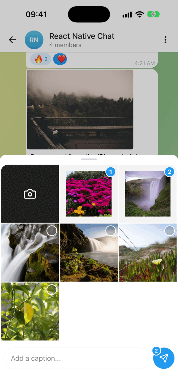
- 📎 Attachment menu - photo grid with numbered selection and a caption, files and location
- 🎥 Video & audio messages - real inline playback, with a tappable fallback
- 🖼️ Photo viewer - tap a photo, then swipe through every photo in the chat; pinch or double-tap to zoom
- 🎙️ Voice & video recording - hold-to-record voice and round video notes, on once their peers are installed
- 👋 Empty chat greeting - a "No messages here yet..." card with a tap-to-send 👋
- 😍 Big emoji - emoji-only messages drop the bubble and draw large
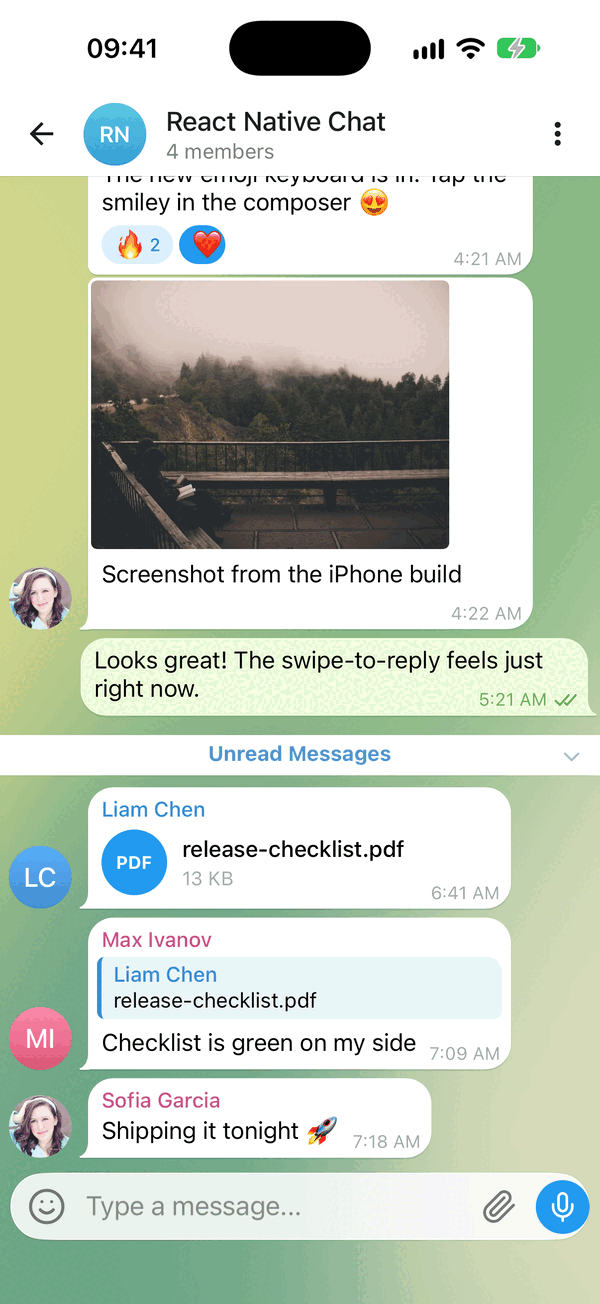
- 🔵 Unread bar - "Unread Messages" above the first unread message, opened scrolled to it
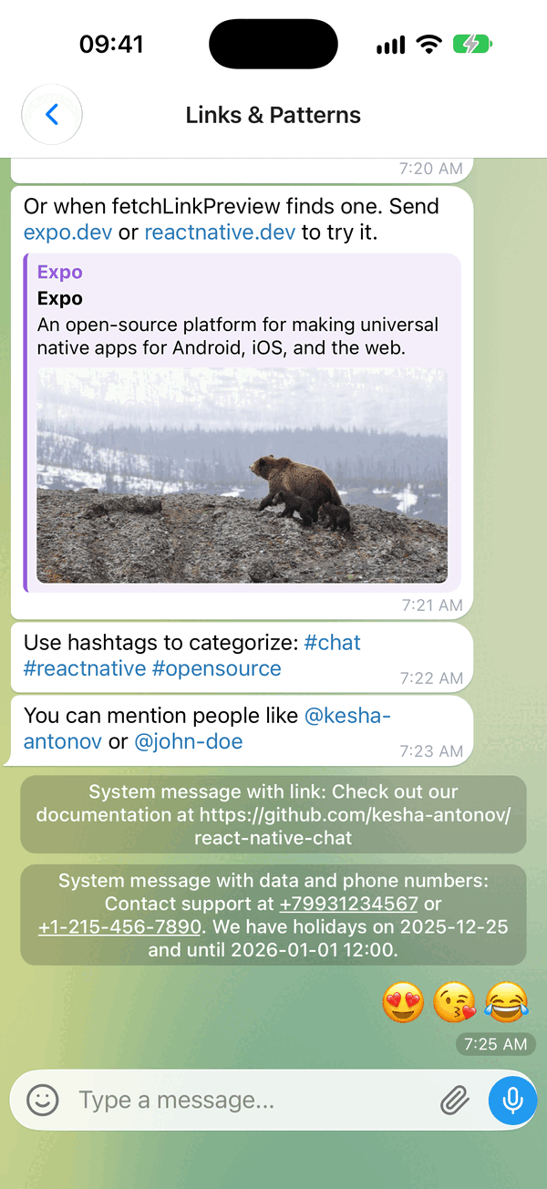
- 🔗 Link previews - a web page block under the text
- ☑️ Multi-select - "Select" in the long-press menu: check circles, Copy / Forward / Delete bar
- 📍 Location messages - map card that opens the system maps app
- ↩️ Swipe to reply - reply preview and message threading
- 📋 Long-press actions - a context menu beside the finger, with a reactions bar
- ⚡ Quick replies - bot-style reply buttons
- 🔗 Smart link parsing - URLs, emails, phones, hashtags, mentions
- 👤 Avatars - user initials or custom images
- ✍️ Typing indicator - show when someone is typing
- ⏮️ Load earlier messages - pagination and infinite scroll
- ⬇️ Scroll to bottom - quick jump back to the latest
- ✅ Message status - ticks for sent, delivered and read
- 💬 System messages - in-line notifications
- 🌍 Localized dates & i18n - Day.js dates, translated UI strings
- ⌨️ Keyboard handling - smart avoidance on every platform
- 🎨 Fully customizable - override any component with your own
- 📱 Expo & 🌐 Web - works with Expo and react-native-web
- 📝 TypeScript - complete definitions, generic over your message type
Actively maintained, New Architecture ready, built for the latest Reanimated / Gesture Handler.
🆕 What's new vs react-native-gifted-chat
Kept in sync with upstream react-native-gifted-chat's latest master, so you keep everything it already has - and the same IMessage model and prop names. Everything added here is non-breaking and opt-in; the media and recording features only activate once you install their optional peer deps.
Side-by-side comparison
| Added in this fork | react-native-gifted-chat | @kesha-antonov/react-native-chat |
|---|---|---|
| Active maintenance | 💤 sporadic | ✅ active |
| Modern default UI (modern messenger look) | dated 2020 look | ✅ wallpaper, tails, inline time, fully overridable |
| Light/Dark theme system | per-component color props | ✅ theme / darkTheme tokens, runtime switch |
| Streaming (AI) messages | ❌ | ✅ token-by-token + typing cursor |
| Emoji reactions | ❌ | ✅ long-press picker + reaction pills |
| Emoji keyboard | ❌ | ✅ built in: tabs, search, recents, skin tones |
| Attachment menu | ❌ (actions sheet) |
✅ built in: photo grid + caption, files, location |
| File messages | ❌ | ✅ IMessage.file document bubble |
| Swipe-to-reply + reply preview | ❌ | ✅ built in |
| Video / audio messages | "not implemented, render your own" | ✅ inline players + tappable fallback |
| Voice notes (hold-to-record + waveform) | ❌ | ✅ optional |
| Video messages (round camera notes) | ❌ | ✅ optional |
| Location messages | ❌ ignored | ✅ map card → opens system maps |
| Bubble tails, inline time + run grouping | flat bubbles | ✅ |
Theming in one line
Override any token, light and dark
// Modern defaults out of the box, or override any token (light + dark):
<Chat
  theme={{ colors: { accent: '#3390EC', outgoingBubble: '#EFFEDE' } }}
  darkTheme={{ colors: { background: '#0E1621' } }}
  {...props}
/>
Voice, video and location
Recording and media playback
Voice notes (expo-audio) and round video notes (react-native-vision-camera) turn on by themselves once their peers are installed: the mic button records on hold, and a tap switches it to the camera. Pass false to turn either off.
<Chat
  videoRecording={{ maxDuration: 30 }}   // optional: configure; `false` turns round notes off
  mediaPlayback={{ playbackRate: 1.5 }}  // optional: start notes at 1.5x, auto-play the next note
  // location messages render automatically for any IMessage with a `location`
  {...props}
/>
# Optional inline media playback + recording:
npx expo install expo-video expo-audio expo-image-picker
# Optional: round video notes and the voice-note waveform
# (vision-camera 5+, which runs on Nitro and needs its two Nitro packages too)
npx expo install react-native-vision-camera react-native-nitro-modules react-native-nitro-image react-native-audio-api react-native-svg expo-haptics
# Optional: trim paused voice takes, blur behind the round-video camera
npx expo install expo-file-system expo-blur
Recording and playback work like this:
- Hold the record button to record, release to send. With both voice and video enabled, a tap switches it between mic and camera, and the choice is remembered. With only video, the camera sits in the record button's place.
- Slide left to cancel: all the way across cancels at once; releasing past about half the way cancels too. Slide up to lock and keep recording hands-free. The two exclude each other: no lock once the cancel slide is under way. "Slide up to lock" is shown for the first few takes.
- Locked, the bar shows a
m:ss,ttimer and a CANCEL button, and the lock turns into a pause button. - A paused voice take turns into a preview: its waveform with play, to send or delete. The mic above send resumes recording onto its end, and the handles at either end of the waveform trim it. Resuming needs
react-native-audio-api; trimming also needsexpo-file-system, and a trimmed take is sent as a WAV. - A paused round video take holds the recording open: the circle shows the frame it paused on (Android; iOS keeps the live camera, dimmed), the bar offers delete and send, and the camera above send resumes into the same video. Round takes can't be trimmed.
- A round note records on the first hold, with the camera drawn over a blurred chat (when
expo-bluris installed). Switch camera and flash work while recording (the screen lights up for the front camera, the torch for the back one), and you can pinch to zoom. At its 60s limit the take stops into a looping preview (tap to hear it) instead of sending. - Haptic ticks on start, stop, lock and mode switch when
expo-hapticsis installed. - Starting a recording pauses any note that is playing.
- Only one note plays at a time. When a voice or round video note plays to its end, the next newer one in the chat starts.
- While a note plays or is paused, a "now playing" bar at the top of the chat has play/pause, the sender, the speed (1x / 1.5x / 2x; long-press for more, shared by every note) and close; a tap on the title scrolls to the note.
- Round notes rest in the list on their first frame with a play button (or loop silently with
isRoundVideoAutoplayEnabled). A tap plays one from the start with sound and grows it, hiding the sender's avatar; a tap pauses it, and a paused note can be scrubbed by dragging around its ring. Its length, in a pill at its bottom-left, counts down while it plays, and playing bars replace its unread dot once it is heard. - Set
isMediaUnreadon a message for the unread dot;mediaPlayback.onMediaReadreports when an incoming one is played.
Emoji keyboard and attachment menu
Built in, on by default
The composer's emoji button opens the built-in emoji keyboard in the system keyboard's place - at the last keyboard height, so switching between the two keeps the composer still. It has the category tabs, search (scroll the grid up to reveal it), recents by use count, a skin-tone popup on long-press and a repeating backspace. A tap inserts at the caret whether or not you control text.
The paperclip opens the built-in attachment menu: your newest photos in a 3-column grid (with expo-media-library), numbered as you pick them, a caption and a "Send N" button; File and Location tabs; a camera tile. Picks arrive in onSend as ordinary messages - image, video, file ({ uri, name, size?, mimeType? }) or location - so there is nothing to wire.
# Each tab shows only when its package is installed:
npx expo install expo-media-library expo-image-picker expo-document-picker expo-location
# Optional: keep emoji recents across launches, share received files, fast ph:// thumbnails
npx expo install @react-native-async-storage/async-storage expo-sharing expo-image
<Chat
  emojiKeyboard={{ columns: 8, recents: { storageKey: 'my-app/emoji' } }}
  attachments={{
    tabs: ['gallery', 'file'],
    // Upload first, then send what your backend returns (or `null` to send nothing).
    onPick: async (picked, { caption }) => upload(picked, caption),
  }}
  {...props}
/>
Hide either with emojiKeyboard={false} / attachments={false}. onPressEmoji replaces the emoji keyboard and actions / onPressActionButton / renderActions replace the attachment menu, as before.
Permissions. iOS kills an app that asks for a permission without a usage string. In Expo, list the plugins with your own strings (the defaults are generic):
"plugins": [
  ["expo-image-picker", { "photosPermission": "...", "cameraPermission": "..." }],
  ["expo-media-library", { "photosPermission": "...", "savePhotosPermission": "...", "granularPermissions": ["photo", "video"] }],
  ["expo-location", { "locationWhenInUsePermission": "..." }],
  "expo-document-picker",
  "expo-sharing"
]
In a bare app add the keys yourself, then rebuild the native app:
| Package | iOS Info.plist |
Android manifest |
|---|---|---|
expo-media-library |
NSPhotoLibraryUsageDescription (NSPhotoLibraryAddUsageDescription to save) |
READ_MEDIA_IMAGES, READ_MEDIA_VIDEO (READ_EXTERNAL_STORAGE below Android 13) |
expo-image-picker |
NSPhotoLibraryUsageDescription, NSCameraUsageDescription (NSMicrophoneUsageDescription for video) |
CAMERA (and RECORD_AUDIO for video) |
expo-location |
NSLocationWhenInUseUsageDescription |
ACCESS_COARSE_LOCATION, ACCESS_FINE_LOCATION |
expo-document-picker |
none (iCloud documents need the iCloud entitlement) | none |
expo-sharing |
none | none |
Custom icons (e.g. Lucide)
Override any built-in icon
Built-in icons are the official Lucide glyphs, rendered via the optional react-native-svg peer when it is installed, or drawn with Views (no dependency) otherwise. Override any of them via the icons prop - the built-in icon is used for anything you don't override:
import { Send, Mic } from 'lucide-react-native'

<Chat
  icons={{
    send: ({ color, size }) => <Send color={color} size={size} />,
    mic:  ({ color, size }) => <Mic color={color} size={size} />,
  }}
  {...props}
/>
Overridable names: send, mic, camera, play, pause, check, checkAll, clock, pin, plus, close, chevronLeft, chevronDown, emoji, paperclip, reply, pencil, lock, trash.
Support This Project
I maintain this project in my free time with no compensation. If you find it useful and want to help keep it alive, please consider sponsoring. Your support means a lot! 💖

Using an AI coding agent?
llms.txtis a condensed integration guide for agents adding this library to an app, andAGENTS.mdcovers working inside this repository.
📖 Table of Contents
- Quick start
- Features
- What's new vs react-native-gifted-chat
- Requirements
- Installation
- Migrating from react-native-gifted-chat
- Usage
- Data Structure
- Props Reference
- Guides
- Platform Notes
- Performance
- Testing
- Example App
- Troubleshooting
- Contributing
- Authors
- License
📋 Requirements
| React Native | React | iOS | Android | Expo | TypeScript |
|---|---|---|---|---|---|
| >= 0.82.0 | >= 19 | >= 15.1 | API 24+ (7.0) | SDK 55+ | >= 5.0 (optional) |
The floor comes from react-native-gesture-handler 3, which the library is built on (3.0+ is required; it supports React Native 0.82 and newer). The example app runs Expo SDK 58 with React Native 0.88.
📦 Installation
Expo Projects
npx expo install @kesha-antonov/react-native-chat react-native-reanimated react-native-gesture-handler react-native-safe-area-context react-native-keyboard-controller
Bare React Native Projects
Three steps
1. Install the packages. Reanimated 4 also needs react-native-worklets; leave it out on Reanimated 3:
yarn add @kesha-antonov/react-native-chat react-native-reanimated react-native-worklets react-native-gesture-handler react-native-safe-area-context react-native-keyboard-controller
npm install --save @kesha-antonov/react-native-chat react-native-reanimated react-native-worklets react-native-gesture-handler react-native-safe-area-context react-native-keyboard-controller
2. Add the worklets Babel plugin as the last entry in babel.config.js - react-native-worklets/plugin on Reanimated 4, react-native-reanimated/plugin on Reanimated 3 - following the react-native-reanimated installation guide.
3. Install iOS pods, then rebuild the native app (npx react-native run-ios / run-android) and restart Metro with --reset-cache. every peer above ships native code, so reloading the JS bundle alone is not enough:
npx pod-install
Optional peers
Every feature below turns itself on when its package is installed and stays hidden when it is not - there is nothing to configure. getChatCapabilities() reports what the current install can do, e.g. to build UI that matches the chat's. In development, a feature that was asked for but cannot work (say audioRecording={{ isEnabled: true }} without expo-audio) logs one hint.
| Package | Feature | getChatCapabilities() key |
|---|---|---|
expo-clipboard or @react-native-clipboard/clipboard |
"Copy" in the long-press menu | clipboard |
expo-haptics |
Haptic ticks (long-press, swipe-to-reply, recording) | haptics |
expo-blur |
Blurred backdrop behind the menu and the round video recorder | blur |
react-native-svg |
Lucide icons and vector rings | svg |
expo-audio |
Voice playback and hold-to-record voice notes | audioPlayback, voiceRecording |
react-native-audio-api |
Voice waveforms, resume and trim | waveform |
expo-video |
Inline video and round video notes | videoPlayback |
react-native-vision-camera 5 |
In-chat round video capture | roundVideoCapture |
expo-image-picker |
System camera fallback for video notes | videoRecording |
react-native-streamdown |
Rich streaming markdown | markdown |
@lodev09/react-native-true-sheet |
Native attachment sheet | nativeSheet |
expo-media-library |
The attachment menu's photo grid | mediaLibrary |
expo-image-picker |
The attachment menu's system photo picker and camera | imagePicker |
expo-document-picker |
The attachment menu's File tab | documentPicker |
expo-location |
The attachment menu's Location tab | location |
expo-sharing |
Opening a received file in the share sheet (otherwise Linking) |
sharing |
@react-native-async-storage/async-storage |
Emoji recents and skin tones kept across launches | persistentEmojiRecents |
expo-image |
Gallery thumbnails straight from the photo library | - |
🔄 Migrating from react-native-gifted-chat
The API, props, and IMessage model are unchanged - migrating is a package swap plus renaming the GiftedChat* identifiers. Full guide with a codemod: docs/MIGRATION.md.
What to rename
yarn remove react-native-gifted-chat
yarn add @kesha-antonov/react-native-chat
| react-native-gifted-chat | @kesha-antonov/react-native-chat |
|---|---|
react-native-gifted-chat |
@kesha-antonov/react-native-chat |
GiftedChat |
Chat |
GiftedAvatar |
ChatAvatar |
GiftedChatContext |
ChatContext |
IMessage, User, useChatContext, … |
unchanged |
🚀 Usage
Basic Example
See Quick start above for the minimal setup. More examples - Slack-style messages, quick replies, custom components - live in the example directory.
📊 Data Structure
Messages, system messages, and quick replies follow the structure defined in Models.ts.
Message object structure
interface IMessage {
  _id: string | number
  text: string
  createdAt: Date | number
  user: User
  image?: string
  /** Tiny stand-in drawn blurred under `image` until it loads: a small image uri, or a blurhash with expo-image */
  imagePlaceholder?: string
  video?: string
  /** Render `video` as a round video note */
  videoNote?: boolean
  audio?: string
  /** Length of `audio` / `video` in seconds */
  duration?: number
  /** The voice or round note has not been played by its recipient yet (unread dot) */
  isMediaUnread?: boolean
  /** View-once voice or round note: plays a single time, then `mediaPlayback.onViewOnceEnd` fires */
  isViewOnce?: boolean
  /** Transcribed text of a voice or round note, shown under it via the transcribe button */
  transcription?: string
  system?: boolean
  sent?: boolean
  received?: boolean
  pending?: boolean
  /** Sending failed: a red badge replaces the checks */
  isFailed?: boolean
  /** The message was edited: its time reads "edited 14:05" */
  isEdited?: boolean
  editedAt?: Date | number
  /** True while the text is still streaming in (shows a typing cursor) */
  streaming?: boolean
  /** Media uploading or downloading: a progress ring with a cancel ✕ ({ type: 'upload' | 'download', progress?, totalBytes? }) */
  transfer?: MediaTransfer
  /** Media not fetched by itself: a download arrow, which calls `mediaTransfer.onDownload` */
  isDownloadRequired?: boolean
  /** A voice note's waveform from the server (0..1, or 0..31 integers), drawn before the audio downloads */
  waveform?: number[]
  quickReplies?: QuickReplies
  replyMessage?: ReplyMessage
  reactions?: MessageReaction[]
  location?: {
    latitude: number
    longitude: number
  }
  /** A document: a file bubble (icon, name, size); a tap opens it */
  file?: {
    uri: string
    name: string
    size?: number
    mimeType?: string
  }
  /** A web page preview under the text (or fetched via `fetchLinkPreview`); `null` hides it */
  linkPreview?: {
    url?: string
    siteName?: string
    title?: string
    description?: string
    image?: string
    imageWidth?: number
    imageHeight?: number
    imageSize?: 'large' | 'small'
  } | null
}

interface ReplyMessage {
  _id: string | number
  text: string
  user: User
  image?: string
  audio?: string
}

interface MessageReaction {
  emoji: string
  userIds: (string | number)[]
}

interface User {
  _id: string | number
  name?: string
  avatar?: string | number | (() => React.ReactNode)
}
📖 Props Reference
Every group below is collapsed - open the one you need.
Core configuration, refs & theming
Core Configuration
messages(Array) - Messages to displayuser(Object) - User sending the messages:{ _id, name, avatar }onSend(Function) - Callback when sending a messagemessageIdGenerator(Function) - Generate an id for new messages. Defaults to a simple random string generator.locale(String) - Locale to localize the dates. You need first to import the locale you need (ie.require('dayjs/locale/de')orimport 'dayjs/locale/fr')colorScheme('light' | 'dark') - Force color scheme (light/dark mode). When set to'light'or'dark', it overrides the system color scheme. Whenundefined, it uses the system color scheme. Default isundefined.theme(Object) - Override the default light theme tokens (colors/radii/spacing/typography/avatar/sendButton/composer/voice/bubble/wallpaper/nameColors). Deep-merged overdefaultLightTheme; any subset is allowed. See Theming & Dark Mode.renderWallpaper(Function | null) - The chat background. By defaultChatdraws a swirl gradient fromtheme.wallpaper, turning one step per message you send. Return your own element (an image,ChatWallpaperwith other props...) to replace it, or passnullfor the plaintheme.colors.background.darkTheme(Object) - Same astheme, applied when the resolved color scheme is dark (deep-merged overdefaultDarkTheme).icons(Object) - Icon override registry. Supply a render function for any built-in icon to replace it (e.g. withlucide-react-native). See Custom icons.labels(Object) - Override any UI string. See Localization (i18n).
Refs
messagesContainerRef(LegendListRef) - Ref to the message list, a Legend List ref:scrollToEnd,scrollToKey(keys are message_ids as strings),scrollToIndex,getState. Indexes count from the oldest messagetextInputRef(TextInput ref) - Ref to the text inputchatRef(ChatHandleref) -chatRef.current.scrollToMessage(id, { animated, viewPosition, isHighlighted })scrolls to a message, also one far up the history, and withisHighlightedflashes it the way a tapped quote does. For a search result or a deep link
Keyboard & layout
Keyboard & Layout
bottomInset(Number) - The composer's space for the home indicator; measured by default. Pass it when the host already knows it, e.g. a chat inside a sliding panel whose own inset arrives late. It is still given up while the keyboard or the emoji panel covers itkeyboardProviderProps(Object) - Props to be passed to theKeyboardProviderfor keyboard handling. No defaults are applied - in particular Chat does not setstatusBarTranslucent/navigationBarTranslucent, because on Android those change the activity window and the change outlives the chat screen (#2755).react-native-keyboard-controllerturns them on by itself when the app is genuinely edge-to-edge, so there is nothing to set in a normal app.Only used when Chat mounts the provider itself. If your app already mounts a
KeyboardProvider(the setupreact-native-keyboard-controllerrecommends - once, at the root), Chat detects it and reuses it instead of nesting a second one, and this prop is ignored. Configure the provider where you mount it.enableKeyboardProvider(Bool) - Render the built-inKeyboardProvider; default istrue. You do not need to turn this off just because your app mounts its own provider - that case is detected and reused. Set it tofalseonly to opt out completely, e.g. when the provider's edge-to-edge behavior causes layout shift or a header jump on Android/Expo.enableGestureHandlerRootView(Bool) - Render theGestureHandlerRootViewChat mounts around itself; default istrue. UnlikeKeyboardProvider, an existing one can't be auto-detected -react-native-gesture-handlerdoesn't expose that publicly - so set this tofalseyourself if your app (or a library it uses, e.g. a bottom sheet) already mounts one at the root. Nesting a second one changes the native view hierarchy around the composer, which has been observed to make a rare Fabric/Yoga layout assertion on iOS more likely, especially when Chat is mounted and unmounted while the keyboard is open (#17).keyboardAvoidingViewProps(Object) - Props to be passed to theKeyboardAvoidingView. See keyboardVerticalOffset below for proper keyboard handling.isAlignedTop(boolean | 'auto') - Where the bubbles sit while the whole conversation fits on screen; once it is taller than the list this has no effect.false(default) keeps the usual bottom-anchored chat,truepins the messages to the top, and'auto'pins them to the top while the keyboard is closed and re-anchors them to the bottom while it is open - so a short conversation starts under the header and moves above the keyboard when the composer is focused (#2736). Works with eitherisInvertedsetting.isInverted(Bool) - Reverses display order ofmessages; default istrue
Understanding keyboardVerticalOffset
keyboardVerticalOffset tells the KeyboardAvoidingView how far down the screen its container starts. That distance depends on the navigation header and on anything else you render above the chat.
You do not normally need to set it. Chat measures its own position on screen and uses that, so the input toolbar sits on the keyboard whether the chat is full-screen or under a navigation header. The measurement comes from the SafeAreaProvider frame and updates on rotation and layout changes.
Pass your own value only to add extra space above the keyboard - it replaces the measured one:
<Chat keyboardAvoidingViewProps={{ keyboardVerticalOffset: headerHeight + 16 }} />
If you do, sanity-check it on device: a toolbar behind the keyboard means the value is too small, a gap above the keyboard means it is too large. useHeaderHeight() is the usual source, but some navigator setups report a value that does not match the header you actually render.
Upgrading from 4.1.0 or earlier: the default used to be
insets.top, which could not account for a navigation header - so most apps passeduseHeaderHeight()to compensate. That is no longer needed; drop it and let Chat measure, or the toolbar will float above the keyboard by the header height.
Text input, composer & actions
Text Input & Composer
text(String) - Input text; default isundefined, but if specified, it will override Chat's internal state. Useful for managing text state outside of Chat (e.g. with Redux). Don't forget to implementtextInputProps.onChangeTextto update the text state.initialText(String) - Initial text to display in the input fieldonDraftChange(Function) -(draft: string) => void, the user's unsent text as it changes (''once sent). Editing a message sets the draft aside and brings it back afterwards, without reporting the edited text. Save it with the chat and pass it back asinitialTextisSendButtonAlwaysVisible(Bool) - Always show send button in input text composer, disabled while there is nothing to send. By default it shows only with text when voice or video notes can be recorded (their button takes the slot while the composer is empty), and always when neither canisTextOptional(Bool) - Allow sending messages without text (useful for media-only messages); defaultfalse. Use withisSendButtonAlwaysVisiblefor media attachments.isMultiline(Bool) - Whether the composer accepts multiple lines; defaulttrue. Withtruethe return key inserts a newline and you send with the send button. Setfalsefor a single-line composer whose return key sends the message (the keyboard's return key becomes "send" and stays open afterwards).renderInputToolbar(Component | Function) - Custom message composer containerrenderComposer(Component | Function) - Custom text input message composerrenderSend(Component | Function) - Custom send button; you can pass children to the originalSendcomponent quite easily, for example, to use a custom icon (example)renderActions(Component | Function) - Custom action button on the left of the message composerrenderAccessory(Component | Function) - Custom second line of actions below the message composeremojiKeyboard(Bool | Object) - The built-in emoji keyboard behind the composer's emoji button, on by default. It opens in the system keyboard's place at the last keyboard height (200 + the bottom inset before a keyboard was seen) and inserts at the caret, whether or not you controltext.falsehides the emoji button. An object configures it:{ isEnabled?, columns?, categories?, recents?, isSearchEnabled?, renderEmojiKeyboard? }-columnsfixes the column count (default: as many 45pt columns as fit);categoriespicks and orders the tabs ('smileys' | 'animals' | 'food' | 'activities' | 'travel' | 'objects' | 'symbols' | 'flags');recentsisfalseor{ isEnabled?, storageKey?, isPersisted? }(persisted through@react-native-async-storage/async-storagewhen installed);isSearchEnabled(defaulttrue);renderEmojiKeyboard({ onSelect, onBackspace, onClose, height, bottomInset })draws your own keyboard in the panel. Colors and sizes live intheme.emojiKeyboard.onPressEmoji(Function) - Called when the emoji button is pressed, instead of opening the built-in emoji keyboard. Passing it shows the button even withemojiKeyboard={false}.audioRecording(Bool | Object) - Hold-to-record voice notes, on by default whenexpo-audiois installed;false(or{ isEnabled: false }) turns them off. An object configures them:{ isEnabled?, minDurationMs?, maxDurationMs?, isViewOnceEnabled?, onPermissionDenied?, onTooShort?, onError? }.isViewOnceEnabledshows a view-once toggle above the pause button while a take is locked or paused; a take sent with it on reachesonSendwithisViewOnce: true.minDurationMs(default 700) drops takes that long or shorter and callsonTooShort;maxDurationMs(default 600000) sends the take when reached. Requires the optionalexpo-audiopeer (andreact-native-audio-apifor the playback waveform); the mic button is hidden when it is absent. A paused take can be resumed whenreact-native-audio-apiis installed with FFmpeg (the M4A recordings are joined without re-encoding), and trimmed whenexpo-file-systemis installed too; a trimmed take reachesonSendas a 16-bit mono WAV at 24kHz, an untrimmed one as the recorder's M4A.videoRecording(Bool | Object) - Round video notes, on by default whenreact-native-vision-camerais installed;false(or{ isEnabled: false }) turns them off.true/{ isEnabled: true }also offers the system-camera fallback below when vision-camera is missing. An object configures them:{ isEnabled?, maxDuration?, minDurationMs?, isViewOnceEnabled?, onPermissionDenied?, onTooShort?, onError? }.maxDurationis in seconds (default 60);minDurationMs(default 800) drops shorter takes and callsonTooShort;isViewOnceEnabledworks as inaudioRecording, for round notes recorded with vision-camera. Withreact-native-vision-camera5 or newer linked (plus itsreact-native-nitro-modulesandreact-native-nitro-imagepeers; it has no Expo config plugin, so addNSCameraUsageDescription/NSMicrophoneUsageDescriptionand theCAMERA/RECORD_AUDIOpermissions yourself), the record button records a note on the first hold - shared with voice notes when both are enabled, on its own otherwise. ReachingmaxDurationstops into a preview (sends directly withoutexpo-video). Without vision-camera it falls back toexpo-image-picker's system camera, which sends a plain (non-round) video.mediaPlayback(Object) - How voice and round video notes play.{ isAutoPlayNextEnabled?, playbackRate?, onPlaybackRateChange?, isRoundVideoAutoplayEnabled?, isNowPlayingBarEnabled?, isFloatingRoundNoteEnabled?, onMediaRead?, isNearEar?, onTranscribe?, onViewOnceEnd? }.isNowPlayingBarEnabled(defaulttrue) shows a "now playing" bar at the top of the chat while a note plays or is paused.isFloatingRoundNoteEnabled(defaulttrue) keeps a round note that is playing or paused going in a small draggable circle over the list once its row scrolls out of view; set it tofalseto stop the note with its row instead.isAutoPlayNextEnabled(defaulttrue) starts the next newer voice or round note in the chat when one plays to its end. The playback speed is shared by every note;playbackRatesets it, andonPlaybackRateChangereports changes so the app can keep the speed across launches.isRoundVideoAutoplayEnabled(defaultfalse) loops round notes silently in the list instead of holding their first frame.onMediaRead(message)is called when an incoming note withisMediaUnreadstarts playing, so the app can mark it listened.isNearEaris raise to listen: feed it from the app's proximity sensor, and while it istruethe current voice or round note plays through the earpiece (restarting if it was under a second in); when it goes back tofalsethe note pauses and the speaker route returns.onTranscribe(message)shows a transcribe button on voice notes and beside round notes; tapping it calls this, shows a loading outline until the app setsmessage.transcription, then opens the text under the waveform, or in a bubble under the round note (tap again to collapse or expand).onViewOnceEnd(message)is called once a view-once note (isViewOnce) has played to its end or been stopped after starting, so the app can remove it. A view-once round note carries the "1" marker on its play button, never autoplays or floats, and cannot be scrubbed.textInputProps(Object) - props to be passed to the<TextInput>.
Composer height - there are no height props. The composer starts one line tall and grows with its content. Constrain it through
textInputProps.style(e.g.{ maxHeight: 120 }), which is applied after the measured height and wins.
Actions & Action Sheet
attachments(Bool | Object) - The built-in attachment menu behind the composer's paperclip, on by default; the paperclip shows when at least one tab's peer is installed. Tabs:gallery(an in-sheet grid withexpo-media-library, the system picker withexpo-image-pickerotherwise),camera(expo-image-picker; a tab of its own only without the grid, which has a camera tile),file(expo-document-picker) andlocation(expo-location). Picks are sent throughonSend: oneimage/videomessage per photo or video with the caption on the first, afilemessage per document, alocationmessage.falsehides the paperclip. An object configures it:{ isEnabled?, tabs?, pickers?, onPick?, renderAttachmentMenu? }-tabspicks and orders them;pickers({ gallery?, camera?, file? }, each anasync () => PickedAttachment[]that returns[]on cancel) replaces the Expo pickers with your own, for an app that picks with other libraries, and shows that tab without its Expo peer;isGalleryGridEnabled: falseleaves Gallery to the system picker instead of the in-sheet grid, for an app without Android'sREAD_MEDIA_IMAGES/READ_MEDIA_VIDEO;onPick(attachments, { caption })intercepts the picks (PickedAttachment[]) and returns the messages to send,nullto send nothing, or nothing for the default;renderAttachmentMenu({ visible, onClose, tabs, onSend })draws your own menu. Colors live intheme.attachments.actions,onPressActionButtonandrenderActionstake precedence. See Emoji keyboard and attachment menu for the permissions each peer needs.actions(Array) - Action options for the composer "+" button. Array of{ title, action }; addicon(and optionalcolor) to an action to render an attachment grid (tiles) instead of a list. Opens the built-in themedAttachmentSheet- no extra dependency.onPressActionButton(Function) - Callback when the "+" button is pressed (if set, the built-inAttachmentSheetis not shown)actionSheet(Function) - Escape hatch for a custom system action sheet. The bundled@expo/react-native-action-sheetdependency was removed, socontext.actionSheet()defaults to a no-op; pass your own implementation (withActionSheetProviderin your tree) if you relied on it.actionSheetOptionTintColor(String) - Tint color for action labels in the attachment sheet
Messages, container & bubbles
Messages & Message Container
messagesContainerStyle(Object) - Custom style for the messages containerrenderMessage(Component | Function) - Custom message containerrenderLoading(Component | Function) - Render a loading view while the chat measures its layout on mountisLoading(Boolean) - The history is loading. Over an empty list the chat shows a spinner in a service-colored circle (a 28 arc in a 36 circle, growing in from 0.3 over 150ms) in place of the empty-chat card. Messages already passed stay visible, without the spinnermediaTransfer(Object) - Handlers for the media transfer buttons.{ onDownload?, onCancel? }. A message withtransfer: { type, progress?, totalBytes? }draws the progress ring with a cancel ✕ over its photo, video, file, voice or round note (with "1.2 MB / 4.5 MB" whentotalBytesor the file size is known); tapping it callsonCancel(message). A message withisDownloadRequireddraws the download arrow; tapping it callsonDownload(message). WithoutonDownload, a voice note or photo then fetches itself. Remote voice notes, photos and round notes that need no app handling show the same ring while they load, from the request's own progressrenderChatEmpty(Function | null) - What to show while there are no messages. By default a greeting card: "No messages here yet...", a line of help and a big 👋 that sends itself when tapped, centered over the wallpaper. Return your own element to replace it, or passnullfor nothing. The card is exported asChatEmpty.emptyChatGreeting(String | null) - The greeting on the empty-chat card, sent as a message when tapped; default'👋'.nullkeeps just the title.firstUnreadMessageId(String | Number | null) - The first message the user has not read. A full-width "Unread Messages" bar is drawn above it and the chat opens scrolled so the bar is at the top. Keep it fixed while the chat is open (the bar stays until you leave), e.g. computed once from the unread count when the screen mounts.renderUnreadSeparator(Function | null) - Custom "Unread Messages" bar, ornullto only scroll to the first unread message. The default is exported asUnreadSeparator.renderChatFooter(Component | Function) - Custom component to render below the MessagesContainer (separate from the ListView)listProps(Object) - Extra props for the message list, anAnimatedLegendList(e.g.drawDistance,maintainScrollAtEnd,onViewableItemsChanged). The list renders oldest first, not inverted, soonEndReachedfires at the newest message. Handlers the list uses itself (onScrollBeginDrag/onScrollEndDrag,onMomentumScrollBegin/onMomentumScrollEnd,onContentSizeChange,onItemSizeChanged,onMetricsChange,onLayout, the viewability callbacks) run after its own, andcontentContainerStylegoes on top of its padding.
Message Bubbles & Content
renderBubble(Component | Function(props: BubbleProps)) - Custom message bubble. Receives BubbleProps as parameter.renderMessageText(Component | Function) - Custom message textrenderMessageImage(Component | Function) - Custom message image. The built-in one opens the photo viewer on tap: it pages through every photo in the chat, oldest first, with a "3 of 12" counter, the caption, sender and date; pinch or double-tap zooms, and a swipe up or down closes itrenderMessageVideo(Component | Function) - Custom message videorenderMessageAudio(Component | Function) - Custom message audiorenderMessageLocation(Component | Function) - Custom renderer forIMessage.location; defaults to a map card that opens the system maps app on taprenderMessageFile(Component | Function) - Custom renderer forIMessage.file; defaults to a document bubble (a circle with the extension, the name, the size) that opens the file in the share sheet (expo-sharing) or throughLinkingon tapmessageActions(Array | Function(message,defaults)) - Long-press context menu actions. Each item is{ key?, label, icon?, onPress, destructive? }. An array replaces the built-in actions; a function receives the message and the built-in actions for it and returns what to show, so you can extend, filter or reorder them. See Message actions.defaultMessageActions(Bool |MessageActionKey[]) - The built-in actions, in this order:reply,copy,forward,pin,edit,select,delete. Defaulttrue(all that can work); an array picks and orders them;falseturns them off. Each shows only when it can work: Reply whenreply.isEnabledis notfalse; Copy for messages with text whenexpo-clipboardor@react-native-clipboard/clipboardis installed; Edit on your own text messages whenonEditMessageis set; Forward / Pin / Delete when their callbacks are set; Select when a selection can be acted on (a clipboard, Forward or Delete). They are also off whenonLongPressMessageis set andmessageActionsis not, so an app that handles long-press itself keeps doing so.onEditMessage(Function(message,text)) - Turns on the "Edit" action for your own text messages. Edit puts the text in the composer under an "Editing" banner; sending then calls this instead ofonSend. Closing the banner cancels the edit.onDeleteMessage(Function(message)) - Turns on the "Delete" action (not red).onRetryMessage(Function(message)) - Turns on "Retry" for your own messages that failed to send (isFailed), first in their menu above Delete, whateverdefaultMessageActionslists.highlightText(String) /highlightTextStyle(TextStyle) - Words to mark in every message's text, links included (case-insensitive), e.g. the query of a search in the chat; yellow behind black text by default.onForwardMessage(Function(message)) - Turns on the "Forward" action.onForwardMessages(Function(messages)) - Forwards the messages checked in selection mode, oldest first (also turns on "Forward"). Without it the selection bar's Forward callsonForwardMessageonce per message.onDeleteMessages(Function(messages)) - Deletes the messages checked in selection mode, oldest first (also turns on "Delete"). Without it the selection bar's Delete callsonDeleteMessageonce per message.onSelectionChange(Function(messages)) - Multi-select: "Select" in the long-press menu checks the message, a tap checks or unchecks others (check circles on the left, a tinted row), and a bar replaces the composer with the count, Copy (texts joined oldest first), Forward and Delete. Called on every change with the checked messages; with[]once it ends (the X, Android's back, or the last message unchecked).renderSelectionBar(Function({ count, actions, onClose, messages }) | null) - Custom bar in the composer's place while selecting, ornullto keep the composer and drive the selection from your own header throughonSelectionChange.fetchLinkPreview(Function(url) => Promise<LinkPreview| null>) - A web page preview (accent bar, site name, bold title, description, picture full width or as a 48dp thumbnail) is drawn under the text for any message withlinkPreviewdata. For messages without it, this fetches one for the first link in the text, e.g. from your server's Open Graph endpoint; each URL is fetched once per app run.IMessage.linkPreview: nullturns it off for one message.renderLinkPreview(Function({ preview, currentMessage, position, maxWidth, onPress }) | null) - Custom link preview, ornullto draw none. The default is exported asLinkPreviewCard.onPressLinkPreview(Function(preview,message)) - Called when a link preview is tapped, instead of opening its URL.onPinMessage(Function(message)) - Turns on the "Pin" action; it reads "Unpin" on a message withisPinned: true. ToggleisPinnedin the handler.renderCustomView(Component | Function) - Custom view inside the bubbleisCustomViewBottom(Bool) - Determine whether renderCustomView is displayed before or after the text, image and video views; default isfalseonPressMessage(Function(context,message)) - Callback when a message bubble is pressedonLongPressMessage(Function(context,message)) - Callback when a message bubble is long-pressed; you can use this to show action sheets (e.g., copy, delete, reply). Setting it (withoutmessageActions) turns the built-in long-press menu offisMessageGestureEnabled(Bool | Function(message)) - Whether the bubble itself is part of the row's tap / long-press surface thatreactionsandmessageActionsrely on; default istrue. Passfalse, or a predicate, for messages that render natively interactive content - the row beside the bubble stays pressable either way. See Interactive content inside bubbles.imageProps(Object) - Extra props to be passed to the<Image>component created by the defaultrenderMessageImageimageStyle(Object) - Custom style for message imagesvideoProps(Object) - Extra props to be passed to the video component created by the requiredrenderMessageVideomessageTextProps(Object) - Extra props to be passed to the MessageText component. Useful for customizing link parsing behavior, text styles, and matchers:matchers- Custom matchers for linking message content (like URLs, phone numbers, hashtags, mentions)linkStyle- Custom style for linksemail/phone/url- Enable/disable parsing (default: true)hashtag/mention- Enable/disable parsing (default: false)hashtagUrl/mentionUrl- Base URLs (e.g.'https://x.com/hashtag')stripPrefix- Strip 'http://' or 'https://' from URL display (default: false)TextComponent- Custom Text component to use (e.g., from react-native-gesture-handler)
A custom matcher, replacing the default phone linking with an action sheet:
<Chat
  messageTextProps={{
    phone: false, // Disable default phone number linking
    matchers: [
      {
        type: 'phone',
        pattern: /\+?[1-9][0-9\-\(\) ]{7,}[0-9]/g,
        getLinkUrl: (replacerArgs: ReplacerArgs): string => {
          return replacerArgs[0].replace(/[\-\(\) ]/g, '')
        },
        getLinkText: (replacerArgs: ReplacerArgs): string => {
          return replacerArgs[0]
        },
        style: styles.linkStyle,
        onPress: (match: CustomMatch) => {
          const url = match.getAnchorHref()

          const options: {
            title: string
            action?: () => void
          }[] = [
            { title: 'Copy', action: () => setStringAsync(url) },
            { title: 'Call', action: () => Linking.openURL(`tel:${url}`) },
            { title: 'Send SMS', action: () => Linking.openURL(`sms:${url}`) },
            { title: 'Cancel' },
          ]

          showActionSheetWithOptions({
            options: options.map(o => o.title),
            cancelButtonIndex: options.length - 1,
          }, (buttonIndex?: number) => {
            if (buttonIndex === undefined)
              return

            const option = options[buttonIndex]
            option.action?.()
          })
        },
      },
    ],
    linkStyle: { left: { color: 'blue' }, right: { color: 'lightblue' } },
  }}
/>
See the full example in LinksExample.
Avatars, username, date & time, system messages
Avatars
Avatars and sender names show in group chats only: a one-to-one chat has neither.
isGroupChat(Bool) - Whether this is a group chat; default is auto-detected (more than one other sender inmessagesmeans a group)isAvatarVisible(Bool) - Show avatars beside incoming messages; defaulttruein group chats,falsein one-to-one chats, andtruewheneverrenderAvataris a function. Passtrueto keep avatars in one-to-one chatsrenderAvatar(Component | Function) - Custom message avatar; set tonullto not render any avatar for the messageisUserAvatarVisible(Bool) - Whether to render an avatar for the current user; default isfalse, only show avatars for other usersisAvatarVisibleForEveryMessage(Bool) - When false, avatars will only be displayed when a consecutive message is from the same user on the same day; default isfalseonPressAvatar(Function(user)) - Callback when a message avatar is tappedonLongPressAvatar(Function(user)) - Callback when a message avatar is long-pressedisAvatarOnTop(Bool) - Render the message avatar at the top of consecutive messages, rather than the bottom; default isfalse
Username
isUsernameVisible(Bool) - Show the sender's name on the first message of each run of incoming messages; defaulttruein group chats andfalsein one-to-one chats (seeisGroupChat)renderUsername(Component | Function) - Custom Username container
Date & Time
timeFormat(String) - Format to use for rendering times; default is'LT'(see Day.js Format)dateFormat(String) - Format to use for rendering dates; default is'D MMMM'(see Day.js Format)dateFormatCalendar(Object) - Format to use for rendering relative times; default is{ sameDay: '[Today]' }(see Day.js Calendar)renderDay(Component | Function) - Custom day above a message. This is also how the day label is styled - it receivesDayProps(createdAt,dateFormat,dateFormatCalendar,containerStyle,wrapperStyle,textProps,isAnimated), so render the built-inDaywith the styles you want:import { Chat, Day, DayProps } from '@kesha-antonov/react-native-chat' <Chat renderDay={(props: DayProps) => ( <Day {...props} wrapperStyle={{ backgroundColor: '#eee' }} textProps={{ style: { color: '#333' } }} /> )} />isAnimatedistruefor the floating header that sticks to the top while scrolling andfalsefor the inline separators, so one function can style them differently.renderTime(Component | Function) - Custom time inside a messagetimeTextStyle(Object) - Custom text style for time inside messages (supports left/right styles)isDayAnimationEnabled(Bool) - Enable animated day label that appears on scroll; default istrue
System Messages
renderSystemMessage(Component | Function) - Custom system message
Load earlier, typing indicator, quick replies, scroll to bottom
Load Earlier Messages
loadEarlierMessagesProps(Object) - Props to pass to the LoadEarlierMessages component. The button is only visible whenisAvailableistrue:isAvailable- Controls button visibility (default: false)onPress- Callback when button is pressedisLoading- Shows a loading cell, a spinner in a 36 service circle, in place of the button (default: false)isInfiniteScrollEnabled- Enable infinite scroll up when reaching the top of messages container, automatically callsonPress(not yet supported for web). The list then ends in the loading cell instead of a button whileisAvailablelabel- Override the default "Load earlier messages" textcontainerStyle/wrapperStyle/textStyle- Custom styles for the buttonactivityIndicatorStyle- Custom style for the loading indicatoractivityIndicatorColor- Color of the spinner's arc (default: the date pill's text color)activityIndicatorSize- Deprecated and ignored: the spinner is a fixed 28 arc
renderLoadEarlier(Component | Function) - Custom "Load earlier messages" button
Typing Indicator
isTyping(Bool) - Typing Indicator state; defaultfalse. If you userenderFooterit will override this.renderTypingIndicator(Component | Function) - Custom typing indicator componenttypingIndicatorStyle(StyleProp) - Custom style for the TypingIndicator component.renderFooter(Component | Function) - Custom footer component on the ListView, e.g.'User is typing...'; see CustomizedRenderingExample.tsx for an example. Overrides default typing indicator that triggers whenisTypingis true; the indicator comes as the second argument,renderFooter(props, typingIndicator), to keep it next to your own footer.TypingStatus(Component) - The messenger way to show it: in your chat header, three dots that swell in turn before "typing" (waves for a recording, arrows for an upload).<TypingStatus users={typingUsers} action='recordingVoice' isGroup color={accent} />reads "typing", "Anna is typing", "Anna and Max are typing", "recording a voice message"...ChatListrows use it fortypingUsers/typingAction, andgetTypingTextgives the text alone
Quick Replies
See the quick replies example in messages.ts.
onQuickReply(Function) - Callback when sending a quick reply (to backend server)renderQuickReplies(Function) - Custom all quick reply viewquickReplyStyle(StyleProp) - Custom quick reply view stylequickReplyTextStyle(StyleProp) - Custom text style for quick reply buttonsquickReplyContainerStyle(StyleProp) - Custom container style for quick repliesrenderQuickReplySend(Function) - Custom quick reply send view
Scroll to Bottom
The button comes up after you scroll back towards the newest message by scrollToBottomOffset, or when a message arrives while you are away from the newest one, and goes away at the newest message (or after scrolling away again by the same distance, when scrolling brought it up). Messages that arrive while you are away are counted in a badge, which counts down as each one scrolls into view.
isScrollToBottomEnabled(Bool) - Show the scroll-to-bottom button; defaulttrue. Passingtrueexplicitly also keeps the older behaviour of a non-inverted list scrolling to its end on layoutisScrollToBottomBadgeEnabled(Bool) - Count new messages in a badge on the button; defaulttruescrollToBottomComponent(Function) - Custom Scroll To Bottom Component containerscrollToBottomOffset(Integer) - How far to scroll before the button shows or hides; default100scrollToBottomStyle(Object) - Custom style for Scroll To Bottom wrapper (position, bottom, right, etc.)scrollToBottomContentStyle(Object) - Custom style for Scroll To Bottom content (size, background, shadow, etc.)
🧩 Guides
Chat List
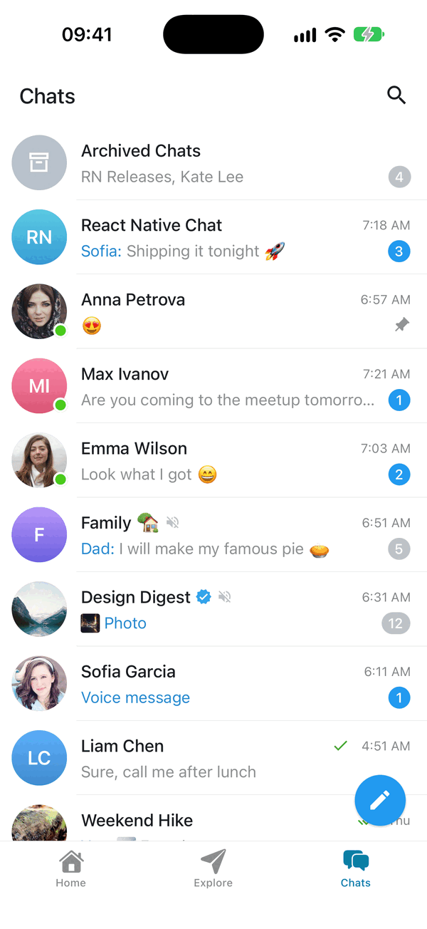
Most apps are a list of chats plus the chats themselves. ChatList is the list: map your backend's conversations to ChatListItem and wire the callbacks, and you get a messenger's main screen:
- a header with search, and a selection bar (pin, mute, archive, delete) after a long-press
- an "Archived Chats" folder, and swipe to archive
- pinned chats first, which you drag into a new order (with reorder handles while selecting)
- unread counters, typing and drafts, a loading placeholder and a new-chat button
import { Chat, ChatList, ChatListItem } from '@kesha-antonov/react-native-chat'

const chats: ChatListItem[] = conversations.map(c => ({
  id: c.id,
  title: c.name,
  avatar: c.photoUrl,
  kind: c.isGroup ? 'group' : 'private',
  lastMessage: c.lastMessage,        // an IMessage: preview, time and your sent/read checks
  unreadCount: c.unread,
  isPinned: c.pinned,                // pinned chats show first, in the order you pass them
  isMuted: c.muted,
  isArchived: c.archived,
  isOnline: c.online,                // green dot on the avatar
  isVerified: c.verified,            // check badge after the name
  typingUsers: c.typing,             // User[]
  typingAction: c.action,            // 'typing' | 'recordingVoice' | 'sendingPhoto' | ...
  draft: drafts[c.id],
}))

<ChatList
  chats={chats}
  user={me}
  isLoading={!loaded}
  onPressChat={chat => navigation.navigate('Chat', { id: chat.id })}
  onPressNewChat={() => navigation.navigate('NewChat')}
  onPinChats={(selected, isPinned) => api.pin(selected.map(c => c.id), isPinned)}
  onMuteChats={(selected, isMuted) => api.mute(selected.map(c => c.id), isMuted)}
  onArchiveChats={(selected, isArchived) => api.archive(selected.map(c => c.id), isArchived)}
  onDeleteChats={selected => api.delete(selected.map(c => c.id))}
  onReorderPinnedChats={ids => api.setPinnedOrder(ids)}
/>
Each action appears only when its callback is passed. The list is controlled: update chats from your backend and it follows. For a prototype, useChatList keeps the chats in local state and returns the handlers:
const list = useChatList(initialChats)
<ChatList chats={list.chats} user={me} {...list.handlers} onPressChat={openChat} />
// later: list.receiveMessage(chatId, message), list.markRead(chatId), list.upsertChat(chat)
| Prop | What it does |
|---|---|
chats |
Every chat, archived ones included |
user |
You: "You:" in groups and the checks on your own last messages |
onPressChat / onLongPressChat |
A tap; a long-press (default: select) |
onPinChats / onMuteChats / onArchiveChats / onDeleteChats |
Selection actions; archive also by swiping a row |
onReorderPinnedChats |
Turns on dragging pinned chats; receives the new order of ids |
onPressNewChat |
Shows the new-chat button |
isLoading |
The loading placeholder |
isSortEnabled |
Pinned first, then by newest message (default true) |
isDeleteConfirmed / isSwipeEnabled |
Ask before deleting; swipe to archive (both default true) |
isHeaderVisible / title / renderHeaderRight / isTopInsetApplied |
The built-in header (hide it to use your navigator's) |
headerRightPosition |
renderHeaderRight before the search button (default) or 'afterSearch', e.g. for a close button |
timeFormat / dateFormat |
dayjs formats for a row's time today ('HH:mm' for a 24-hour clock) and its date before this week ('DD.MM.YY') |
isSearchEnabled / filterChat / onSearchChange |
Search; a custom match; a server-side search |
isArchiveOpen / onArchiveOpenChange |
Control which list shows |
renderChat / renderEmpty / listProps / style |
A custom row (ChatListCell is the built-in one), the empty text, FlatList props (onEndReached, refreshControl...) |
theme / darkTheme / colorScheme / locale / labels / icons |
As on Chat; the list's colors are theme.chatList |
ChatListCell, ChatListAvatar, ChatListShimmer, sortChats, getChatPreview and formatChatListDate are exported for building your own row or screen.
ChatHeader is the chat screen's bar to match: back arrow, a 42 avatar, the name with a status line under it ("online" and "typing" in the accent color) and your buttons at the end, in theme.chatList's header colors.
<ChatHeader
  title='Anna Petrova'
  subtitle={isOnline ? 'online' : 'last seen recently'}
  isSubtitleActive={isOnline}
  typingUsers={typingUsers}
  avatar={{ id: chat.id, uri: chat.avatar }}
  onBack={navigation.goBack}
  onPressTitle={openProfile}
  renderRight={() => <CallButton />}
/>
Reply to Messages
Swipe-to-reply, reply preview and threading
Swipe on a message to reply to it, showing a reply preview in the input toolbar and the replied message above the new bubble. Uses ReanimatedSwipeable from react-native-gesture-handler plus react-native-reanimated.
Basic Usage
<Chat
  messages={messages}
  onSend={onSend}
  user={{ _id: 1 }}
  reply={{
    swipe: {
      isEnabled: true,
      direction: 'left', // swipe left to reply
    },
  }}
/>
Replying works out of the box: long-press a message and pick Reply, or swipe it left. The swipe takes over from the list after 0.4cm (about 25pt) of mostly sideways travel, the row follows the finger up to 80pt, a reply arrow fades in from 20pt and fills by 50pt, where a light haptic ticks; letting go past 50pt starts the reply, and the row slides back over 180ms. Turn the swipe off with reply={{ swipe: { isEnabled: false } }}, or all replying with reply={{ isEnabled: false }}.
Tapping a quote inside a bubble scrolls to the quoted message and highlights its row for a second, then fades it out over 300ms. The scroll-to-bottom button then comes up, and its first tap takes you back to the message you tapped the quote in. Pass reply.onPress(replyMessage, message) to do something else.
Reply Props (Grouped)
interface ReplyProps<TMessage> {
  isEnabled?: boolean                // The menu's Reply and swipe-to-reply; default true
  onReply?: (message: TMessage) => void  // A reply started (menu or swipe); use with a controlled `message`

  // Swipe gesture configuration
  swipe?: {
    isEnabled?: boolean              // Swipe-to-reply; default true (false to turn it off)
    direction?: 'left' | 'right'     // Swipe direction; default 'left'
    onSwipe?: (message: TMessage) => void  // Callback when swiped
    renderAction?: (                 // Custom swipe action component
      progress: SharedValue<number>,
      translation: SharedValue<number>,
      position: 'left' | 'right'
    ) => React.ReactNode
    actionContainerStyle?: StyleProp<ViewStyle>
  }

  // Reply preview styling (above input toolbar)
  previewStyle?: {
    containerStyle?: StyleProp<ViewStyle>
    textStyle?: StyleProp<TextStyle>
    imageStyle?: StyleProp<ImageStyle>
  }

  // In-bubble reply styling
  messageStyle?: {
    containerStyle?: StyleProp<ViewStyle>
    containerStyleLeft?: StyleProp<ViewStyle>
    containerStyleRight?: StyleProp<ViewStyle>
    textStyle?: StyleProp<TextStyle>
    textStyleLeft?: StyleProp<TextStyle>
    textStyleRight?: StyleProp<TextStyle>
    imageStyle?: StyleProp<ImageStyle>
  }

  // Callbacks and state
  message?: ReplyMessage             // Controlled reply state
  onClear?: () => void               // Called when reply cleared
  onPress?: (message: ReplyMessage) => void  // Quote tapped; default jumps to the quoted message and flashes it

  // Custom renderers
  renderPreview?: (props: ReplyPreviewProps) => React.ReactNode
  renderMessageReply?: (props: MessageReplyProps) => React.ReactNode
}
ReplyMessage Structure
interface ReplyMessage {
  _id: string | number
  text: string
  user: User
  image?: string
  audio?: string
}
Advanced Example with External State
const [replyMessage, setReplyMessage] = useState<ReplyMessage | null>(null)

<Chat
  messages={messages}
  onSend={messages => {
    const newMessages = messages.map(msg => ({
      ...msg,
      replyMessage: replyMessage || undefined,
    }))
    setMessages(prev => Chat.append(prev, newMessages))
    setReplyMessage(null)
  }}
  user={{ _id: 1 }}
  reply={{
    swipe: {
      isEnabled: true,
      direction: 'right',
      onSwipe: setReplyMessage,
    },
    message: replyMessage,
    onClear: () => setReplyMessage(null),
    onPress: (msg) => scrollToMessage(msg._id),
  }}
/>
Smooth Animations
The reply preview animates automatically - it expands from zero height with a fade-in when it appears, collapses with a fade-out when cleared, and transitions smoothly when you reply to a different message. These use react-native-reanimated for 60fps performance.
Maintaining Scroll Position (AI Chatbots)
Keep the reading position while long answers stream in
The list follows new content only while it is at the newest message. Scrolled up, the reading position stays put while a long answer streams in or new messages arrive, and the scroll-to-bottom button counts them. Both are Legend List behaviours (maintainScrollAtEnd, maintainVisibleContentPosition) that the chat turns on; override them through listProps:
// Never follow new content, even at the newest message
<Chat listProps={{ maintainScrollAtEnd: false }} />
Streaming (AI) Messages
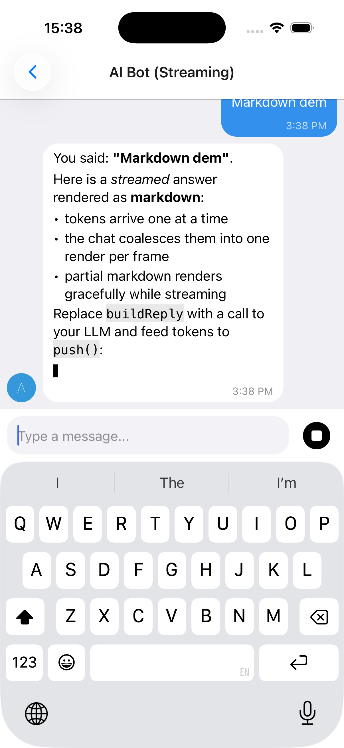
Render AI assistant replies token-by-token. Incoming chunks are batched with requestAnimationFrame (one render per frame, only the streaming bubble re-renders) and a blinking caret shows while a message is still streaming.
useStreamingMessages, stop control and a full example
The reply above streams in token-by-token (note the caret ▋) and renders as markdown - bold, italics, lists, inline and fenced code - while the app swaps the send button for a Stop control mid-stream (with renderSend, below). See Markdown rendering for AI replies to enable markdown.
IMessage.streaming- flag a message as streaming (shows the caret)useStreamingMessages(...)- owns the message list, rAF-batchespush(), and supports stop viaAbortController. It returns{ messages, setMessages, append, startStream, isStreaming, stop };setMessagesis there for anything the hook does not cover, so you can patch a message with a plainmap.
import { useCallback } from 'react'
import { Chat, IMessage, Send, SendProps, useStreamingMessages } from '@kesha-antonov/react-native-chat'

function Bot () {
  const { messages, append, startStream, isStreaming, stop } = useStreamingMessages<IMessage>()

  const onSend = useCallback((newMessages: IMessage[] = []) => {
    append(newMessages[0])                      // show the user's message
    const stream = startStream({ user: { _id: 2, name: 'Assistant' } }) // empty streaming bubble

    runMyModel(newMessages[0].text, {
      signal: stream.signal,                    // aborts when stop() is called
      onToken: token => stream.push(token),     // batched, one render per frame
      onDone: () => stream.done(),              // clears the streaming flag
    })
  }, [append, startStream])

  // While a reply streams, the send button becomes a Stop button.
  const renderSend = useCallback(
    (sendProps: SendProps<IMessage>) =>
      isStreaming ? <MyStopButton onPress={stop} /> : <Send {...sendProps} />,
    [isStreaming, stop]
  )

  return <Chat messages={messages} onSend={onSend} user={{ _id: 1 }} renderSend={renderSend} />
}
See docs/STREAMING.md for the full hook API and a real Claude streaming adapter (via a backend proxy). A runnable demo lives in example/components/chat-examples/AIBotExample.tsx.
Markdown rendering for AI replies
Built-in renderer, or react-native-streamdown
AI/LLM replies are usually markdown (bold, lists, fenced code). Enable markdown with messageTextProps={{ markdown: true }} (streamed messages auto-render as markdown unless you pass markdown={false}):
// Force markdown for every message:
<Chat messageTextProps={{ markdown: true }} {...props} />

// Streamed messages auto-render as markdown; disable with markdown: false.
There are two renderers and you get the best available one automatically:
Built-in, zero-dependency renderer (default). Covers headings, bullet/ordered lists, blockquotes, fenced + inline code, bold/italic/strikethrough, and links. It handles streaming-incomplete markdown gracefully (a half-written
**boldor an unclosed code fence renders as plain text until complete), so it's safe to feed token-by-token. Nothing to install. Exposed asBasicMarkdownif you want to use it directly.react-native-streamdown(optional upgrade). When installed it's used instead, for richer streaming-safe markdown (tables, partial-table handling, etc.). It is a native module with its own peers - install the full set:npx expo install react-native-streamdown react-native-enriched-markdown remend katexIt also requires
react-native-worklets >= 0.8.3(i.e.react-native-reanimated >= 4.3), andreact-native-enriched-markdownis a native module, so a dev build / prebuild is required (it does not work in Expo Go). 0.3 processes the markdown on a worklet runtime, which needs react-native-worklets' Bundle Mode: passbundleMode: trueandimportForwarding: { moduleNames: ['remend'] }toreact-native-worklets/plugininbabel.config.js, and wrapmetro.config.jsingetBundleModeMetroConfigfromreact-native-worklets/bundleMode(the example app does both). Until Bundle Mode is on, the chat keeps the built-in renderer and logs a one-time dev hint, since 0.3 throws on its first render without it. Version 0.3+ (StreamdownText) and the olderStreamdownexport are both recognised. The bubble's text color, size and link color are mapped onto itsmarkdownStyle, so replies match the chat theme in light and dark. Anything inmarkdownPropsis forwarded toStreamdownText; amarkdownStylethere is merged per element over the derived one:<Chat messageTextProps={{ markdown: true, markdownProps: { markdownStyle: { codeBlock: { backgroundColor: '#0d1117' } } }, }} {...props} />
Emoji Reactions
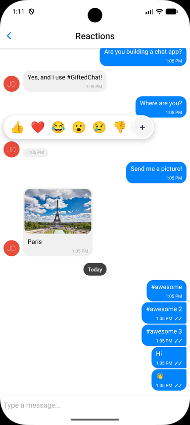
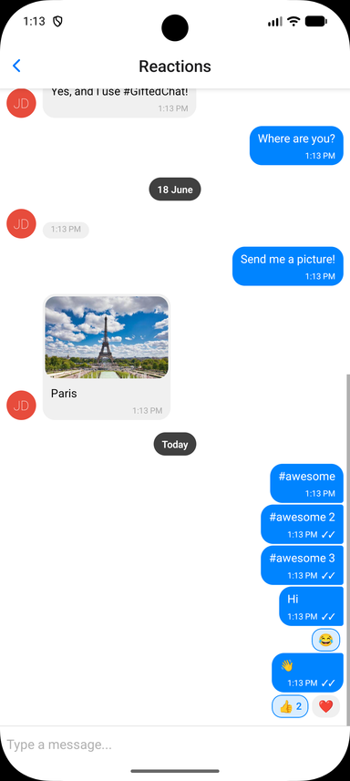
Long-press a message to open a quick emoji picker; selected reactions render as pills in the bubble and toggle on tap. The bar's chevron opens the built-in full emoji grid (search, tabs, recents) in place; both ship in the core with no extra dependencies, and renderExpandedPicker / renderReactionPicker replace them.
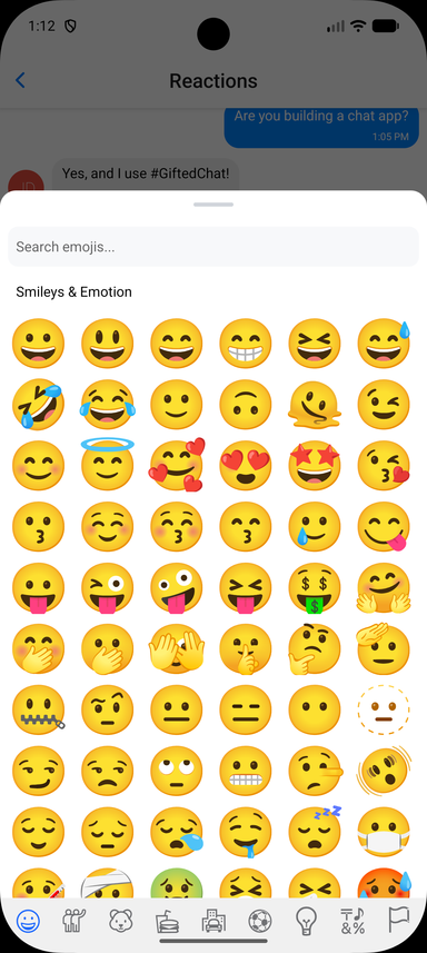
Wiring up the toggle, and the full prop list
Store reactions on each message as a reactions array and pass reactions.onReactionPress - that alone turns reactions on. Chat.toggleReaction(messages, messageId, emoji, userId) is the reducer, so the handler is one line. Reaction state is owned by you, so it works with any backend:
interface IChatMessage extends IMessage {
  reactions?: MessageReaction[] // { emoji: string, userIds: (string | number)[] }[]
}

const CURRENT_USER_ID = 1

const handleReactionPress = useCallback((message: IChatMessage, emoji: string) => {
  setMessages(prev => Chat.toggleReaction(prev, message._id, emoji, CURRENT_USER_ID))
}, [])

<Chat
  messages={messages}
  onSend={onSend}
  user={{ _id: CURRENT_USER_ID }}
  reactions={{
    onReactionPress: handleReactionPress,
    // Optional: provide a richer picker (e.g. a full emoji browser).
    // See example/components/chat-examples/ReactionsExample.tsx
    // renderReactionPicker: props => <MyEmojiPicker {...props} />,
  }}
/>
Chat.toggleReaction (also exported as toggleReaction) returns a new array and leaves other messages untouched. A user can leave up to three different reactions on a message by default, as in Telegram - a fourth replaces their oldest; pass { maxPerUser: 1 } as a fifth argument for one reaction each, or any other limit (Infinity for none).
For a prototype, useChatMessages({ initialMessages, user }) keeps the messages in local state and returns chatProps wired to sending, reactions, editing and deleting: <Chat {...chatProps} />.
Reactions Props (Grouped)
isEnabled(Bool) - Enable emoji reactions; default is on wheneveronReactionPressis passedemojis(String[]) - Emojis shown in the quick picker (default['👍', '❤️', '😂', '😮', '😢', '👎'])onReactionPress(Function) -(message, emoji) => voidcalled when an emoji is selected or a pill is tapped. Apply it withChat.toggleReactiongetUser(Function) -(userId) => User | undefined, who reacted. As in Telegram, a pill shows up to three reactors' avatars instead of a count in a one-to-one chat, and in a group while the message has three reactions or fewer, when every reactor is known. Defaults to the senders of the loaded messages (and you)renderReactions(Function) - Override the reactions-display component rendered below the bubblerenderReactionPicker(Function) - Override the picker shown on long-press (use for a full emoji browser). It receivesReactionPickerProps:visible,message,emojis,onSelect,onDismiss,position, the bubble's on-screen box (pageX,pageY,bubbleWidth,bubbleHeight), the two picker styles and:messagePreview(ReactNode, optional) - A copy of the pressed bubble to draw lifted above your backdrop at the bubble's box. While it is mounted the original bubble is hidden, so the message seems to rise out of the list; if you never render it, the original simply stays put. The easiest way to get the built-in look is to render the exportedContextMenuwithitems={[]}(see Message actions for its props)
renderExpandedPicker(Function({ onSelect }) | null, optional) - The expand button. The reactions bar (in the quick picker and above the context menu) ends in a chevron that grows the bar in place into a panel holding what this returns. Defaults to the built-in emoji grid (8 columns, search, tabs, recents); pass your own, ornullto drop the button. CallonSelect(emoji)with the pick; the overlay closes andonReactionPressis called. Also passed to a customrenderReactionPickercontainerStyle,reactionStyle,reactionActiveStyle,reactionTextStyle,reactionCountStyle- Styles for the reaction pillspickerContainerStyle,pickerEmojiStyle- Styles for the quick picker
Smart Link Parsing
URLs, emails, phones, hashtags and mentions
Message text is automatically scanned for URLs, emails, and phone numbers; hashtags and mentions are opt-in. Configure it via messageTextProps:
<Chat
  messageTextProps={{
    url: true,        // default true
    email: true,      // default true
    phone: true,      // default true
    hashtag: true,    // default false
    mention: true,    // default false
    hashtagUrl: 'https://example.com/hashtag',
    mentionUrl: 'https://example.com',
    linkStyle: { left: { color: '#1d9bf0' }, right: { color: '#fff' } },
    onPress: (message, url, type) => {
      // type: 'url' | 'email' | 'phone' | 'mention' | 'hashtag'
      Linking.openURL(url)
    },
  }}
/>
For full control, pass custom matchers ({ type, pattern, getLinkUrl?, getLinkText?, renderLink?, onPress? }[]) to add or override patterns. See the Links example in the example app.
Message actions (long-press context menu)
Floating menu
Long-press a message to open a context menu beside your finger. It opens by default with these actions: Reply, Copy (with expo-clipboard or @react-native-clipboard/clipboard installed), Forward, Pin / Unpin, Edit (your own text messages), Select and Delete - Forward, Pin, Edit and Delete appear once you pass onForwardMessage, onPinMessage, onEditMessage and onDeleteMessage. Select starts multi-select: check circles beside the messages and a Copy / Forward / Delete bar in the composer's place (see onSelectionChange). When reactions are enabled, a reactions row is shown on top of the menu automatically.
<Chat
  messages={messages}
  onSend={onSend}
  user={user}
  onEditMessage={(message, text) => setMessages(prev => prev.map(m => m._id === message._id ? { ...m, text } : m))}
  onDeleteMessage={message => setMessages(prev => prev.filter(m => m._id !== message._id))}
/>
To change the set, pass messageActions. A function receives the built-in actions for the message (each with its key), so you can add, drop or reorder; an array replaces them. defaultMessageActions picks the built-ins by key, or turns them off with false.
<Chat
  messageActions={(message, defaults) => [
    ...defaults.filter(action => action.key !== 'forward'),
    { label: 'Report', icon: ({ color, size }) => <Flag color={color} size={size} />, onPress: () => report(message) },
  ]}
/>
After 0.4s the menu opens with a haptic (if expo-haptics is installed). The message neither shrinks nor lifts - the chat dims under a black 0.2 scrim and the pressed message stays lit where it is. The menu - a 200-wide card of 48pt rows with icons, in theme.contextMenu colors - opens with its right edge just left of your finger and its top at it, unrolling from the top while each row drops into place. The reactions bar above it pops out from its right end with a slight overshoot, with a "thought bubble" tail; reactions you already picked sit smaller in a circle, and the chevron at its end grows the bar into the emoji panel. A picked reaction grows and flies into the message's reaction pill; an action runs once the menu has closed; a tap on the backdrop closes it all. Every animation runs on Reanimated and follows the system Reduce Motion setting. The reaction-only picker (reactions without messageActions) is the same overlay without actions.
A fully custom menu - each item is { key?, label, icon?, onPress, destructive? }:
import { setStringAsync } from 'expo-clipboard'
import { Copy, Trash2 } from 'lucide-react-native' // optional icons

<Chat
  messageActions={message => [
    { label: 'Copy', icon: ({ color, size }) => <Copy color={color} size={size} />, onPress: () => setStringAsync(message.text) },
    { label: 'Delete', icon: ({ color, size }) => <Trash2 color={color} size={size} />, destructive: true, onPress: () => deleteMessage(message) },
  ]}
/>
ContextMenu is exported for custom pickers and menus. Beyond visible, items, onDismiss (called once its exit has played), position and the bubble's box (pageX, pageY, bubbleWidth, bubbleHeight), it takes these optional props:
reactions(Object) -{ emojis, onSelect, selected?, containerStyle?, emojiStyle?, renderAccessory?, renderExpandedPicker? }.selectedlists the reactions the user already picked (drawn smaller, in a circle);renderAccessoryadds content at the end of the bar;renderExpandedPickeradds the expand button and the panel it opens (seereactions.renderExpandedPickerabove)touchX,touchY(Number) - Where the finger was, in window coordinates; the menu opens beside it (beside the bubble's middle without them)messagePreview(ReactNode) - The copy of the message drawn above the scrim in place; pass the one a custom picker receiveschildren(ReactNode) - Drawn above everything else in the overlay, e.g. a full emoji sheet
Note: This library no longer depends on
@expo/react-native-action-sheet. PrefermessageActionsabove. If you specifically want a native action sheet, install it yourself, wrap your tree inActionSheetProvider, and either calluseActionSheet()in your ownonLongPressMessageor pass anactionSheetprop - theactionSheetprop /context.actionSheet()escape hatch still works when you provide an implementation. The composer "+" actions use the built-in themedAttachmentSheetand need no setup.
Interactive content inside bubbles (video players, maps)
Keeping native controls tappable
When reactions or messageActions are enabled, the long-press surface spans the whole message row - the bubble and the empty space beside it. (A tap gesture is added on top only when onPressMessage is set.) Those recognizers do not cancel touches on native subviews, so a react-native-video / expo-video player rendered through renderMessageVideo keeps its native controls interactive.
If a message must own every touch that lands on it, set isMessageGestureEnabled to false for it. The gesture surface then drops behind the bubble: the bubble's content takes its touches, and long-pressing the row next to the bubble still opens the picker - so reactions are never lost for that message.
<Chat
  reactions={{ isEnabled: true, onReactionPress }}
  renderMessageVideo={props => <Video source={{ uri: props.currentMessage.video }} controls style={styles.video} />}
  // the video owns its controls; long-press beside the bubble still reacts
  isMessageGestureEnabled={message => !message.video}
/>
Theming & Dark Mode
Token groups, runtime switching and themed components
The default look is a modern messenger style: a classic day theme (pale green outgoing bubbles over a green swirl wallpaper) and a dark blue night theme (a purple-to-blue outgoing gradient fixed to the screen). Every value is a token. Override any subset via theme (light) and darkTheme (dark); your overrides are deep-merged over defaultLightTheme / defaultDarkTheme, and the resolved theme switches at runtime with the color scheme (system, or forced via colorScheme). Explicit per-component style props still win over the theme.
<Chat
  theme={{
    colors: { accent: '#3390EC', outgoingBubble: '#3390EC', outgoingText: '#FFFFFF' },
    radii: { bubble: 18 },
    wallpaper: { colors: ['#7FA381', '#FFF5C5', '#336F55', '#FBE37D'] },
  }}
  darkTheme={{ bubble: { outgoingGradient: ['#5B3FA8', '#2F6FD6'] } }}
  // colorScheme="dark"   // optional: force a scheme instead of following the system
  {...props}
/>
Token groups: colors, radii, spacing, typography, avatar, sendButton, composer, voice, plus:
bubble-hasTail(a curled tail on the last bubble of a run; drawn withreact-native-svgwhen installed),isTimeInline(the time on the last line of text when it fits;falsegives it a row),outgoingGradient(stops, top to bottom, ornullfor the solidcolors.outgoingBubble),outgoingGradientMode('screen': one gradient across the list, each bubble shows its slice as it scrolls;'bubble': each bubble carries the whole gradient),maxWidthInset(the text column ismin(width, height) - maxWidthInset, 80 by default),bigEmojiMaxCount(a message of up to this many emoji and nothing else drops its bubble and draws them large, with the time in a service pill; 20 by default,0turns it off),bigEmojiSizes(font size by emoji count,40.8, 40.8, 33.6, 26.4, 22.8).wallpaper-isEnabled,colors(three or four, for the swirl gradient),isAnimated(one step per outgoing message),pattern(an image tiled over the gradient; no pattern is bundled),patternOpacity,patternColor. Off, the chat showscolors.background. Replace it entirely with therenderWallpaperprop, or draw it elsewhere with the exportedChatWallpapercomponent.nameColors- the seven sender-name colors, picked per user id. Empty usescolors.senderName.avatar.palette/avatar.paletteEnd- initials avatar gradient stops, picked per user id. An emptypaletteEnddraws flat colors.textScale- the text size the user picked, a multiplier of everytypographysize (1 by default): messages, times, names, day and service pills, quotes and the composer grow together, e.g.theme={{ textScale: 1.2 }}.chatList.headerSubtitle/chatList.headerSubtitleActive-ChatHeader's status line, grey and in the accent color.
A few behaviours follow from the tokens: setting colors.outgoingBubble turns the gradient off, setting colors.senderName empties nameColors, and setting avatar.palette without paletteEnd draws flat avatars - so an app that picks its own colors keeps seeing them. Bubbles in a run (same sender, at most five minutes apart, utils.isSameGroup) share one tail and one name, 2pt apart (spacing.withinGroup), with 6pt between runs (spacing.betweenGroups).
Build your own theme-aware components with the exported hooks:
import { useTheme, useThemedStyles } from '@kesha-antonov/react-native-chat'
import { StyleSheet } from 'react-native'

const MyBadge = () => {
  const theme = useTheme()
  const styles = useThemedStyles(t => StyleSheet.create({
    badge: { backgroundColor: t.colors.accent, borderRadius: t.radii.bubble },
  }))
  return <View style={styles.badge} />
}
Also exported: defaultLightTheme, defaultDarkTheme, ChatWallpaper, and the ChatTheme / PartialChatTheme types.
The built-in panels have their own token groups: emojiKeyboard, contextMenu, attachments and chatList. The full set of tokens and their default values is the ChatTheme type and defaultLightTheme / defaultDarkTheme.
Localization (i18n)
Built-in translations and label overrides
All built-in UI strings (composer placeholder, send/cancel, load earlier, today, voice/video/location labels, slide-to-cancel, reply/edit banner, camera-permission text) route through a label table. Built-in translations ship for es, fr, de, ru, zh, ar, pt, ja, ko, it, tr, hi, nl, pl and id, with English as the default, selected by the existing locale prop. A regional tag falls back to its base language, so pt-BR resolves to pt. Override any individual string with labels:
<Chat
  locale="fr"                       // pick a built-in translation
  labels={{ placeholder: 'Votre message...' }}  // override any string
  {...props}
/>
Right-to-left layout follows the locale (Arabic, Hebrew, Persian, Urdu and a few others). forceRTL overrides the guess: true for an RTL language not in that set, false to keep a left-to-right layout.
Exported helpers: ChatLabels (type), defaultLabels, translations, resolveLabels, and the useLabels hook for reading the resolved labels in custom components.
Message Status
Tick indicators for sent / delivered / read
Set sent, received, pending or isFailed on a message to show its delivery status. The status is yours to set: add a message with pending: true in onSend, then set sent and received as your backend confirms. Every outgoing message shows it, voice notes, round notes, files and photos included. They render beside the time: one check once sent, two once received (read), a spinning clock while pending, a red badge when sending failed. isEdited or editedAt prefix the time with "edited":
const message: IMessage = {
  _id: 1,
  text: 'Delivered!',
  createdAt: new Date(),
  user: { _id: 1 },
  sent: true,
  received: true,
}
Customize the indicators with renderTicks (full override) or tickStyle (style only):
<Chat
  renderTicks={message => (message.received ? <MyReadIcon /> : null)}
  tickStyle={{ color: '#1d9bf0' }}
/>
TypeScript
Generic over your own message type
Chat ships complete type definitions and is generic over your message type. Extend IMessage to add custom fields and everything stays typed end to end:
import { Chat, IMessage } from '@kesha-antonov/react-native-chat'

interface MyMessage extends IMessage {
  reactions?: { emoji: string, userIds: (string | number)[] }[]
}

<Chat<MyMessage>
  messages={messages}
  onSend={msgs => {/* msgs is typed as MyMessage[] */}}
  user={{ _id: 1 }}
/>
Building blocks
Lower-level components and helpers
Chat is assembled from exported parts, so you can reuse them in your own screens or render props:
- Rows and bubbles:
Message,Bubble,MessageText,MessageImage,MessageVideo,MessageAudio,MessageFile,MessageLocation,MessageReply,SystemMessage,Day,Time,Avatar,ChatAvatar,UnreadSeparator,ChatEmpty,LinkPreviewCard,MediaCard - Composer:
InputToolbar,Composer,Send,Actions,ReplyPreview,EmojiGrid,AttachmentMenu,AttachmentSheet - Voice and video:
VoiceMessageInput,WaveformPlayer,VideoRecordButton,VideoNoteRecorder, withisVoiceRecordingAvailable,isWaveformAvailable,isVideoRecordingAvailable,isVisionCameraAvailable - Menus and status:
ContextMenu,TypingStatus(getTypingText),StreamingCursor,MarkdownMessageText(isMarkdownAvailable),BasicMarkdown - Lists:
MessagesContainer,ChatList,ChatListCell,ChatListAvatar,ChatListShimmer - Hooks:
useTheme,useThemedStyles,useColorScheme,useIcons,useLabels,useIsRTL,useChatContext,useStreamingMessages,useChatMessages,useChatList - Helpers:
toggleReaction,getChatCapabilities,buildAttachmentMessages,getAttachmentTabs,formatFileSize,findFirstUrl,countEmojiOnly,isRTLLocale,mirrorPosition,formatChatListDate,getChatPreview,sortChats,matchesChatQuery,DEFAULT_MESSAGE_ACTION_KEYS,EMOJI_CATEGORY_KEYS,DEFAULT_RECENT_EMOJIS
Components rendered outside Chat need a GestureHandlerRootView above them.
📱 Platform Notes
Android
Keyboard configuration
If you are using Create React Native App / Expo, no Android specific installation steps are required. Otherwise, we recommend modifying your project configuration:
Make sure you have android:windowSoftInputMode="adjustResize" in your AndroidManifest.xml:
<activity
  android:name=".MainActivity"
  android:label="@string/app_name"
  android:windowSoftInputMode="adjustResize"
  android:configChanges="keyboard|keyboardHidden|orientation|screenSize">
For Expo, you can append KeyboardAvoidingView after Chat (Android only):
<View style={{ flex: 1 }}>
   <Chat />
   {Platform.OS === 'android' && <KeyboardAvoidingView behavior="padding" />}
</View>
Web (react-native-web)
Install the web renderer alongside the library:
yarn add react-native-web react-dom
Expo / Metro (recommended) - no extra config
npx expo start --web
Nothing else to set up. Metro runs Babel over node_modules, so this package's JSX and its Reanimated worklets get transpiled the same way your own code does. The example app runs on web exactly like this.
Other bundlers (webpack, Vite, Next.js) - the package must be transpiled
The published files are ES modules with JSX left in place, and the component uses Reanimated worklets, which need react-native-reanimated/plugin to run. Bundlers that skip node_modules when transpiling - webpack's babel-loader does by default - will choke on that. So outside Metro you need to:
- Alias
react-nativetoreact-native-weband let the resolver pick up.web.js/.web.tsxextensions - Run
@kesha-antonov/react-native-chat- and the React Native packages it depends on - through Babel with@react-native/babel-presetandreact-native-reanimated/plugin, instead of excluding all ofnode_modules
In Next.js that is transpilePackages in next.config.js; in a plain webpack setup it means widening the babel-loader rule's exclude so these packages are included.
React Strict DOM
Works inside an RSD tree - verified on iOS and Expo web
Chat drops into a React Strict DOM app unchanged. RSD's native build renders through React Native, so <Chat> is just another RN subtree:
import { css, html } from 'react-strict-dom'
import { Chat } from '@kesha-antonov/react-native-chat'

const styles = css.create({
  root: { display: 'flex', flexDirection: 'column', height: '100%' },
})

<html.div data-layoutconformance='strict' style={styles.root}>
  <Chat messages={messages} onSend={onSend} user={user} />
</html.div>
Three things to know:
- Web needs
react-native-web. RSD's web build contains no React Native code at all, so Chat does not resolve there on its own. Expo web gives youreact-native-webalready, so RSD (real DOM) and Chat (RNW's DOM output) render side by side in one tree. A Vite or Next.js RSD app has to add the alias and transpile step from the section above - Metro needs
unstable_enablePackageExports: true. RSD publishes only anexportsmap with nomain, so with package exports off it fails to resolve. This is the default on recent Expo SDKs - StyleX styles do not reach Chat. It takes React Native style objects and its own
themeprop, notcss.createoutput. On native,compat.nativeis the bridge if you want RSD to drive a wrapper around it
⚡ Performance
A message re-renders only when something it shows changes. Each row subscribes to its own message by id, so a send, a status tick, a reaction or a streamed token renders that one row (plus a neighbour only when the bubbles' grouping changes) and leaves the list and the composer alone. Everything the rows share - render props, styles, actions, labels - reaches them through context, kept stable between renders:
- Event handlers can be inline.
onPressMessage={() => ...},reply={{ onPress: ... }}, an action'sonPress: they are called through a stable proxy that always reaches your latest handler. - Style and config objects can be inline.
timeTextStyle={{ left: { color } }},reactions={{ isEnabled: true }}are compared by content. - Memoize render functions. A new
renderBubblemay draw something new, so a new reference re-renders every row - wrap it inuseCallback.
// ✅ Handlers and objects inline; the render function memoized
const renderBubble = useCallback(props => <MyBubble {...props} />, [])

<Chat renderBubble={renderBubble} onPressMessage={message => open(message)} timeTextStyle={{ left: { color: 'gray' } }} />
Messages, neighbours, context props and virtualization tuning
Keep messages immutable. Update a message by replacing its object (e.g. Chat.append(...), or messages.map(m => m._id === id ? { ...m, sent: true } : m)), never by mutating it in place. A store that rebuilds every message object on each update still only re-renders what changed - unchanged messages are compared by content.
Neighbours are for grouping. previousMessage / nextMessage handed to renderMessage, renderBubble or renderAvatar are kept current for what decides grouping (sender, day, time apart, whether there is one). A row does not re-render because a neighbour's text, status or reactions changed, so do not draw those from a neighbour.
Theme, icons and labels don't need drilling. theme / darkTheme, icons, and labels are read from context (useTheme, useIcons, useLabels), so passing them once on <Chat> is enough; they don't cause per-row churn.
Tune virtualization if needed. The list is Legend List, which keeps only what is near the viewport mounted. drawDistance (in pixels) sets how far beyond the screen it renders; raise it if fast flings show blank space, lower it to mount less. Leave recycleItems off: message rows hold state (players, animations) that must not move to another message.
<Chat listProps={{ drawDistance: 500 }} {...props} />
🧪 Testing
Triggering layout events in tests
TEST_ID is exported as constants that can be used in your testing library of choice.
React Native Chat uses onLayout to determine the height of the chat container. To trigger onLayout during your tests:
const WIDTH = 200
const HEIGHT = 2000

const loadingWrapper = getByTestId(TEST_ID.LOADING_WRAPPER)
fireEvent(loadingWrapper, 'layout', {
  nativeEvent: {
    layout: {
      width: WIDTH,
      height: HEIGHT,
    },
  },
})
📦 Example App
Running the demo locally
The repository includes an example app with two parts. The Chats tab is a small messenger built on the defaults: a chat list (unread badges, pinned and muted chats, "typing…" previews, swipe to archive, long-press selection, a compose button) where each chat is a bare <Chat> with seeded history, and sending moves the chat to the top and gets a simulated reply. The Explore tab has one screen per feature or customization: streaming AI replies, reactions, the long-press menu, media and voice, theming, localization, links, custom rendering, a Slack-style layout, and more.
git clone https://github.com/kesha-antonov/react-native-chat.git
cd react-native-chat/example
yarn install

npx expo run:ios       # iOS
npx expo run:android   # Android
npx expo start --web   # Web
❓ Troubleshooting
"Cannot read property 'Chat' of undefined"
This means the package threw while it was being loaded, so the import came back empty. The real cause is the first error in the Metro log or red box, logged before this one - almost always a native peer that is missing or out of sync with the installed app:
react-native-reanimated,react-native-worklets,react-native-gesture-handlerandreact-native-keyboard-controllerare native modules. After installing or upgrading any of them, rebuild the app (npx expo run:ios,npx expo prebuild, orpod install+ a native build) - reloading the JS bundle is not enough.- In Expo, install them with
npx expo installso the versions match your SDK. A plainnpm installpulls the latest releases, which Expo Go and an existing dev build may not include, and Reanimated throws a version-mismatch error on import. - In bare React Native, check the worklets Babel plugin is in
babel.config.js(see Bare React Native Projects), then restart Metro with--reset-cache.
The whole message list is blurred on iOS 26
The chat sits under a transparent navigation header - Expo Router 58's default is a transparent Liquid Glass header the screen scrolls under. iOS 26 then blurs scroll content beneath the header with a scroll edge effect, so the messages under the header are blurred. Give the chat screen an opaque header:
<Stack.Screen name='chat' options={{ headerTransparent: false }} />
TextInput is hidden on Android
Make sure you have android:windowSoftInputMode="adjustResize" in your AndroidManifest.xml. See Android configuration above.
How to set Bubble color for each user?
See this issue for examples.
How to customize InputToolbar styles?
See this issue for examples.
How to manually dismiss the keyboard?
See this issue for examples.
How to use renderLoading?
See this issue for examples.
🤔 Have a Question?
- Check this README first
- Search existing issues
- Ask on StackOverflow
- Open a new issue if needed
🤝 Contributing
Contributions are welcome - fork, branch, and open a Pull Request.
Development Setup
Commands
yarn install          # install dependencies
yarn build            # build the library
yarn test             # run tests
yarn lint             # run linting
yarn prepublishOnly   # full validation
Before opening a PR, please make sure yarn test, yarn lint and yarn build all pass.
👥 Authors
Based on FaridSafi/react-native-gifted-chat, which is no longer actively maintained.
Maintainer: Kesha Antonov
I also build cryptoc - a crypto portfolio app with home screen, lock screen and Watch widgets, no account and no exchange API keys.
I maintained the original project solo for 2 years before deciding to continue development in this repository. If you find this library useful, please consider becoming a sponsor to support continued development. 💖
📄 License
Built with ❤️ by the React Native community