
gpbl/react-day-picker
gpbl/react-day-picker has 6,866 GitHub stars and 783 forks. GitHot measured +3 stars in 24 hours. Last checked 2026-11-05 00:03 UTC. Last push 2026-10-21.
DayPicker is a customizable date picker component for React. Add date pickers, calendars, and date inputs to your web applications.
What you can do
- 🛠 Extensive set of props for customizing the calendar.
- 🎨 Minimal design that can be easily styled with CSS or any CSS framework.
- 📅 Supports selections of single days, multiple days, ranges of days, or custom selections.
- 🌍 Can be localized into any language and time zones.
Measured star growth
- in 24h
- +3
- in 7 days
- Update delayed
- in 15 days
- Update delayed
- in 1 month
- Update delayed
Net star changes over overlapping periods, not daily totals. Missing measurements are left blank. Stars measure attention, not software quality.
README.md
OriginalReact DayPicker
DayPicker is a React component for creating date pickers, calendars, and date inputs for web applications.
@daypicker/react is the preferred package name for DayPicker v10 and newer.
Documentation
See daypicker.dev for guides, examples, and API reference, or read the v10 docs in the repository.
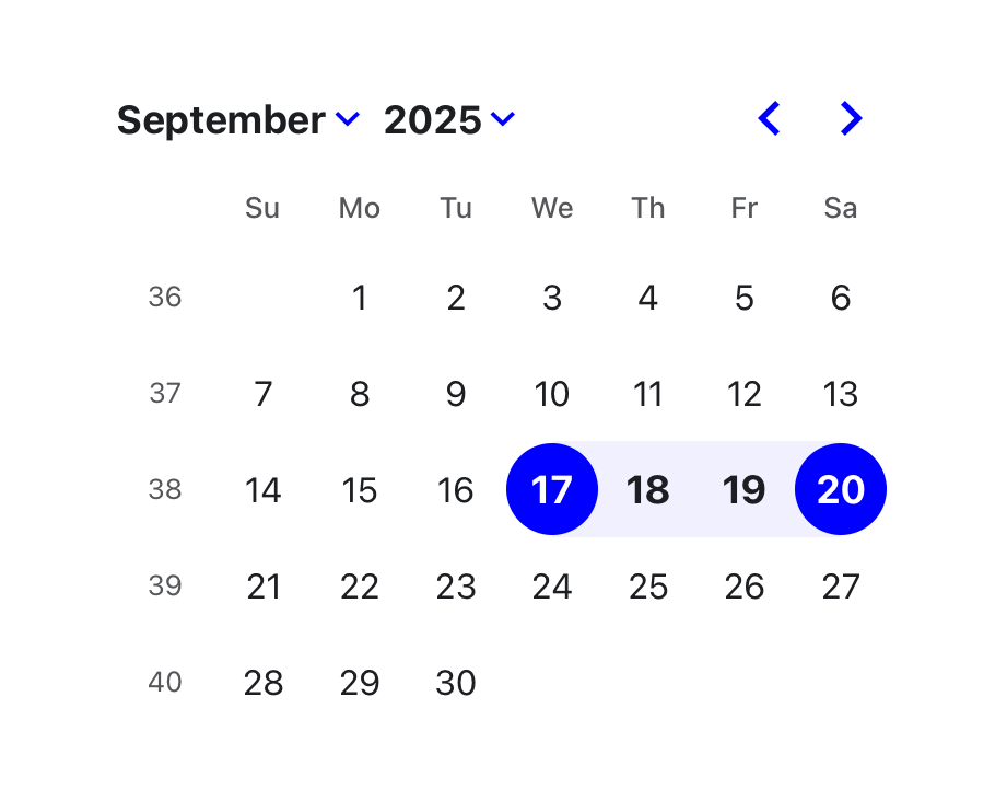
Features
- 🛠 Extensive set of props for customizing the calendar.
- 🎨 Minimal design that can be easily styled with CSS or any CSS framework.
- 📅 Supports selections of single days, multiple days, ranges of days, or custom selections.
- 🌍 Can be localized into any language and time zones.
- 🌐 Support for ISO 8601 and broadcast calendars, plus Persian, Hijri, Buddhist (Thai), Ethiopic, and Hebrew calendars through
@daypicker/*add-on packages. - 🦮 Complies with WCAG 2.1 AA requirements for accessibility.
- ⚙️ Customizable components to extend the rendered elements.
- 🔤 Easy integration with input fields.
DayPicker is written in TypeScript and compiled to CommonJS and ESM. It relies on date-fns for date manipulation and formatting.
Installation
Install the preferred DayPicker package name:
npm install @daypicker/react



Example
import { useState } from "react";

import { DayPicker } from "@daypicker/react";
import "@daypicker/react/style.css";

function MyDatePicker() {
  const [selected, setSelected] = useState<Date>();

  return (
    <DayPicker
      mode="single"
      selected={selected}
      onSelect={setSelected}
      footer={
        selected ? `Selected: ${selected.toLocaleDateString()}` : "Pick a day."
      }
    />
  );
}
Compatibility
DayPicker is compatible with React 16.8 and later.
License
DayPicker is released under the MIT License.
Community
Ask for help and share your experience with DayPicker:
- 💬 Discussion forums - Get support and provide feedback.
- 🪳 Report an issue - Report bugs or request features.
Sponsors
Thank you to everyone supporting DayPicker - your sponsorship keeps this project maintained and evolving.


- 🎗️ Become a sponsor: https://github.com/sponsors/gpbl
Explore related projects
freeCodeCamp/freeCodeCamp
freeCodeCamp.org's open-source codebase and curriculum. Learn math, programming, and computer science for free.
458,607 starsdonnemartin/system-design-primer
Learn how to design large-scale systems. Prep for the system design interview. Includes Anki flashcards.
376,968 starsreact/react
The library for web and native user interfaces.
252,005 starsvuejs/vue
This is the repo for Vue 2. For Vue 3, go to https://github.com/vuejs/core
212,503 stars