
github/storybook-addon-performance-panel
github/storybook-addon-performance-panel has 434 GitHub stars and 18 forks. GitHot measured -1 stars in 24 hours. Last checked 2026-11-22 19:30 UTC. Last push 2026-11-19.
Measured star growth
- in 24h
- -1
- in 7 days
- Collecting history
- in 15 days
- Collecting history
- in 1 month
- Collecting history
Net star changes over overlapping periods, not daily totals. Missing measurements are left blank. Stars measure attention, not software quality.
About
A Storybook Addon for tracking web performance
Web & AppsREADME.md
Original@github-ui/storybook-addon-performance-panel
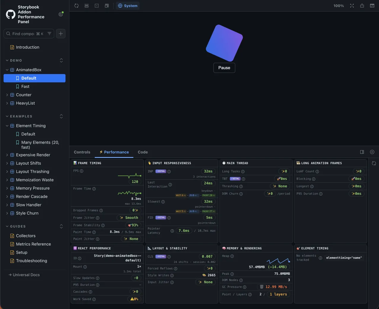
A Storybook addon that provides real-time performance monitoring for stories. It displays comprehensive metrics including frame timing, input responsiveness, memory usage, React profiling, and more.
Quick Start
React projects
Add the addon to your Storybook configuration:
// .storybook/main.ts
const config = {
  addons: [
    '@github-ui/storybook-addon-performance-panel',
  ],
}
// .storybook/preview.ts
import addonPerformancePanel from '@github-ui/storybook-addon-performance-panel'
import {definePreview} from '@storybook/react-vite'

export default definePreview({
  addons: [addonPerformancePanel()],
})
Non-React projects (HTML, Vue, Svelte, Web Components, etc.)
Use the ./universal subpath — no React dependency:
// .storybook/main.ts
const config = {
  addons: [
    '@github-ui/storybook-addon-performance-panel/universal',
  ],
}
The universal entry collects all browser-level metrics (frame timing, CLS, INP, etc.) but omits React Profiler metrics. The React Performance section is automatically hidden in the panel.
The performance panel appears as a "⚡ Performance" tab at the bottom of Storybook.
Project Structure
This is an npm workspaces monorepo:
| Package | Description |
|---|---|
| packages/storybook-addon-performance-panel | The addon — collectors, panel UI, and types |
| packages/examples-react | React docs storybook (@storybook/react-vite) |
| packages/examples-html | HTML docs storybook (@storybook/html-vite) |
| packages/storybook-config | Shared storybook config (theming, features, Vite helpers) |
| packages/website | Documentation site (TanStack Start + MDX) |
Documentation
See the addon README for full documentation including:
- Architecture and how the addon works
- All metrics collected (frame timing, input, main thread, LoAF, CLS, React, memory)
- Metric thresholds and color coding
- Browser compatibility
- Interpreting metrics and troubleshooting guide
Development
npm install          # Install dependencies
npm run build        # Build the addon
npm test             # Run tests
npm run lint         # Lint
npm run tsc          # Type check
npm run dev          # Build + start storybooks and site with portless
                     # → http://examples-react.localhost:1355 (React)
                     # → http://examples-html.localhost:1355 (HTML)
                     # → http://site.localhost:1355 (Docs site)
npm run docs         # Start just the React docs storybook
npm run docs:html    # Start just the HTML docs storybook
Contributing
See CONTRIBUTING.md for development setup and pull request guidelines.
License
Explore related projects
Loading…