
esdrassantos06/liftbox
esdrassantos06/liftbox has 64 GitHub stars and 4 forks. GitHot measured 0 stars in 24 hours and +11 in 7 days. Last checked 2026-11-15 12:49 UTC. Last push 2026-11-05.
What you can do
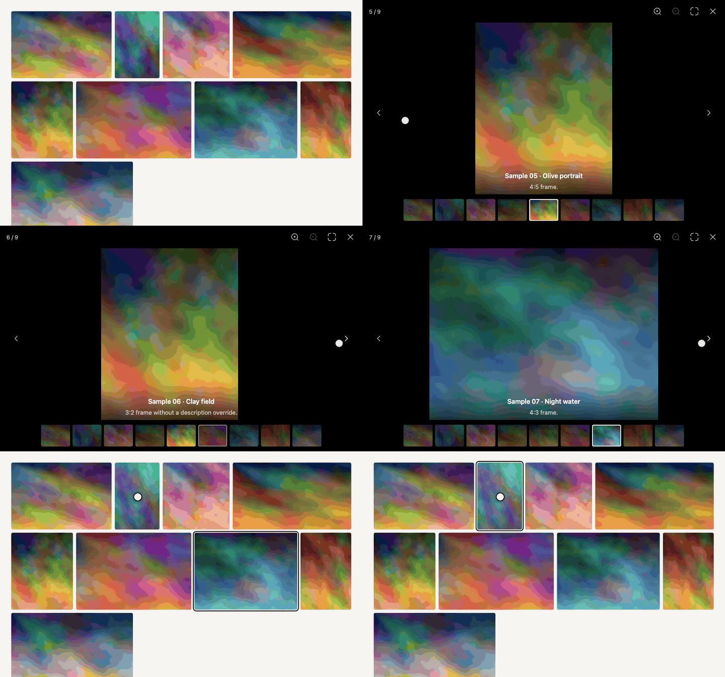
- Open and close animation from your thumbnail, with a zoom and fade fallback.
- Arrows, keyboard, swipe and flick navigation, with slide, fade and zoom transitions.
- Thumbnail strip or pager dots, zoom (wheel, pinch, double tap, buttons, keys), pinch to close, fullscreen, rotation, flip, sharing and downloads.
- A toolbar that moves what does not fit into an accessible "More options" menu, controls that fade out when idle, and right-to-left layouts.
Measured star growth
- in 24h
- 0
- in 7 days
- +11
- in 15 days
- Collecting history
- in 1 month
- Collecting history
Net star changes over overlapping periods, not daily totals. Missing measurements are left blank. Stars measure attention, not software quality.
About
Accessible, themeable React lightbox and gallery with zoom, video, slideshow, and deep links. Zero runtime dependencies.
Web & AppsREADME.md
Original

liftbox


Documentation and live demos · Try it on StackBlitz · Comparison with other React lightboxes
A React lightbox that opens each photo out of the thumbnail you clicked, even a cropped one, and flies it back on close. Zoom, video, thumbnails, slideshow and masonry or justified grids ship in one MIT package with zero runtime dependencies; you can swap every string, icon, color and timing, and it works with any grid you already have.
Using liftbox? A star on GitHub is how the next person searching for a React lightbox finds it.
Features
- Open and close animation from your thumbnail, with a zoom and fade fallback.
- Arrows, keyboard, swipe and flick navigation, with
slide,fadeandzoomtransitions. - Thumbnail strip or pager dots, zoom (wheel, pinch, double tap, buttons, keys), pinch to close, fullscreen, rotation, flip, sharing and downloads.
- A toolbar that moves what does not fit into an accessible "More options" menu, controls that fade out when idle, and right-to-left layouts.
- Native video with captions, YouTube and Vimeo without their player scripts, any page in an iframe, and room for custom players such as Video.js 10.
- Slideshow that pauses when the user takes over.
- AVIF, WebP and art-directed crops through
<picture>sources on image slides. - Fast with thousands of images and videos: the current image loads first with its thumbnail as a placeholder, preloading adapts to slow connections, and the thumbnail strip, pager and grids render only what is in view.
- Optional justified, masonry and uniform grids and a category filter, each usable with or without the lightbox.
- Deep links through the URL hash with
useLightboxHash, by number or by slide name, closed by the back button. - Modal dialog semantics, focus trap and return, a live region, reduced motion and a scroll lock that keeps the page still.
- Server-rendering safe, ready for the Next.js App Router.
- Styled with
--eg-*CSS variables. The lightbox needs no'unsafe-inline'in a Content Security Policy.
Compared with other React lightboxes
| liftbox | yet-another-react-lightbox | PhotoSwipe | lightGallery | |
|---|---|---|---|---|
| License | MIT | MIT | MIT | GPL-3.0 or a paid license |
| Opens out of the thumbnail | Yes, also cropped ones | No | Yes | Yes, cropped with a plugin |
| Grids | Masonry, justified, uniform | Separate package | No | Justified |
| Zoom, thumbnails, video | Built in | One plugin each | Zoom only | One plugin each |
| YouTube and Vimeo | Built in | No | No | Plugin |
Measured bundle sizes, pinned versions, sources and an accessibility table are on the comparison page, with migration guides from yet-another-react-lightbox, lightGallery and PhotoSwipe.
Installation
npm install liftbox
import "liftbox/styles.css";
React 18 or 19 is a peer dependency. The package is ESM only and ships TypeScript declarations.
Quick start
The lightbox is controlled: you own open and index, it tells you when the user wants to change them. Keep it mounted so the close animation can play.
import { useRef, useState } from "react";
import { Lightbox, type Slide } from "liftbox";
import "liftbox/styles.css";

const slides: Slide[] = [
  {
    src: "/photos/harbour.jpg",
    width: 1600,
    height: 1067,
    alt: "Boats in the harbour",
    title: "Harbour",
  },
  // ...
];

export function Gallery() {
  const [index, setIndex] = useState(-1);
  const thumbnails = useRef<(HTMLButtonElement | null)[]>([]);

  return (
    <>
      {slides.map((slide, i) => (
        <button
          key={slide.src}
          ref={(el) => {
            thumbnails.current[i] = el;
          }}
          onClick={() => setIndex(i)}
          aria-label={`Open ${slide.alt}`}
        >
          <img src={slide.src} alt="" width={200} height={133} />
        </button>
      ))}

      <Lightbox
        slides={slides}
        open={index >= 0}
        index={Math.max(index, 0)}
        onIndexChange={setIndex}
        onClose={() => setIndex(-1)}
        getThumbnail={(i) => thumbnails.current[i]}
      />
    </>
  );
}
Documentation
The full documentation, with live demos on every page, is at liftbox.digital.
| Topic | Pages |
|---|---|
| Getting started | Installation, Quick start, Next.js App Router, Server rendering |
| Features | Slides, Navigation and gestures, Thumbnails, Pager dots, Zoom, Fullscreen, Slideshow, Deep linking, Rotation, Flip, Download, Share, Toolbar and overflow menu, Idle controls, Right-to-left, Custom players, Grids, Category filter |
| Customising | Labels and i18n, Icons, Render overrides, Styling, Class names and data attributes |
| Reference | Lightbox props, Slide, Exports |
| Guides | Accessibility, Content Security Policy, Performance, Bundle size, Comparison, Migrating from yet-another-react-lightbox, Migrating from lightGallery, liftbox vs PhotoSwipe |
The source of the docs lives in docs/, and the prop tables there are generated from src/types.ts.
Bundle size


Minified and gzipped by bundlejs from the version on npm, React excluded. The Bundle size page lists every entry, minified and brotli-compressed with npm run size each time the docs are built.
Development
| Script | What it does |
|---|---|
npm run dev |
Playground on Vite, also used by the e2e tests |
npm run test |
Unit and integration tests (Vitest, jsdom) |
npm run e2e |
Playwright on desktop Chrome and Pixel 7 |
npm run typecheck |
TypeScript, including isolated declaration checks |
npm run lint |
ESLint with React Hooks and jsx-a11y |
npm run build |
ESM bundle, declarations and stylesheet in dist |
npm run size |
Bundle size |
npm run check:package |
publint and Are the Types Wrong |
The public site, with the docs and demos, lives in docs/ (Next.js and Fumadocs) and has its own scripts: npm run dev --prefix docs and npm run build --prefix docs. It runs as a Next.js server on Vercel, with docs as the project's root directory. docs/proxy.ts gives every page a fresh nonce and a Content Security Policy with default-src 'self' that trusts only scripts and style tags carrying that nonce.
Migrating from @esdrassantos06/gallery
This package was published as @esdrassantos06/gallery until 1.2.0. Moving over takes one install and two import paths: the API, class names and --eg-* variables did not change.
Contributing
Contributions are welcome. Read CONTRIBUTING.md and the Code of Conduct, and report vulnerabilities as described in SECURITY.md. Changes are listed in CHANGELOG.md.
License
MIT. The justified layout math is adapted from opengallery and the built-in icons are from Mynaui Icons, both MIT. Their notices are in NOTICE.