
douglasjunior/react-native-gradient-shimmer
douglasjunior/react-native-gradient-shimmer has 58 GitHub stars and 1 forks. GitHot measured -1 stars in 24 hours. Last checked 2026-11-16 03:38 UTC. Last push 2026-11-01.
Measured star growth
- in 24h
- -1
- in 7 days
- Update delayed
- in 15 days
- Update delayed
- in 1 month
- Update delayed
Net star changes over overlapping periods, not daily totals. Missing measurements are left blank. Stars measure attention, not software quality.
About
⚛ A pure JavaScript, performant, typed shimmer component for Android, iOS and Web
Web & AppsREADME.md
Original
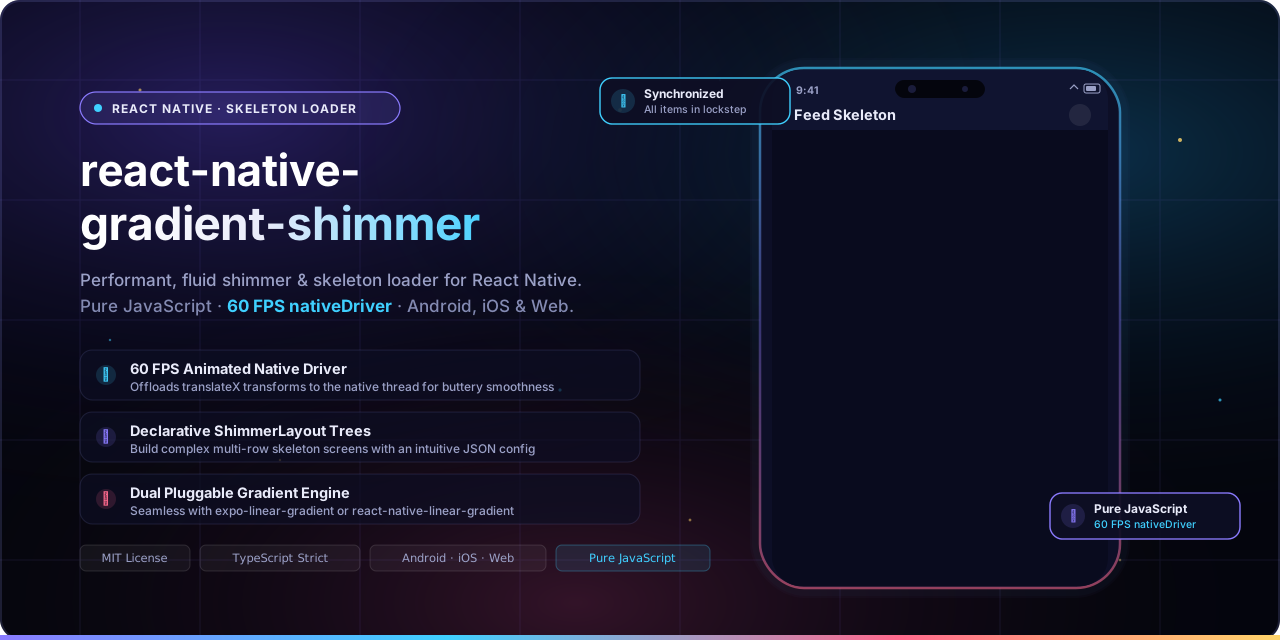
A pure JavaScript, performant, typed shimmer component for Android, iOS, and Web.
React Native Gradient Shimmer delivers buttery smooth 60 FPS skeleton loading screens across Android, iOS, and Web. Powered by React Native's native Animated driver and flexible linear gradient engines (expo-linear-gradient or react-native-linear-gradient), it contains no native code in this package, supports declarative layout tree composition via ShimmerLayout, and coordinates animations across multiple skeleton elements.






Quick Start · Why · Demo · Requirements · Installation · Usage · Shimmer Layout · API · Contributing
Quick Start
# 1. Install library
yarn add react-native-gradient-shimmer
# or: npm i -S react-native-gradient-shimmer

# 2. Install your preferred gradient provider (Expo or Bare RN)
npx expo install expo-linear-gradient
# or for bare React Native:
# yarn add react-native-linear-gradient && cd ios && pod install
import React from 'react';
import {SafeAreaView} from 'react-native';
import {LinearGradient} from 'expo-linear-gradient'; // or 'react-native-linear-gradient'
import GradientShimmer from 'react-native-gradient-shimmer';

export default function App() {
  return (
    <SafeAreaView style={{flex: 1, padding: 16}}>
      {/* Circle Avatar Skeleton */}
      <GradientShimmer
        LinearGradientComponent={LinearGradient}
        width={80}
        height={80}
        style={{borderRadius: 40, marginBottom: 16}}
      />

      {/* Text Line Skeleton */}
      <GradientShimmer
        LinearGradientComponent={LinearGradient}
        width={240}
        height={16}
        style={{borderRadius: 4, marginBottom: 8}}
      />
      <GradientShimmer
        LinearGradientComponent={LinearGradient}
        width={160}
        height={16}
        style={{borderRadius: 4}}
      />
    </SafeAreaView>
  );
}
Why Gradient Shimmer?
- ⚡ Pure JavaScript Package. No native code inside this package—simply bring your preferred gradient engine (
expo-linear-gradientin Expo orreact-native-linear-gradientin bare React Native). Installs in seconds. - 🏎 60 FPS Animated Native Driver. Dispatches translation transforms directly to the native UI thread via
useNativeDriver: truefor smooth active animation playback. - 🌐 Cross-Platform Support. Delivers consistent behavior across Android, iOS, and Web (Expo Web or
react-native-web). - 📐 Declarative ShimmerLayout Trees. Design intricate wireframes and multi-row skeleton loaders effortlessly using JSON layout configs with standard Flexbox properties (
flexDirection,gap,justifyContent,alignItems). - 🔄 Synchronized Group Animations. Built-in
AnimationProvidercoordinates multiple skeleton elements into a sharedAnimated.parallelloop to keep related shimmer elements aligned together. - 🔌 Pluggable LinearGradient Engine. Decoupled gradient dependency: seamlessly plug in
expo-linear-gradientin Expo apps orreact-native-linear-gradientin bare React Native projects. - 🎨 Factory Customization. Generate reusable, pre-configured component instances using
createGradientShimmerwith your app's brand colors, duration, and custom easing curves. - 📦 Strict TypeScript Definitions. Comprehensive TypeScript typing for props, layout configurations, and container items out of the box.
Demo
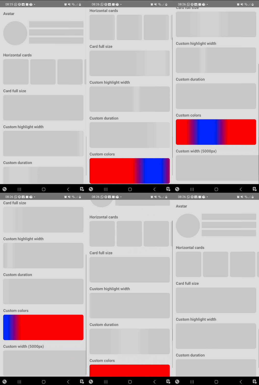
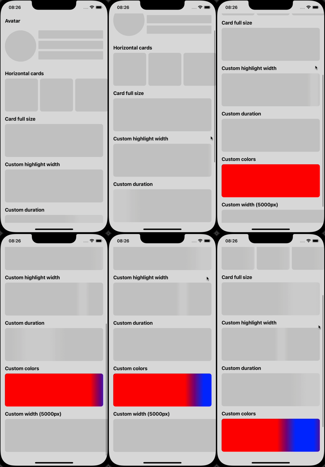
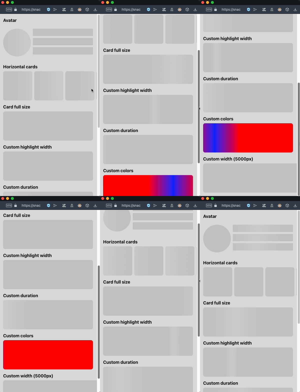
Experience the live component in your browser or phone via the Snack Online Demo.
| Android | iOS | Web |
|---|---|---|
 |
 |
 |
Requirements
| Requirement | Declared Peer Dep | Effective Minimum | Notes |
|---|---|---|---|
react-native |
>= 0.60.0 |
>= 0.69.0 (or >= 0.71.0 for gap) |
Declared in peerDependencies. Note that GradientShimmer uses React 18+ (useId), and ShimmerLayout flexbox gap requires React Native 0.71+. |
| Linear Gradient Engine | expo-linear-gradient or react-native-linear-gradient |
Latest stable | Passed via the LinearGradientComponent prop. |
Installation
1. Install Package
# Using Yarn
yarn add react-native-gradient-shimmer

# Using npm
npm i -S react-native-gradient-shimmer
2. Install Gradient Provider
Choose the gradient engine matching your workflow:
Option A: Expo (Managed or Bare)
npx expo install expo-linear-gradient
Option B: Bare React Native
yarn add react-native-linear-gradient
cd ios && pod install
Usage
Basic Direct Usage
Pass your preferred gradient component directly via the LinearGradientComponent prop:
import React from 'react';
import {View} from 'react-native';
import {LinearGradient} from 'expo-linear-gradient'; // or 'react-native-linear-gradient'
import GradientShimmer from 'react-native-gradient-shimmer';

export const UserCardSkeleton = () => {
  return (
    <View style={{flexDirection: 'row', alignItems: 'center', padding: 16}}>
      <GradientShimmer
        LinearGradientComponent={LinearGradient}
        width={56}
        height={56}
        style={{borderRadius: 28, marginRight: 12}}
      />
      <View style={{flex: 1}}>
        <GradientShimmer
          LinearGradientComponent={LinearGradient}
          width={140}
          height={14}
          style={{borderRadius: 4, marginBottom: 8}}
        />
        <GradientShimmer
          LinearGradientComponent={LinearGradient}
          width={90}
          height={12}
          style={{borderRadius: 4}}
        />
      </View>
    </View>
  );
};
Custom Shimmer Factory (createGradientShimmer)
Avoid repeating LinearGradientComponent and styling props on every skeleton item by creating a tailored shimmer instance with preset defaults:
import {Easing, View} from 'react-native';
import {LinearGradient} from 'expo-linear-gradient';
import {createGradientShimmer} from 'react-native-gradient-shimmer';

// Define reusable brand shimmer component
export const AppShimmer = createGradientShimmer({
  LinearGradientComponent: LinearGradient,
  backgroundColor: '#151838',
  highlightColor: '#2b3164',
  duration: 1200,
  easing: Easing.bezier(0.4, 0, 0.2, 1),
});

// Use anywhere without passing LinearGradientComponent again
export const ArticleSkeleton = () => (
  <View style={{padding: 16}}>
    <AppShimmer
      width={300}
      height={180}
      style={{borderRadius: 12, marginBottom: 12}}
    />
    <AppShimmer
      width={220}
      height={16}
      style={{borderRadius: 4, marginBottom: 8}}
    />
    <AppShimmer width={150} height={14} style={{borderRadius: 4}} />
  </View>
);
Synchronizing Multiple Elements (AnimationProvider)
When rendering multiple standalone GradientShimmer components on the same screen, wrap them in AnimationProvider to synchronize their highlight sweeps in parallel:
import React from 'react';
import {View} from 'react-native';
import {LinearGradient} from 'expo-linear-gradient';
import GradientShimmer, {
  AnimationProvider,
} from 'react-native-gradient-shimmer';

export const FeedSkeleton = () => {
  return (
    <AnimationProvider animating={true}>
      <View style={{gap: 16, padding: 16}}>
        <GradientShimmer
          LinearGradientComponent={LinearGradient}
          width={280}
          height={20}
        />
        <GradientShimmer
          LinearGradientComponent={LinearGradient}
          width={200}
          height={20}
        />
        <GradientShimmer
          LinearGradientComponent={LinearGradient}
          width={240}
          height={20}
        />
      </View>
    </AnimationProvider>
  );
};
For full working examples, explore the repository App.tsx.
Shimmer Layout
The ShimmerLayout component allows you to compose complex nested skeleton hierarchies declaratively using a JSON configuration tree. It automatically wraps items with AnimationProvider for synchronized animations.
import React from 'react';
import {SafeAreaView} from 'react-native';
import {LinearGradient} from 'expo-linear-gradient';
import {
  ShimmerLayout,
  ShimmerLayoutContainerType,
} from 'react-native-gradient-shimmer';

const postCardLayout: ShimmerLayoutContainerType = {
  style: {padding: 16, backgroundColor: '#0d0f27', borderRadius: 16},
  content: [
    // Header row: Avatar + User info
    {
      flexDirection: 'row',
      alignItems: 'center',
      marginBottom: 16,
      content: [
        {width: 48, height: 48, style: {borderRadius: 24}, marginRight: 12},
        {
          justifyContent: 'space-between',
          content: [
            {width: 140, height: 14, style: {borderRadius: 4}, marginBottom: 6},
            {width: 80, height: 12, style: {borderRadius: 4}},
          ],
        },
      ],
    },
    // Media Banner
    {width: 320, height: 180, style: {borderRadius: 12}, marginBottom: 14},
    // Text lines
    {width: 280, height: 14, style: {borderRadius: 4}, marginBottom: 8},
    {width: 210, height: 14, style: {borderRadius: 4}, marginBottom: 8},
    {width: 150, height: 12, style: {borderRadius: 4}},
  ],
};

export default function PostScreen() {
  return (
    <SafeAreaView
      style={{flex: 1, justifyContent: 'center', alignItems: 'center'}}>
      <ShimmerLayout
        LinearGradientComponent={LinearGradient}
        layout={postCardLayout}
        backgroundColor="#151838"
        highlightColor="#2c3268"
      />
    </SafeAreaView>
  );
}
API Reference
All components, types, and factories are exported from 'react-native-gradient-shimmer'.
GradientShimmer Props
| Prop | Type | Default | Description |
|---|---|---|---|
LinearGradientComponent |
ComponentType<LinearGradientPropsType> |
Required | Linear gradient component from expo-linear-gradient or react-native-linear-gradient. |
width |
number |
Required | Component width in DPI (must be a positive number). |
height |
number |
Required | Component height in DPI. |
backgroundColor |
string |
'rgb(200,200,200)' |
Base placeholder background color in HEX, RGB, or RGBA. |
highlightColor |
string |
'rgb(210,210,210)' |
Highlight shimmer beam color in HEX, RGB, or RGBA. |
highlightWidth |
number |
200 |
Width of the animated gradient highlight beam in DPI. |
duration |
number |
1500 |
Animation duration for a single pass in milliseconds. |
animating |
boolean |
true |
Starts or stops the shimmer animation. |
easing |
EasingFunction |
Easing.linear |
Easing function applied to Animated.timing(). |
style |
StyleProp<ViewStyle> |
undefined |
Styles passed to the container view (e.g. borderRadius, margin). |
testID |
string |
undefined |
Identifier used for automated testing. |
ShimmerLayout Props
Inherits properties from GradientShimmer except width, height, and style.
| Prop | Type | Default | Description |
|---|---|---|---|
layout |
ShimmerLayoutContainerType |
Required | Hierarchical layout configuration tree. |
LinearGradientComponent |
ComponentType<LinearGradientPropsType> |
Required | Linear gradient component from Expo or bare React Native. |
defaultShimmerProps |
Omit<Partial<GradientShimmerPropsType>, 'LinearGradientComponent'> |
undefined |
Fallback props inherited by all layout items (colors, duration, etc.). |
animating |
boolean |
true |
Controls animation playback for all nested items. |
ShimmerLayoutContainerType
Defines a container node within the ShimmerLayout tree:
| Property | Type | Description |
|---|---|---|
content |
Array<ShimmerLayoutItemType | ShimmerLayoutContainerType> |
Array of nested container nodes or leaf shimmer items. |
flexDirection |
'row' | 'column' | 'row-reverse' | 'column-reverse' |
Flexbox layout direction. |
alignItems |
FlexAlignType |
Alignment along the cross axis. |
justifyContent |
'flex-start' | 'flex-end' | 'center' | 'space-between' | 'space-around' | 'space-evenly' |
Alignment along the main axis. |
gap |
number |
Gutter spacing between rows and columns. |
rowGap |
number |
Spacing between element rows. |
columnGap |
number |
Spacing between element columns. |
style |
StyleProp<ViewStyle> |
Custom styles applied to the container view. |
marginTop / marginBottom / marginLeft / marginRight |
number |
Margin offsets for the container. |
ShimmerLayoutItemType
Defines a leaf shimmer shape within the layout tree:
| Property | Type | Description |
|---|---|---|
width |
number |
Item width in DPI. |
height |
number |
Item height in DPI. |
style |
StyleProp<ViewStyle> |
Styles applied to the item (e.g., borderRadius). |
marginTop / marginBottom / marginLeft / marginRight |
number |
Margin spacing for the item. |
createGradientShimmer(fixedProps)
Creates a customized GradientShimmer component with preset props:
function createGradientShimmer<
  FixedProps extends Partial<GradientShimmerPropsType>,
>(fixedProps: FixedProps): FunctionComponent<NonFixedProps>;
AnimationProvider
Wraps multiple shimmer components to synchronize their loop cycles:
<AnimationProvider animating={true}>
  {/* Nested GradientShimmer components animate in parallel lockstep */}
</AnimationProvider>
Contributing
Contributions, bug reports, and suggestions are welcome!
- Fork the repository and create your feature branch:
git checkout -b feat/my-feature. - Verify code quality and typing:
yarn lint yarn build - Open a Pull Request detailing your changes.
For questions and feature requests, please open an issue.
Support the Maintainer
If this project saved you development time, consider supporting Douglas Junior:


Star History
License
The MIT License (MIT)

Copyright (c) 2023 Douglas Nassif Roma Junior
See the full license file.
Author & More Projects

Discover more open-source libraries, creative animation engines, and developer tools at douglasjunior.work.