
dokar3/compose-sonner
dokar3/compose-sonner has 363 GitHub stars and 26 forks. GitHot measured -1 stars in 24 hours. Last checked 2026-11-09 08:53 UTC. Last push 2026-11-06.
An opinionated toast component for Compose Multiplatform.
What you can do
- Stacked toasts and expanded toasts
- Different types and rich colors
- Positions (Alignments)
- Swipe down to dismiss
Measured star growth
- in 24h
- -1
- in 7 days
- Update delayed
- in 15 days
- Update delayed
- in 1 month
- Update delayed
Net star changes over overlapping periods, not daily totals. Missing measurements are left blank. Stars measure attention, not software quality.
README.md
Original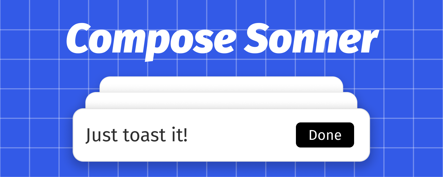
Compose Sonner


An opinionated toast component for Compose Multiplatform.
This is a Compose implementation of sonner - an excellent toast library by emilkowalski.
Demo
WasmJs Demo
https://dokar3.github.io/compose-sonner/
Video
https://github.com/dokar3/compose-sonner/assets/68095777/ff97c6cc-012e-4152-8c40-0d2ba382c757
Features
- Almost the same as emilkowalski's React implementation: UI, Animations, and even the API.
These include:
- Stacked toasts and expanded toasts
- Different types and rich colors
- Transitions
- Positions (Alignments)
- Swipe down to dismiss
- Close button and action button
- Custom icons
- Durations
- Lazy and performant, you can display a large amount of toasts at once
- Fully customizable, you can render your own Composable on it
- Supports both Material 2 and Material 3 because it does not depend on them
Roadmaps
- iOS target. Done in #8, thanks to @shubhamsinghshubham777!
- Online wasmJs sample
Usages
Installation
build.gradle(.kts)
implementation("io.github.dokar3:sonner:<VERSION>")
libs.versions.toml
sonner = { module = "io.github.dokar3:sonner", version = "<VERSION>" }
Basic
val toaster = rememberToasterState()

Button(onClick = { toaster.show("Hello world!") }) {
    Text("Show a toast")
}

Toaster(state = toaster)
Types
toaster.show(
    message = "Message",
    type = ToastType.[Normal | Success | Info | Warning | Error],
)
Dark theme
toaster.show(
    message = "Message",
    darkTheme = true,
)
Positions
Toaster(
    state = toaster,
    alignment = Alignment.[TopStart | TopCenter | TopEnd | BottomStart | BottomCener | BottomEnd],
)
Durations
toaster.show(
    message = "Message",
    duration = [ToasterDefaults.DurationLong | 5000.milliseconds | Duration.INFINITE],
)
Updates
const val TOAST_ID_LOADING = ANYTHING

toaster.show(message = "Loading", id = TOAST_ID_LOADING, duration = Duration.INFINITE)

toaster.show(message = "Success", id = TOAST_ID_LOADING)
Dismiss
toaster.dismiss(id)
toaster.dismiss(toast)
toaster.dismissAll()
Buttons
// Enable close buttons
Toaster(
    state = toaster,
    showCloseButton = true,
)

// Set an action button
toaster.show(
    message = "Message",
    action = TextToastAction(
        text = "Dismiss",
        onClick = { toaster.dismiss(it) },
    )
)
Icons
Toaster(
    state = toaster,
    iconSlot = { toast ->
        // ICON_LOADING can be anything, it's just a mark
        if (toast.icon == ICON_LAODING) {
            LoadingIcon()
        } else {
            // Fallback to the default icon slot
            ToasterDefaults.iconSlot(toast)
        }
    },
)
Dismiss pause
Toaster(
    state = toaster,
    dismissPause = ToastDismissPause.[Never | OnNotFront | OnInvisible],
)
Other
@Composable
fun Toaster(
    contentColor: @Composable (toast: Toast) -> Color,
    border: @Composable (toast: Toast) -> BorderStroke,
    background: @Composable (toast: Toast) -> Brush,
    shape: @Composable (toast: Toast) -> Shape,
    elevation: Dp,
    shadowAmbientColor: Color,
    shadowSpotColor: Color,
    contentPadding: PaddingValues,
    containerPadding: @Composable (toast: Toast) -> PaddingValues,
    widthPolicy: @Composable (toast: Toast) -> ToastWidthPolicy,
    offset: IntOffet,
)
Interact with ViewModel UiState
Define the mapping function
fun UiMessage.toToast(): Toast = when (this) {
    is UiMessage.Error -> Toast(id = id, message = message, type = ToastType.Error)
    is UiMessage.Success -> Toast(id = id, message = message, type = ToastType.Success)
}
Then
val toaster = rememberToasterState(
    onDismissed = { viewModel.removeUiMessageById(it.id as Long) },
)

val uiState by viewModel.uiState.collectAsState()

LaunchedEffect(viewModel, toaster) {
    // Listen to messages changes and map to toasts
    val toastsFlow = viewModel.uiState.map { it.uiMessages.map(UiMessage::toToast) }
    toaster.listenMany(toastsFlow)
}

Toaster(state = toaster)
Or use an adapter function
@Composable
fun UiMessageToaster(
    messages: List<UiMessage>,
    onRemoveMessage: (id: Long) -> Unit,
    modifier: Modifier = Modifier,
) {
    val toaster = rememberToasterState(
        onToastDismissed = { onRemoveMessage(it.id as Long) },
    )

    val currentMessages by rememberUpdatedState(messages)

    LaunchedEffect(toaster) {
        // Listen to State<List<UiMessage>> changes and map to toasts
        toaster.listenMany { currentMessages.map(UiMessage::toToast) }
    }

    Toaster(state = toaster, modifier = modifier)
}

@Composable
fun YourScreen(...) {
    val uiState by viewModel.uiState.collectAsState()

    ...

    UiMessageToaster(
        messages = uiState.uiMessages,
        onRemoveMessage = { viewModel.removeUiMessageById(it) },
    )
}
License
Copyright 2024 dokar3

Licensed under the Apache License, Version 2.0 (the "License");
you may not use this file except in compliance with the License.
You may obtain a copy of the License at

    http://www.apache.org/licenses/LICENSE-2.0

Unless required by applicable law or agreed to in writing, software
distributed under the License is distributed on an "AS IS" BASIS,
WITHOUT WARRANTIES OR CONDITIONS OF ANY KIND, either express or implied.
See the License for the specific language governing permissions and
limitations under the License.
Explore related projects
freeCodeCamp/freeCodeCamp
freeCodeCamp.org's open-source codebase and curriculum. Learn math, programming, and computer science for free.
458,824 starsdonnemartin/system-design-primer
Learn how to design large-scale systems. Prep for the system design interview. Includes Anki flashcards.
377,452 starsreact/react
The library for web and native user interfaces.
252,461 starsvuejs/vue
This is the repo for Vue 2. For Vue 3, go to https://github.com/vuejs/core
212,625 stars