
Travins/yi-ui
Travins/yi-ui has 65 GitHub stars and 1 forks. Star changes are not measured yet. Last checked 2026-11-13 08:07 UTC. Last push 2026-11-11.
Yi UI · 易 —— 为中文界面打磨的线条网格 React 组件库(shadcn registry)
Measured star growth
- in 24h
- Collecting history
- in 7 days
- Collecting history
- in 15 days
- Collecting history
- in 1 month
- Collecting history
Net star changes over overlapping periods, not daily totals. Missing measurements are left blank. Stars measure attention, not software quality.
README.en.md
Original
Yi UI
易 · A line-grid styled React component library. Components install as source into your project, so the code is yours from day one.
Website · Components · Blocks · Pages · Themes · Docs
简体中文 · English
About
Yi UI is a component library distributed as a shadcn registry, maintained by Travins as a personal project, with docs at yiui.dev. Nothing ships as an npm package: the shadcn CLI copies the source into your project, where you can change styles, structure and behavior freely.
The name comes from the site's logo, the Chinese character 易 (yì), drawn as three thin and three thick slashes. It means both "easy" and "change": easy to pick up, and yours to change.
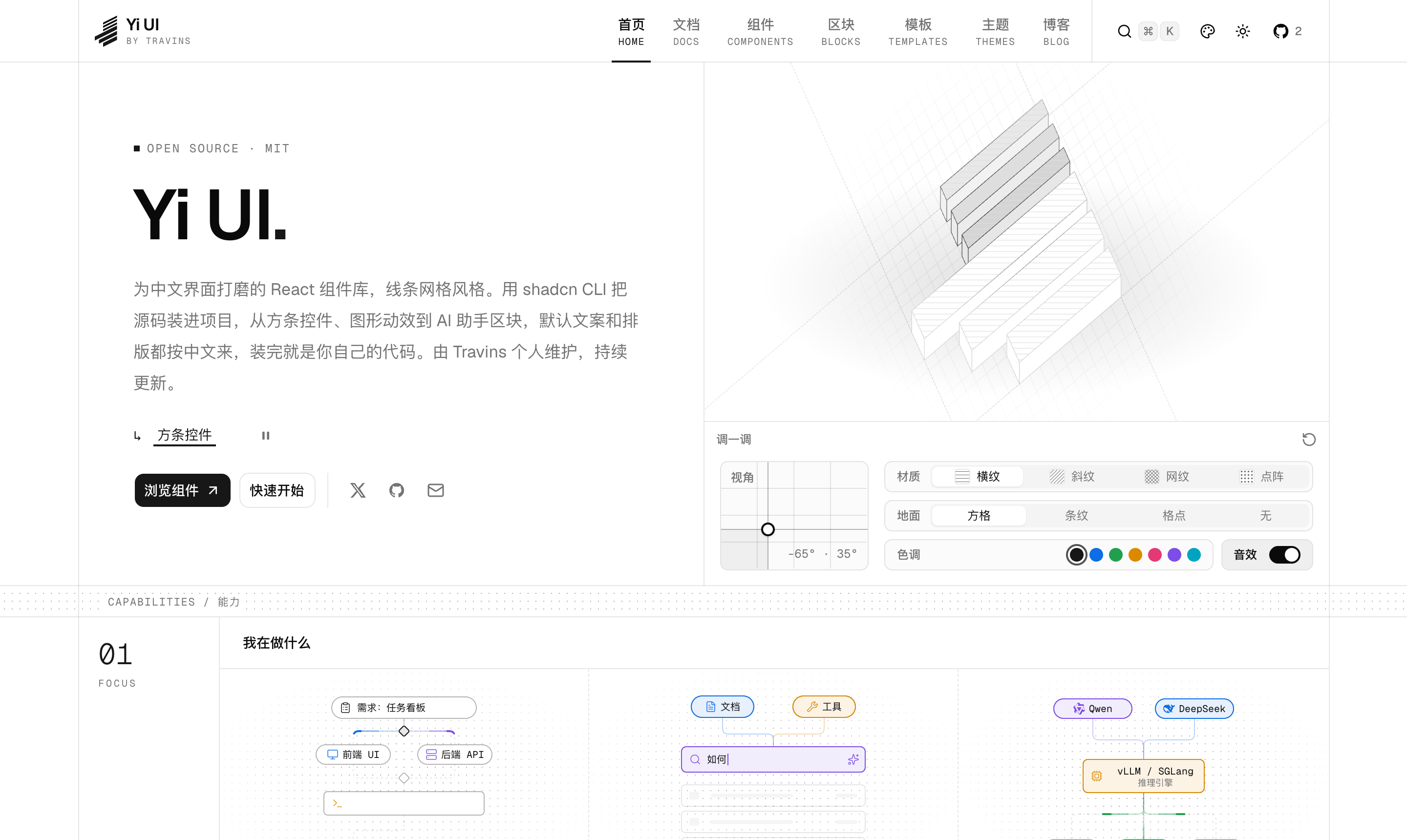
Everything follows one visual language, the line grid: full-width rules, ruled containers and dotted separators, combined with hairline borders, small radii and restrained motion.
Yi UI is Chinese-first: the docs are in Simplified Chinese, default component labels (buttons, hints, screen-reader text) are Chinese, and typography is tuned for Chinese system fonts. User-facing text is collected into a labels prop you can override, so the components can still be used in other languages; there are no plans for an English edition of the docs.
Features
- You own the code — Install with the shadcn CLI; the component, the registry items it depends on and the CSS variables it needs are written into your project together.
- Built on Base UI — Interactive primitives use Base UI, so keyboard support, focus management and screen-reader semantics come built in.
- Theme-aware — Every color comes from theme variables: light / dark plus 14 color themes, and components recolor as you switch.
- A family of bar controls — Value slider, segmented control, switch, tone picker, angle dial and XY pad share one height scale and look. Combine them into a parameter panel and copy the current values as JSX in one click. The Chinese form controls — amount, phone number, ID number, quantity and region — share the same look.
- Grid-style table chrome — The grid toolbar lays out search, filters and column settings as a row of cells, and bar controls placed in it drop their own frame. Grid pagination sits under the table; when you page, the numbers roll and the current-page block slides, so the bar never jumps.
- Works on phones — On touch devices buttons and inputs grow one step (36 / 40 / 44px), drag controls tell scrolling from dragging, numeric inputs bring up the number keyboard, and every example can be opened on a phone by scanning a QR code.
- Thoughtful motion — Animations start when scrolled into view, pause off-screen and respect "reduce motion".
- Prerender-friendly — Every page is prerendered at build time. Components that measure layout or draw on a canvas render a same-size placeholder before scripts load, so there are no blank areas or layout shifts.
- AI-friendly — Install the agent skill with
npx skills add Travins/yi-ui --skill yi-ui. Every doc page has a Markdown version with examples and props expanded, plusllms.txtandllms-full.txt.
Quick start
You need React 19, Tailwind CSS v4 and a shadcn project initialized with the Base UI base.
# New project (for an existing one, drop -t and -n)
pnpm dlx shadcn@latest init -t next -b base -p nova -n my-app

# Install any component
pnpm dlx shadcn@latest add @yiui/value-slider
Yi UI is listed in the official shadcn registry directory, so the @yiui namespace works without any setup — the CLI adds it to components.json on first install. You can also install by full URL:
pnpm dlx shadcn@latest add https://yiui.dev/r/value-slider.json
See the installation guide for where files land, how dependencies and styles are written, and common issues.
Components
| Group | Components |
|---|---|
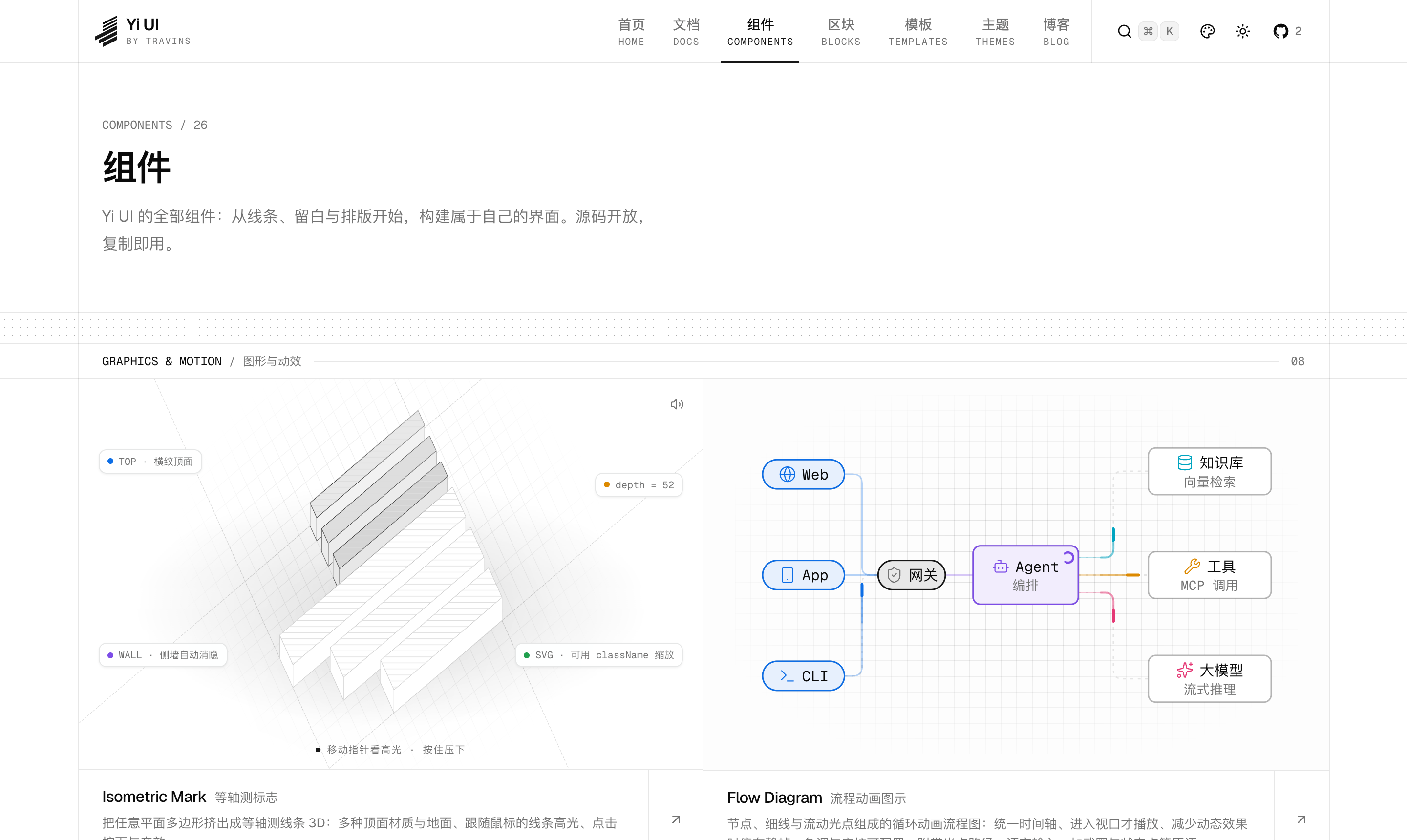
| Graphics & Motion | Isometric Mark · Flow Diagram · Dotted Globe · Glyph Field · Shuffle Grid · Orbit · Ripple · Code Stack |
| Form & Input | Palette Editor · Color Picker · Bar Field · Bar Select · Value Slider · Control Panel · XY Pad · Angle Dial · Segmented Control · Toggle Switch · Tone Picker · Amount Input · Phone Input · ID Number Input · Number Stepper · Steps · Region Picker · File Upload |
| Data Display | Grid Toolbar · Grid Pagination · Chart Card · Stat Card · Mini Chart · Change Summary |
| Text & Marquee | Text Animate · Marquee |
| Content Display | Timeline · Card Stack · Checklist |
| Time | Local Time · Greeting |
| Layout | Grid Layout |
| Utilities | Chinese Number · China Regions · Flow Tone |
Blocks & Pages
Blocks are split into three groups, the same as on the website.
| Group | Name | Description |
|---|---|---|
| Application | AI assistant agent-chat-01 |
Embedded and floating layouts showing reasoning summaries, tool calls (timing, grouping, auto-expand on failure with retry), sources, charts and change summaries, with a built-in streaming demo. |
| Application | Data table data-table-01 |
Grid toolbar (search, status and owner dropdowns, column settings, density), sorting, column resizing, selection, cell editing with optimistic save, grid pagination and virtual scrolling; narrow screens switch to a card list. |
| Application | Theme Customizer theme-customizer-01 |
Color, radius, content width and appearance preferences with early restoration. |
| Navigation | Collapsible sidebar sidebar-01 |
Search filtering, accordion groups and sub-items with guide lines; when collapsed to an icon rail, submenus fly out on hover or from the keyboard. |
| Navigation | Team & account sidebar sidebar-02 |
Team switcher (⌘1…⌘9), ⌘K command search, navigation with counts and group actions, and multi-account switching from the user card. |
| Navigation | Workspace tree sidebar sidebar-03 |
Module icon rail plus a tree panel with WAI-ARIA tree keyboard support, status dots, counts, filtering and a storage usage card. |
| Navigation | Context panel sidebar-04 |
A right-side data panel: project switcher, stacked progress chart, status breakdown and tasks assigned to you, with composable sections. |
| Forms & Flows | Split sign-in auth-01 |
Brand panel plus forms: password / one-time-code sign-in (auto-formatted phone number, inline send-code button with countdown), sign-up with a strength meter, password recovery. |
| Forms & Flows | QR-first sign-in auth-02 |
A real, scannable QR code with five states: waiting, scanned awaiting confirmation, expired with refresh, success and error; configurable providers, with SMS and password as fallbacks. |
| Forms & Flows | SMS code sign-in auth-03 |
Two steps: phone number with agreement checkbox, then a 6-digit code (auto-submits on paste) with a masked number you can edit, a resend countdown and rate-limit messages. |
| Forms & Flows | Enterprise SSO auth-04 |
Identifier-first: enter a work email, detect the organization's identity provider by domain, retry or fall back to a password on failure; organization slug sign-in and an organization panel on wide screens. |
| Forms & Flows | Passkey & MFA auth-05 |
The second sign-in step: passkey (waiting, cancelled, unsupported), authenticator app, SMS code and recovery code, with "remember this device". |
| Forms & Flows | Sign-up Wizard auth-06 |
Multi-step sign-up: account (password strength), profile (phone, region, team size) and an optional identity step; a step rail on wide screens, a compact progress bar on phones. |
| Forms & Flows | Lock Screen auth-07 |
Full-screen lock: large clock, greeting and avatar, unlock with a password or PIN; locks with a countdown after repeated failures, also fits re-authentication after a session expires. |
| Forms & Flows | Magic Link auth-08 |
Email only: after sending the sign-in link it offers an "open mailbox" shortcut by domain, or accepts the code from the email; with domain suggestions and a resend countdown. |
| Forms & Flows | Settings settings-01 |
A full settings page built from the bar controls: section nav, live preview, modified count, reset and async save. |
| Forms & Flows | Checkout checkout-01 |
Address, shipping, invoice, payment and order completion, with a mobile store ordering demo. |
| Page | Console shell app-shell-01 |
Fixed header, collapsible nav, workspace sidebar and AI assistant, with example pages full of stat cards and charts; the list page reuses the data table block. |
Color themes
Three neutral bases (Neutral, Stone, Slate) and 11 color themes (Red, Orange, Amber, Lime, Green, Teal, Sky, Blue, Violet, Fuchsia, Pink). Color themes always use white text on the primary color, at a contrast ratio of at least 4.5:1. Preview them on the themes page and copy the CSS variables, or install one directly:
pnpm dlx shadcn@latest add https://yiui.dev/r/theme-blue.json
Local development
git clone https://github.com/Travins/yi-ui.git
cd yi-ui
nvm use          # Node 24 (see .nvmrc)
pnpm install
pnpm dev
| Command | What it does |
|---|---|
pnpm dev |
Start the dev server |
pnpm build |
Production build (preview with pnpm start) |
pnpm lint |
Lint |
pnpm registry:build |
Generate public/r/*.json and other registry output |
pnpm registry:lint |
Check registry items for dependencies, files and conventions |
pnpm test |
Script unit tests and self-tests |
pnpm qa:shots <name> |
Screenshot QA on the build (light / dark, color themes, narrow widths, errors, overflow) |
pnpm qa:install [name…] |
Local install, type, build and browser QA; --fresh, --keep, --namespace; --monorepo uses the official shadcn monorepo template |
pnpm qa:interaction |
Interaction QA: touch heights, focus styles, keyboard use, whether errors clear once fixed; --build checks the production build |
pnpm qa:loading |
Block scripts and check pre-hydration placeholders and blank areas |
Project structure
content/            Docs and blog (MDX)
src/registry/       Published source (single source of truth)
  ui/               Components
  blocks/           Blocks
  pages/        Pages
  examples/         Examples used in the docs
src/components/     The site's own shell, doc rendering and home page
src/styles/         Line grid, color themes and doc styles
registry.json       Registry manifest
public/r/           Generated registry JSON
Doc previews, code views and public/r/*.json all read the same source in src/registry/.
Tech stack
Next.js 16 (App Router, deployed on Vercel) · React 19 · Tailwind CSS v4 · shadcn/ui · Base UI · Motion · Fumadocs (content layer) · Shiki · Recharts
Contributing
Issues and pull requests are welcome. See CONTRIBUTING.md for the workflow and conventions (written in Simplified Chinese).
License
MIT © Travins
Explore related projects
freeCodeCamp/freeCodeCamp
freeCodeCamp.org's open-source codebase and curriculum. Learn math, programming, and computer science for free.
459,068 starsdonnemartin/system-design-primer
Learn how to design large-scale systems. Prep for the system design interview. Includes Anki flashcards.
377,734 starsreact/react
The library for web and native user interfaces.
252,565 starsvuejs/vue
This is the repo for Vue 2. For Vue 3, go to https://github.com/vuejs/core
212,527 stars