
Snorlark/plop-ui
Snorlark/plop-ui has 52 GitHub stars and 8 forks. GitHot measured +2 stars in 24 hours. Last checked 2026-11-12 15:43 UTC. Last push 2026-11-11.
PlopUI: hand-drawn React UI kit, imperfect on purpose. Wobbly stickers, washi tape and a hand-lettered font, accessible to WCAG AA.
Measured star growth
- in 24h
- +2
- in 7 days
- Collecting history
- in 15 days
- Collecting history
- in 1 month
- Collecting history
Net star changes over overlapping periods, not daily totals. Missing measurements are left blank. Stars measure attention, not software quality.
README.md
Original
Hand-drawn UI, imperfect on purpose.
Press it like you mean it.



Docs · Getting started · Playground · Every component · Changelog
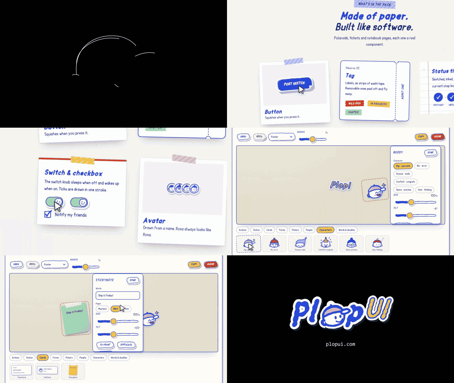
PlopUI (also written Plop UI or plop-ui) is an open-source React + TypeScript component library for people who'd rather have fun than follow the design rulebook. Lines wobble, stickers sit a little crooked, and the colors are picked by instinct, not strategy. It breaks the visual rules on purpose and keeps the ones that matter: every piece is accessible to WCAG AA. Everything is drawn in one cobalt marker on cream paper: die-cut sticker buttons, hatched shadows, boiling ink outlines, a cast of little characters, and press feedback you can feel (a squish, an ink burst, a buzz on your phone). Every "imperfection" is seeded, so it renders the same on the server and the client.
The "o" in the logo is the capped buddy who peeks over the top of a Button. He is the kit's mascot, and his friends show up wherever the kit has something to tell you.
Packages
| Package | What it is |
|---|---|
@plop-ui/react |
Components, hooks, the buddy cast, onColor, seeded randomness |
@plop-ui/tokens |
Colors, contrast roles, type, motion and 5 surfaces, as CSS variables and a typed object |
@plop-ui/fonts |
Sketchpop, the hand-drawn marker family (SIL OFL 1.1) |
Quick start
npm i @plop-ui/react @plop-ui/fonts # or: pnpm add @plop-ui/react @plop-ui/fonts
import "@plop-ui/fonts/fonts.css";
import "@plop-ui/react/styles.css";
import { PlopProvider, Button, StatusTimeline, toast } from "@plop-ui/react";

export function App() {
  return (
    <PlopProvider surface="poster">
      <Button variant="ink" buddy onClick={() => toast.success("Sketch posted", { buddy: true })}>
        Post sketch
      </Button>
      <StatusTimeline steps={["Sketched", "Inked", "Colored", "Shipped"]} current={2} />
    </PlopProvider>
  );
}
Like it? Star the repo on GitHub ⭐ so more people find it.
For the paper to cover the whole screen (not just your content), and why buttons stretch inside a grid, see Good to know in the Getting Started guide.
Using Next.js? The library never imports next/*, and every interactive component already carries "use client", so it drops straight into the App Router. Static pieces like StatusTimeline stay Server Components. See Using with Next.js.
What's in the kit
| Group | Pieces |
|---|---|
| Actions | Button, ButtonLink, IconButton, Menu, Tooltip |
| Inputs | Select (with a searchable people picker), MultiSelect, TextField, TextArea, Switch, Checkbox, RadioGroup / Radio, SearchField |
| Navigation | CommandPalette (⌘K / Ctrl K), Tabs |
| Display | Tag, Avatar, AvatarStack, TicketCard, UnitCard, StickyNote, Count, StatusDot, EmptyState |
| Feedback | StatusTimeline, Progress, Callout, Toast / toast() |
| Characters | Buddy, BuddyPeek: six characters, one per state |
| Lettering | Heading, Lettering, WordSticker, Doodle |
| Foundations | PlopProvider, Sheet, PlopFilters, 21 hand-drawn icons |
| Hooks | useHaptics, useSound, useBoil, useInkBurst, useReducedMotion |
| Utilities | onColor / contrastRatio (readable text on any fill), seed / seededTilt / seededPick |
The cast
Each character stands for exactly one state, everywhere in the kit:
| Character | Mood | Shows up for |
|---|---|---|
| Pip | success |
Things that went right |
| Bix | error |
Things that went wrong |
| Snooze | stale |
Data that hasn't updated in a while |
| Confetti | congrats |
Milestones worth celebrating |
| Specs | preview |
Previews and drafts |
| Hum | thinking |
Loading and working |
Pass buddy to Toast, toast() or Callout and the right character appears for the kind or tone, or pass a mood to choose one. A character never carries the message alone: the text always says it too.
Feedback that matches the intent
Pressing a sticker gives you an ink burst and a short haptic tap on phones that support it. Soft "plop" sounds are off by default; turn them on only after someone asks for them. Destructive (tomato) buttons shake their head and puff a little dust instead of throwing confetti. One PlopProvider at the root sets haptics and sound for everything inside it.
Surfaces
Five paper surfaces, each in light and dark: Poster, Cutting mat, Notebook, Kraft and Riso. Set one with <PlopProvider surface="kraft">. Every color pairing meets WCAG 2.2 AA on every surface.
Accessible by default
Native elements first, full keyboard support, visible focus, AA contrast on every surface in light and dark, and every effect respects prefers-reduced-motion.
The docs site
It's live at plopui.com (or run it locally, see below):
| Page | What it is |
|---|---|
/ |
The landing page: why PlopUI, how a sticker is made, and every component |
/docs/getting-started |
Installation, the Next.js guide, surfaces, tokens, accessibility, hooks, and one page per component |
/playground |
Three tools: a Sticker board to arrange real components and copy the code, a Lettering studio to make hand-lettered words and export them as React, HTML, SVG or PNG, and Tweak a component to change any prop live |
Press ⌘K / Ctrl K (or /) on any page to search every component and docs page.
New here? The ticket stub in the bottom-right corner of every page opens the Ride-along pass: a five-stop tour (what PlopUI is, install, components, playground, GitHub) that stamps each stop as you reach it. Finish it and Holo Pip is yours.
Run it locally
You need Node 20+ and pnpm 11 (corepack enable sets pnpm up for you).
pnpm install
pnpm build                              # builds tokens, fonts, the library and the apps
pnpm --filter @plop-ui/docs dev         # docs site  → http://localhost:4321
pnpm --filter @plop-ui/dispatch-demo dev  # dispatch demo → http://localhost:4322
pnpm --filter @plop-ui/storybook dev    # Storybook  → http://localhost:6006
The apps use the library's built output (packages/react/dist), not its source. If you change the library while the docs site is running, also run pnpm --filter @plop-ui/react dev in a second terminal so it rebuilds on save. If you don't, the site keeps the old build, and something you just exported will show up as "not a function".
Checks
pnpm lint
pnpm typecheck
pnpm test                               # Vitest + Testing Library (packages/react)
pnpm size                               # size-limit budgets for the library
pnpm --filter @plop-ui/docs test:e2e    # Playwright: hydration, axe on every page and surface, keyboard
                                        # (builds into .next-e2e, so it's safe while the dev server runs)
Repo map
CLAUDE.md         the rules the codebase follows
CONTRIBUTING.md   how to contribute, step by step
packages/tokens   design tokens → CSS variables + typed object (source: src/tokens.ts)
packages/fonts    Sketchpop woff2/ttf, the OFL license, font build tools
packages/react    @plop-ui/react (esbuild, CSS Modules, per-file "use client")
apps/docs         Next.js 15 site: landing, docs, playground
apps/dispatch-demo  Next.js 15 live incident queue built only from PlopUI (SSE + Server Action)
apps/storybook    Storybook 8 workshop with the a11y addon
docs/decisions    one short file per decision: what we chose and why
docs/prototype    the original v0.6 HTML prototype
docs/assets       the logo and the buddy mark
Contributing
Contributions are welcome: bug fixes, new components, docs, or a new character. Read CONTRIBUTING.md, which covers setup, the codebase rules, how to add a component from start to finish, and how to open a pull request. Not sure where to start? Pick an issue labelled good first issue. Found a security problem? See SECURITY.md. Everyone taking part follows the code of conduct.
Contributors
Thank you to everyone who has shipped code to PlopUI:


- @glaucusec:
BreadcrumbandSlider - @aneqlique: the playground's radius control
- @matheussilvano: the
nameprop onSelectandMultiSelect - @bfs2021: JSX escaping in the playground's copy button
Want to be on this list? See Contributing.
Support
PlopUI is free and open source, built in my spare time. If it makes your app a little more fun, you can buy Bix a beanie on Ko-fi or sponsor on GitHub. A star on the repo helps too. ♥
License
Code: MIT, © 2026 Lark Sigmuond Babao. The Sketchpop font: SIL Open Font License 1.1, so you can use, bundle and modify it freely, including in commercial work.
Explore related projects
freeCodeCamp/freeCodeCamp
freeCodeCamp.org's open-source codebase and curriculum. Learn math, programming, and computer science for free.
459,044 starsdonnemartin/system-design-primer
Learn how to design large-scale systems. Prep for the system design interview. Includes Anki flashcards.
377,700 starsreact/react
The library for web and native user interfaces.
252,544 starsvuejs/vue
This is the repo for Vue 2. For Vue 3, go to https://github.com/vuejs/core
212,527 stars