
AKAspanion/ui-neumorphism
AKAspanion/ui-neumorphism has 658 GitHub stars and 61 forks. GitHot measured 0 stars in 24 hours. Last checked 2026-11-15 23:48 UTC. Last push 2026-11-10.
Measured star growth
- in 24h
- 0
- in 7 days
- Collecting history
- in 15 days
- Collecting history
- in 1 month
- Collecting history
Net star changes over overlapping periods, not daily totals. Missing measurements are left blank. Stars measure attention, not software quality.
About
📕 React component library designed on the "new skeuomorphism" or "neumorphism" UI/UX trend.
Web & AppsREADME.md
Originalui-neumorphism


React component library designed on the "new skeuomorphism" or "neumorphism" UI/UX trend.
All the components are designed according to the neumorphic design trend.
Library features more than 50 individual components.
Demo
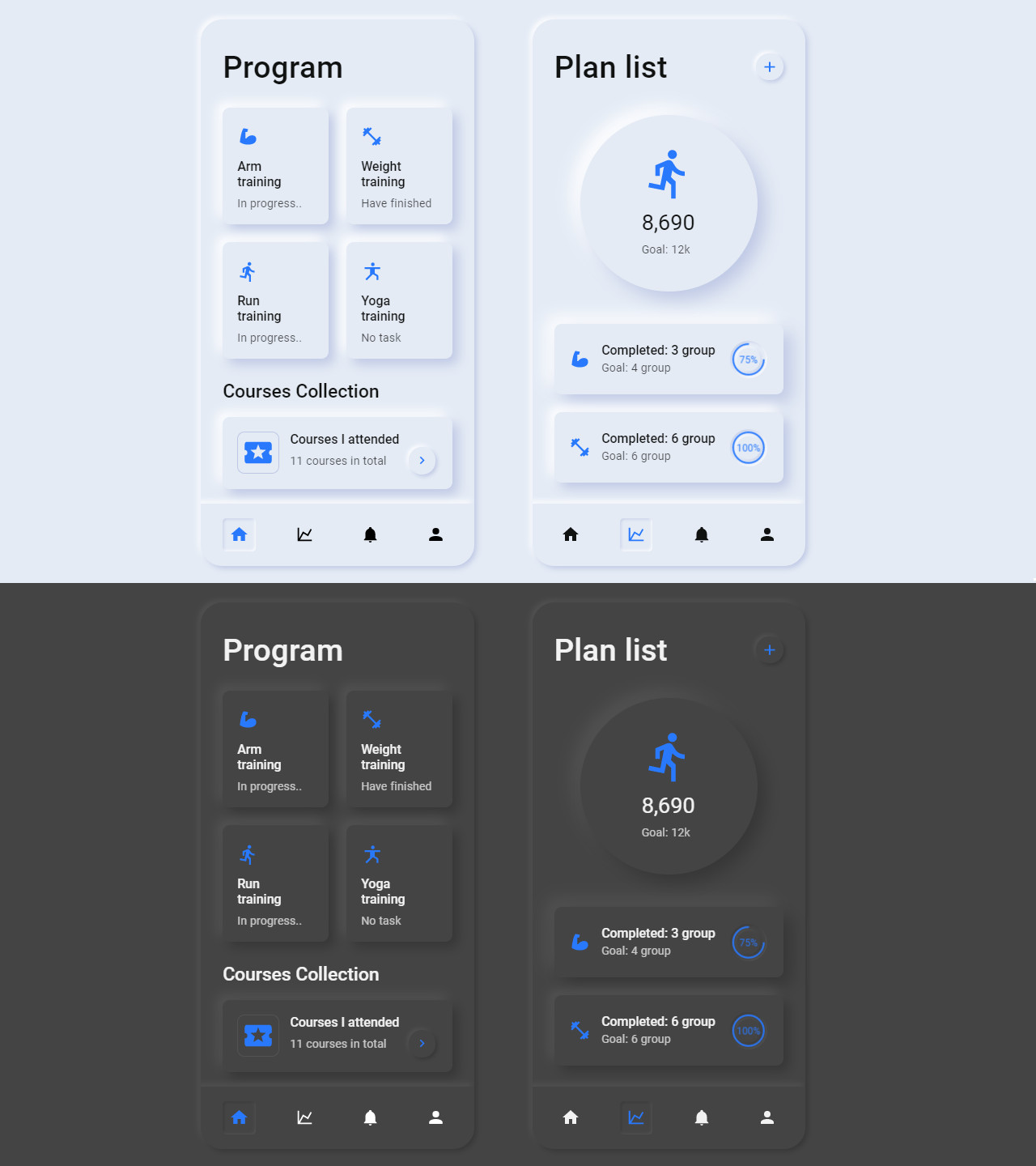
View examples here.
Documentation
Each component, and its API is well documented, with various examples along with their code and preview.
Check out the documentation here.
Install
npm install --save ui-neumorphism
Requires React 19 (react and react-dom ^19.0.0).
Upgrading to React 19
React 19 removed ReactDOM.findDOMNode, so components that need the DOM node of something you pass in (withResize, withClickOutside, and the Fade, Grow, Slide and SlideCarousel transitions) now find it through ref. Pass them one of:
- a DOM element (
<div>) - a ui-neumorphism component (each one exposes its root element as
domNode) - a component that passes its
refprop to a DOM element - a class component with a
domNodegetter:
class Panel extends React.Component {
  domRef = React.createRef()

  get domNode() {
    return this.domRef.current
  }

  render() {
    return <div ref={this.domRef}>...</div>
  }
}

export default withResize(Panel)
getDOMNode(refValue) is exported if you need the same lookup yourself. In development, a warning is logged when no DOM node can be found.
Usage
import React, { Component } from 'react'

import { Button } from 'ui-neumorphism'
import 'ui-neumorphism/dist/index.css'

class Example extends Component {
  render() {
    return <Button />
  }
}
Theming
In neumorphism UI, theming is dead simple. It is accomplished by using and modifying root css variables for colors.
To change the theme, you modify the root css variables directly or with the help of overrideThemeVariables() function, like this.
import React, { Component } from 'react'

import { overrideThemeVariables } from 'ui-neumorphism'
import 'ui-neumorphism/dist/index.css'

class App extends Component {
  componentDidMount() {
    // takes an object of css variable key-value pairs
    overrideThemeVariables({
      '--light-bg': '#E9B7B9',
      '--light-bg-dark-shadow': '#ba9294',
      '--light-bg-light-shadow': '#ffdcde',
      '--dark-bg': '#292E35',
      '--dark-bg-dark-shadow': '#21252a',
      '--dark-bg-light-shadow': '#313740',
      '--primary': '#8672FB',
      '--primary-dark': '#4526f9',
      '--primary-light': '#c7befd'
    })
  }

  ...
}
Here --light-bg and --dark-bg are css variables that hold specific values of color.
Using this power of CSS variables, you can change the app theme from anywhere in the entire application.
All the css variable definition is present in root tag of index.css. These variables are used to theme the library and its available for you to modify.
License
MIT © AKAspanion