
tbxark/TKSwitcherCollection
tbxark/TKSwitcherCollection has 915 GitHub stars and 88 forks. GitHot measured 0 stars in 24 hours. Last checked 2026-11-15 12:07 UTC. Last push 2026-09-14.
What you can do
- Four animated switches: simple (with optional rotate effect), exchange, smile and liquid.
- UIKit controls built on UIControl: target/action and @IBDesignable / @IBInspectable support.
- SwiftUI wrappers with Binding<Bool> sharing the same animations.
- Light / dark mode friendly when configured with semantic colors.
측정된 스타 증가
- in 24h
- 0
- in 7 days
- 기록 수집 중
- in 15 days
- 기록 수집 중
- in 1 month
- 기록 수집 중
서로 겹치는 기간의 순증가량이며 일별 합계가 아닙니다. 측정값이 없으면 비워 둡니다. 스타는 관심도를 나타내며 품질을 보장하지 않습니다.
소개
An animation switch collection
창작 및 미디어README.md
OriginalTKSwitcherCollection
A collection of animated switches for UIKit and SwiftUI.
English | 简体中文




| Switch | Example |
|---|---|
TKSimpleSwitch |
 |
TKSimpleSwitch (rotate) |
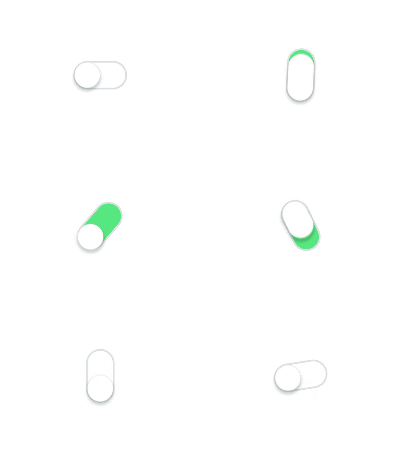 |
TKExchangeSwitch |
 |
TKSmileSwitch |
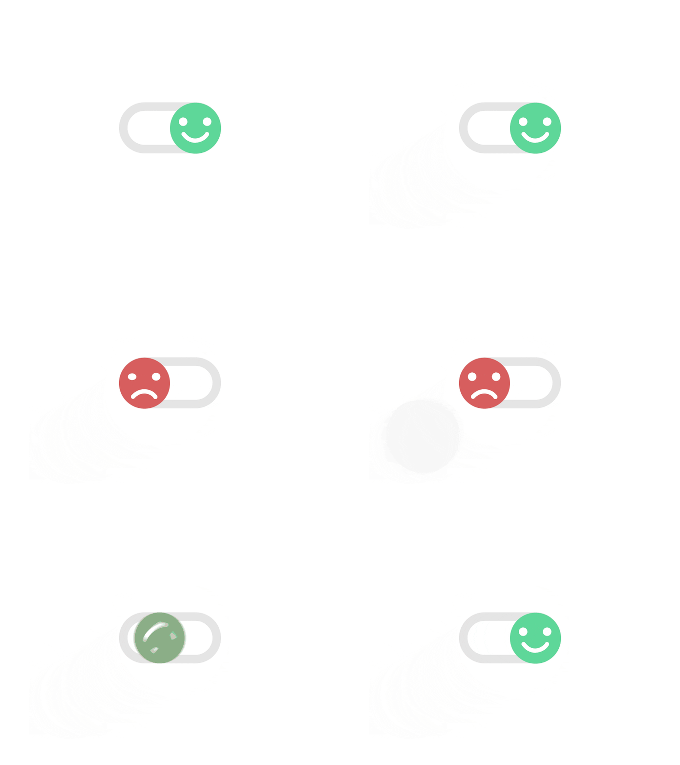 |
TKLiquidSwitch |
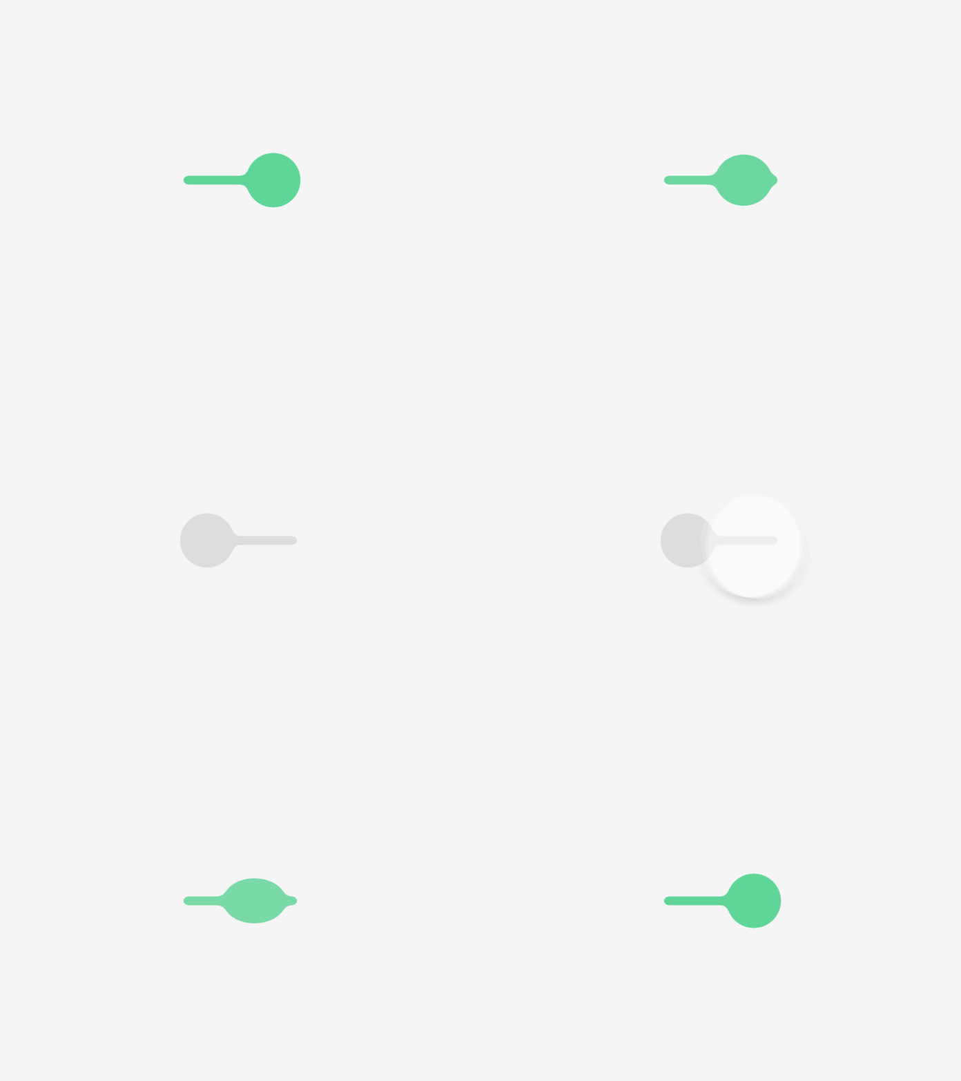 |
Switch designs by Oleg Frolov.
Features
- Four animated switches: simple (with optional rotate effect), exchange, smile and liquid.
- UIKit controls built on
UIControl: target/action and@IBDesignable/@IBInspectablesupport. - SwiftUI wrappers with
Binding<Bool>sharing the same animations. - Light / dark mode friendly when configured with semantic colors.
Requirements
- iOS 13.0+
- Swift 6 toolchain (Xcode 16+)
Installation
Swift Package Manager
In Xcode, select File > Add Package Dependencies... and enter the package URL:
https://github.com/TBXark/TKSwitcherCollection
Or add it to your Package.swift:
dependencies: [
    .package(url: "https://github.com/TBXark/TKSwitcherCollection.git", from: "2.0.0")
]
CocoaPods
pod 'TKSwitcherCollection', '~> 2.0'
Usage
UIKit
Every switch is a UIControl subclass. A tap toggles the switch and sends .valueChanged.
import UIKit
import TKSwitcherCollection

let switcher = TKSimpleSwitch(frame: CGRect(x: 0, y: 0, width: 100, height: 50))
switcher.onColor = .systemGreen
switcher.rotateWhenValueChange = true

// Closure callback: fired when the user toggles, with the new value
switcher.onValueChange = { value in
    print("switch -> \(value)")
}

// Or use target/action
switcher.addTarget(self, action: #selector(handleValueChanged(_:)), for: .valueChanged)

// Programmatic changes do not fire events (same as UISwitch.setOn(_:animated:))
switcher.isOn = false            // updates immediately, no animation
switcher.setOn(true)             // animated
Available switches: TKSimpleSwitch, TKExchangeSwitch, TKSmileSwitch, TKLiquidSwitch.
SwiftUI
Every switch ships with a SwiftUI view that wraps the UIKit implementation, so the animations are identical. isOn is a regular Binding<Bool>.
import SwiftUI
import TKSwitcherCollection

struct DemoView: View {
    @State private var isOn = true

    var body: some View {
        TKSimpleSwitchView(isOn: $isOn, rotateWhenValueChange: true)
            .frame(width: 100, height: 50)
    }
}
Available views: TKSimpleSwitchView, TKExchangeSwitchView, TKSmileSwitchView, TKLiquidSwitchView.
Customization
All color / size properties are settable on both the UIKit controls and their SwiftUI wrappers:
| Switch | Properties |
|---|---|
TKSimpleSwitch |
onColor, offColor, lineColor, circleColor, lineSize, rotateWhenValueChange |
TKExchangeSwitch |
lineColor, onColor, offColor, lineSize |
TKSmileSwitch |
– |
TKLiquidSwitch |
onColor, offColor |
All switches also expose isOn, animationDuration, onValueChange and setOn(_:animated:).
Demo
make demo
The demo app is generated with XcodeGen from Demo/project.yml and shows every switch in both a UIKit and a SwiftUI tab. make demo-build builds it from the command line.
License
TKSwitcherCollection is available under the MIT license. See the LICENSE file for more info.