
tbxark/PinterestSegment
tbxark/PinterestSegment has 692 GitHub stars and 51 forks. GitHot measured 0 stars in 24 hours. Last checked 2026-11-15 12:49 UTC. Last push 2026-09-14.
What you can do
- Pinterest-style segment control: an indicator capsule slides between titles while the selected title color is revealed through a mask
- Horizontally scrollable, so any number of titles works
- Optional leading icons per title
- Configurable style: fonts, colors, spacing, minimum item width, borders
측정된 스타 증가
- in 24h
- 0
- in 7 days
- 기록 수집 중
- in 15 days
- 기록 수집 중
- in 1 month
- 기록 수집 중
서로 겹치는 기간의 순증가량이며 일별 합계가 아닙니다. 측정값이 없으면 비워 둡니다. 스타는 관심도를 나타내며 품질을 보장하지 않습니다.
소개
A Pinterest-like segment control with masking animation.
창작 및 미디어README.md
OriginalPinterestSegment
A Pinterest-like segment control with a sliding masking animation, for UIKit and SwiftUI.
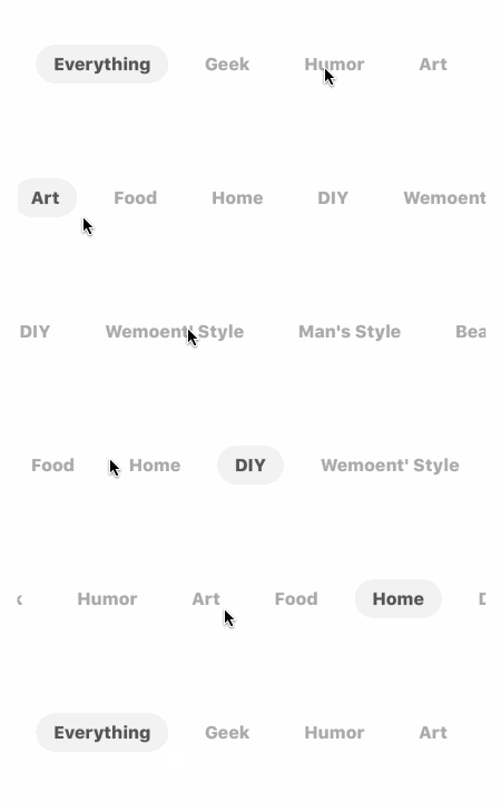


Features
- Pinterest-style segment control: an indicator capsule slides between titles while the selected title color is revealed through a mask
- Horizontally scrollable, so any number of titles works
- Optional leading icons per title
- Configurable style: fonts, colors, spacing, minimum item width, borders
- UIKit implementation built on
UIControl(@IBDesignable/@IBInspectablesupport) - Native SwiftUI implementation with a
Binding-driven API - Light and dark mode support (SwiftUI defaults are adaptive)

Requirements
- iOS 13.0+
- Swift 5.9+ / Xcode 15+
Installation
Swift Package Manager
In Xcode, select File > Add Package Dependencies... and enter the repository URL:
https://github.com/TBXark/PinterestSegment.git
Or add it to your Package.swift:
dependencies: [
    .package(url: "https://github.com/TBXark/PinterestSegment.git", from: "2.0.0")
]
CocoaPods
pod 'PinterestSegment', '~> 2.0'
Usage
UIKit
import UIKit
import PinterestSegment

var style = PinterestSegmentStyle()
style.indicatorColor = UIColor(white: 0.95, alpha: 1)
style.titleMargin = 15
style.titleFont = .boldSystemFont(ofSize: 14)
style.normalTitleColor = .lightGray
style.selectedTitleColor = .darkGray

let segment = PinterestSegment(frame: CGRect(x: 20, y: 100, width: 335, height: 40),
                               segmentStyle: style,
                               titles: ["Everything", "Geek", "Humor", "Art", "Food", "Home", "DIY"])
segment.valueChange = { index in
    // Called when the selection changes
}

view.addSubview(segment)

// Select programmatically. The `valueChange` callback and `.valueChanged`
// action are only sent when the index actually changes.
segment.setSelectIndex(index: 3, animated: true)
Titles with a leading icon use PinterestSegment.TitleElement:
let symbols = ["face.smiling", "heart", "star"]
let titles = symbols.map { symbolName in
    let image = UIImage(systemName: symbolName)
    return PinterestSegment.TitleElement(title: symbolName,
                                         selectedImage: image?.withTintColor(.darkGray, renderingMode: .alwaysOriginal),
                                         normalImage: image?.withTintColor(.lightGray, renderingMode: .alwaysOriginal))
}
segment.setRichTextTitles(titles)
PinterestSegment also works in Interface Builder: add a UIView, set its class to PinterestSegment, and edit the @IBInspectable style properties in the attributes inspector.
Notes
PinterestSegmentStyleis a value type. Assigning a whole style (segment.style = newStyle) reloads the control automatically. Mutating a property in place (segment.style.titleFont = font) does not; callsegment.reloadData()afterwards.valueChange/sendActions(for: .valueChanged)fire only when the selected index changes, including taps and programmaticsetSelectIndex(index:animated:)calls. Initializing, reloading data, or setting the same index never fires the event.
SwiftUI
The SwiftUI implementation is native (no UIKit bridging), with an API designed for SwiftUI: the selection is a Binding and data changes drive the view.
import SwiftUI
import PinterestSegment

struct ContentView: View {
    @State private var selection = 0

    var body: some View {
        PinterestSegmentPicker(selection: $selection,
                               titles: ["Everything", "Geek", "Humor", "Art", "Food", "Home", "DIY"])
            .frame(height: 40)
    }
}
Items with a leading icon and a custom style:
var body: some View {
    PinterestSegmentPicker(selection: $selection,
                           items: [
                               .init(title: "Face-1", icon: Image(systemName: "face.smiling")),
                               .init(title: "Face-2", icon: Image(systemName: "heart")),
                           ],
                           style: style,
                           onSelectionChange: { index in ... })
}
Customization
UIKit styles use PinterestSegmentStyle (UIColor / UIFont based); SwiftUI uses
PinterestSegmentPicker.Style (Color / Font based). The available options
match one-to-one: indicator color, title colors, font, item margin, item
padding, minimum item width, and capsule borders. See the type documentation
for the full list.
Demo
The demo app shows the UIKit and SwiftUI implementations side by side in two tabs. It is generated with XcodeGen:
./Scripts/demo.sh
or
make demo
Run the tests with:
make test
Release History
- 2.0
- Swift Package Manager with a native SwiftUI implementation, bug fixes
- 1.2.4
- support swift 4.2
- 1.2.0
- support swift 4.0
- 1.0.1
- fix bug
- 1.0.0
- first commit
License
Distributed under the MIT license. See LICENSE for more information.