
tabler/tabler-icons
tabler/tabler-icons has 22,588 GitHub stars and 1,269 forks. GitHot measured +10 stars in 24 hours and +59 in 7 days. Last checked 2026-11-09 07:32 UTC. Last push 2026-10-29.
웹 프로젝트에서 사용할 수 있는 6,200개 이상의 고품질 SVG 아이콘 모음으로, MIT 라이선스로 제공됩니다.
측정된 스타 증가
- in 24h
- +10
- in 7 days
- +59
- in 15 days
- 업데이트 지연
- in 1 month
- 업데이트 지연
서로 겹치는 기간의 순증가량이며 일별 합계가 아닙니다. 측정값이 없으면 비워 둡니다. 스타는 관심도를 나타내며 품질을 보장하지 않습니다.
README.md
OriginalTabler Icons
A set of 6257 free, MIT-licensed, high-quality SVG icons for your web projects. Each icon is designed on a 24x24 grid with a 2px stroke.
Browse all icons at tabler.io →


Sponsors
If you want to support our project and help us grow it, you can become a sponsor on GitHub or donate on PayPal.

Preview
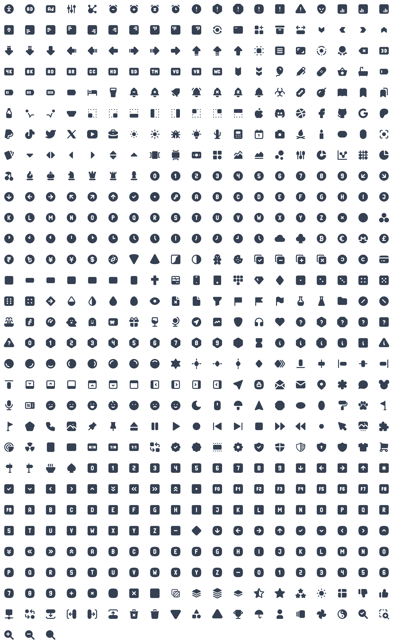
Outline version (5203 icons)

Filled version (1054 icons)
Packages
Tabler Icons is distributed as a set of official packages, one for each format and framework. All packages are published to npm from this repository and share the same version number. The full documentation is available at tabler.io/docs/icons.
| Package | Description | Documentation |
|---|---|---|
@tabler/icons |
Raw SVG files (outline and filled) with icon metadata | SVG |
@tabler/icons-sprite |
SVG sprite with all icons | Sprite |
@tabler/icons-webfont |
Icon font with CSS and SCSS files | Webfont |
@tabler/icons-react |
React components | React |
@tabler/icons-react-native |
React Native components | React Native |
@tabler/icons-preact |
Preact components | Preact |
@tabler/icons-vue |
Vue 3 components | Vue |
@tabler/icons-svelte |
Svelte 4 components | Svelte |
@tabler/icons-svelte-runes |
Svelte 5 components (runes) | Svelte 5 |
@tabler/icons-solidjs |
SolidJS components | SolidJS |
@tabler/icons-astro |
Astro components | Astro |
@tabler/icons-angular |
Angular component and icon providers | Angular |
@tabler/icons-png |
PNG files | PNG |
@tabler/icons-pdf |
PDF files | |
@tabler/icons-eps |
EPS files | EPS |
Installation
Install the SVG package with your package manager of choice:
npm install @tabler/icons
yarn add @tabler/icons
pnpm add @tabler/icons
Replace @tabler/icons with any package from the table above to install a framework-specific version.
You can also download the latest release from GitHub.
Usage
SVG
All icons are plain SVG files, so you can use them as an <img> source, as a CSS background-image, or inline in your HTML.
HTML image
When you load an icon as an image, you can control its size with CSS.
<img src="path/to/icon.svg" alt="icon title" />
Inline SVG
Paste the content of the icon file directly into your HTML to render it inline.
<svg
  xmlns="http://www.w3.org/2000/svg"
  class="icon icon-tabler icons-tabler-outline icon-tabler-activity"
  width="24"
  height="24"
  viewBox="0 0 24 24"
  fill="none"
  stroke="currentColor"
  stroke-width="2"
  stroke-linecap="round"
  stroke-linejoin="round"
>
  <path stroke="none" d="M0 0h24v24H0z" fill="none" />
  <path d="M3 12h4l3 8l4 -16l3 8h4" />
</svg>
Inline icons inherit currentColor, so you can change their size, color, and stroke-width with CSS.
.icon-tabler {
  color: red;
  width: 32px;
  height: 32px;
  stroke-width: 1.5;
}
SVG sprite
Install @tabler/icons-sprite and reference an icon by its name prefixed with tabler-. Replace activity in the example below with any valid icon name.
<svg width="24" height="24">
  <use xlink:href="path/to/tabler-sprite.svg#tabler-activity" />
</svg>
The package also ships tabler-sprite-filled.svg for filled icons and tabler-sprite-nostroke.svg for outline icons without a fixed stroke width.
Webfont
Install @tabler/icons-webfont and include one of the stylesheets from the dist directory.
| Stylesheet | Icons | Stroke width |
|---|---|---|
tabler-icons.css |
Outline | 2 |
tabler-icons-300.css |
Outline | 1.5 |
tabler-icons-200.css |
Outline | 1 |
tabler-icons-filled.css |
Filled | – |
Minified variants with the .min.css suffix and SCSS sources are included as well.
<link rel="stylesheet" href="path/to/tabler-icons.min.css">
Use an icon with the ti base class and the ti-{name} modifier:
<i class="ti ti-brand-tabler"></i>
In CSS, use the icon's unicode value. In SCSS, use the generated variable:
content: '\ec8f';
content: $ti-icon-brand-tabler;
React
Components are available through the @tabler/icons-react package. The package is built with ES modules, so unused icons are tree-shaken from your bundle.
import { IconAward } from '@tabler/icons-react';

const MyComponent = () => {
  return (
    <IconAward
      size={36} // sets `width` and `height`
      color="red" // sets `stroke` color
      stroke={3} // sets `stroke-width`
      strokeLinejoin="miter" // any other SVG attribute is passed through
    />
  );
};
@tabler/icons-react ships its own TypeScript declarations.
The same API is available for Preact, SolidJS, and React Native:
import { IconArrowDown } from '@tabler/icons-preact';
import { IconArrowRight } from '@tabler/icons-solidjs';
import { IconArrowLeft } from '@tabler/icons-react-native';
Vue
Components are available through the @tabler/icons-vue package.
<script setup>
import { IconHome } from '@tabler/icons-vue';
</script>

<template>
  <!-- basic usage -->
  <IconHome />

  <!-- set `stroke` color -->
  <IconHome color="red" />

  <!-- set `width` and `height` -->
  <IconHome size="36" />

  <!-- set `stroke-width` -->
  <IconHome stroke-width="1.5" />
</template>
With the Options API, register the icon in components:
<script>
import { IconHome } from '@tabler/icons-vue';

export default {
  components: { IconHome },
};
</script>
Svelte
For Svelte 4 and earlier, use @tabler/icons-svelte:
<script lang="ts">
  import { IconHeart } from '@tabler/icons-svelte';
</script>

<IconHeart size={48} stroke={1} />
<IconHeart color="crimson" class="p-1" size={96} stroke={2} />
For Svelte 5, use @tabler/icons-svelte-runes, which is built with runes:
<script lang="ts">
  import { IconHeart } from '@tabler/icons-svelte-runes';
</script>

<IconHeart size={48} stroke={1} />
<IconHeart color="crimson" class="p-1" size={96} stroke={2} />
Astro
Components are available through the @tabler/icons-astro package.
---
import { IconArrowRight } from '@tabler/icons-astro';
---

<IconArrowRight color="red" size={48} />
Angular
The official @tabler/icons-angular package provides a standalone TablerIconComponent. Register the icons you need with provideTablerIcons():
import { bootstrapApplication } from '@angular/platform-browser';
import { provideTablerIcons, IconBrandAngular, IconHome } from '@tabler/icons-angular';

bootstrapApplication(AppComponent, {
  providers: [provideTablerIcons({ IconBrandAngular, IconHome })],
});
Import TablerIconComponent in any component that renders icons, then reference icons by name in templates:
<tabler-icon icon="brand-angular" />
<tabler-icon icon="home" [size]="48" color="blue" [stroke]="1.75" />
See the package documentation for NgModule usage and global configuration.
CDN
All published packages are available from jsDelivr. Replace latest with a specific version number (for example 3.46.0) to pin a release.
SVG
<img src="https://cdn.jsdelivr.net/npm/@tabler/icons@latest/icons/outline/home.svg" alt="Home" />
<img src="https://cdn.jsdelivr.net/npm/@tabler/icons@latest/icons/filled/home.svg" alt="Home" />
SVG sprite
<svg width="24" height="24">
  <use xlink:href="https://cdn.jsdelivr.net/npm/@tabler/icons-sprite@latest/dist/tabler-sprite.svg#tabler-activity" />
</svg>
Webfont
<link rel="stylesheet" href="https://cdn.jsdelivr.net/npm/@tabler/icons-webfont@latest/dist/tabler-icons.min.css">
Stroke width
All outline icons are designed with a 2px stroke, but every path is drawn so that it also renders well at other stroke widths. Change the stroke-width value to get lighter or bolder variants that match your design.

Community packages
The following packages are maintained by the community and are not part of this repository:
angular-tabler-iconsprovides an alternative Angular integration.compose-iconsbrings Tabler Icons to Jetpack Compose for Android and Desktop. See its documentation.
Contributing
Bug reports and icon requests are welcome in the issue tracker. Every release is listed in the changelog.
License
Tabler Icons is licensed under the MIT License.
관련 프로젝트 살펴보기
freeCodeCamp/freeCodeCamp
freeCodeCamp.org의 오픈 소스 코드베이스와 커리큘럼입니다. 수학, 프로그래밍, 컴퓨터 과학을 무료로 배울 수 있습니다.
458,826 스타donnemartin/system-design-primer
대규모 시스템 설계 방법을 배우고 시스템 설계 면접을 준비할 수 있습니다. Anki 플래시카드가 포함되어 있습니다.
377,475 스타react/react
웹과 네이티브 사용자 인터페이스를 위한 라이브러리.
252,467 스타vuejs/vue
Vue 2 저장소입니다. Vue 3은 https://github.com/vuejs/core를 방문하세요.
212,625 스타