
gpbl/react-day-picker
gpbl/react-day-picker has 6,865 GitHub stars and 784 forks. GitHot measured 0 stars in 24 hours and +2 in 7 days. Last checked 2026-11-07 18:03 UTC. Last push 2026-10-21.
DayPicker는 사용자 지정 가능한 React 날짜 선택기 컴포넌트입니다. 웹 애플리케이션에 날짜 선택기, 달력, 날짜 입력 필드를 추가할 수 있습니다.
What you can do
- 🛠 Extensive set of props for customizing the calendar.
- 🎨 Minimal design that can be easily styled with CSS or any CSS framework.
- 📅 Supports selections of single days, multiple days, ranges of days, or custom selections.
- 🌍 Can be localized into any language and time zones.
측정된 스타 증가
- in 24h
- 0
- in 7 days
- +2
- in 15 days
- 업데이트 지연
- in 1 month
- 업데이트 지연
서로 겹치는 기간의 순증가량이며 일별 합계가 아닙니다. 측정값이 없으면 비워 둡니다. 스타는 관심도를 나타내며 품질을 보장하지 않습니다.
README.md
OriginalReact DayPicker
DayPicker is a React component for creating date pickers, calendars, and date inputs for web applications.
@daypicker/react is the preferred package name for DayPicker v10 and newer.
Documentation
See daypicker.dev for guides, examples, and API reference, or read the v10 docs in the repository.
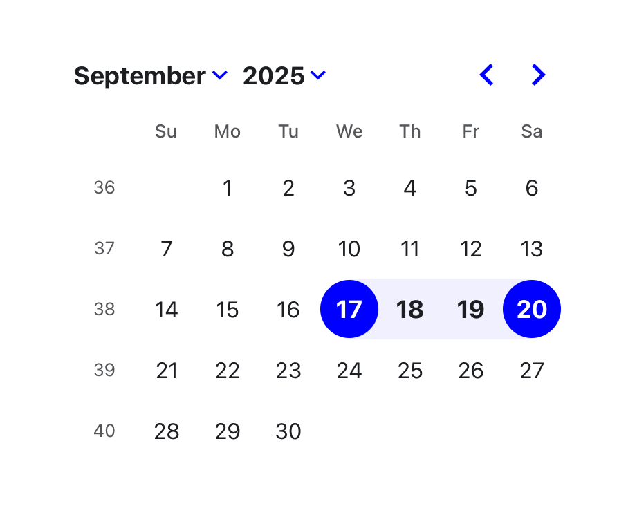
Features
- 🛠 Extensive set of props for customizing the calendar.
- 🎨 Minimal design that can be easily styled with CSS or any CSS framework.
- 📅 Supports selections of single days, multiple days, ranges of days, or custom selections.
- 🌍 Can be localized into any language and time zones.
- 🌐 Support for ISO 8601 and broadcast calendars, plus Persian, Hijri, Buddhist (Thai), Ethiopic, and Hebrew calendars through
@daypicker/*add-on packages. - 🦮 Complies with WCAG 2.1 AA requirements for accessibility.
- ⚙️ Customizable components to extend the rendered elements.
- 🔤 Easy integration with input fields.
DayPicker is written in TypeScript and compiled to CommonJS and ESM. It relies on date-fns for date manipulation and formatting.
Installation
Install the preferred DayPicker package name:
npm install @daypicker/react



Example
import { useState } from "react";

import { DayPicker } from "@daypicker/react";
import "@daypicker/react/style.css";

function MyDatePicker() {
  const [selected, setSelected] = useState<Date>();

  return (
    <DayPicker
      mode="single"
      selected={selected}
      onSelect={setSelected}
      footer={
        selected ? `Selected: ${selected.toLocaleDateString()}` : "Pick a day."
      }
    />
  );
}
Compatibility
DayPicker is compatible with React 16.8 and later.
License
DayPicker is released under the MIT License.
Community
Ask for help and share your experience with DayPicker:
- 💬 Discussion forums - Get support and provide feedback.
- 🪳 Report an issue - Report bugs or request features.
Sponsors
Thank you to everyone supporting DayPicker - your sponsorship keeps this project maintained and evolving.


- 🎗️ Become a sponsor: https://github.com/sponsors/gpbl
관련 프로젝트 살펴보기
freeCodeCamp/freeCodeCamp
freeCodeCamp.org의 오픈 소스 코드베이스와 커리큘럼입니다. 수학, 프로그래밍, 컴퓨터 과학을 무료로 배울 수 있습니다.
458,747 스타donnemartin/system-design-primer
대규모 시스템 설계 방법을 배우고 시스템 설계 면접을 준비할 수 있습니다. Anki 플래시카드가 포함되어 있습니다.
377,323 스타react/react
웹과 네이티브 사용자 인터페이스를 위한 라이브러리.
252,408 스타vuejs/vue
Vue 2 저장소입니다. Vue 3은 https://github.com/vuejs/core를 방문하세요.
212,630 스타