
vojtechportes/react-query-builder
vojtechportes/react-query-builder has 61 GitHub stars and 20 forks. GitHot measured 0 in 7 days. Last checked 2026-11-09 22:18 UTC. Last push 2026-10-23.
Simple, configurable react query builder
計測したスター増加
- 24時間
- 更新が遅れています
- 7日間
- 0
- 15日間
- 更新が遅れています
- 1か月
- 更新が遅れています
期間ごとの純増数です。期間は重複しており、日別の値ではありません。未計測の値は空欄です。スター数は注目度の指標であり、品質の保証ではありません。
README.md
オリジナル
Simple, highly configurable query builder
for React written in TypeScript


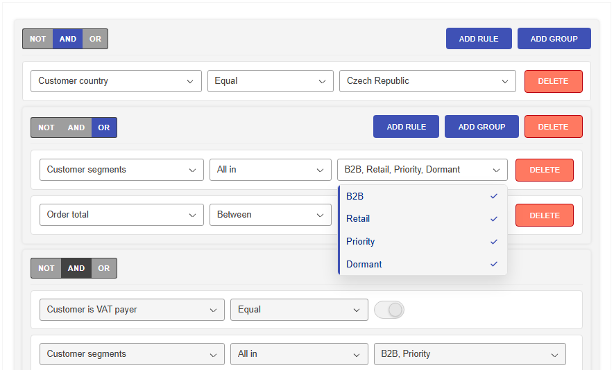
React Query Builder is a TypeScript library for building nested filter editors, formatting them into external query syntaxes, and parsing supported expressions back into builder state.
It also supports an optional SQL text mode for Builder, with built-in syntax
and semantic validation, plus an optional Monaco-based advanced editor
integration for protected locked ranges.
Field-to-field comparisons are also supported through
allowFieldComparisons, per-field fieldComparison metadata, and
valueSource: 'field' / valueField rule data.
Full documentation, API reference, and the interactive demo are available on the project website:
Installation
npm install @vojtechportes/react-query-builder
React Query Builder supports React 18+.
Example
import React, { useState } from 'react';
import {
  Builder,
  type DenormalizedQuery,
  type IBuilderFieldProps,
} from '@vojtechportes/react-query-builder';

const fields: IBuilderFieldProps[] = [
  {
    field: 'STATE',
    label: 'State',
    type: 'LIST',
    operators: ['EQUAL', 'NOT_EQUAL'],
    value: [
      { value: 'CZ', label: 'Czech Republic' },
      { value: 'SK', label: 'Slovakia' },
    ],
  },
  {
    field: 'IS_IN_EU',
    label: 'Is in EU',
    type: 'BOOLEAN',
  },
];

const initialData: DenormalizedQuery = [
  {
    type: 'GROUP',
    value: 'AND',
    isNegated: false,
    children: [
      {
        field: 'STATE',
        operator: 'EQUAL',
        value: 'CZ',
        readOnly: true,
      },
      {
        field: 'IS_IN_EU',
        operator: 'EQUAL',
        value: true,
      },
    ],
  },
];

export const MyBuilder = () => {
  const [data, setData] = useState(initialData);

  return <Builder fields={fields} data={data} onChange={setData} />;
};
Localization
The package includes built-in translations for the locales listed below.
Locales can be imported from their subpaths and passed to the Builder through the
strings prop:
import { Builder } from '@vojtechportes/react-query-builder';
import { strings } from '@vojtechportes/react-query-builder/locale/fr-FR';

<Builder fields={fields} data={data} strings={strings} onChange={setData} />;
Supported locale subpaths:
@vojtechportes/react-query-builder/locale/en-US@vojtechportes/react-query-builder/locale/fr-FR@vojtechportes/react-query-builder/locale/it-IT@vojtechportes/react-query-builder/locale/de-DE@vojtechportes/react-query-builder/locale/es-ES@vojtechportes/react-query-builder/locale/pt-PT@vojtechportes/react-query-builder/locale/cs-CZ@vojtechportes/react-query-builder/locale/sk-SK@vojtechportes/react-query-builder/locale/zh-CN@vojtechportes/react-query-builder/locale/zh-TW
The package-root named strings export remains the backward-compatible English (en-US) strings. IStrings properties remain optional, so applications can continue supplying partial custom overrides.
Validation and Usage Limits
Field metadata can define both value validation and structural usage limits.
Use validation for rule-local checks like required values or numeric bounds,
and use usageLimit when a field or shared field bucket should only appear a
limited number of times globally or within the same parent group.
const fields: IBuilderFieldProps[] = [
  {
    field: 'PRIMARY_EMAIL',
    label: 'Primary email',
    type: 'TEXT',
    operators: ['EQUAL', 'CONTAINS'],
    usageLimit: {
      max: 1,
      scope: 'global',
    },
    validation: {
      required: true,
    },
  },
  {
    field: 'BILLING_CONTACT',
    label: 'Billing contact',
    type: 'TEXT',
    operators: ['EQUAL'],
    usageLimit: {
      key: 'contact-field',
      max: 1,
      scope: 'parent',
    },
  },
  {
    field: 'SHIPPING_CONTACT',
    label: 'Shipping contact',
    type: 'TEXT',
    operators: ['EQUAL'],
    usageLimit: {
      key: 'contact-field',
      max: 1,
      scope: 'parent',
    },
  },
];
When a usage limit is exhausted, the field becomes disabled in the selector, and the built-in Add Rule action is disabled when no selectable fields remain in the current scope.
Dynamic Field Options
When list options depend on other rules or on external application state, keep
the fields array stable and update options through the imperative builderRef
API instead of replacing the full field definition.
This is especially useful for dependent selects, async option loading, and integrations with tools like TanStack React Query.
Use field-level methods when every rule of the same field should share one runtime option set:
isFieldInUse(field)setFieldOptions(field, options)setFieldOptionsStatus(field, status)invalidateFieldOptions(field)reloadFieldOptions(field)clearFieldOptions(field)
Use rule-level methods when options depend on other rules or on surrounding app state:
bindRuleOptions(field, config)useBuilderRuleDependencies(builderRef, field, dependencyFields)subscribeToRuleDependencies(field, dependencyFields, listener)setRuleOptions(ruleId, options)setRuleOptionsStatus(ruleId, status)reconcileRuleValueWithOptions(ruleId, { strategy: 'clear-if-missing' })
See the Dynamic Field Options documentation for the full concept, live example, and React Query integration example:
Styling and legacy color theming
Import @vojtechportes/react-query-builder/styles.css once and customize the
inherited --query-builder-* CSS variables for new integrations.
ThemeProvider remains available as a deprecated compatibility API for the
built-in components. Its colors prop accepts deep partial color overrides and
does not add a DOM wrapper. Only supplied color values become inline CSS
variables, so omitted values do not suppress CSS inherited from your app.
Nested providers keep replacement semantics: the nearest provider replaces the
outer provider value, and omitted legacy colors resolve to the exported
colors defaults. On a Builder, precedence runs from stylesheet defaults, to
inherited CSS, to explicit ThemeProvider colors, and finally to variables in the
Builder style prop.
import { Builder, ThemeProvider } from '@vojtechportes/react-query-builder';

<ThemeProvider colors={{ primary: { default: '#3f51b5' } }}>
  <Builder data={data} fields={fields} onChange={setData} />
</ThemeProvider>;
UI Adapters
The package also exposes ready-made component mappings through versioned subpath exports:
@vojtechportes/react-query-builder/mui/v9for new Material UI projects@vojtechportes/react-query-builder/mui/v7for applications still on MUI 7@vojtechportes/react-query-builder/bootstrap/v5for Bootstrap 5 projects@vojtechportes/react-query-builder/antd/v6for new Ant Design projects@vojtechportes/react-query-builder/antd/v5for applications still on Ant Design 5@vojtechportes/react-query-builder/mantine/v9for new Mantine projects@vojtechportes/react-query-builder/mantine/v8for applications still on Mantine 8@vojtechportes/react-query-builder/fluentui/v8for Fluent UI React 8 projects@vojtechportes/react-query-builder/radix/v1for Radix Themes 1 projects
Install the peer dependencies that match the adapter you want to use and pass
the exported components object to Builder.
Bootstrap 5 example:
import React from 'react';
import 'bootstrap/dist/css/bootstrap.min.css';
import { Builder } from '@vojtechportes/react-query-builder';
import { components } from '@vojtechportes/react-query-builder/bootstrap/v5';

export const MyBootstrapBuilder = () => {
  return (
    <Builder
      fields={fields}
      data={data}
      components={components}
      onChange={setData}
    />
  );
};
Material UI example:
npm install @mui/material@^9.0.1 @mui/icons-material@^9.0.1 @emotion/react @emotion/styled
import React from 'react';
import { Builder } from '@vojtechportes/react-query-builder';
import { components } from '@vojtechportes/react-query-builder/mui/v9';

export const MyMuiBuilder = () => {
  return (
    <Builder
      fields={fields}
      data={data}
      components={components}
      onChange={setData}
    />
  );
};
Ant Design example:
npm install antd@^6.0.0 @ant-design/icons@^6.0.0
import React from 'react';
import { Builder } from '@vojtechportes/react-query-builder';
import { components } from '@vojtechportes/react-query-builder/antd/v6';

export const MyAntdBuilder = () => {
  return (
    <Builder
      fields={fields}
      data={data}
      components={components}
      onChange={setData}
    />
  );
};
Mantine example:
npm install @mantine/core@^9.0.0 @mantine/hooks@^9.0.0
import React from 'react';
import '@mantine/core/styles.css';
import { MantineProvider } from '@mantine/core';
import { Builder } from '@vojtechportes/react-query-builder';
import { components } from '@vojtechportes/react-query-builder/mantine/v9';

export const MyMantineBuilder = () => {
  return (
    <MantineProvider>
      <Builder
        fields={fields}
        data={data}
        components={components}
        onChange={setData}
      />
    </MantineProvider>
  );
};
Fluent UI example:
npm install @fluentui/react@^8.125.6
import React from 'react';
import { Builder } from '@vojtechportes/react-query-builder';
import { components } from '@vojtechportes/react-query-builder/fluentui/v8';

export const MyFluentUiBuilder = () => {
  return (
    <Builder
      fields={fields}
      data={data}
      components={components}
      onChange={setData}
    />
  );
};
Radix example:
npm install @radix-ui/themes@^1.1.2 @radix-ui/react-icons@^1.3.2
The Radix adapter also uses @radix-ui/react-icons, so install it alongside
@radix-ui/themes.
import React from 'react';
import '@radix-ui/themes/styles.css';
import { Theme } from '@radix-ui/themes';
import { Builder } from '@vojtechportes/react-query-builder';
import { components } from '@vojtechportes/react-query-builder/radix/v1';

export const MyRadixBuilder = () => {
  return (
    <Theme>
      <Builder
        fields={fields}
        data={data}
        components={components}
        onChange={setData}
      />
    </Theme>
  );
};
ThemeProvider customizes the built-in default component set. It does not
theme the MUI, ANTD, Mantine, Fluent UI, or Radix adapters, which keep their styling in their host UI
libraries.
More adapter details:
Text Mode
Builder can optionally switch between the visual query UI and a SQL text
editor view.
<Builder
  fields={fields}
  data={data}
  textMode
  defaultMode="text"
  onChange={setData}
/>
For advanced text editing, the package also exposes
@vojtechportes/react-query-builder/monaco. The built-in editor is lightweight
and works without extra dependencies, while the Monaco integration is the
recommended path when locked query segments must stay protected in text mode.
Set allowGroupNegation={false} to remove the group-level NOT toggle and
reject NOT (...) groups in text mode, while still allowing operator-level
negation such as NOT IN or IS NOT NULL.
Read-only and Protected Editing
Rules and groups can be fully read-only or partially read-only through
readOnly.targets.
- Rule targets:
field,operator,value - Group targets:
combinator,negation
Targeted read-only controls stay visible but become non-editable. When using the Monaco text editor integration, protected SQL fragments remain locked while users can still edit the unlocked parts of the query.
By default, deleting a group is also blocked when that delete would indirectly
remove read-only protected descendants. Set readOnlyProtectsDelete={false} on
Builder if you want to disable that subtree delete protection.
Query Conversion
The library also provides parser and formatter helpers through subpath exports:
@vojtechportes/react-query-builder/formatQuery@vojtechportes/react-query-builder/parseQuery
Supported formats are documented on the website:
Field-to-field comparisons are supported in the builder model and in native
query formats that have a direct right-hand-side field-reference form. See the
supported-formats documentation for the current list and unsupported cases such
as Elasticsearch and RSQL.
- Documentation: Parsing and Formatting
- Documentation: Supported Formats
- API: formatQuery
- API: parseQuery
Responsive Behavior
The default builder components include a compact responsive layout.
- Rule rows reflow to preserve field, operator, action, and value legibility when horizontal space gets tighter.
- Multi-select values use a summarized closed state to avoid chip overflow.
- The default responsive behavior applies automatically when you use the built-in components.
- If you replace layout containers such as
components.Ruleorcomponents.Group, your custom components are responsible for their own responsive behavior.
Responsive behavior is documented in more detail on the website:
関連プロジェクトを探す
freeCodeCamp/freeCodeCamp
freeCodeCamp.org のオープンソースのコードベースとカリキュラムです。数学、プログラミング、コンピュータサイエンスを無料で学べます。
458,964 スターdonnemartin/system-design-primer
大規模システムの設計を学び、システム設計面接の対策ができます。Anki のフラッシュカードが含まれています。
377,604 スターreact/react
Web とネイティブのユーザーインターフェース向けライブラリ。
252,509 スターvuejs/vue
Vue 2 のリポジトリです。Vue 3 については https://github.com/vuejs/core をご覧ください。
212,622 スター