
gpbl/react-day-picker
gpbl/react-day-picker has 6,866 GitHub stars and 783 forks. GitHot measured +1 stars in 24 hours and +3 in 7 days. Last checked 2026-11-08 17:12 UTC. Last push 2026-10-21.
Comment ces chiffres sont mesurés
DayPicker est un composant de sélection de dates personnalisable pour React. Ajoutez des sélecteurs de dates, des calendriers et des champs de date à vos applications web.
What you can do
- 🛠 Extensive set of props for customizing the calendar.
- 🎨 Minimal design that can be easily styled with CSS or any CSS framework.
- 📅 Supports selections of single days, multiple days, ranges of days, or custom selections.
- 🌍 Can be localized into any language and time zones.
Progression mesurée des étoiles
- in 24h
- +1
- in 7 days
- +3
- in 15 days
- Historique en cours
- in 1 month
- Historique en cours
Variations nettes sur des périodes qui se chevauchent, pas des totaux quotidiens. Les mesures absentes restent vides. Les étoiles indiquent l’intérêt, pas la qualité.
README.md
OriginalReact DayPicker
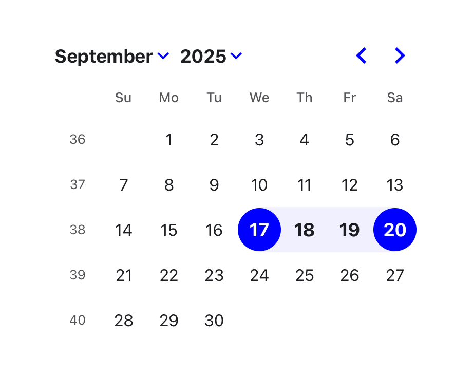
DayPicker is a React component for creating date pickers, calendars, and date inputs for web applications.
@daypicker/react is the preferred package name for DayPicker v10 and newer.
Documentation
See daypicker.dev for guides, examples, and API reference, or read the v10 docs in the repository.
Features
- 🛠 Extensive set of props for customizing the calendar.
- 🎨 Minimal design that can be easily styled with CSS or any CSS framework.
- 📅 Supports selections of single days, multiple days, ranges of days, or custom selections.
- 🌍 Can be localized into any language and time zones.
- 🌐 Support for ISO 8601 and broadcast calendars, plus Persian, Hijri, Buddhist (Thai), Ethiopic, and Hebrew calendars through
@daypicker/*add-on packages. - 🦮 Complies with WCAG 2.1 AA requirements for accessibility.
- ⚙️ Customizable components to extend the rendered elements.
- 🔤 Easy integration with input fields.
DayPicker is written in TypeScript and compiled to CommonJS and ESM. It relies on date-fns for date manipulation and formatting.
Installation
Install the preferred DayPicker package name:
npm install @daypicker/react



Example
import { useState } from "react";

import { DayPicker } from "@daypicker/react";
import "@daypicker/react/style.css";

function MyDatePicker() {
  const [selected, setSelected] = useState<Date>();

  return (
    <DayPicker
      mode="single"
      selected={selected}
      onSelect={setSelected}
      footer={
        selected ? `Selected: ${selected.toLocaleDateString()}` : "Pick a day."
      }
    />
  );
}
Compatibility
DayPicker is compatible with React 16.8 and later.
License
DayPicker is released under the MIT License.
Community
Ask for help and share your experience with DayPicker:
- 💬 Discussion forums - Get support and provide feedback.
- 🪳 Report an issue - Report bugs or request features.
Sponsors
Thank you to everyone supporting DayPicker - your sponsorship keeps this project maintained and evolving.


- 🎗️ Become a sponsor: https://github.com/sponsors/gpbl
Explorer des projets similaires
freeCodeCamp/freeCodeCamp
La base de code open source et le cursus de freeCodeCamp.org. Apprenez gratuitement les mathématiques, la programmation et l'informatique.
458,761 étoilesdonnemartin/system-design-primer
Apprenez à concevoir des systèmes à grande échelle et préparez-vous à l’entretien de conception de systèmes. Comprend des cartes mémoire Anki.
377,346 étoilesreact/react
La bibliothèque pour les interfaces utilisateur web et natives.
252,413 étoilesvuejs/vue
Voici le dépôt de Vue 2. Pour Vue 3, rendez-vous sur https://github.com/vuejs/core
212,631 étoiles