
ChaosLeung/PinView
ChaosLeung/PinView has 656 GitHub stars and 124 forks. GitHot measured 0 stars in 24 hours and 0 in 7 days. Last checked 2026-11-21 22:35 UTC. Last push 2022-02-17.
Progression mesurée des étoiles
- in 24h
- 0
- in 7 days
- 0
- in 15 days
- Historique en cours
- in 1 month
- Historique en cours
Variations nettes sur des périodes qui se chevauchent, pas des totaux quotidiens. Les mesures absentes restent vides. Les étoiles indiquent l’intérêt, pas la qualité.
À propos
A PIN view library for Android. Use to enter PIN/OTP/password etc.
Outils de développementREADME.md
OriginalPinView
Provides a widget for enter PIN/OTP/password etc on Android 4.1+ (API 16).
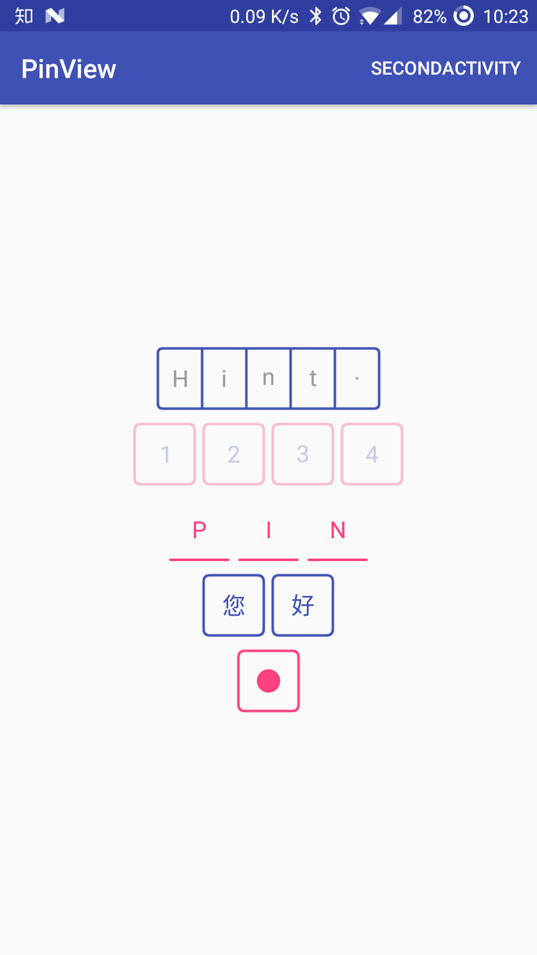
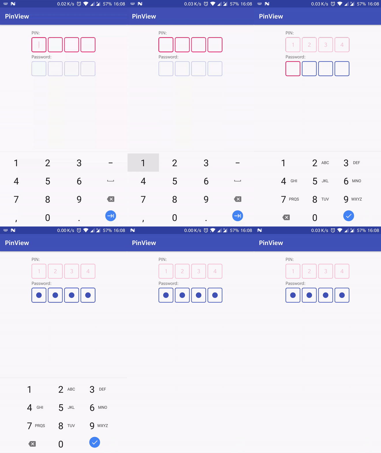
Dependency
JCenter(Deprecated)
repositories {
    maven {
        jcenter()
    }
}

dependencies {
   implementation 'com.chaos.view:pinview:1.4.4'
}
MavenCentral
repositories {
    maven {
        mavenCentral()
    }
}

dependencies {
   implementation 'io.github.chaosleung:pinview:1.4.4'
}
Note that
MavenCentralusesio.github.chaosleungas the group id
Usage
PinView inherits from EditText, which means you can use all the APIs from EditText.
Step 1:
Add PinView in your layout.
XML
<com.chaos.view.PinView
    android:id="@+id/firstPinView"
    style="@style/PinWidget.PinView"
    android:layout_width="wrap_content"
    android:layout_height="wrap_content"
    android:cursorVisible="true"
    android:hint="Hint."
    android:inputType="text"
    android:itemBackground="@mipmap/ic_launcher"
    android:padding="@dimen/common_padding"
    android:textColor="@color/text_colors"
    android:textSize="18sp"
    android:textStyle="bold"
    app:cursorColor="@color/line_selected"
    app:cursorWidth="2dp"
    app:hideLineWhenFilled="true"
    app:itemCount="5"
    app:itemHeight="48dp"
    app:itemRadius="4dp"
    app:itemSpacing="0dp"
    app:itemWidth="48dp"
    app:lineColor="@color/line_colors"
    app:lineWidth="2dp"
    app:viewType="rectangle" />
Java
final PinView pinView = findViewById(R.id.secondPinView);
pinView.setTextColor(
        ResourcesCompat.getColor(getResources(), R.color.colorAccent, getTheme()));
pinView.setTextColor(
        ResourcesCompat.getColorStateList(getResources(), R.color.text_colors, getTheme()));
pinView.setLineColor(
        ResourcesCompat.getColor(getResources(), R.color.colorPrimary, getTheme()));
pinView.setLineColor(
        ResourcesCompat.getColorStateList(getResources(), R.color.line_colors, getTheme()));
pinView.setItemCount(4);
pinView.setItemHeight(getResources().getDimensionPixelSize(R.dimen.pv_pin_view_item_size));
pinView.setItemWidth(getResources().getDimensionPixelSize(R.dimen.pv_pin_view_item_size));
pinView.setItemRadius(getResources().getDimensionPixelSize(R.dimen.pv_pin_view_item_radius));
pinView.setItemSpacing(getResources().getDimensionPixelSize(R.dimen.pv_pin_view_item_spacing));
pinView.setLineWidth(getResources().getDimensionPixelSize(R.dimen.pv_pin_view_item_line_width));
pinView.setAnimationEnable(true);// start animation when adding text
pinView.setCursorVisible(false);
pinView.setCursorColor(
        ResourcesCompat.getColor(getResources(), R.color.line_selected, getTheme()));
pinView.setCursorWidth(getResources().getDimensionPixelSize(R.dimen.pv_pin_view_cursor_width));
pinView.addTextChangedListener(new TextWatcher() {...});
pinView.setItemBackgroundColor(Color.BLACK);
pinView.setItemBackground(getResources().getDrawable(R.drawable.item_background));
pinView.setItemBackgroundResources(R.drawable.item_background);
pinView.setHideLineWhenFilled(false);
pinView.setPasswordHidden(false);
pinView.setTransformationMethod(new PasswordTransformationMethod());
Step 2:
Specifies pinViewStyle in your theme,
<style name="AppTheme" parent="Theme.AppCompat.Light">
    ...
    <item name="pinViewStyle">@style/PinWidget.PinView</item>
</style>
or use the PinWidget.PinView style.
<com.chaos.view.PinView
    android:id="@+id/pinView"
    android:layout_width="wrap_content"
    android:layout_height="wrap_content"
    style="@style/PinWidget.PinView" />
Step 3 (Optional):
To highlight current item, use 'selected' state, in other words,
add android:state_selected="true" to app:lineColor
<selector xmlns:android="http://schemas.android.com/apk/res/android">
    <!-- Use for the item to be input, set the value as the default to disable it -->
    <item android:color="@color/line_selected" android:state_selected="true" />
    <item android:color="@color/line_focused" android:state_focused="true" />
    <item android:color="@color/line_default" />
</selector>
or add android:cursorVisible="true".
Attributes
- itemCount, the length of your pin code.
- itemWidth, the width of each item.
- itemHeight, the height of each item.
- itemSpacing, the spacing between two items.
- lineWidth, the line (border) width.
- lineColor, the line (border) colors.
- viewType, the view type of PinView, currently this will be one of
rectangle,lineornone. - cursorVisible, show cursor or not.
- cursorColor, the cursor color.
- cursorWidth, the width of cursor.
- itemBackground, the item background.
- hideLineWhenFilled, specifies whether the line (border) should be hidden or visible when text entered.
Thanks
- Inspired by PasswordInput in EthanCo
License
Copyright 2017-2018 Chaos Leong

Licensed under the Apache License, Version 2.0 (the "License");
you may not use this file except in compliance with the License.
You may obtain a copy of the License at

    http://www.apache.org/licenses/LICENSE-2.0

Unless required by applicable law or agreed to in writing, software
distributed under the License is distributed on an "AS IS" BASIS,
WITHOUT WARRANTIES OR CONDITIONS OF ANY KIND, either express or implied.
See the License for the specific language governing permissions and
limitations under the License.
Explorer des projets similaires
Chargement…