
gpbl/react-day-picker
gpbl/react-day-picker has 6,866 GitHub stars and 784 forks. GitHot measured 0 stars in 24 hours. Last checked 2026-11-05 21:13 UTC. Last push 2026-10-21.
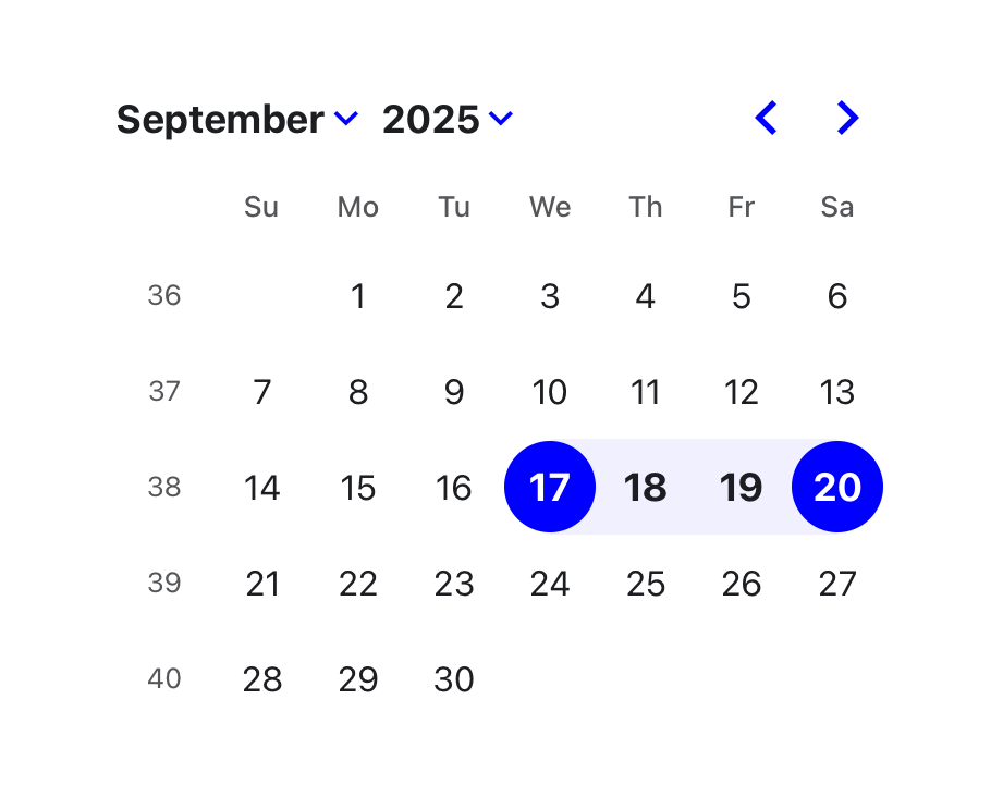
DayPicker es un componente de calendario personalizable para React. Añade selectores de fecha, calendarios y campos de fecha a tus aplicaciones web.
What you can do
- 🛠 Extensive set of props for customizing the calendar.
- 🎨 Minimal design that can be easily styled with CSS or any CSS framework.
- 📅 Supports selections of single days, multiple days, ranges of days, or custom selections.
- 🌍 Can be localized into any language and time zones.
Crecimiento de estrellas medido
- in 24h
- 0
- in 7 days
- Recopilando historial
- in 15 days
- Recopilando historial
- in 1 month
- Recopilando historial
Cambios netos en períodos que se solapan, no totales diarios. Los datos no disponibles se dejan en blanco. Las estrellas indican interés, no calidad.
README.md
OriginalReact DayPicker
DayPicker is a React component for creating date pickers, calendars, and date inputs for web applications.
@daypicker/react is the preferred package name for DayPicker v10 and newer.
Documentation
See daypicker.dev for guides, examples, and API reference, or read the v10 docs in the repository.
Features
- 🛠 Extensive set of props for customizing the calendar.
- 🎨 Minimal design that can be easily styled with CSS or any CSS framework.
- 📅 Supports selections of single days, multiple days, ranges of days, or custom selections.
- 🌍 Can be localized into any language and time zones.
- 🌐 Support for ISO 8601 and broadcast calendars, plus Persian, Hijri, Buddhist (Thai), Ethiopic, and Hebrew calendars through
@daypicker/*add-on packages. - 🦮 Complies with WCAG 2.1 AA requirements for accessibility.
- ⚙️ Customizable components to extend the rendered elements.
- 🔤 Easy integration with input fields.
DayPicker is written in TypeScript and compiled to CommonJS and ESM. It relies on date-fns for date manipulation and formatting.
Installation
Install the preferred DayPicker package name:
npm install @daypicker/react



Example
import { useState } from "react";

import { DayPicker } from "@daypicker/react";
import "@daypicker/react/style.css";

function MyDatePicker() {
  const [selected, setSelected] = useState<Date>();

  return (
    <DayPicker
      mode="single"
      selected={selected}
      onSelect={setSelected}
      footer={
        selected ? `Selected: ${selected.toLocaleDateString()}` : "Pick a day."
      }
    />
  );
}
Compatibility
DayPicker is compatible with React 16.8 and later.
License
DayPicker is released under the MIT License.
Community
Ask for help and share your experience with DayPicker:
- 💬 Discussion forums - Get support and provide feedback.
- 🪳 Report an issue - Report bugs or request features.
Sponsors
Thank you to everyone supporting DayPicker - your sponsorship keeps this project maintained and evolving.


- 🎗️ Become a sponsor: https://github.com/sponsors/gpbl
Explorar proyectos relacionados
freeCodeCamp/freeCodeCamp
Base de código abierto y plan de estudios de freeCodeCamp.org. Aprende matemáticas, programación y ciencias de la computación gratis.
458,619 estrellasdonnemartin/system-design-primer
Aprende a diseñar sistemas a gran escala y prepárate para la entrevista de diseño de sistemas. Incluye fichas de Anki.
376,991 estrellasreact/react
La biblioteca para interfaces de usuario web y nativas.
252,013 estrellasvuejs/vue
Este es el repositorio de Vue 2. Para Vue 3, visita https://github.com/vuejs/core
212,508 estrellas